A character turn around...critiques welcome
-
I have been working on a new look with my drawing that has a little more detail and that is sparked by an idea for a picture book.
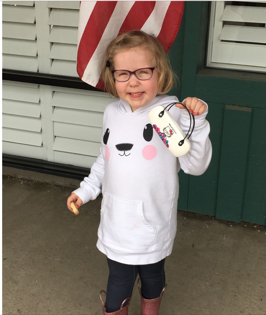
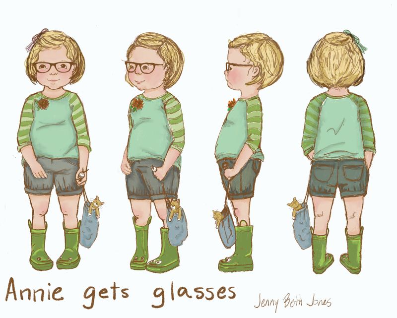
I spent A LONG time drawing (about 22hours so far) and feel like I gained a bit of confidence in my mark making. This is my first time trying a turn around. Does the child look like the same child in all the poses? She is based off of the look of both of my girls at that age. I intend for her to look about 5. She should look sweet and childlike. She will have her favorite cat stuffed animal that she carries in a drawstring bag. She loves to wear green frog rain boots. You will not be able to tell from the picture here, but she is curious and generally good natured and happy.
Does it look like the same child?
Are there any drawing / anatomy mistakes that need a tweak?
Does the drawing look stiff? Or just lifeless?Thanks for the eyes!
Here’s my Annie. It’s the story of her getting glasses that is the inspiration.

Here’s my drawing
 image url)
 -
@JennyJones first off, holy adorable lil girl you got there! As for your turn around, I think they are great. I would suggest pushing the smile into the checks more. The checks should be pushing up under the eyes which give the eyes that curve to them. The front on view, her hips seem to be a little larger then the full on back view. Maybe bring them in a little. Great work!
-
@JennyJones very cute! I especially love that profile view. I do have some issues about the eyes. Perhaps you don’t have to arch them as much since your girl isn’t really smilling that wide. Great work.
-
@JennyJones Looking great, I would also add to watch the anatomy of the legs. You've done a good job with the arms but in the front view, her knees should be at the same height, in the back view her heels should be at the same height, and in the 3/4 view her back leg is looking a bit thin.
-
@StudioLooong @Chip-Valecek @Nyrryl-Cadiz Thanks for the advice everyone. I have looked at this drawing for a LONG time and tweaked minuscule details over and over. Her eyes gave me troubles and so did the cheeks and so did those blessed legs. You guys nailed it! If you had seen how many erases and draw overs I did.... sometimes getting there is so hard.
I do want her eyes smiling a little bit bigger and to have those cheeks push up more. My usual eye is a dot or a dot with a squiggle over top. So this is new territory. I’m going to work on it a bit more tonight and post the changes. Thanks again.
@Chip-Valecek thanks for the cutie comments. She’s a keeper for sure. One of those kids who says funny stuff everyday that you wish you had written down!
-
Here is the next installment after a longer than I wanted break. As a teacher I had to put a halt on some personal projects to prepare my classroom (and heart) for my new group of little ones. But I’m ready for school to begin and my mind is freed to think about art again!
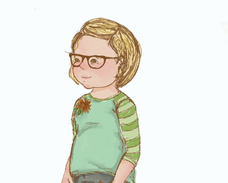
I fixed several problems in the line work and colored the piece on Procreate. I still want to go in and do it traditionally, so I guess I will call this a color study.
It seems a bit flat to me and I cannot seem to figure out what to do to tweak it just right without trying to be hyper realistic. Any thoughts?
Also I’m wondering if the colors are blah, or too saturated. I’m still not sure about some of it but I very much want to improve. Any critiques are welcome.

-
I downloaded the image and put it in Photoshop, then adjusted the levels a bit... By making the darks darker, it seems like there's more dimension (to me, anyway). Is that something you're interested in doing? Because sometimes "flat" is part of what makes it interesting... There are a lot of successful illustrators that exploit "flatness"...

-
@Coreyartus Thanks for doing an adjustment. I guess I do like a flatter look. When I go back and look at some of my favorite illustrators I guess their style is a little muted too. I guess I will have to make several more pieces and see how I feel after that....
-
@JennyJones First of all, I love this! I am a sucker for realism. One note about the quarter turn. Her mouth drops down a little giving the impression of a huge upper lip. Maybe inch the mouth up a bit to match the others. It could be that her nose moves up. I am not exactly sure. I like the muted look too. Makes it look more like a watercolor drawing. @Coreyartus But I do like yours too.
-
@chrisaakins thanks for the feedback! That quarter turn face has given me ( literally) hours of fits. I can’t even say how many times I erased and redrew the mouth. And then the nose and chin and cheeks because of the mouth. I love the realistic/not realistic too. Some of the illustrators who inspire me are Sophie Blackall, Freya Blackwood, Stephanie Graegin, Eliza Wheeler, and the like. I am starting my master copy work and they feature quite a bit.
Anyway, thanks again I will try some more tweaks. I really want it to be better and just don’t feel like it’s there yet. Naggingly annoying to not be able to get it done to my satisfaction. Baby steps!
-
@chrisaakins Ok here are the tweaks to the mouth and nose. I think it looks a little better and more like what I was going for. Better?

-
@JennyJones Yes! as someone who needed glasses early on, I like this concept and your real-life character is adorable—great job getting her developed on paper.
-
@BichonBistro Awesome! Thanks. The concept is Annie getting glasses and being thrilled about it. So many books are about children being worried and apprehensive. But I want there to be one about being excited about it.
-
@JennyJones can’t wait to see the progression of this concept


-
@JennyJones Yes! Much better.
-
@JennyJones Just wanted to say great work! She looks like a very loveable character!
-
Thanks. I’m still working on the story. But maybe at the same time working on a few of the illustrations that I want to include. Thanks for the encouragement! I’ll post so progress here when there is some...