Picture Book Front Cover - Critique Please
-
@lmrush Hi Lisa, thanks for your comment. I still like the first one and with the kerning tightened I'm going to put them side by side and choose later today.

-
@Sophie-Lawson Hi Sophie. What a beautiful comment.
 Thank you! The story has an element of mystery and there is certainly a happy ending.
  :white_medium_star:
 -
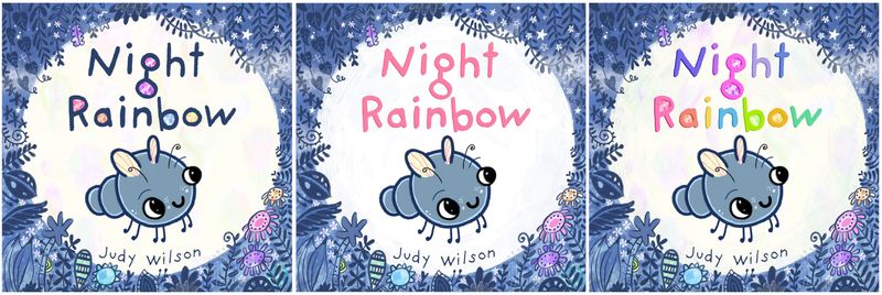
@Judy-Elizabeth-Wilson I kind of liked the background colors and the patterns in the letters in your first one. It fits your style. I do see where the letters could be a bit closer together though.
Marsha Ottum Owen
-
@Marsha-Kay-Ottum-Owen Thanks Marsha. The letters are closer together now and it does look better.
Thanks for everyones feedback. Which would you choose from these 3 covers?
Website http://www.judyelizabethwilson.com/
Instagram https://www.instagram.com/judyelizabethart/
Sharing positivity through art.
-
@Judy-Elizabeth-Wilson This looks great! Nice edits! I like the dark blue letters with the jewel fillings.
www.adrianabergstrom.com
IG/Twi/Pin/etc @adriprints -
@Judy-Elizabeth-Wilson I really like #1 up close but when I zoom out, #2 calls me more (I wish I could explain why).
-
@BichonBistro Thank you. I think it's the pink text that sings. I have made a pink text with jewels to see how it looks.
The blue text looks more dominant and clear though.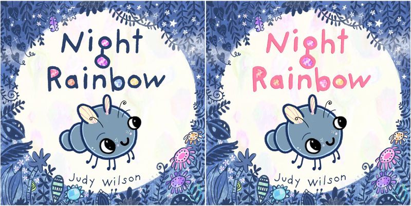
-
@Adriana-Bergstrom Thank you. I Adriana. I'm drawn to the blue too. It was worth to experiment though. You never know what cool surprises you'll find if you don't try.
Website http://www.judyelizabethwilson.com/
Instagram https://www.instagram.com/judyelizabethart/
Sharing positivity through art.
-
@Judy-Elizabeth-Wilson I still like number 1 but the pink text pops out more. I wonder what would happen if there was a very thin outline of pink around the letters in number 1? Would they pop more from a distance?
Marsha Ottum Owen
-
@Marsha-Kay-Ottum-Owen That's a nice idea Marsha. I'll play around with the shadow and see if something good shows up. Thank you!