Acorn Defender WIP
-
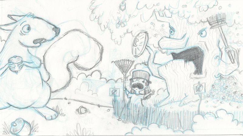
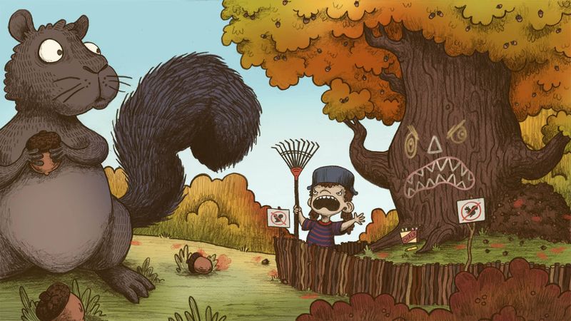
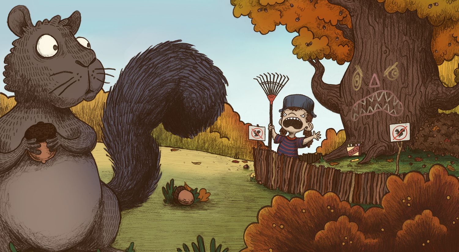
Working on a new piece, It's given me a bit of trouble but I think I'm getting close now. I'm going to add a few fallen leaves to make it look more like autumn and keep playing with the color as i render things out a little more and add lighting.
-
I've opened up the space between the girl and the squirrel a little and tweaked the angle of his foot just a little to try and make the perspective look a little less forced. Is it coming across as believable or is there something that sticks out as being the wrong size?
-
There is a lot of appeal to this image but the perspective and size relationships are confusing and I am not sure of your intent.
In any case, I found a squirrel image that might be helpful to you as it shows a squirrel in the foreground with people in the background and the size relationships are very clear and easy to read.
-
@StudioLooong I will admit I'm a little confused regarding scale... Is the squirrel in the foreground, and thus a normal scale? Is the squirrel on the same plane as the boy and tree, and thus super-sized?
If the tree and boy are far away in the distance, I would urge you to ponder different ways to suggest more depth in the image. Adjusting the placement of the acorn on the ground that is between the boy and the squirrel might help--it seems too high if it's supposed to be in the middle distance. Pulling the squirrel down in the picture plane so we see only part of it as it's looking over its shoulder might also help. Moving the boy and the tree upward in the picture plane so they appear to be more in the distance might also help.
If the the squirrel and the boy/tree are indeed on the same plane, the scale of the acorns needs to be adjusted to be the same. The boy needs to be looking upwards more, and there should be more visual clues as to the unusual size of the squirrel.
The rendering execution of this image, though, is lovely! You have gorgeous texture, and the range of color is really spot on!
-
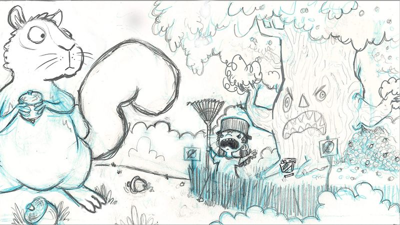
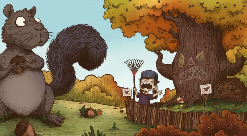
thanks @bathyscaph @Coreyartus I moved some things around and made the squirrel a little bigger. It is supposed to read as a normal sized squirrel that is very close to the camera. You can use the acorns as a refrence point - the tiny ones in the tree in the bg are the same size as the one the squirrel has. Do you think this is working better?
-
Much much better (at least to my eye)! I think your intent is a lot clearer now. Upon seeing it this way, one other thing I might suggest is to darken ever so slightly the squirrel and lighten the trees in the far distance. Dark things pop forward in images, and light things recede. Even if you made the darks of the tree & boy and his fence just a bit lighter, and then the trees in the far distance even lighter, it might give some more depth to your image and make the squirrel seem closer.
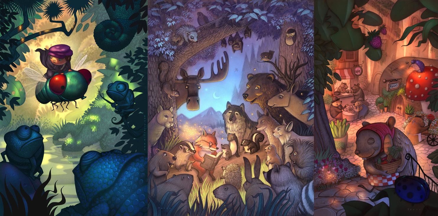
Will Terry has some examples on his website: https://www.willterry.com/
You can clearly see the depth of the image he's created because he's got dark foregrounds in all three of them, and the middleground and background are progressively lighter. Your primary emphasis, as it looks right now, is also in the middle ground (the boy and his tree). The surprised look on the squirrels face stands out because of the contrast of the light eyes against his dark face. We'll still get that if you make him a smidge darker, or perhaps added another deeper brown tone to his shading.
Anyway, you get the point. That's just what I see with my eye--you may want to approach it differently. In my opinion it's still so much clearer than what you had earlier--kudos to making those adjustments the way you did. It's looking good!!
Children's Illustration Portfolio: https://www.coreyartusillustration.com
Art Portfolio: https://www.coreyartusimagery.com
Mastodon: https://mindly.social/@Coreyartus
Pixelfed: https://pixelfed.social/Coreyartus -
@Coreyartus oh yeah, totally plan to do that, I still have a bit of work to do with the colors/lighting.
-
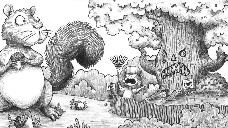
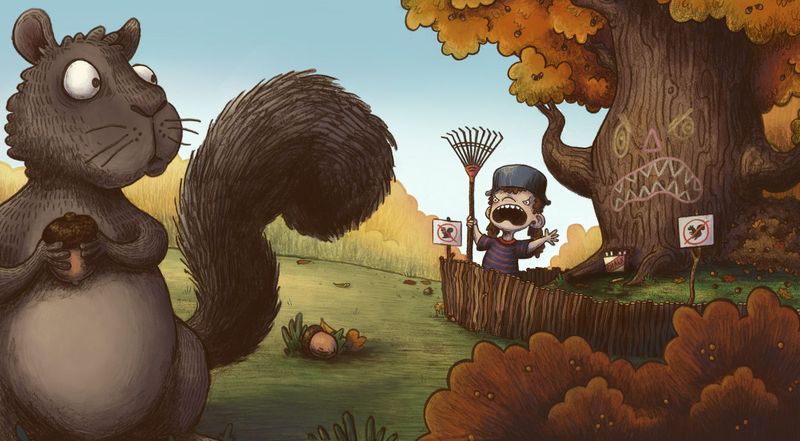
finally got all the line work fixed up - now on to rendering and light
Taylor Woolley
(Formerly Taylor Ackerman / StudioLooong)
Website: www.woolleystories.com
Instagram: https://www.instagram.com/woolleystories/ -
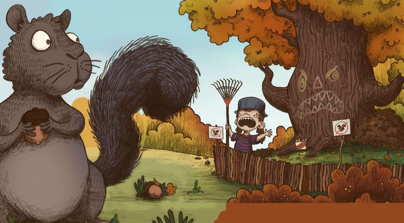
@StudioLooong This much more clearly shows the squirrel is in the foreground...nice update. What a fun concept.
-
@StudioLooong I think you definitely need some more atmospheric perspective. If you greyed out the tree and the girl just a bit more there would be no forced perspective. Also, even though the squirrel is close there would be brighter highlights on it. It's the contrast of the up close object and the lack of contrast in the background which gives the illusion of space and depth.
-
@chrisaakins thanks, I'm still working on the rendering and lighting
") I hadn't gotten to the squirrel or the bg yet.
I hadn't gotten to the squirrel or the bg yet. -
@StudioLooong Well get on it, then!
haha. We are all waiting to see your good work! -
Calling this one done! I'm not sure if I am completely satisfied with the color on the squirrel's face yet - I might go back in in a day or two and give it another try if it's still bothering me.
Taylor Woolley
(Formerly Taylor Ackerman / StudioLooong)
Website: www.woolleystories.com
Instagram: https://www.instagram.com/woolleystories/ -
The chalk on the tree and the tree's trunk are perfect! I just love everything about this.
-
@StudioLooong hey this looks great! The concept is much clearer than the initial version. Also love the expressions! I do have 2 suggestions which you can try:
- As suggested by coreyartus earlier, try desaturating the foreground elements (the squirrel and the bush), maybe to a similar shade.
- I understand you’ve repositioned the squirrel to the bottom left corner to get the perspective, but the crop looks a little tight. Maybe if you have time you can draw the full squirrel, and show that it’s sitting on a tree branch. So it,l be a close up of the tree bark and branch which will be bordering the left side. Makes sense?

-
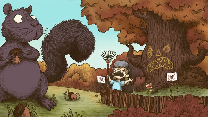
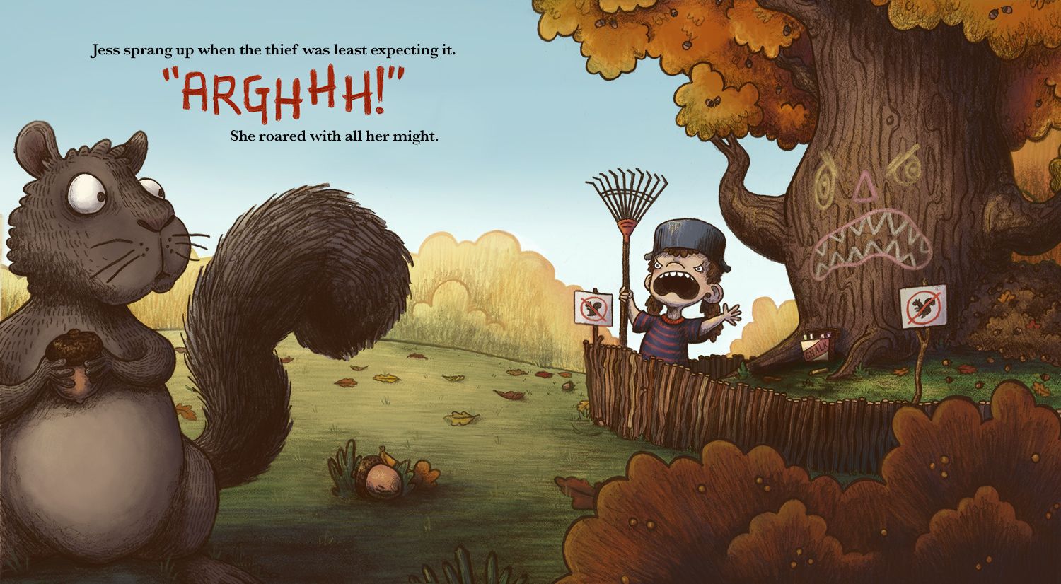
I couldn't leave it alone - I went back in and made the squirrel a bit smaller and mocked in some text so that it can show as a two page spread.
Taylor Woolley
(Formerly Taylor Ackerman / StudioLooong)
Website: www.woolleystories.com
Instagram: https://www.instagram.com/woolleystories/ -
It's gorgeous! I love it.
-
@StudioLooong It is wonderful and funny, I love how you made the "arghhh" really big
-
OH, this turned out lovely!!! Well done!!! Congrats!!
-
@StudioLooong this is a really great piece. I love it.