Serious Critique Request
-
Chip, your piece is great! I love the macabre take on the three little pigs concept, and the cackling wolf/teacher. You do a great job with storytelling and the contrast and lighting makes the focal point stand out. I'm not sure exactly what their criteria are for the contests, but please don't be disheartened. I look at this piece and can't wait until I have gained the skill to create something like this!
Great job on the steam clouds coming from the hot pork products, but I'd love to see how she got them so fresh and steamy-good. It could be funny if she has a mini electric griddle and is cooking them right there or something, making the smell of grilling pig permeate the cafeteria. You could even have some of the background pigs be looking over in horror (but of course, this is your piece and it's great as it is too!).
You could also possibly play with the wolf teacher - I love the laughing, amused versio, but you could also explore a more menacing wolf, getting ideas about the pigs from seeing and smelling that tasty bacon.
Anyway, this piece is fantastic, and I can't wait to see more of your work! Don't give up, and you will be recognized for your work because you've put your time and effort into making it great.
-
@burvantill not hard at all, I am taking it all in. I can't thank this community enough for getting behind me and pushing me. Total support and I love it. I did get away from the white lines on my larger pieces like this one. A few contests back there was a lot of feedback on removing the white line and working on values more. For my quick pieces that take about an hour I add it.
-

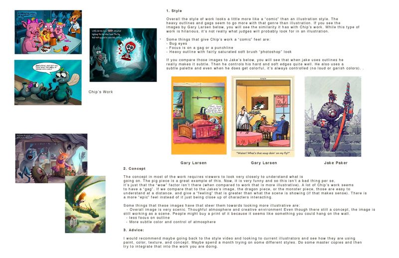
I asked @Chip-Valecek if I could show this and he said yes. It's a quick crit that highlights some of the things we are seeing with his images. I hope this might help both Chip and other people to gain some insight to things we think about when judging images. Note: this is just an opinion and there could be other judges that say the total opposite.
The crux of the problem with Chip's images is they seem to be right in the middle of and illustration and a Sunday "comic" panel. If they leaned more into illustration and less toward the comic side, it may nudge it in the right direction. OR, he could go totally to the comic side of things. But being in the middle is tough because it doesn't fit in either category really well.
Take a look and hopefully this makes sense! We love seeing all the work you guys do and we respect each and every one of your entries! Keep 'em coming! : )
Cheers,
Lee -
@Lee-White this is really good advice, and it helps understand your judging. I do have a question on how Jake Parker use of hard and soft edges, what do you mean by how he uses them?
-
@Heather-Boyd jake really understands lighting quite well and uses that to his advantage. When he is making a form shadow across a form, it's very soft (like it should be). But jake keeps the edges of his shadows hard everywhere else (cast shadows, etc.). Also, the edges of his objects are very controlled with hard objects getting hard edges and things that are in the background getting softer as they recede into space.
-
This post is deleted! -
@Lee-White Very useful info for everyone Thanks for this Lee.
-
@Lee-White thanks for chiming in! You guys created this forum to help artists help artists. It truly has created friendships that we all want each other to succeed. I know I try to offer advice that will help, but i don’t have the credentials to back it up. So again, thanks for leaving your words!
@Chip-Valecek good luck! You have some things to think about. Hang in there and we all can’t wait to see what comes next.
-
Stay tuned... I am taking a step back from contests the rest of the year. I will finish inktober but in the meantime I am going to start over. Taking @Lee-White advice I am doing the dream portfolio assignment, this time with master study's. I then I will move on from there.
I can't thank this community or the instructors enough for all the support! Special thanks to @Lee-White for taking time out of his busy day to put this together for me/us.
-
@Chip-Valecek I hope you'll still post your work here at the forum -- I would love to see the evolution of Chip V.
 Also, I don't think you're starting over. I think you're evolving as an artist and building on to your existing skillset.
 -
@Chip-Valecek steps back can help propel you forward. Keep on learning and have some fun along the way. You will certainly find something solid to grab hold of and make your own. Definitely post a thread as you go.

-
@Chip-Valecek Solid plan. I have done that same step a few times and am even doing it again this spring!
-
@Laurel-Aylesworth I still have a handful of pieces waiting to be posted on instagram and facebook. During that time I will for sure post my journey along the way.
-
I should add in this thread that we will be offering 1 on 1 video critiques VERY soon at svs. They will be affordable and give you guys a chance to check in with an instructor to see how you can improve your work. We will let you know about this as things progress!

-
-
@Chip-Valecek Have great fun with the dream portfolio. I did Lee's assignment during the spring this year, and plan to do it again in the begining of next year. The most difficult part for me was to decide on 20 images to include in the dream portfolio. But once I manage to narrow down, it was very fasinating to do master copy. It really helped me.
-
@Chip-Valecek I am excited to see what comes of that.


I learned A LOT about myself after the style/dream portfolio class. I hope you post your progress.
-
@Chip-Valecek hi Chip. I just though of this but perhaps your slogan in the background should be “You are what you eat”. Lol
-
@Lee-White That’s amazing news Lee
-
This has resulted in being one of the most interesting and helpful posts for us all @Chip-Valecek
I can’t wait to see your next steps.
