Request for critique (first time posting)
-
@theprairiefox , Thank you. Yes, at first I had it right on the gutter and then I moved the girl and the giraffe the right a little so they would be outside the gutter. I guess I have to rethink the view. I was envisioning the girl and her giraffe coming out of their room and peeking around the wall into the hallway and it seemed like a cave to them. Thanks for the comment, now I realize it may be a little confusing.
@NessIllustration , You are correct, I have to remove those words because it is redundant. This is just a draft so I will delete those words as they are not necessary. May be I will take the entire wall part and just show them coming out of their room into a cave.
Thank you both.
-
@TessaW , Thank you. Based on all the thoughtful feedback, I am going to rework the spread. Since I am new at this I am learning as I go. I won't query this MS until I get a decent spread.
-
@RG-Spaulding thanks for posting. I hope we helped this spread along and didn't scare you off. It is fine to post "works in progress" no matter how far along they are.
One thing you could do next time if you were looking for a different kind of feedback is to ask specifically about what you are struggling with. For example, if you knew the gutter was an issue but weren't addressing it yet and were more worried about the colors or perspective. Then you could just say, I know the gutter is an issue but I want your thoughts on my perspective. Or is it giving you this kind of feeling?
Because you posted without disclaimer you may not get the feedback you are looking for right now.
I have this same problem with my work (especially my writing). I will be working on fixing a specific problem, but others will see something else completely.
Good luck, can't wait to see the next evolution of this spread.
-
@theprairiefox , Thankyou. I will ask better questions. Do you feel like the color choices work? I am not very knowledgeable about how to pick color palettes that work well. I feel like kid in a candy store with the color wheel and forget later what colors and brushes I used.
How do you pick colors that will print well on a printer when art is done? Is there any tricks and tips?
I welcome all critiques though since i am a beginner and it was good to know that the wall corner was confusing. Thanks
-
@RG-Spaulding using my model of color choosing probably shouldn't be duplicated... it is crazy.
My work is using printmaking techniques so I am working with a limited number of colors to start with (each new color equates to a new plate). I also like very subdued or muted colors, earthy and textured. So that factors in for me. (Read, I take my colors and add brown to them.) If you want to see my color choices, look at my Instagram feed.
One thing that helped me settle on the colors I mostly play with was doing the Dream Portfolio exercise of finding 20 images I would love to have in my portfolio. Then analyze them to find the similarities and differences. One of the biggest similarities I found was a muted color palette and there I was...
Just so you know, I wasn't commenting on your colors in any way, I was just using that as an example of a type of feedback a lot of folks ask for. I just want you to get what you need from the forum.
-The Prairie Fox
https://www.instagram.com/theprairiefox
https://www.theprairiefox.com -
@RG-Spaulding you should really post your image here in the forum rather than just using a link. It makes it a bit easier and quicker for us to see your work.

Portfolio: nyrrylcadiz.com
Instagram: https://www.instagram.com/nyrryl_cadiz/
YouTube: https://www.youtube.com/channel/UCbJCF1Im8ZO7hpGWTKOJMuA -
@theprairiefox , Thank you. I will check out your IG. I have to start using IG as most artists are on it. Good to know about your process.
-
@Nyrryl-Cadiz , I tried several times reducing my size to under the limit and then I got an error again saying that the dimensions were too big. I did my spread on a 8.5x11 but on layout and the spread is twice the size and with extra margin for bleed it became 23"x 9.5" and that was probably too big to post. If there is another way to post it, please let me know and I will. Thanks.
-
You need to reduce the size of your image even more. 1000 pixels for landscape layout is good for the forums. I have to reduce all of my images before posting here. If you are using photoshop, the Export As feature makes this quick and simple.
Website: www.tessawrathall.com
Instagram: www.instagram.com/tessawrathall_art/
-
@TessaW
Thank you. I am redoing my image. I will try to reduce it to post it here. -
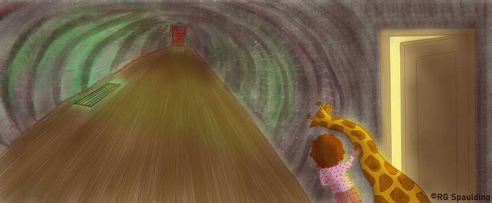
Here is the updated one. Do you think the colors work and would show up well on paper? How can I improve this spread? Thank you.
-
@RG-Spaulding hi! I’ve experience that trouble too. What’s you image dpi? I always use 300 dpi on mine and I’ve fond that when my canvas dimensions exceed 10 inches, my images becomes too big to post here. So probably aim to keep your dimensions smaller than 10. Better yet try to have a smaller image altogether. I hope this was helpful.
Portfolio: nyrrylcadiz.com
Instagram: https://www.instagram.com/nyrryl_cadiz/
YouTube: https://www.youtube.com/channel/UCbJCF1Im8ZO7hpGWTKOJMuA -
@Nyrryl-Cadiz , It helped thank you. I was able to post my revised art above.
-
@RG-Spaulding definitely getting better! The door they are peeking out of is much more readable. I think the text would fit on the floor pretty well too.
A few things to consider.
-
The bathroom door is still very near the gutter. If you moved it left into the 1/3s hotspot (1/3 in and 1/3 down on the left page) you might get more bang for your buck.
-
The perspective on your door is now off. The door frame should probably use the same vanishing point as the floor and tunnel.
-
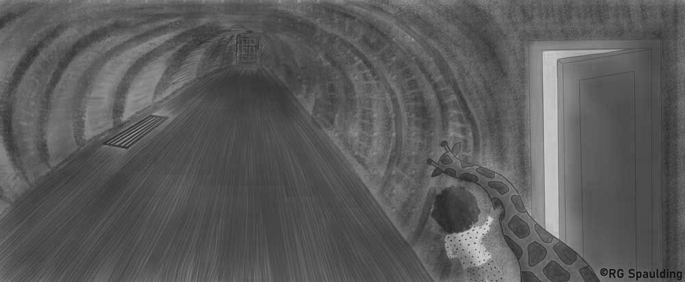
You may want to look at your values. Your light and dark areas don't vary much. See below. In greyscale, you cannot even see the bathroom door.
Good luck, it is coming along.
-
-
Thank you @theprairiefox for the valuable comments. I will work on it more. I need to learn more about working in grey scale. Learning much! Thanks.
-
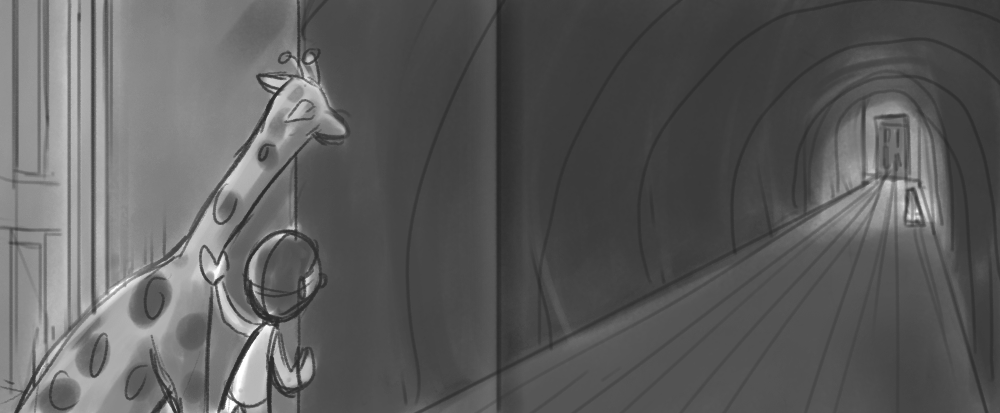
I have a couple of suggestions. Please take them with a grain of salt as I'm just offering up some brainstorming ideas. I've done a very rough composition to help me illustrate my points. I've indicated where the gutter would be so we can take that into consideration.
- Perspective- I Love your overall perspective. It's dramatic and helps drive home your mood. I think it could be tweaked slightly so we read it from left to right, the door doesn't get stuck in the gutter, and the characters are larger, so we see the hallway more from their point of view.
- Values- I think you could utilize the vent light to make the red doorway stand out so it doesn't get lost. I also think you could possibly simplify the contrast of most of the values, keeping most of the contrast to the area of the girl/giraffe and the red door at the end of the hall- the rest can be less contrasted so we keep the focal points. Once you get your values sorted out, you could have a lot of different color schemes and they would still work pretty well.
- Rendering- I haven't demonstrated this in my rough composition, but for your final, I'd consider making your rendering consistent. For example, your girl currently doesn't have line-work, but the door and the giraffe does. Keeping the rendering consistent will make the piece more unified.
Anyway, those are my thoughts. Thanks again for posting.
-
Wow @TessaW , Thank you for showing a different perspective. I will take your valuable input and see how else I can tweak it. Moving the vent closer to the bathroom door would allow me to light up the door better. You guys are so awesome. Thank you.