My style discovery
-
Your pieces are lovely. It feels like your work is somewhere between the two dream portfolios. Are you going to pick one of them to head towards?
-
Thank you @neschof! I have the feeling there's way too much (different) style there! :smiling_face_with_open_mouth_cold_sweat: I thought to proceed with both. One (below) for fast little projects (editorial, instructional, informational ...). The other for longterm projects like children's books, book covers, or I don't know yet ... bord games whatever.
Havn't explored the market sufficiently yet. If anyone has a hint, where my stuff would fit, pleeease let me know! -
@Meta ok then here are some of my thoughts:
The 1st portfolio tends to capture moments in time, like stills from a film. I think your portfolio also does this, more so with the recent Inktober pieces because they are full scenes with backgrounds. Your recent pieces are also closer in style to the first portfolio - painterly, generally dark with highlights at the focus.
Your earlier work is closer in style to the 2nd portfolio - lighter, more linework, minimal backgrounds. But the content is still a snapshot of a scene. The content of your 2nd dream portfolio has more stylised elements, creating complete little self contained stories within a single image.
-
All three sets are amazing. There are some really stunning pieces in the 1st one. I love your inktober pieces. You have a great style right there, huge fan already.
-
@Chip-Valecek Thank you so much, Chip! This lifts me up
 I can still not do all I'd need to be doing though!
 ") Mainly technically.
Mainly technically.This forum is too fast for me! I tried to follow some of you guys, but don't find time to answer

So I proceed by posting my first master copy for now. I took a piece from spanish illustrator Núria Tamarit. I spent way too long on that. For me as a perfectionist it is hard to stop! I bet N´ria was much faster with it! In the end I didn't like all about it and firgured out that what I really liked was mainly movement and spontaneity, composition and color.
The original is the one with the signature.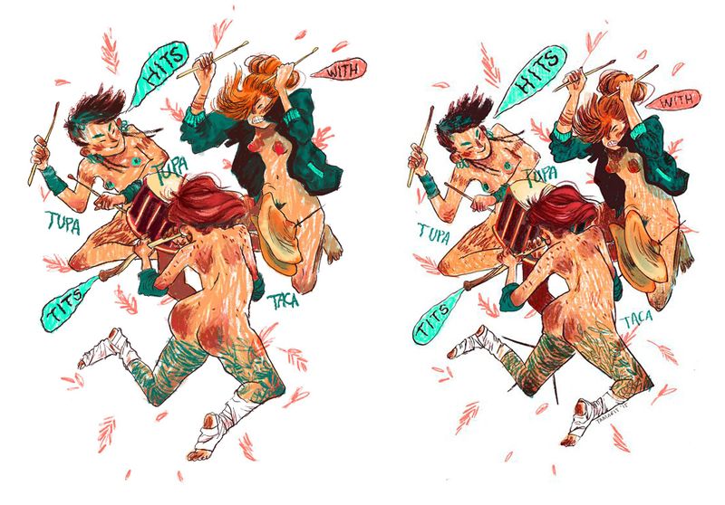
It is not a technique I would simply take as it is and transfer to my work. For my next master copies, I think I will focus on the main element that make me kike the image when copying. Maybe I even just take a part of the picture.
-
@Meta This is great! A very close copy. I guessed the one on the right was probably the original before reading your comment but I'm not sure exactly why. Maybe just the slightly more controlled line work - it seems to vary more deliberately between straight lines and wobbly whiles yours is generally freer.
I am trying to find some time this weekend to do my first master copy. In deciding which to do I realised that some I'd be excited to copy and others I would dread - I wonder if this means they should not really be in my dream portfolio...
and I know what you mean about trying to keep up with the forum - it quickly gets away from me! -
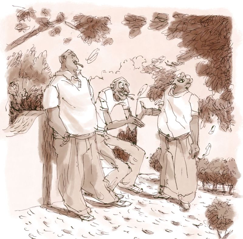
Just did another mastercopy. Speed copy, I would say. I think Cyril Pedrosa also didn't take much longer on his after having the concept finished
I am seeing that I could have darkened some areas more, and that I have squeezed it a bit too much in the bottom. And my ballpoint pen is spotty. Have to get another one. I found out he was using that pen after seing a self portrait in which he's holding such pen. I love them and used to draw with them a lot some years ago. I will try this simple technique for my Slowvember. Still gonna study some other work by Pedrosa. Original, obviously, with the French.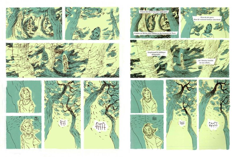
Sorry ... I wish I could keep this up better and answer more to your posts ... How do you all fit so much forum writing in your days?
-
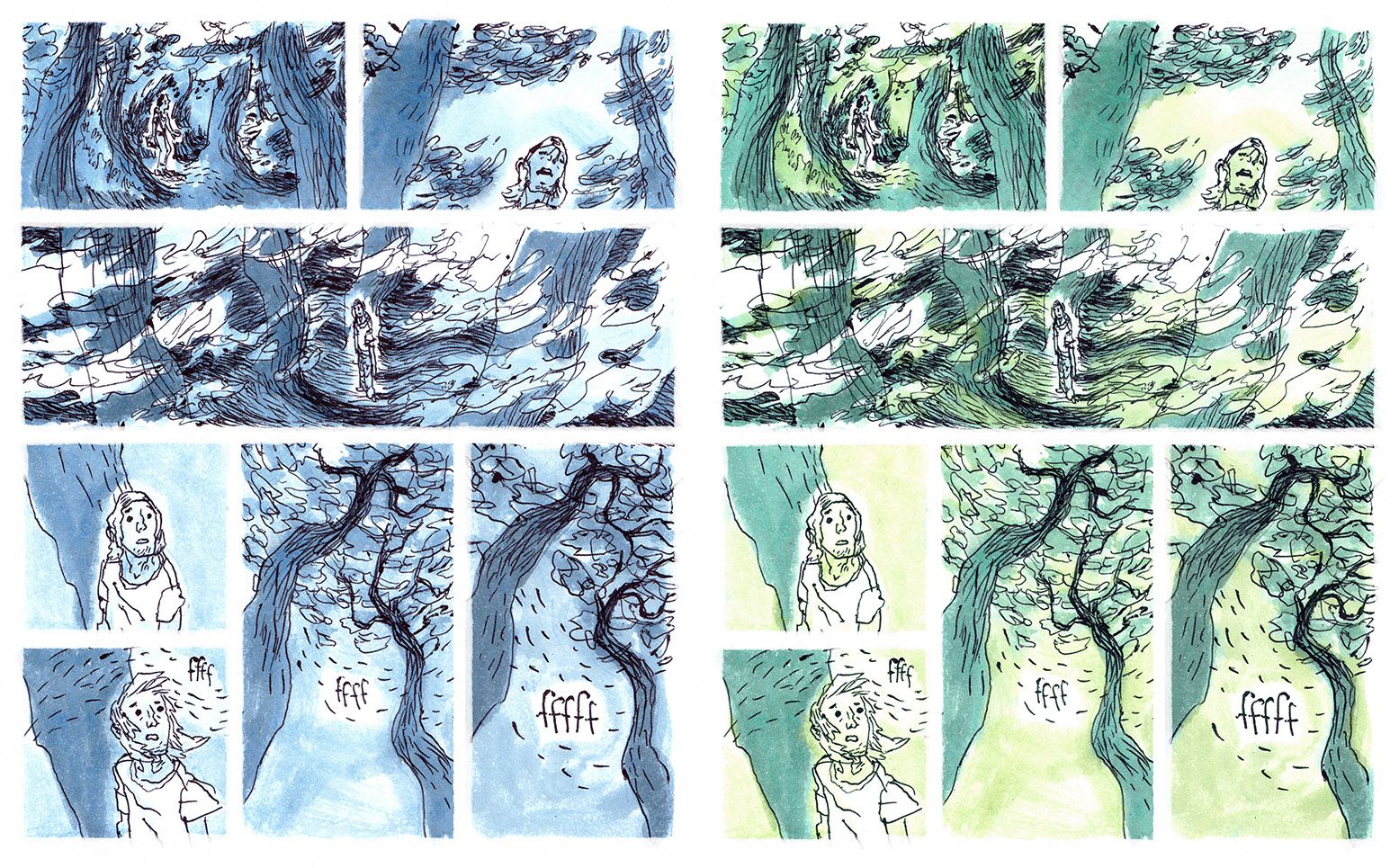
Back to inks! I took my drawing of Pedros copy and inked it. Strange paper for inking though. It soaks up all the ink. But the effect I gained was even similar to the ink Pedrosa used. For the left one, I gave similar colors to the inks as in the original in Photoshop.
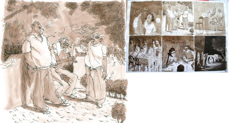
And another copy from Cyril Pedrosa, same book (graphic novel "Portugal"). I took one panel and inked it, changed the hue in Photoshop an am quite content with the result. I think I'm going to try it with some of my sketches for Slowvember now, which should resemble some old black and white photograph.
-
Just another one ... using the scan of the lineart I made before inking. Putting monochromatic values in photoshop. Which do you think is better?
-
@Meta I’ve slowed down in forum writing. Your doing a wonderful job at these master copies!