Slowvember, slow start.
-
@xin-li #1 is my favorite--it's going to be beautiful

-
@xin-li this is gorgeous! I like the first color study. It’s so magical.
-
@xin-li I love this! I also really love the first colour study, it will look amazing!
-
@anya-macleod @BichonBistro @Pamela-Fraley thank you for weighing in your thoughts. I hope I will be able to get similar color with water color. I don't have much experence, but very excited to get time to paint.
-
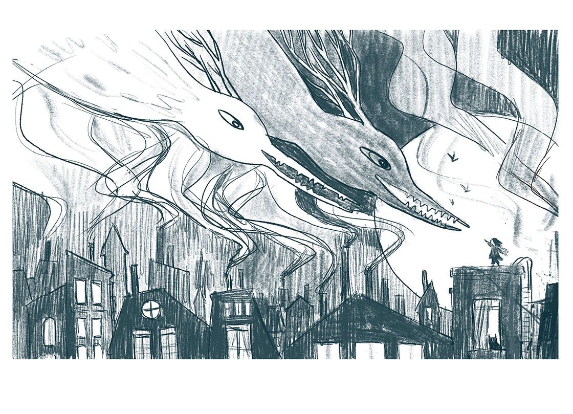
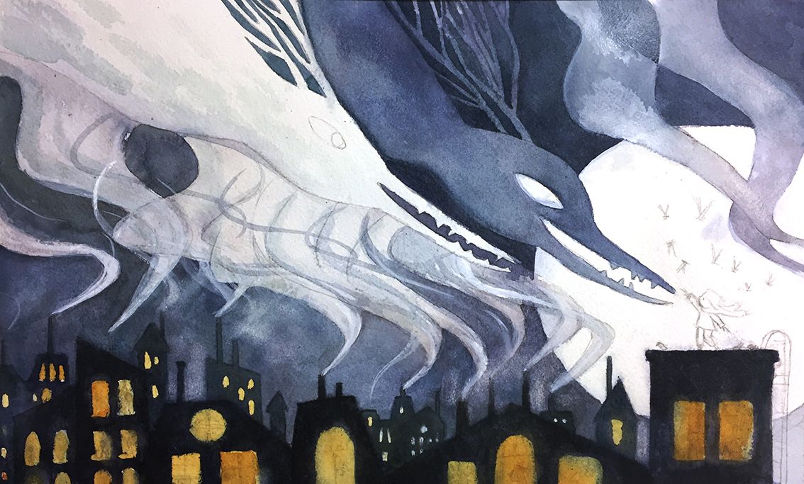
My progress of slowvember piece is very very slow due to have to stay at home with my sick child for a couple of days. I managed to redraw the sketch for this piece while she napped. I am almost ready to paint. Any critiques before I move further with the painting? I flipped the sketch, because I kind of imagining this could be a spread in a book. I also wanted to have a clearer silhouette for the girl. I hope the new sketch has achieved that.
I do not know if I am able to make it to the deadline, but I figured it is a good place to start painting with watercolor.
-
@xin-li I really love your concept and style in this piece (as usual), but I think the read is not quite as clear as before and because of that I don't see the girl right away. Some of it, no doubt, is that you're still at the sketch stage for this new composition. But part of it may be that in the first versions, the taller building highlighted her as the focal point. In theory, I totally get why putting her against the moon would provide a clearer silhouette. But the building itself could still do some of the work of directing our focus: Maybe her building should still be taller, have a spire, or some such thing? She's about the same size as some of the other spires and chimneys. Just thinking aloud...
Can't wait to see how this turns out! And great that you can do this and take care of your child/children too
 . It takes a lot of determination!
 -
@LauraA Thank you so much for the critic. I see what you mean. I will try to make the building she stands on a bit higher, and maybe work on the silhouette of her a bit more.
-
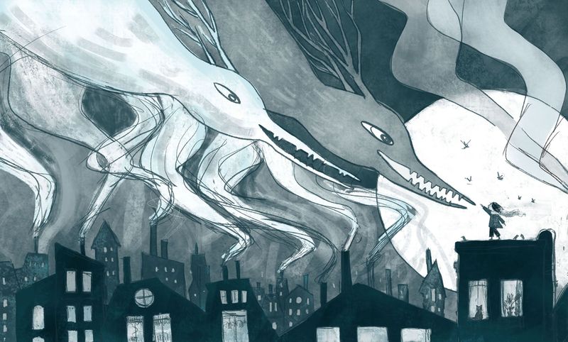
@xin-li Nice! The silhouette of the girl is certainly clearer now. As to the flippiness of the image, I could take it either way. Depends on whether your audience to go 'oh a girl - what's she pointing at? - oh neat majestic smoke creatures' or 'neat majestic smoke creatures - what are they looking at? - oh a little girl'.
WHether you finish it for slowvember or not this is gonna be beautiful!
-
@xin-li I hope you get to finish and enter. The new composition is wonderful.
-
Did some adjustments on composition. Thanks to @LauraA 's critique. I think I am getting really close to start painting :-).
@Braden-Hallett It is really interesting about what you said about flipping the image. As you said, it changes the perspective of the story a bit, very sable. It gets me to think.
@JoannaH thank you for the encouragement.
-
@xin-li Yesss!!!! Really clear now. You've got it!
-
@LauraA thank you, Laura
")
-
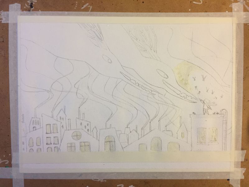
Ready to paint tomorrow.
-
@xin-li it's going to be BEAUTIFUL!
-
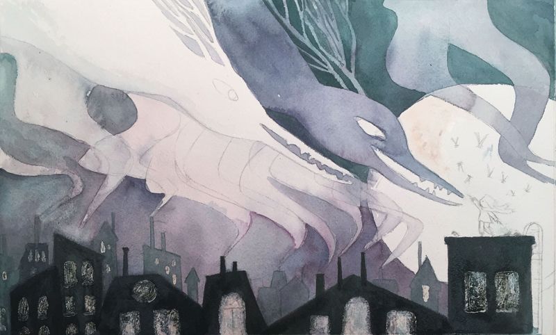
WIP: I have no clue how much color I need to mix to cover an area. So I always mixed too little. Right now, the color is all over the place, due to I keep mixing color when it is run out, and every time I mix it ends up slightly different.
Am I frustrated? yes. Is this fun? also yes.
Is there a way to harmonize the color at this stage? would glaze on top work?
-
@xin-li I like the variations! It is fun to watch what happens with watercolor
You may already be doing this, but sometimes it helps to mix your colors (more than you think you need) in clear glass jars at the deepest shade, then use your palette (or smaller containers) to lighten the values of that mix.
If you really want to unify an area, a transparent glaze of one hue (I would not mix for glazing) can work, but I would not glaze over the darks at the bottom. You could glaze one area in a cool transparent hue, the focal point in a warm version of that hue, for example. But I would test the glazing on scraps first to see if it's an effect you like.
Glad you are having fun!
-
Progress so far. The color is way off compared to the color study. I might try to a glaze of green tone tomorrow to bring the color closer to the color study.
@BichonBistro thank you for the watercolor tip.
-
@xin-li You said: "Am I frustrated? yes. Is this fun? also yes." Love it! This sums up why we make art!
Also, I like your warm windows. And I think the purplish-blue has enough harmony.
Do you do watercolors frequently? I thought maybe you did digital more, but I'm not sure.
-
@xin-li I think this is working well! Blue is complementary color of orange and purple complementary of yellow, so unless this goes against your vision for the piece, I wouldn’t worry about matching to your original color study.
-
@LauraA I normally work digitally. But I learned a lot of working with wet media during this year's inktober. Color is tricky for me with watercolor. It helped a lot by followed SVS watercolor courses by Vesper Stamper and Lee. @BichonBistro also gave me lots of useful watercolor tips.