Society of Visual Storytelling

    SVSLearn Forums

    • Register
    • Login
    • Search
    • Recent
    • Tags
    • Popular
    • Users
    • Groups
    • Search

    Dec WIP

    Artwork
    7
    24
    1275
    Loading More Posts
    • Oldest to Newest
    • Newest to Oldest
    • Most Votes
    Reply
    • Reply as topic
    Log in to reply
    This topic has been deleted. Only users with topic management privileges can see it.
    • braden H
      braden H @jdubz last edited by

      @jdubz I think full ghost mode works much better 🙂 You could even make her a tad more transparent and give her a glowy halo to really sell it

      carlianne 1 Reply Last reply Reply Quote 0
      • carlianne
        carlianne @braden H last edited by

        Oh yeah! I totally agree with Branden. Full ghost mode totally reads, more glow/transparency could be fun - but your call.

        Check out my art and tutorials :)

        Instagram: www.instagram.com/carliannecreates/

        Youtube:
        https://youtube.com/c/CarlianneCreates

        Shop: www.carliannecreates.com

        1 Reply Last reply Reply Quote 0
        • CosmoglotJay
          CosmoglotJay last edited by

          "full ghost mode" for the win.

          Jay Douglas Rumisek

          www.instagram.com/CosmoglotJay
          www.CosmoglotCreative.com

          1 Reply Last reply Reply Quote 0
          • Coley
            Coley last edited by

            Full ghost mode yes! Other option is to lighten her layer ( if she's on a separate layer) and have some background showing through? Really sweet! I love your style!

            https://www.instagram.com/nicoleledrewmay/

            1 Reply Last reply Reply Quote 0
            • Zachary Drenski
              Zachary Drenski last edited by

              @jdubz I saw you said you were coloring over the value layer. Some people seem to be good at that but it's not my preference.

              Here's how I like to keep my values in check while coloring

              1. Create a new layer on top of all other layers.
              2. Fill that layer completely with white.
              3. Change that layer's blend mode to 'color'
                You can turn that layer on and off to see your painting in grayscale. I don't know if you already know that hack but learning that made my life so much better so I thought I'd throw it out there.

              Awesome painting by the way! I love the concept.

              J 1 Reply Last reply Reply Quote 0
              • J
                jdubz last edited by

                Thanks all - really sounds like that's the way to go. Really appreciate the feedback.

                Josh White
                https://www.instagram.com/joshwhiteillustration/

                1 Reply Last reply Reply Quote 0
                • J
                  jdubz @Zachary Drenski last edited by

                  @Zachary-Drenski Ahhh interesting I see what you mean. What I ended up doing is create a hue/saturation adjustment layer at the top and set it to grayscale and then I just turn it off and on. It sounds like it's doing the exact same thing.

                  I think I'm going to try some more of painting on the grayscale. It seems like the final result has a specific look I'd like to try and master, but it's really counterintuitive to how I want to work hah.

                  Josh White
                  https://www.instagram.com/joshwhiteillustration/

                  1 Reply Last reply Reply Quote 0
                  • J
                    jdubz last edited by

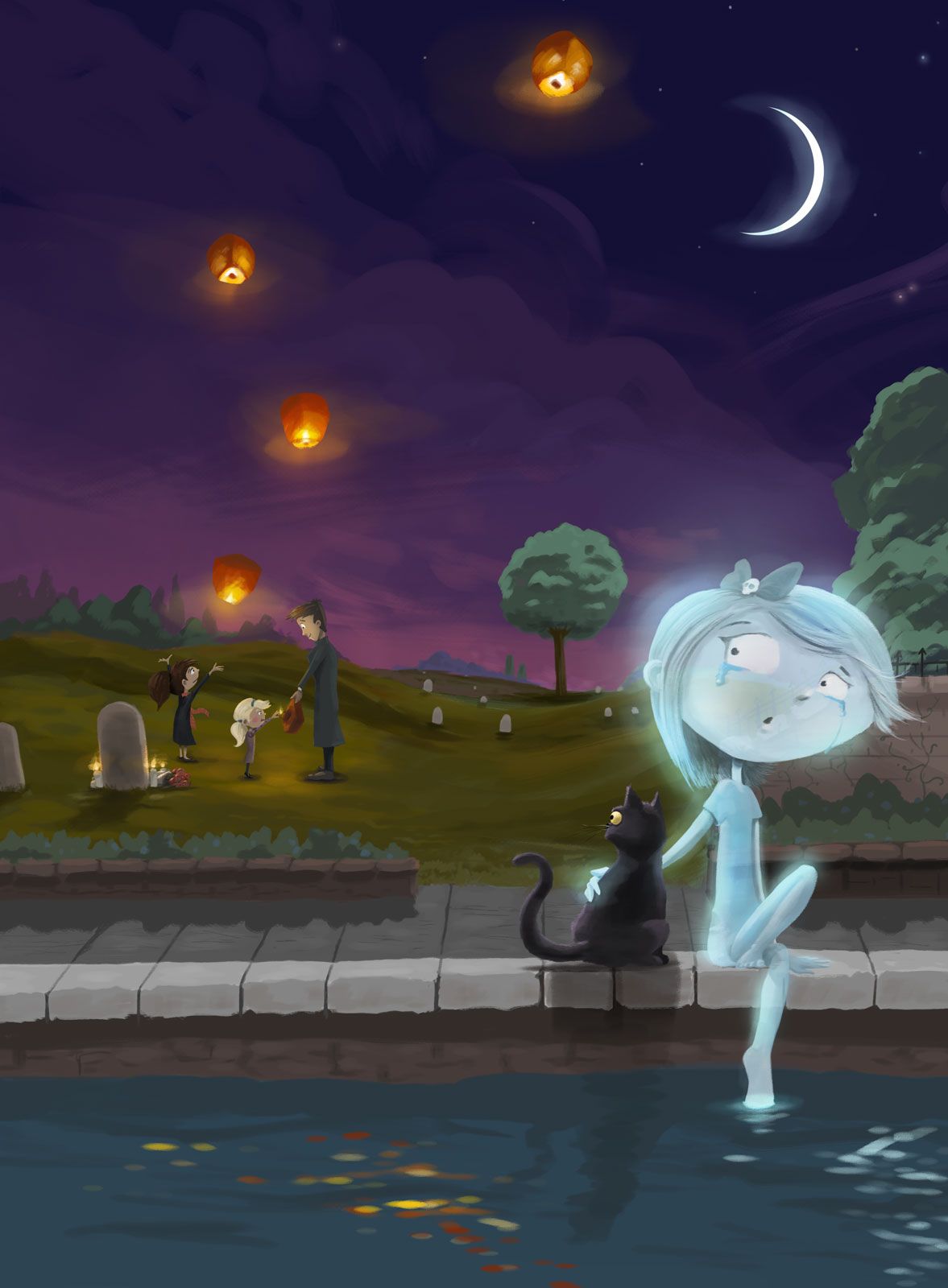
                    Cleaned up the cat and the girl and then added several more layers of glows to her, and then made her transparent in the middle to point @carlianne made which was it should be transparent in the middle. I think that worked a lot better!
                    ghost-final1.jpg

                    Josh White
                    https://www.instagram.com/joshwhiteillustration/

                    carlianne 1 Reply Last reply Reply Quote 1
                    • carlianne
                      carlianne @jdubz last edited by

                      @jdubz this reads clearly to me now! Great job!

                      Check out my art and tutorials :)

                      Instagram: www.instagram.com/carliannecreates/

                      Youtube:
                      https://youtube.com/c/CarlianneCreates

                      Shop: www.carliannecreates.com

                      1 Reply Last reply Reply Quote 0
                      • J
                        jdubz last edited by

                        Hey everyone, can I ask a favor?

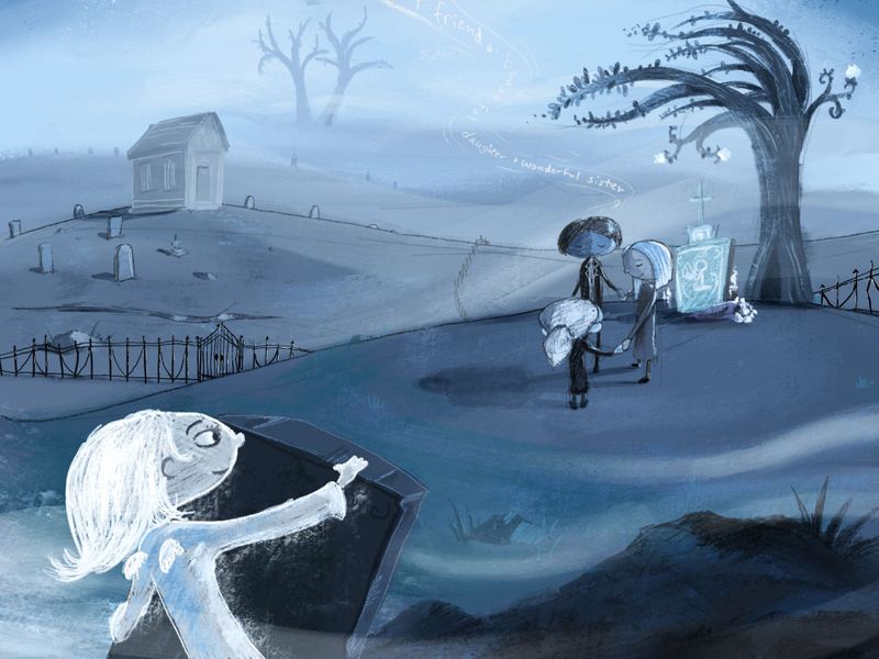
                        In the last few months I've been working on my iPad in a way that's just totally different than my desktop tablet. The drawing tools just end up being more rough and stylized versus more painterly which I've been doing the kind of work above. So instead of trying to make them match, I've tried to embrace the difference and just make that totally different style of art.

                        Over Christmas break I had been doing a lot of different pieces and one of them I thought I might do this same prompt with the same subject matter/characters but see what the results would be. What I'm trying to do is get better at communicating the scene and what's going on.

                        So I was hoping to get some feedback on how I'm communicating the subject matter. Does this more clearly communicate what's going on? Or did the first one do a better job of that?
                        graveyard3.jpg

                        Josh White
                        https://www.instagram.com/joshwhiteillustration/

                        1 Reply Last reply Reply Quote 1
                        • First post
                          Last post