Society of Visual Storytelling

    SVSLearn Forums

    • Register
    • Login
    • Search
    • Recent
    • Tags
    • Popular
    • Users
    • Groups
    • Search

    SCBWI Snow Day WIP - Critiques Welcome

    Artwork
    5
    22
    1275
    Loading More Posts
    • Oldest to Newest
    • Newest to Oldest
    • Most Votes
    Reply
    • Reply as topic
    Log in to reply
    This topic has been deleted. Only users with topic management privileges can see it.
    • theprairiefox
      theprairiefox last edited by

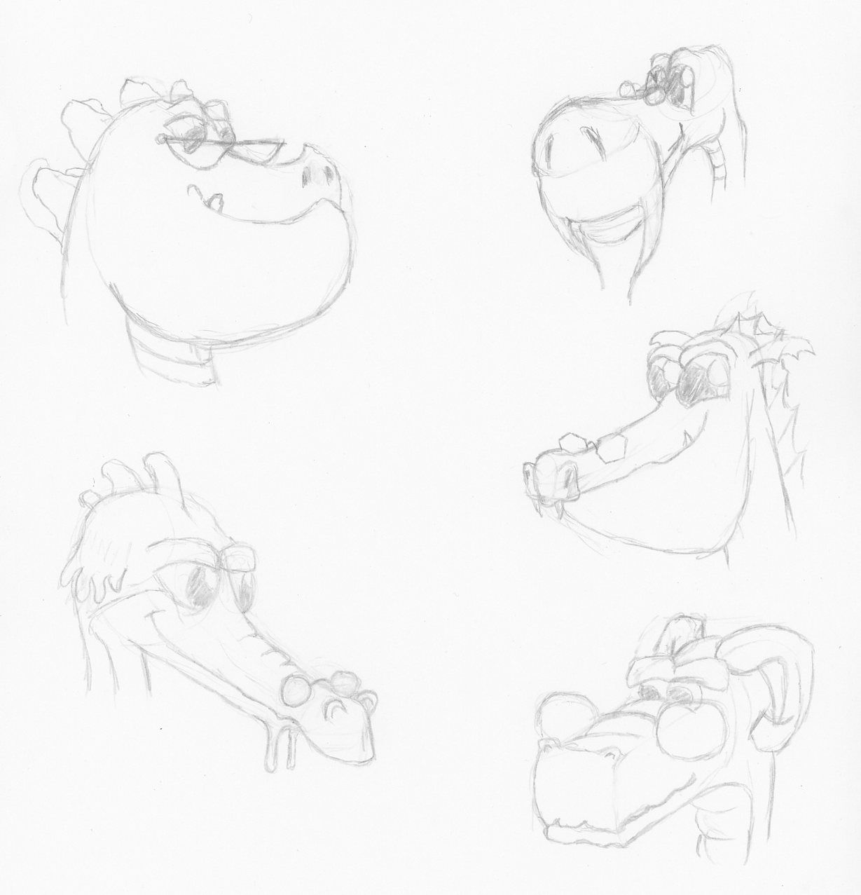
      Here are some character sketches for the dragon.

      SnowDay_Dragon_001.jpg

      -The Prairie Fox
      https://www.instagram.com/theprairiefox
      https://www.theprairiefox.com

      1 Reply Last reply Reply Quote 2
      • Coley
        Coley last edited by

        I love the dragon heads! So well done. I am having trouble picking a thumb I like best. Seems like they all could work. I like the roundness in them , gives that soft cozy feeling. Bottom left the most roundish , I like top left for unexpected viewpoint. I like the other two as well, sorry lol!

        https://www.instagram.com/nicoleledrewmay/

        theprairiefox 1 Reply Last reply Reply Quote 1
        • theprairiefox
          theprairiefox @Coley last edited by

          @Coley thanks for the feedback.

          The dragons were a lot of fun. It is always interesting to push proportions on creatures and see what happens!

          -The Prairie Fox
          https://www.instagram.com/theprairiefox
          https://www.theprairiefox.com

          Coley 1 Reply Last reply Reply Quote 0
          • Coley
            Coley @theprairiefox last edited by

            @theprairiefox dragons are definitely fun to draw!

            https://www.instagram.com/nicoleledrewmay/

            1 Reply Last reply Reply Quote 0
            • Heather Boyd
              Heather Boyd last edited by Heather Boyd

              I like #15 but possibly with a larger window could speak to the cold far more. Even a skylight attached to the window then you could maybe have the snow flakes shadow on top of them (dragons below) if you understand what I’m trying to say. And with the cozy size of the large dragon. That and with that size I prefer the dragon head to the top right, like a wise grandfather.

              πŸ™‚

              Instagram: www.instagram.com/heatherboyd.illustration/
              Website: https://heatherboydillustration.ca
              Shop: https://www.inprnt.com/search/products?q=HeatherBoydIllustration
              Ko-Fi: https://ko-fi.com/heatherboydillustration

              Be blessed,

              theprairiefox S 2 Replies Last reply Reply Quote 1
              • theprairiefox
                theprairiefox @Heather Boyd last edited by

                @Heather-Boyd yeah that dragon could be fun with 15. His whiskers could squiggle out on the floor!

                Thanks for the input.

                -The Prairie Fox
                https://www.instagram.com/theprairiefox
                https://www.theprairiefox.com

                1 Reply Last reply Reply Quote 1
                • S
                  Sara Vecchi @Heather Boyd last edited by

                  @Heather-Boyd said in SCBWI Snow Day WIP - Critiques Welcome:

                  I like #15 but possibly with a larger window could speak to the cold far more.

                  This was going to be my exact comment! I imagine being curled up in the middle of a curled dragon would be a very snug spot indeed. You could enlarge the window behind them but still have it feel cozy with the dragons body effectively shielding the child from the cold scene behind. I like the very physical surrounding, mimicking the total other world you can enter into when you read on a day when you have no other obligations. 😊

                  Twitter and instagram: @saravecchiart
                  www.saravecchiart.com

                  theprairiefox 1 Reply Last reply Reply Quote 2
                  • theprairiefox
                    theprairiefox @Sara Vecchi last edited by

                    @Sara-Vecchi thanks for all the input. My wife liked 15 most too, so I think that is the one. I will move forward with that.

                    I will test a few different sized and shaped windows. I am thinking something like the window from 18 might give more contrast as well.

                    -The Prairie Fox
                    https://www.instagram.com/theprairiefox
                    https://www.theprairiefox.com

                    1 Reply Last reply Reply Quote 0
                    • theprairiefox
                      theprairiefox last edited by

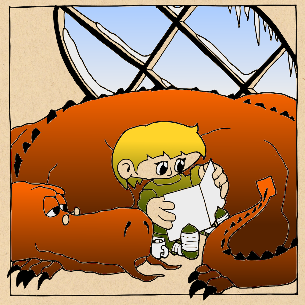
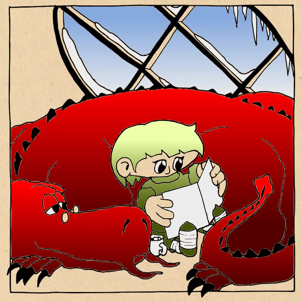
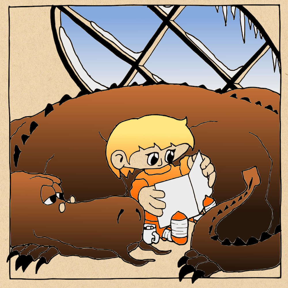
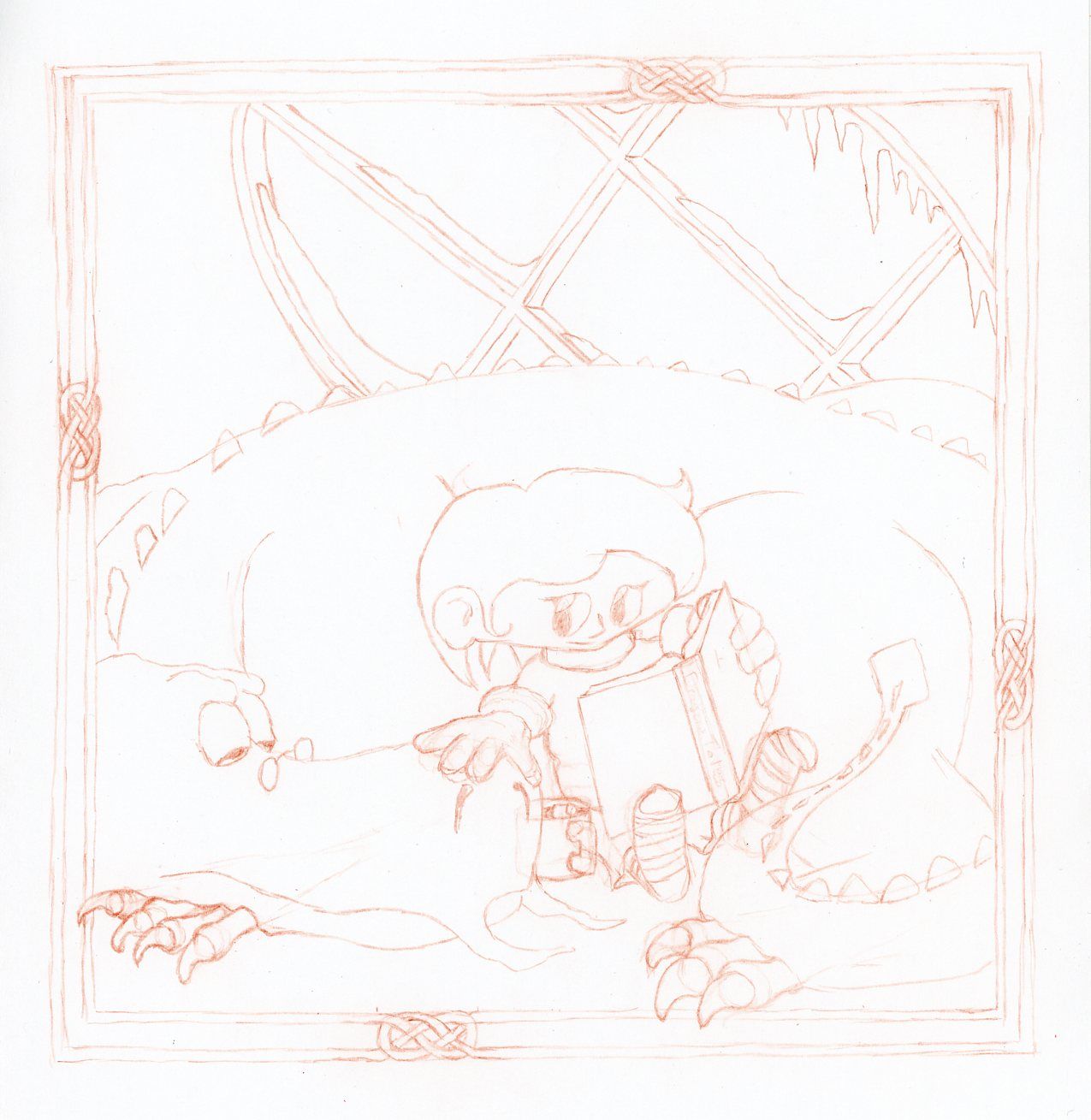
                      I have gotten the sketch (5x5) complete and have done a few color studies.

                      I am planning on doing a woodcut with multiple plates and rainbow rolls (similar to a gradient). Before that happens I will be rendering it one more time at full size (8x8).

                      Here are the color studies on the sketch.

                      Let me know which you like best and anything you see in the sketch that is amiss (I know the book is a little off and it will be corrected).

                      SnowDay_ColorStudy_001 copy.png SnowDay_ColorStudy_002 copy.png SnowDay_ColorStudy_003 copy.png

                      -The Prairie Fox
                      https://www.instagram.com/theprairiefox
                      https://www.theprairiefox.com

                      Heather Boyd 1 Reply Last reply Reply Quote 1
                      • Heather Boyd
                        Heather Boyd @theprairiefox last edited by

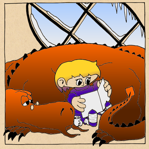
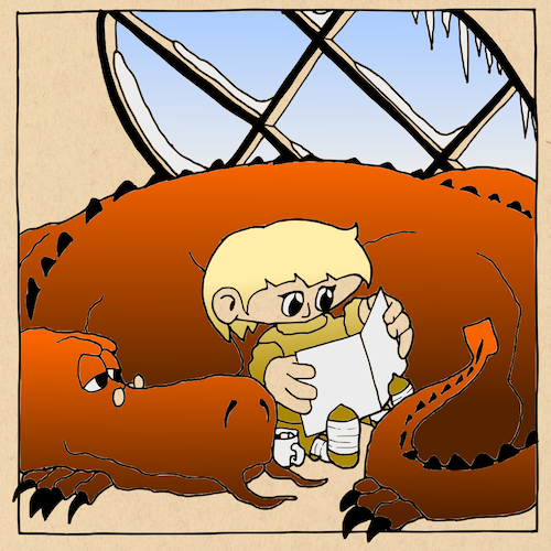
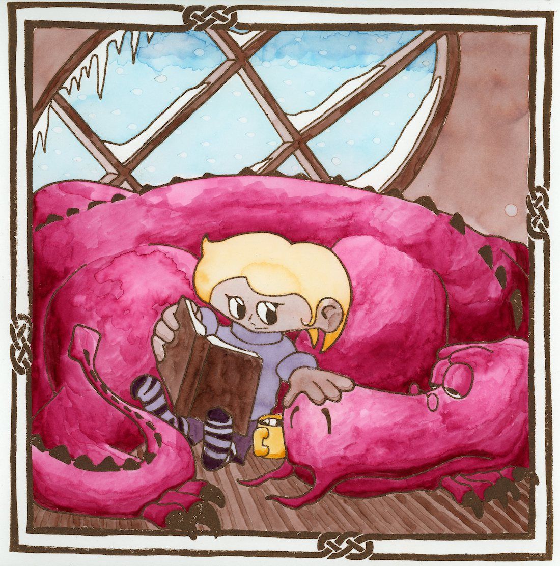
                        @theprairiefox I really like the first one with the orange dragon -he really warms the room. Not sure about the clothing colour of the boy though. Everything else I like -the slanted window good way to solve that element.

                        Instagram: www.instagram.com/heatherboyd.illustration/
                        Website: https://heatherboydillustration.ca
                        Shop: https://www.inprnt.com/search/products?q=HeatherBoydIllustration
                        Ko-Fi: https://ko-fi.com/heatherboydillustration

                        Be blessed,

                        theprairiefox 1 Reply Last reply Reply Quote 0
                        • theprairiefox
                          theprairiefox @Heather Boyd last edited by

                          @Heather-Boyd here are a couple of changes with the orange dragon. Orange was my favorite too, but I have been unsure about the clothing for the kid as well.

                          SnowDay_ColorStudy_001 copy.png SnowDay_ColorStudy_011.png SnowDay_ColorStudy_012.png SnowDay_ColorStudy_013.png

                          -The Prairie Fox
                          https://www.instagram.com/theprairiefox
                          https://www.theprairiefox.com

                          Heather Boyd 1 Reply Last reply Reply Quote 0
                          • Heather Boyd
                            Heather Boyd @theprairiefox last edited by

                            @theprairiefox I like the last two. If you played with the warmth of the purple, right now I feel it's on the cool side. Like a more purple burgundy maybe. The yellow hair in that one is warmer than in the last one but still like the paler but maybe the yellow clothes could be a warmer yellow (with that combo I feel it's more on the cool side).

                            The cool/cold is the wall and window/outside portion, so I don't want the cold to bleed into the foreground anymore than the boys pale skin. Also feel cold maybe because the book is white.

                            Keep it up. πŸ™‚

                            Instagram: www.instagram.com/heatherboyd.illustration/
                            Website: https://heatherboydillustration.ca
                            Shop: https://www.inprnt.com/search/products?q=HeatherBoydIllustration
                            Ko-Fi: https://ko-fi.com/heatherboydillustration

                            Be blessed,

                            1 Reply Last reply Reply Quote 1
                            • Griffin McPherson
                              Griffin McPherson last edited by

                              I would slick 15 because the composition is feeling strongest for that one. However I think you should try to stagger the composition a bit. Right now it’s all very centered, shifting things around to create a flow for the viewers eye will make it much more balanced and relaxed which is especially important for a scene that should feel comfortable like this one. As for the dragon sketches I really both of the ones on the left.

                              theprairiefox 1 Reply Last reply Reply Quote 0
                              • theprairiefox
                                theprairiefox @Griffin McPherson last edited by

                                @Griff thanks for the advice.

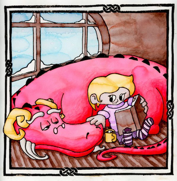
                                I was thinking I was not moving the viewer around the composition very well either. As I did my final sketch, I changed the dynamic by moving the eyes of the characters.

                                I think it is working better to move the viewer around. The girl looking at the dragon and the dragon facing back at the book which brings you back to the girl. Let me know your thoughts.

                                With the dragon falling asleep it adds more story to the image as well. It feels to me that the girl is reading a story and her dragon is falling asleep because of it.

                                SnowDay_FullSketch_001.jpg

                                -The Prairie Fox
                                https://www.instagram.com/theprairiefox
                                https://www.theprairiefox.com

                                1 Reply Last reply Reply Quote 1
                                • theprairiefox
                                  theprairiefox last edited by

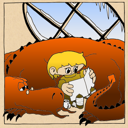
                                  @Heather-Boyd , @Griff , @Sara-Vecchi , @Coley Thank you all for the input. I decided to take the plunge and attempt the watercolor over a woodcut print I have been pondering!

                                  Not perfect, but done! And I learned a lot in the process about my watercoloring!

                                  SnowDay_FinalScan_001 copy.jpg

                                  -The Prairie Fox
                                  https://www.instagram.com/theprairiefox
                                  https://www.theprairiefox.com

                                  theprairiefox 1 Reply Last reply Reply Quote 2
                                  • theprairiefox
                                    theprairiefox @theprairiefox last edited by theprairiefox

                                    @theprairiefox just realized that this isn't due until Jan 20th! They don't do a December DRAW THIS!

                                    So, I will be reprinting and repainting this... so any comments are welcome.

                                    I plan on doing the following for sure.

                                    1. Reverse the plate (forgot and that is why it is backwards.)
                                    2. Print the sepia much darker. The watercolors came out much darker than I expected so the lines should have been darker as well.
                                    3. Switch which side of the book is darker.
                                    4. Use a slightly different technic for coloring the dragon.
                                    5. See if I can develop a better technic for the snowflakes.

                                    Anything else you guys can see or think might improve it would be welcome.

                                    -The Prairie Fox
                                    https://www.instagram.com/theprairiefox
                                    https://www.theprairiefox.com

                                    S 1 Reply Last reply Reply Quote 0
                                    • S
                                      Sara Vecchi @theprairiefox last edited by

                                      @theprairiefox You did a great job! I think the changes you listed out for yourself are all good ideas. As for the snowflakes, I have seen some people use salt on watercolor for some interesting effects. It may be worth trying the technique and seeing if you like the results.

                                      alt text

                                      https://www.liveabout.com/using-salt-to-create-snowflakes-in-watercolor-2573986

                                      Twitter and instagram: @saravecchiart
                                      www.saravecchiart.com

                                      theprairiefox 1 Reply Last reply Reply Quote 1
                                      • theprairiefox
                                        theprairiefox @Sara Vecchi last edited by

                                        @Sara-Vecchi I have seen this too! Thanks for reminding me. I am definitely going to give it a try now that I have some more time to experiment.

                                        -The Prairie Fox
                                        https://www.instagram.com/theprairiefox
                                        https://www.theprairiefox.com

                                        1 Reply Last reply Reply Quote 0
                                        • theprairiefox
                                          theprairiefox last edited by

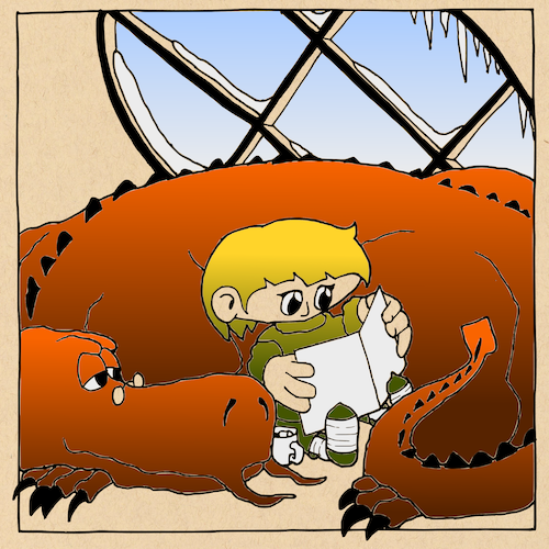
                                          Well, I did all the things:

                                          1. Updated sketch to provide a better composition (focal points on 1/3s better eye movement between girl/dragon)
                                          2. Updated dragon's anatomy to work better
                                          3. Attempted different technique for snow, did not look how I wanted so I went back to droplets.
                                          4. Fixed shadows extensively using what I learned in the shadows class by @Lee-White that I have been working through with watercolor
                                          5. Reversed the plate.
                                          6. Darker sepia print.
                                          7. Changed color of dragon slightly.

                                          I ended up darkening the scan as the colors did not seem rich enough for me.

                                          I am pretty happy with the overall. But let me know what you think. Any feedback would be welcome. I will be submitting it on Sunday.

                                          SnowDay_Rev2_Final_001_Darker1.jpg

                                          -The Prairie Fox
                                          https://www.instagram.com/theprairiefox
                                          https://www.theprairiefox.com

                                          Heather Boyd 1 Reply Last reply Reply Quote 2
                                          • Heather Boyd
                                            Heather Boyd @theprairiefox last edited by

                                            @theprairiefox

                                            I like it -it's warmer and cosier πŸ™‚ . I haven't been on much so I apologise if this was already in your work but I like seeing the depth of the window intersecting vertical and horizontal panels (holds the glass) ahh you understand I hope - gives a nice depth.
                                            I just thought of an addition of the dragon's tongue coming up and over to take some hot chocolate but leave that for another time, I like this one as it is.

                                            Instagram: www.instagram.com/heatherboyd.illustration/
                                            Website: https://heatherboydillustration.ca
                                            Shop: https://www.inprnt.com/search/products?q=HeatherBoydIllustration
                                            Ko-Fi: https://ko-fi.com/heatherboydillustration

                                            Be blessed,

                                            theprairiefox 1 Reply Last reply Reply Quote 1
                                            • First post
                                              Last post