Rules for ‘no rules’ perspective illustrations
-
@Coley oh that’s great that quite a few of us have been thinking along these lines. I felt a bit like I might be asking a stupid question and everyone probably understood it, but this forum is so open I knew I’d get a load of intelligent, helpful answers. After reading what everyone has said, it’s really helped me understand it too. I now think it’s about style, design and creating something fresh looking, or showing an object or scene in a more complete way (Than with a more literal interpretation ) or communicating a certain feel or emotion to the image.
I’ve been doing a bit of soul searching too and I think with drawing there’s a bit of an element of trying to prove yourself, which can hold you back from experimenting. Like, if I show wonky buildings to some people I know, they just won’t get it and think I’ve gone mad and can’t draw. -
@Zachary-Drenski cheers Zach, a bit like what Jazz is to music I guess.
-
@peteolczyk that's a great way to put it! And I also think I'd worry as well about what people would say. But it works for others so I guess we have to learn to stick to our own motivations. Loved this question of yours and this thread. Thanks for asking the question!
-
@peteolczyk There's been many really interesting answers in this thread, but I've noticed no actual practical examples of codes that can be used to create good wonky elements that still work in a composition (including in my own response). So I thought I'd show my favorite go to codes for stylized perspective!
My very favorite is drawing something in correct perspective then flattening just one side of it:
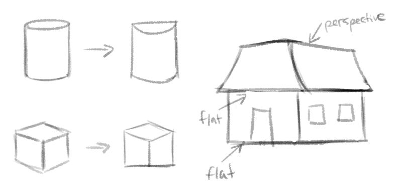
I do this in practically every illustration I think! Something I do very often also is drawing something in proper perspective, but drawing a flat texture on top of it that doesn't follow the same rules. This flattens the object and creates a wonky feeling, even while the object itself is still very much in perspective:
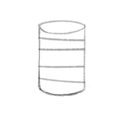
I hope this gives you ideas! Observing others' wonky illustrations and doing master copies is a great way to learn what codes you'd like to use yourself

-
@NessIllustration wow this is helpful!!! I just screenshotted it to save for referring to. Thanks

-
@NessIllustration brilliant Ness. I really like that style of cylinder.
Also I’ll share my Pinterest with you all, when I figure out how to do it.
-
I've been thinking about this all week since I read this thread. I think that artists generally push away from what is 'real' in all aspects of an image. Colour, proportions of people / animals, facial features. And also perspective. Sometimes only one aspect is distorted, sometimes many.
My first thought was that there are many alternate perspectives that can be used to create an image, some more formal than others:
5 point perspective (fisheye):
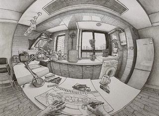
90 degree (flattens floor and perpendicular wall into a single plane):
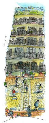
360 degree (Does what it says on the tin):
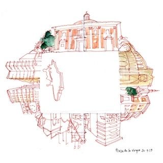
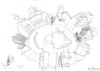

Multiple viewpoints / seeing around corners (far less formal & kinda anything goes):
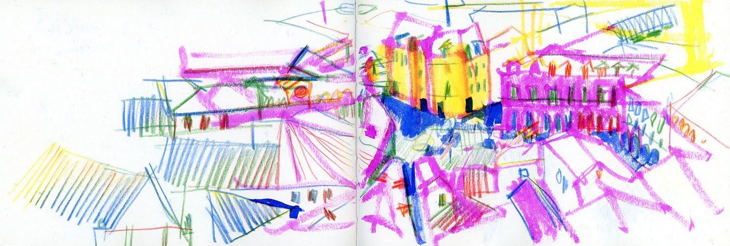
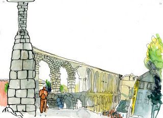
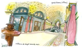
My experience with these is via a few urban sketching workshops I’ve been to. If it’s something you’re interested in then you could try searching for Swasky (artist’s name) and Bending the Floor, or Space Oddities but I’m not sure how much is documented.
I feel though that is not quite what is being done in the images you showed and I’ve been thinking a lot about them.
Stepping back and considering colour instead for a moment, it's often said that you can create an image in any colours you like as long as you control the values and the scene will be readable. So then your colour choices can be based on emotion or creating a particular atmosphere, they don't have to relate to the real colour of sky, grass, skin, etc. at all for people to still know what they’re looking at. E.g.
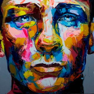
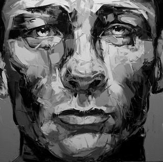
In a similar way I was thinking perhaps the equivalent of value in perspective is just that things tend to get smaller the further away they are. If you follow that then the scene should be readable but it leaves a huge amount of room for distortion and expression. Looking at your example illustrations this generally seems to be achieved by dividing the scene into planes and flattening objects within the planes, like cardboard stage scenery. At its simplest then you just have two planes - one giant object at the front and smaller objects at the back.
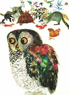
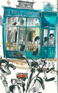
But you can have as many planes as you like and the more you have the closer the images gets to 'proper' perspective (this uses infinite planes so the closer side of an individual object is bigger than the side further away)
Once you have the planes then you can bring in some of the ideas about seeing round corners or multiple viewpoints to suit the image you’re making.
It’s a huge topic and I think there are never going to be easy instructions you can just follow to achieve a particular look but there are some themes. The parallel with colour theory really helps me to consider the vastness of the possibilities but also the complexities involved.
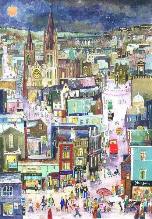
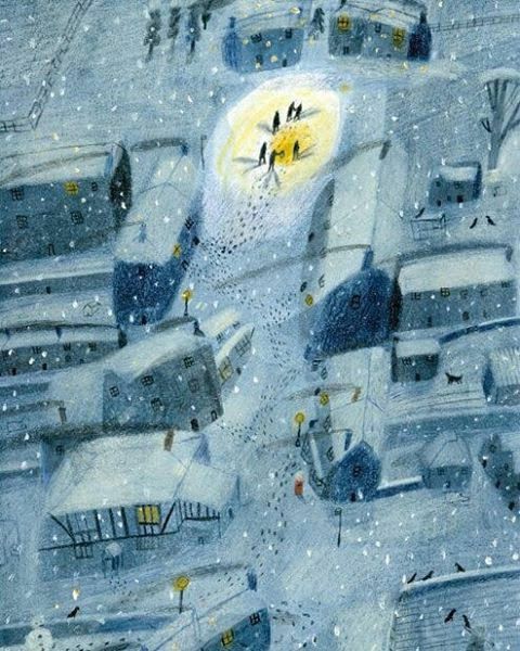
Two very different approaches I like below. The first seems to have quite a few planes but everything is very flat within them. It is dominated by vertical lines and feels like a calm, controlled, static scene. The second feels less formal and more fluid. There are maybe three planes (foreground, middle & background), the houses are not flat but we see more of each face than we really would be able to. There are very few vertical lines.
-
@neschof thank you for the write-up. Definitely a huge pile of fruits for thoughts.
-
So when I've done this in my illustrations, I usually first draw what feels right (which means I don't use a ruler, I just eyeball it) which already makes the perspective feel kind of loose. But then if I have an area that I want to still see I'll just do what I call "cheating' the perspective and just make it recede a little less, or make it more like isometric perspective where there isn't a vanishing point the lines are paralel to each other.
-
@neschof that’s a really good comment, thank you Nicola. Looking at your post and the images you’ve used, I think you could put different types of playful perspective into very different categories.
I’ve been looking at perspective on and in buildings and I think even straight line perspective is an illusion, especially when you look at it as it travels beyond your field of view, so that you have to move your eyes along it. It tends to curve off. Like fish eye but not as severe.
I guess for illustrators, how we use distortion comes back to how we use it for story telling.
(Still figuring out how to do this)