Rules for ‘no rules’ perspective illustrations
-
@xin-li thanks for sharing that, the activities look really useful. They break it down into 5 activity steps so you can learn about it. I like that there’s an emphasis on textures too.
-
@peteolczyk Out of all the images that you showed this one is the only one that I can see that doesn’t have clear vanishing points. The others may be a bit wonky or warped but they all do follow a perspective rule. Except also maybe the one that is a straight on view of buildings. If you can draw a picture with one, two or even 3 points of perspective you should be able to bend the rules to get that wonky feel and have it still hold together. Are you familiar with the rules of perspective? If not, I think SVS has a class. I’m going to take it to help fill in the blanks of my perspective education.
-
I have your question in the back of my mind all day. I am thinking maybe these "Soft-rule perspective" illustrations are the artists' honest attempt to capture how they feel about that moment in a story.
Expressing emotion is always hard to learn, no matter it is through words or images. But I think you are right, there are some rules. I think maybe we can go back and study a bit more about the fundamentals of visual language, how the basic shapes, color, and composition express different emotions. Maybe an excise could be just using abstract shapes, color and composition to describe a feeling, and see how far you can go to not use any specific characters or objects. (e.g. instead of drawing a kid crying to express sadness, what shapes, color and composition you would use to express the same emotion?) -
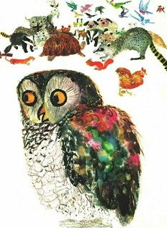
It looks to me that there are perspectives in each picture, but for each individual object, the illustrator chose to use either simplified language with minimal perspective or entirely flatten them. Distortion of shapes (or freehand shapes) is an important technique here, which the artists perhaps do on purpose to add fun elements to image and mimic language of kids.
-
@peteolczyk I never was able to do this "no rules" perspective until I learned how to do perspective properly! For it not to look messy, you do have to have a base composition base on actual rules. But then within that composition, you can choose to bend some of the elements, lines, shapes to go purposefully against the grain, creating a wonky feeling. There is always a fine line between how "wonky" it can look until it's just a mess, and which elements you can bend and which you can't so the composition as a whole remains readable.
vanessastoilova.com
instagram.com/vanessa.stoilova/Check out my Youtube channel for tips on how to start your career in illustration! www.youtube.com/c/ArtBusinesswithNess
-
Looking through your work, it does look like you play with the perspective a bit already, though perhaps not as loosely as some of the examples you've shown, so I think you already have experience in pushing perspective and you just need to play around and take it a little further. Maybe some master studies would be a good idea for you to do- or on your next illustration, focus on utilizing some of the things you're seeing in your pinterest board.
As others have stated, the examples you've shown seem to follow a basic perspective structure, but are very playful with the different elements within it. They tilt and curve things, aren't so rigid with keeping details perfectly spaced and straight, and distort elements, but the overall picture is following the bigger perspective setup.
This is something I'm currently trying to implement into my own work. I have reference on pinterest and am re-drawing elements as I go or utilizing the lasso tool and liquify to play with my perspective so it isn't so rigid. Lot's of trial and error. I'm hoping it will become more natural to me the more I play with it.
Website: www.tessawrathall.com
Instagram: www.instagram.com/tessawrathall_art/
-
@NessIllustration @burvantill @idid @xin-li thank you very much for all your knowledge and insight and taking the time to answer.
I’ll go through the perspective class to see if that’s the issue. I hadn’t considered it could be the expression of emotion through shapes, but it makes sense now when I look at some of them images.
I think I’m going to play around with some shapes and sketch out some street scenes to see what happens. -
@peteolczyk Also do some master studies of wonky perspectives you like! It's highly possible your brain just doesn't have a good catalogue of wonky shapes to draw from yet.
-
@TessaW @NessIllustration that’s some really good points, thank you again for your intelligent insight.
It might be that I’m trying to push it but winding it back as it’s currently out of my comfort zone.
Master studies sounds like a great idea too. -
I have always found this a little perplexing too, @peteolczyk and am glad you asked the question! I always figured it was something everyone else understood and somehow I missed it lol. I did the persepctive classes at SVS this year and boy, I learned so much! I did them both twice actually and think it's the biggest improvement I made this year (other than going from zero with no knowledge of digital at all!). But now it's the breaking of the rules or tweaking of them I have to work on. And maybe now that I know this stuff it's more of using shapes and composition with a general knowledge of perspective rules in mind. I love @NessIllustration 's comment about needing more library of wonky shapes in our brains lol. That's awesome and likely a large part of it. So this is another thing to be added to the list of things to work on! I also really like how Lee White uses mark making and I never understood how to use it. But this week I was working on some characters for an illustration project I'm working on and accidentally made some marks, then suddenly it made sense to me where to put some lighter marks on the the forms to define some texture and shape. Really cool when things just start to make sense a little!
-
@peteolczyk To me 'no rules' perpective is more like 'personal expression' perspective. Of course look at people who do it well, then go experiment in a sketchbook to see what kind of wonk you're comfortable with and suits your style.
As far as rules go, I think as long as you hint at a sense of space with things like size relationships, overlapping, atmosphere etc. you're good draw as unconventionally as you like
-
@Coley oh that’s great that quite a few of us have been thinking along these lines. I felt a bit like I might be asking a stupid question and everyone probably understood it, but this forum is so open I knew I’d get a load of intelligent, helpful answers. After reading what everyone has said, it’s really helped me understand it too. I now think it’s about style, design and creating something fresh looking, or showing an object or scene in a more complete way (Than with a more literal interpretation ) or communicating a certain feel or emotion to the image.
I’ve been doing a bit of soul searching too and I think with drawing there’s a bit of an element of trying to prove yourself, which can hold you back from experimenting. Like, if I show wonky buildings to some people I know, they just won’t get it and think I’ve gone mad and can’t draw. -
@Zachary-Drenski cheers Zach, a bit like what Jazz is to music I guess.
-
@peteolczyk that's a great way to put it! And I also think I'd worry as well about what people would say. But it works for others so I guess we have to learn to stick to our own motivations. Loved this question of yours and this thread. Thanks for asking the question!
-
@peteolczyk There's been many really interesting answers in this thread, but I've noticed no actual practical examples of codes that can be used to create good wonky elements that still work in a composition (including in my own response). So I thought I'd show my favorite go to codes for stylized perspective!
My very favorite is drawing something in correct perspective then flattening just one side of it:
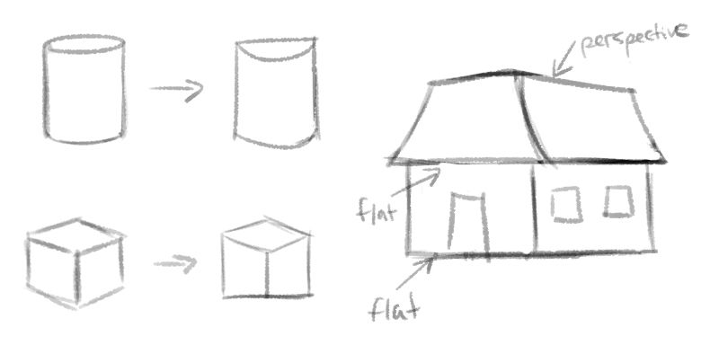
I do this in practically every illustration I think! Something I do very often also is drawing something in proper perspective, but drawing a flat texture on top of it that doesn't follow the same rules. This flattens the object and creates a wonky feeling, even while the object itself is still very much in perspective:
I hope this gives you ideas! Observing others' wonky illustrations and doing master copies is a great way to learn what codes you'd like to use yourself
")
vanessastoilova.com
instagram.com/vanessa.stoilova/Check out my Youtube channel for tips on how to start your career in illustration! www.youtube.com/c/ArtBusinesswithNess
-
@NessIllustration wow this is helpful!!! I just screenshotted it to save for referring to. Thanks

-
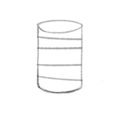
@NessIllustration brilliant Ness. I really like that style of cylinder.
Also I’ll share my Pinterest with you all, when I figure out how to do it.
-
I've been thinking about this all week since I read this thread. I think that artists generally push away from what is 'real' in all aspects of an image. Colour, proportions of people / animals, facial features. And also perspective. Sometimes only one aspect is distorted, sometimes many.
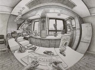
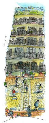
My first thought was that there are many alternate perspectives that can be used to create an image, some more formal than others:
5 point perspective (fisheye):
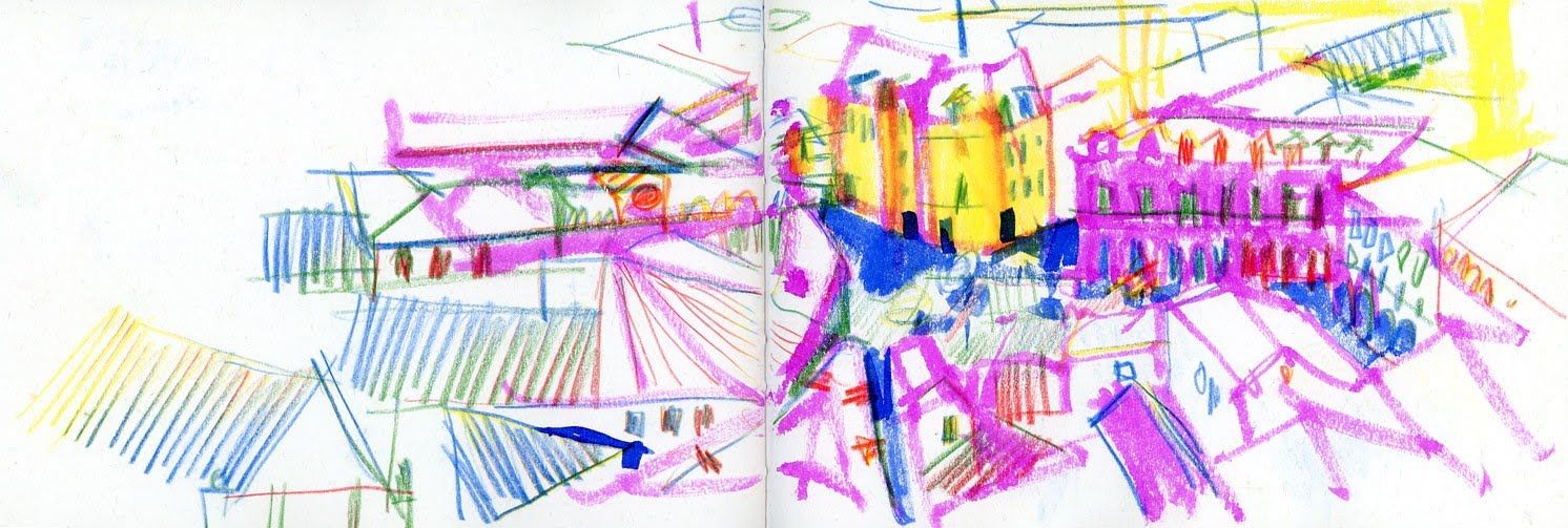
90 degree (flattens floor and perpendicular wall into a single plane):
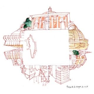
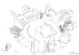
360 degree (Does what it says on the tin):
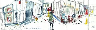
Multiple viewpoints / seeing around corners (far less formal & kinda anything goes):
My experience with these is via a few urban sketching workshops I’ve been to. If it’s something you’re interested in then you could try searching for Swasky (artist’s name) and Bending the Floor, or Space Oddities but I’m not sure how much is documented.
I feel though that is not quite what is being done in the images you showed and I’ve been thinking a lot about them.
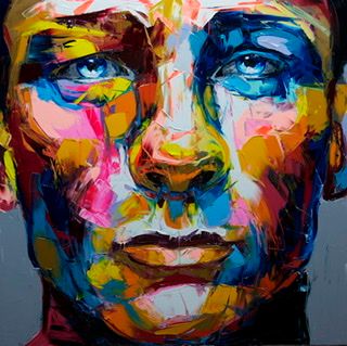
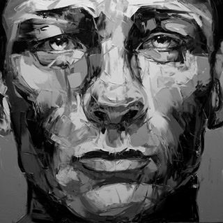
Stepping back and considering colour instead for a moment, it's often said that you can create an image in any colours you like as long as you control the values and the scene will be readable. So then your colour choices can be based on emotion or creating a particular atmosphere, they don't have to relate to the real colour of sky, grass, skin, etc. at all for people to still know what they’re looking at. E.g.
In a similar way I was thinking perhaps the equivalent of value in perspective is just that things tend to get smaller the further away they are. If you follow that then the scene should be readable but it leaves a huge amount of room for distortion and expression. Looking at your example illustrations this generally seems to be achieved by dividing the scene into planes and flattening objects within the planes, like cardboard stage scenery. At its simplest then you just have two planes - one giant object at the front and smaller objects at the back.
But you can have as many planes as you like and the more you have the closer the images gets to 'proper' perspective (this uses infinite planes so the closer side of an individual object is bigger than the side further away)
Once you have the planes then you can bring in some of the ideas about seeing round corners or multiple viewpoints to suit the image you’re making.
It’s a huge topic and I think there are never going to be easy instructions you can just follow to achieve a particular look but there are some themes. The parallel with colour theory really helps me to consider the vastness of the possibilities but also the complexities involved.
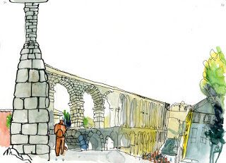
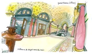
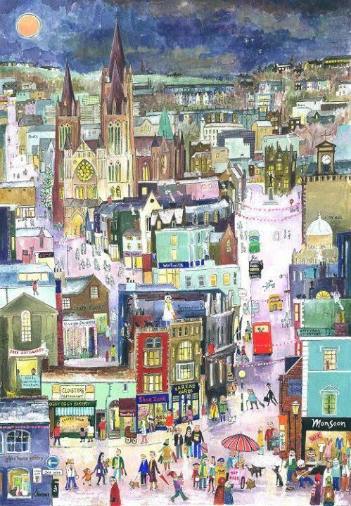
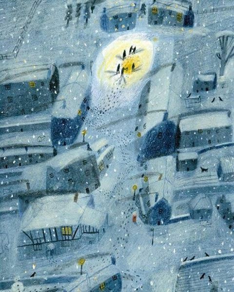
Two very different approaches I like below. The first seems to have quite a few planes but everything is very flat within them. It is dominated by vertical lines and feels like a calm, controlled, static scene. The second feels less formal and more fluid. There are maybe three planes (foreground, middle & background), the houses are not flat but we see more of each face than we really would be able to. There are very few vertical lines.
Nicola Schofield
Twitter: twitter.com/NSchofieldArt
Instagram: instagram.com/NicolaSchofieldArt/ -
@neschof thank you for the write-up. Definitely a huge pile of fruits for thoughts.
-
So when I've done this in my illustrations, I usually first draw what feels right (which means I don't use a ruler, I just eyeball it) which already makes the perspective feel kind of loose. But then if I have an area that I want to still see I'll just do what I call "cheating' the perspective and just make it recede a little less, or make it more like isometric perspective where there isn't a vanishing point the lines are paralel to each other.