Society of Visual Storytelling

    SVSLearn Forums

    • Register
    • Login
    • Search
    • Recent
    • Tags
    • Popular
    • Users
    • Groups
    • Search

    December prompt WIP - Sad - Critiques welcome

    Artwork
    8
    23
    963
    Loading More Posts
    • Oldest to Newest
    • Newest to Oldest
    • Most Votes
    Reply
    • Reply as topic
    Log in to reply
    This topic has been deleted. Only users with topic management privileges can see it.
    • APHOTICMOTH
      APHOTICMOTH Moderator last edited by APHOTICMOTH

      dec prompt svs wip 2 2019.jpg

      dec prompt svs wip 3 2019.jpg

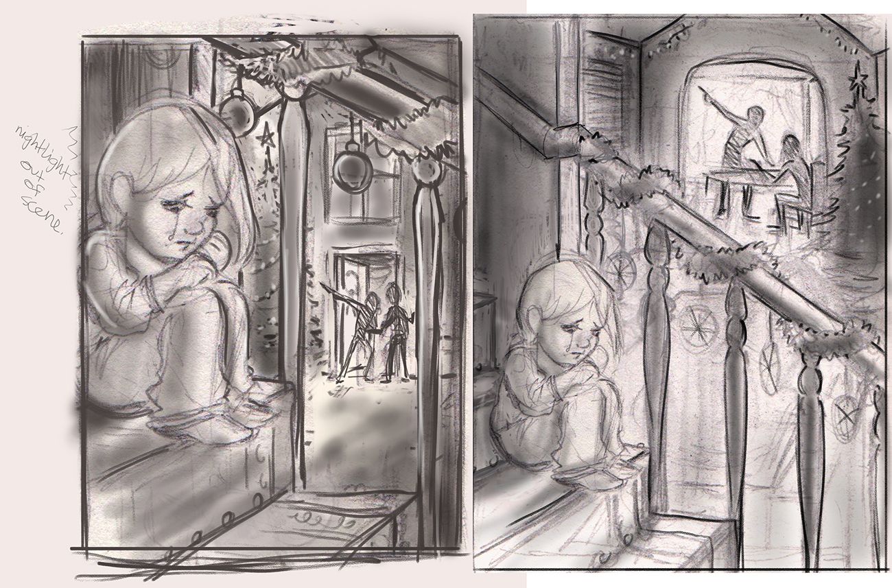
      Refined the 2nd idea. Added a bit of text. Might not be needed, but I thought it added to the storybook feel.

      @jdubz Tried to rectify that issue with this update. I noticed that too. Torn between this latest one, and the first one in the last post.

      1 Reply Last reply Reply Quote 1
      • J
        jdubz last edited by

        @CLCanadyArts The only issue I'm seeing is that the way #2 is shaping up is that it's forcing you to make the parents the subject matter because based on the scene, it has to have the brightest light and highest contrast.

        It might end up being totally fine and it really makes the image though.

        On the #1, the adults are more in shadow so the girl can be the most lit thing in the scene and you can really control that.

        You might toy with making the #2 scene use the front door like #1 so you can choose to put the lights where you want.

        Josh White
        https://www.instagram.com/joshwhiteillustration/

        APHOTICMOTH 1 Reply Last reply Reply Quote 1
        • APHOTICMOTH
          APHOTICMOTH Moderator @jdubz last edited by

          @jdubz Good point, I will try that out right now. 🙂

          J 1 Reply Last reply Reply Quote 0
          • J
            jdubz @APHOTICMOTH last edited by

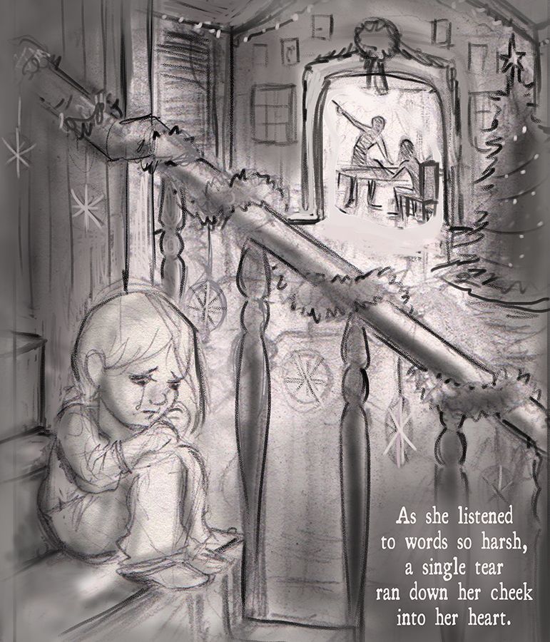
            @CLCanadyArts One thing I thought of also (if I'm not being to presumptuous lol) is the words could definitely take up more space and not feel crammed down there.

            The 3rd-4th banister up is essentially dead space so you could push that back a bit with contrast and get those words nice and spaced out. I mentioned on someone else's post that Will Terry's words are really sticking with me when he said if you're going to put the words in there, make sure you're treating them like another element on the page that is supposed to be there with as much importance as everything else.

            Josh White
            https://www.instagram.com/joshwhiteillustration/

            APHOTICMOTH 1 Reply Last reply Reply Quote 1
            • APHOTICMOTH
              APHOTICMOTH Moderator @jdubz last edited by

              @jdubz That makes sense too. I was timid about it, and it does feel crammed into a tiny space. Thanks for your thoughts!

              1 Reply Last reply Reply Quote 0
              • APHOTICMOTH
                APHOTICMOTH Moderator last edited by

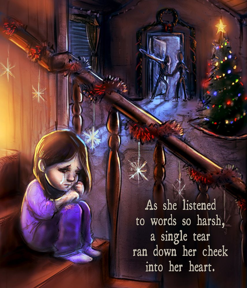
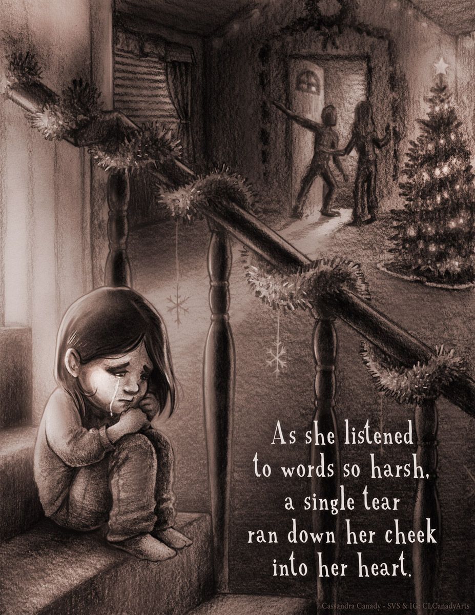
                Switched the dining room to the front door. Enlarged the text. Did a rough color mock-up.(too much black at the moment, i'll refine the colors. I think I'm about ready to start refining and inking this. Need to work out perspective and detail. Thank you all for your feedback.

                dec prompt svs wip 4 2019.jpg

                Oriana Fernandez 1 Reply Last reply Reply Quote 7
                • J
                  jdubz last edited by

                  Nice! I think it's reading really well at least for me.

                  Josh White
                  https://www.instagram.com/joshwhiteillustration/

                  1 Reply Last reply Reply Quote 1
                  • Oriana Fernandez
                    Oriana Fernandez @APHOTICMOTH last edited by

                    @CLCanadyArts I absolutely love this! 😍 ♥

                    https://www.instagram.com/oriana_fernandez_/
                    My blog: https://orianafernandez.wordpress.com/2018/05/16/28-twilight-stories-or-the-flight-of-the-wryter-and-the-weaver/

                    1 Reply Last reply Reply Quote 1
                    • lmrush
                      lmrush Pro SVS OG last edited by

                      Wow amazing job, your composition, lighting, color, use of line for focal point; this is an amazing piece, congrats!

                      Lisa Rush
                      www.lisarushgallery.com
                      www.facebook.com/ArtbyLisaRush/
                      www.instagram.com/lisarush11/

                      1 Reply Last reply Reply Quote 0
                      • Chip Valecek
                        Chip Valecek SVS Team SVS OG last edited by

                        Is someone cutting an onion in here? Wow man you nailed the emotions with this one.


                        https://www.instagram.com/chipvalecek/
                        https://www.facebook.com/cvalecek
                        http://www.cshellmedia.com/

                        1 Reply Last reply Reply Quote 0
                        • APHOTICMOTH
                          APHOTICMOTH Moderator last edited by

                          This post is deleted!
                          1 Reply Last reply Reply Quote 0
                          • APHOTICMOTH
                            APHOTICMOTH Moderator last edited by

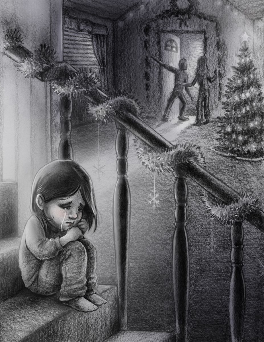
                            Giving up on this one for now. I rushed it again, but I'm tired of rushing art. I spent about an hour penciling this and it shows, so much heavy grain from quickly shading... Digitally fixed her face, and some light and dark values.

                            Too much going on between holidays, family showing up, people showing up, other freelance work that is more important.

                            I might go back and redo this in the future.

                            sad girl svs.jpg

                            1 Reply Last reply Reply Quote 1
                            • APHOTICMOTH
                              APHOTICMOTH Moderator last edited by

                              sad girl svs done.jpg

                              Overlaid some color, and slapped the text back on. Going to submit even though Im not 100% happy with it. Would still be nice to possibly get some feedback on at least the composition, feel, etc. I actually think the monotone adds to the sadness a bit.

                              1 Reply Last reply Reply Quote 1
                              • First post
                                Last post