Feedback Request WIP Haunted Library
-
Sweet guys. Thanks for your feedback. I've been spinning my wheels for a while and it's nice to have some help getting back on track.
@peteolczyk You constantly give great feedback. Thank you. The brief for this:
It's art for a middle grade book. The book follows the same boy on many different adventures. Rather than a long storyline, it's made up of different "episodes" and each chapter is it's own self contained story. We see things mainly through his point of view, but periodically the view will shift to a different character.
This piece is one of 3-5 illustrations for a chapter in this book. I'll be making a couple of full bleed images and perhaps some spots, or layouts more integrated with the text. By now the reader knows the boy (the one casting the shadow) and have been on many adventures with him, but this setting and the 2 ghosts are new to the reader. The chapter opens from the older ghost's point of view. She's confused and scared about who this boy is and why he's in her home. The view points in this chapter will switch between 3 characters and it will be pretty clear to the reader that 2 of the characters are indeed ghosts. The chapter will gradually reveal some of the relationship between the boy and the ghosts and by the end, the ghosts will "move on".
This is just a made up brief, so I will probably be putting in a little more information into the illustrations than might actually be done if it was accompanying text, but I still want to strike a good balance between making the story clear through the illustrations and leaving things open as if there where actual text accompanying them. I hope this makes sense. My goal with this piece is to introduce the ghost characters, the setting, and relay the uncertainty and fear of the ghost.
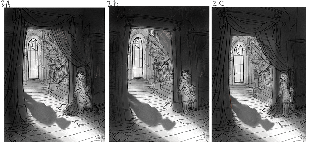
I've made up some options based on all your feedback. I'll be playing with the boys cast shadow more, but if anyone has a preference between options, I'd appreciate a vote. Thanks.

Website: www.tessawrathall.com
Instagram: www.instagram.com/tessawrathall_art/
-
@TessaW , I like #2 the best.
-
@TessaW I really like this composition with no figure and only shadow. In this way, you can design the shape of the shadow to reflect the emotion of the ghost characters. It can be scary, it can be aggressive, and it can be curious, etc. Great concept.
-
@Jeremy-Ross @TessaW samsies for me on number 2
-
I love how each rough image has a little more of the room's architecture in it--I wonder if communicating to the reader the atmosphere of the house is less/more important, and if that might point you toward which rough to use...
The direction of the face on 2C could be more effective depending on the scale of the image being large enough to see the direction of her eyes... The turn of the face in both 2A and 2B indicate where she's got her attention focused, but I think that 2C would be more effective it the reader can see either her eye direction or tension in her face and body, and that might require a closer perspective...
Is it important that the reader have more information about the house itself that it might require more of a view of the doorway? I think it's clear the boy hasn't been here, right? Maybe showing some of the stripped wallpaper and haphazardly hanging drapes is important to communicate an emotional state, maybe?
All of these three options are lovely, and could be used equally effectively. I guess it all depends on what specifics you might want to get across to the reader...
Lovely lovely lovely work!!!
-
@TessaW thanks Tessa you’re too kind. You’ve got a really good backstory to this.
Just my thought process again, I like 2a the best. I think the differences that are drawing me to it are the pose of the characters and the composition element added by the curtain. I think the way it drapes and softens that frame looks really interesting. It also swoops down drawing your eye towards the tension, where the characters are stood.
The way the girl is looking at the shadow also creates more tension than 2c where she’s looking away. -
I like 2A the best. The direction of the girls face and eyes are on point and relatable. Definitely keep the drapes, they're really enhancing the mood of the environment.
As for the cast shadow, since you're going for a long shadow, structurally, it should be more proportionate at the base (near the legs) and should elongate in parts further away from the boy (near the head). So the shadow of the head is basically a long ellipse.
Beautiful sketch!")
-
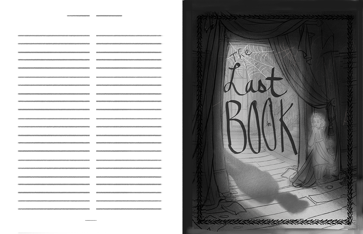
Thank you everyone! You gave such good feedback, it's been very helpful. I've decided to make this into a chapter title page. I'll be working on the final sketch a little later, once I figure out the layouts and general comps of the other pieces. I'll be keeping your notes on hand for when I get back to it.
If anyone wants to throw out some thoughts on the text layout, I'm all ears.
Website: www.tessawrathall.com
Instagram: www.instagram.com/tessawrathall_art/
-
@TessaW lovely!
-
@TessaW cool idea! I do find the border distracting from your artwork. But I like your word placement, especially "the" trapped in the web.