Society of Visual Storytelling

    SVSLearn Forums

    • Register
    • Login
    • Search
    • Recent
    • Tags
    • Popular
    • Users
    • Groups
    • Search

    January Challenge WIP feedback appreciated.

    Artwork
    wip comics
    10
    27
    2437
    Loading More Posts
    • Oldest to Newest
    • Newest to Oldest
    • Most Votes
    Reply
    • Reply as topic
    Log in to reply
    This topic has been deleted. Only users with topic management privileges can see it.
    • chrisaakins
      chrisaakins last edited by

      @Aleksey It just occurred to me that if they were trodden upon in a forward direction they would be pointing forward and would be even more smashed. Hmmm. I will have to think about this. How would I depict this?

      Chris Akins
      www.chrisakinsart.com
      www.instagram.com/chrisakinsart/

      ArtofAleksey 1 Reply Last reply Reply Quote 0
      • ArtofAleksey
        ArtofAleksey @chrisaakins last edited by

        @chrisaakins i think more mass of the trunks would still be im the ground, while the smashed part would be breaking off of it.
        Theres some good images on google I found when i searched “broken tree” where you’ll see how the mass of the trunk is still in the ground, while if you search “uprooted tree” you’ll see the roots sticking out with the whole tree. Maybe a good mix of both might help show “woah something big came through here and destroyed these trees”

        instagram and twitter: @artofaleksey
        alekseyillustration.com

        1 Reply Last reply Reply Quote 0
        • chrisaakins
          chrisaakins last edited by

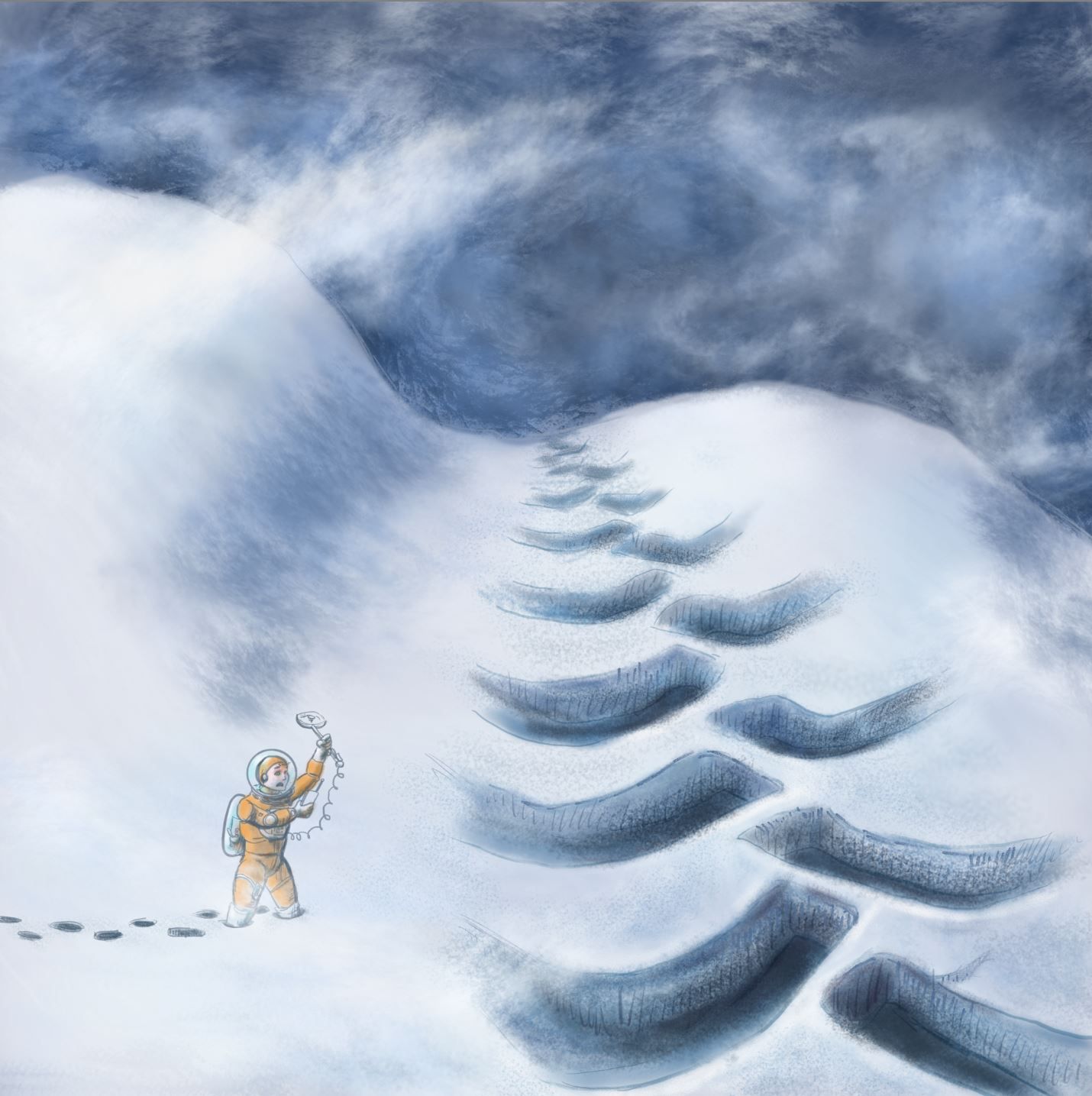
          So I decided to redo my idea and go for the inhospitable planet idea. How do you like the new direction?What story does it tell? What improvements would you make?
          Jan WIP revision.JPG

          Chris Akins
          www.chrisakinsart.com
          www.instagram.com/chrisakinsart/

          1 Reply Last reply Reply Quote 0
          • chrisaakins
            chrisaakins last edited by

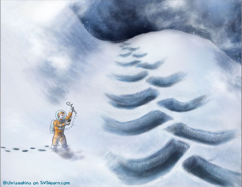
            I add more value and intensified the colors on the guy. NOt getting much feedback on this one. Cannot tell whether that is good or bad...

            Will and the tracks.jpg

            Chris Akins
            www.chrisakinsart.com
            www.instagram.com/chrisakinsart/

            NicolaSchofield 1 Reply Last reply Reply Quote 0
            • chrisaakins
              chrisaakins last edited by

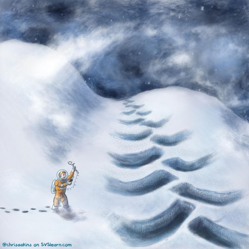
              I also thought about cropping it like this:
              Cropped version.JPG
              What say you?

              Chris Akins
              www.chrisakinsart.com
              www.instagram.com/chrisakinsart/

              1 Reply Last reply Reply Quote 0
              • NicolaSchofield
                NicolaSchofield @chrisaakins last edited by

                @chrisaakins I love how you've done the snow and particularly the swirling snow in the wind and the sky.

                I guess I'm not feeling much else from it though. Maybe it's the straight line of the tracks or just the lack of anything else in the image but I feel like there needs to be something more to hold my attention and keep me wondering what might be going on. Perhaps some hint at what made the tracks or a more intriguing landscape.

                Nicola Schofield

                Twitter: twitter.com/NSchofieldArt
                Instagram: instagram.com/NicolaSchofieldArt/

                1 Reply Last reply Reply Quote 0
                • Coreyartus
                  Coreyartus Moderator last edited by Coreyartus

                  As neschof says above, the sky is gorgeous. it's very billowy and snow-filled. Lovely!!

                  I wonder if the tracks themselves need some more definition? Like, maybe some debris or snow mounds with shadows? They seem very soft and gentle, but usually tracks in the snow aren't quite so consistently clean. I get that the snow has been swirling and maybe covered up some of the raw broken snow, but I wonder if maybe it might be interesting to add it back in... Your earlier version where you ran over the tree suggested a bit of chunkiness or density to the snow. Maybe incorporate some of that? I think what I'm personally missing is a sense of edges.

                  Your instinct to add more shadows and deeper values is good! It made things a lot deeper and richer. I'd keep going with that. There is something interesting about "whiteout" conditions created by blustering snow, and I can see how that might narrow the value range of everything into a lot of subtle greys, but maybe a couple layers of flurries behind and in front of the spaceman might help to communicate the depth and scale you're wanting to suggest? That way you can up the whites and deepen the darks in the snow, and the snow floating on top will contrast against them?

                  I dunno--just my 2¢. It's coming along!!!! I love love love the cold, hard blues you've chosen. They're very chilly! And the subtle pale blues of the snow is very delicate! Well done!!

                  Children's Illustration Portfolio: https://www.coreyartusillustration.com
                  Art Portfolio: https://www.coreyartusimagery.com
                  Mastodon: https://mindly.social/@Coreyartus
                  Pixelfed: https://pixelfed.social/Coreyartus

                  1 Reply Last reply Reply Quote 0
                  • chrisaakins
                    chrisaakins last edited by

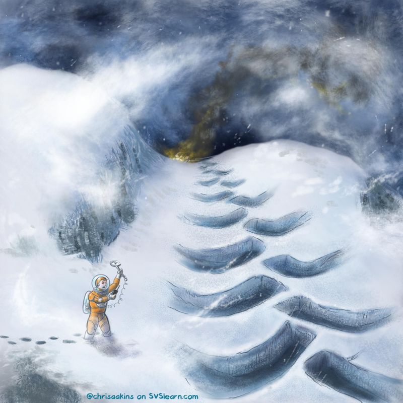
                    Thankyou @Coreyartus and @neschof for your input. I was inclined to agree that it looked boring. I added some line work and the suggestion of a crash or burning city (let your imagination decide.) I also added some rocks and a cliff and more whirling snow. How's that?
                    Will and the tracks with crash.jpg

                    Chris Akins
                    www.chrisakinsart.com
                    www.instagram.com/chrisakinsart/

                    NicolaSchofield 1 Reply Last reply Reply Quote 3
                    • NicolaSchofield
                      NicolaSchofield @chrisaakins last edited by

                      @chrisaakins much better - you work fast!

                      Nicola Schofield

                      Twitter: twitter.com/NSchofieldArt
                      Instagram: instagram.com/NicolaSchofieldArt/

                      1 Reply Last reply Reply Quote 0
                      • Coreyartus
                        Coreyartus Moderator last edited by

                        Wow, that's so much clearer!! And swift!! Kudos!!

                        Children's Illustration Portfolio: https://www.coreyartusillustration.com
                        Art Portfolio: https://www.coreyartusimagery.com
                        Mastodon: https://mindly.social/@Coreyartus
                        Pixelfed: https://pixelfed.social/Coreyartus

                        1 Reply Last reply Reply Quote 0
                        • First post
                          Last post