January Contest WIP critique the heck out of it please
-
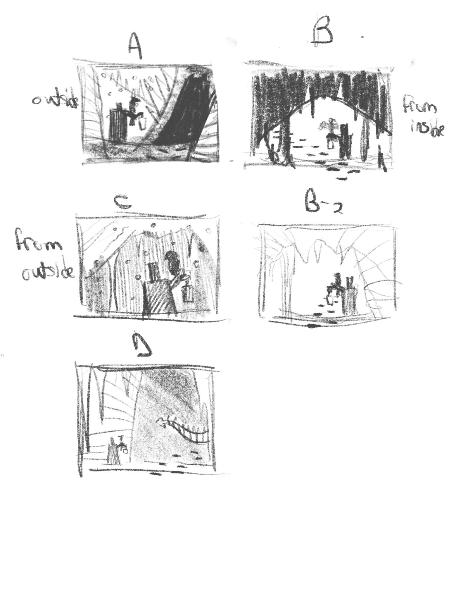
Doing a thing where theres a man with a lantern approaching a creepy cave. Heres a few of the thumbs i ended up liking most.
I really like D it feels overbearing, like he’s getting to in over his head. But A also looks fun. I tried to do some shot from within the cave can be fun to do for dramatic affect.
Would appreciate input please.
-
I like the one from the inside looking out because:
-
it feels like you are looking at the man from the creature's perspective (assuming there is a creature in there) which, to me, feels more mysterious.
-
It gives you a chance to see the man's face instead of just his back so we could know how he is feeling about this venture into the cave
-
I just like backlighting. I think it's more dramatic.
I do like the shape of the mouth of the cave better in A and D though. Hope that's helpful.
Laurie DeMott
instagram.com/demotlj -
-
@demotlj ooo good feedback maybe i can combined those 2 things, the inside shot and the shape of the cave
-
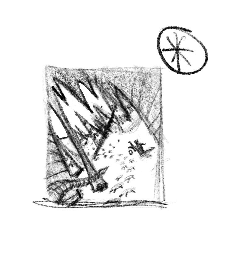
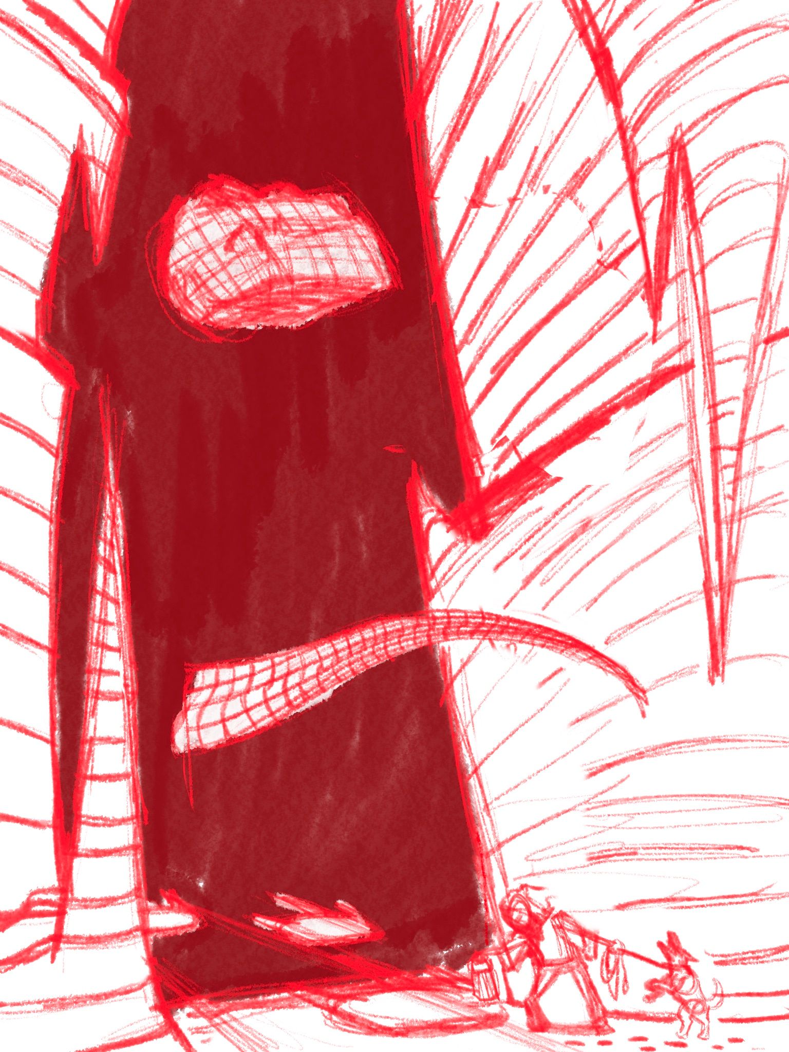
Ok i think i came up with a solution. I want the cave to appear big so i made the man small but now im worried that he might not be visible but it might be more dramatic if i use light and shadows to accentuate the dramas. Theres also some negative space being created in the top left corner between the cave and the outside. Im wondering if I should put something there like a cottage or something to create some more depth but still related to the illustration.
instagram and twitter: @artofaleksey
alekseyillustration.com -
@Aleksey My favourite is D. I like the redone version with the mouth of the cave (really neat perspective!) but if I were you I would stick closer to the original version.
Here's mah reasons to go with option 'D'!
1.) The original is just brimming with potential for dramatic irony if the figure is looking down at the footprints while the tail (and maybe a set of glowing eyes in the upper third?) lurk unseen.
2.) It's simple. I decode the original right away. I'm starting to lose track of the number of times I've got a super cool thumbnail with an awesome dynamic perspective and then utterly buggered it up at a later stage because it was just a bit too complicated.
3.) The sense of scale is immediately apparent and it's awesome. That is a big cave with a big creature against a tiny person.
4.) You can simultaneously silhouette the dark person against the light rock and the bright lantern against the dark cave if you shuffle things about a tiny bit.
5.) The difference in size will be even more pronounced if you use a portrait instead of a landscape.
TL;DR I like them both, but I'd stick with 'D'
")
-
@Braden-Hallett dang when’d you get so good at critiques. Ty I actually had a gut feeling to D because of that size. I like the solution to have the character turned and looking down. Perhaps a dog barking up at the creature and the old man not paying attention. Thanks im going to work on that one a bit more.
-
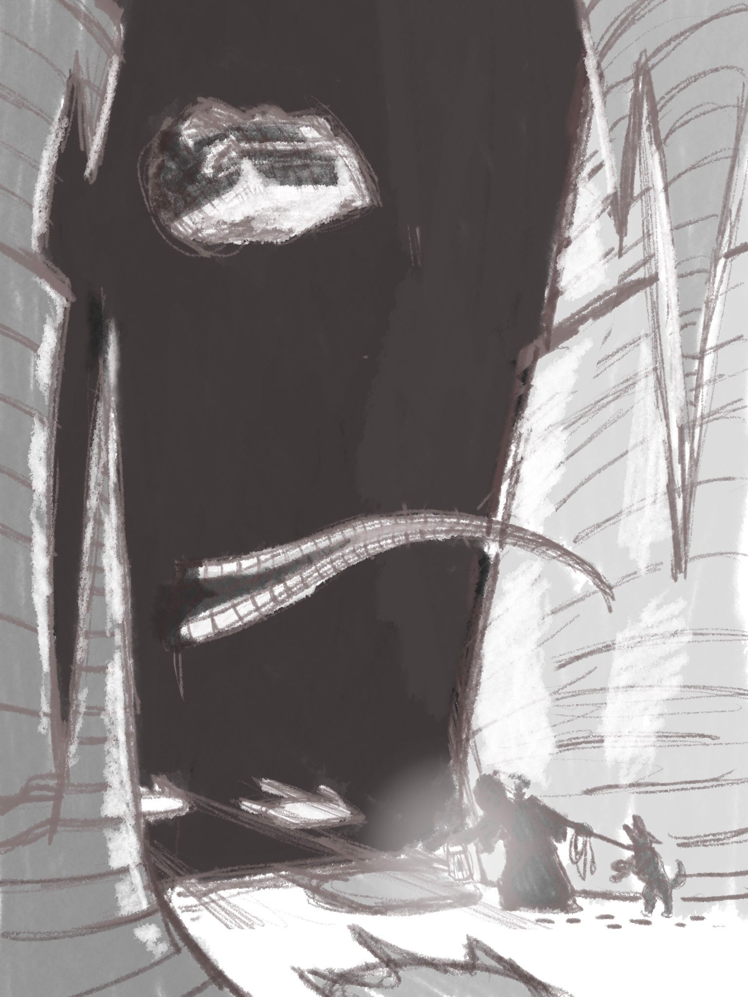
I think i like the Composition of the vertical one, but a more low angled shot would work better. I’m also thinking about the snow and Perhaps a crystal cave instead of stone? I want to make it feel cold. Like a glacial cave? I’ll have to do some research to see if glacial caves are a thing and tis not just a superman thing.
-
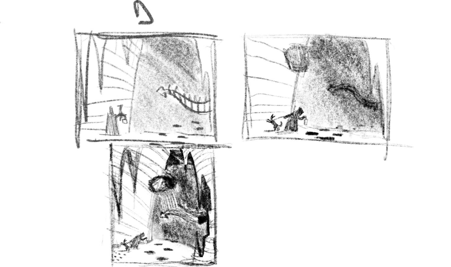
So i did 2 versions the only difference is the cave area.
-
I think the first one is a bit stronger because it feels like it removes the unnecessary space on the right side.
-
@jdubz yeah I felt like it was too constricted
I also think maybe i need to raise the ground level a bit, it looks too close to the edge. And perhaps the dino head.
-
Ok i think i figured out the values and the light source. I’m going to have to do some research to figure out the lighting for ice walls. I’m also going to do a more refined version of the interior comp to see if i like it more.
instagram and twitter: @artofaleksey
alekseyillustration.com -
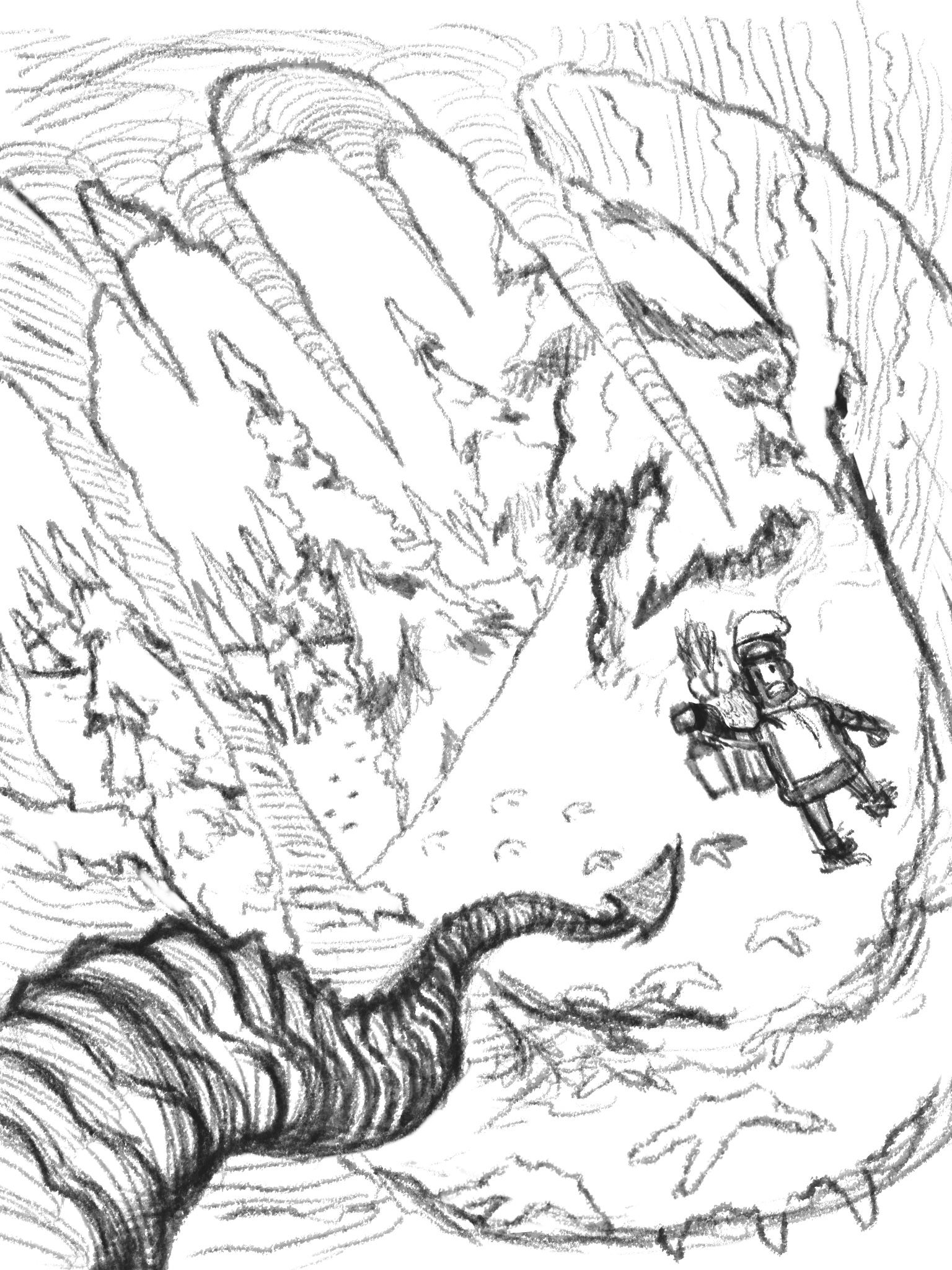
@Aleksey THe tracks are getting lost a little bit. They should be more of a "star" in your production since that is the prompt and they are being downplayed by the dino. The suspense and drama I think you want to create might be getting lost as well. Maybe if you did a more vertical pitch and really let the tracks lead up to the cave and have a really good silhouette of the fellow looking at them, I think you will get more of the drama and suspense.
Also, why would the tracks appear white in the cave? Are they glowing?
-
@chrisaakins yeah these are good points. I actually decided to go with my previous comp decision because i realized i was way more into it than this one. The foot prints in the cave were going to be melted snow, so water prints.
I decided to go with this comp instead: i also really wanted to draws a birb because i had an idea for this character, but also really like birbs.
-
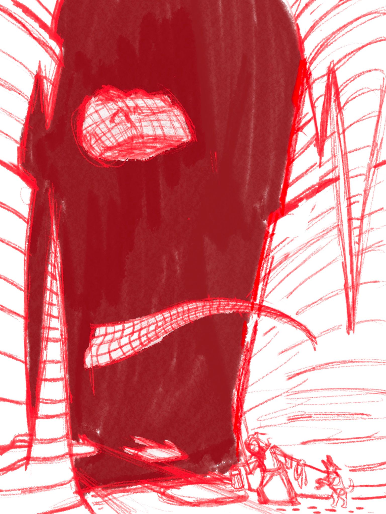
Ok i got rid of the bird because it wasnt helping create a story really in any way. But im liking where this is going. Does the tip of the tail feel too close?
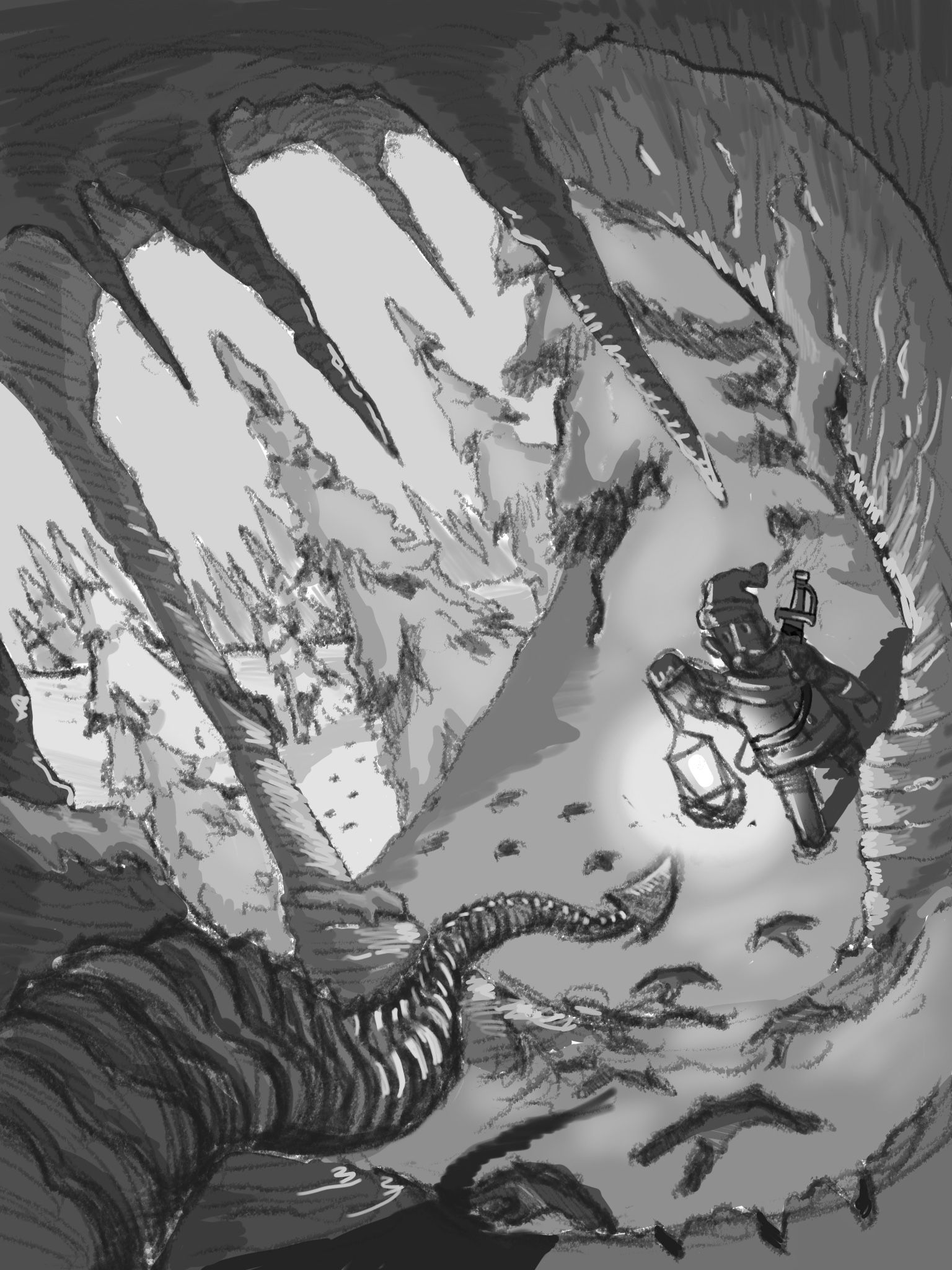
instagram and twitter: @artofaleksey
alekseyillustration.com -
@Aleksey this looks fantastic. Re the tip of the tail, it might feel a little close, maybe have it tilted more away and/or smaller?
I think this is going to be great! -
@Coley ok cool thank you thank you
Everyones been super helpful im very excited about this piece
-
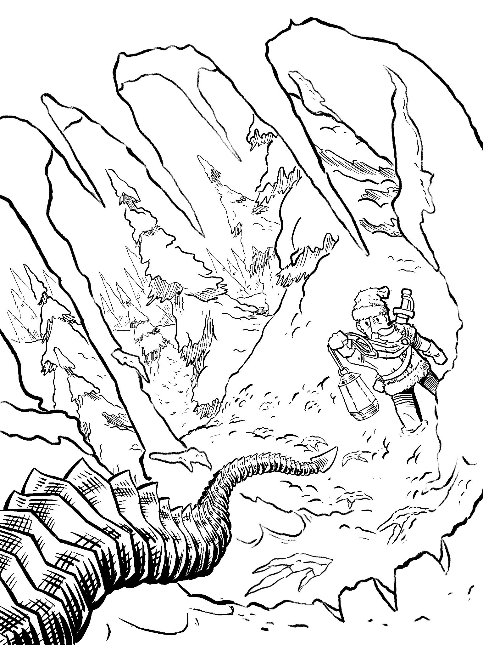
Line work so far. I’m going to try and add texture using color and light rather than line
-
Love it! Can't wait to see it in color!
-
@KaraDaniel thanks! colors gonna be a struggle but I think my method of stealing color palettes has been successful so far.
-
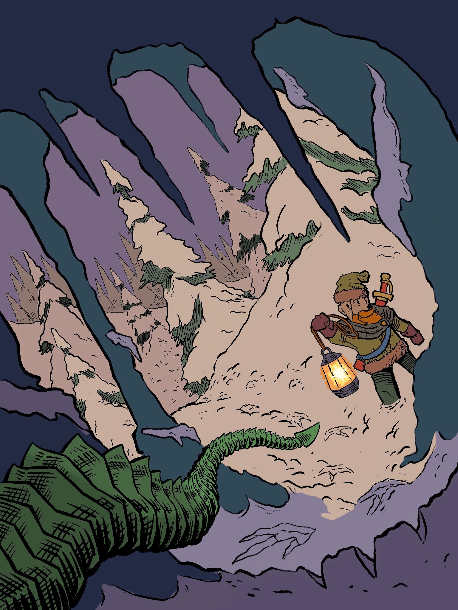
Ok after great turmoil i think I finally found local colors that i like.
instagram and twitter: @artofaleksey
alekseyillustration.com