Honest critiques please 😊
-

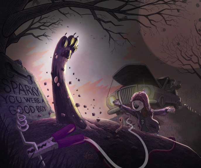
Hello everyone, it’s been a busy few months so I haven’t been around much but I did manage to color this piece from October. This is my first picture book portfolio piece and will probably get pulled as soon as I get a few more but could really use some honest criticism to improve this and point me in the right direction for the future. Thank you

-
@Zachary-Drenski Amazing! I really don’t have anything to critique
-
@Zachary-Drenski Love the style! I like the way you rendered the trees, grass and textured details!...Poor Sparky:(...It's a fun image!!! I am pulled to the paw and its contrast to the sky... Is this a night scene (I see headlights)? Maybe look at contrast, sightlines between characters, and backlighting. Maybe just play with some of those elements to see what you like...I hope it ok to play with your image. It's so fun I couldn't resist! Really Nice Work!!
-
@Zachary-Drenski so awesome!
-
@Nyrryl-Cadiz @aska thank you!
@jbleau thanks for taking the time to draw over this! I really love your ideas, especially the big moon and agree that something needs to be done to make the girl pop. I was going for a sunset evening feel, light enough to see but dark enough you need headlights.
@gavpartridge thank you! I'll see what I can do to make this less static.
-
@Zachary-Drenski This is a really cool picture. I think it does a good job of redirecting the eye in a cycle from character to character. The only things I noticed critically would be all of the characters seem to be fighting for attention. Maybe use some contrast or lighting to highlight the primary focus a bit. Also, the dad in the truck feels a bit stiff, and want to pull my eye out of the frame a bit. Other than that this is really cool, and a fun idea.
-
@nickTabor you're the second person talking about static or stiff poses. So, I'll definately work on that. Thank you!
-
Everyone has given great suggestions! I would just like to add that I too like the style, clean lines, details such as the glare from the headlights, your use of textures and the perspective. Really fun and well done! I dare say your style is similar to what mine seems to be becoming. However, I'm pretty new at this, so what you've done here is an inspiration for me! If you have any suggestions for me. I've posted to the January critique, which is the piece I'm referring to, not to the prior pieces.
-
@Zachary-Drenski Your welcome! It's really great work! Looking forward to seeing what you come up with!!!
-
@deborah-Haagenson thank you! I checked out your piece. I like the use of large simple shapes in the composition. Perhaps, making the snow more random and adding just a bit of texture, cast shadows. I don't know if that would pollute the simplicity which is wonderful so you'd have to experiment
@Rikki-Rose thank you!
-
I personally love the lighting. it's like twilight, and the headlights help indicate that the car is running. I'd imagine most people would have headlights on during twilight as well. Just my opinion, it doesn't mean much.
 Wonderful piece.
 -
@Zachary-Drenski Amazing work, especially on the coloring. My only critique is that I didn’t see the girl when I first looked at this, but it is otherwise a great composition.
-
@Zachary-Drenski Thank you for looking at my piece and your suggestions! I am going to play with the things you mentioned. I was concerned sbout the lack of shadows.
-
@Zachary-Drenski I love this piece. The story is funny and unexpected.
I agree with others about the girl needs to be more prominent. @jbleau 's idea of the big moon is so cool and really fitting with this story. I would try to find a composition to use the big moon to frame the girl (or and the paw) within the moon so she/they get a strong contrast within the image. (hope this make sense). -
@Zachary-Drenski I really like your execution of this, the colours are lovely.
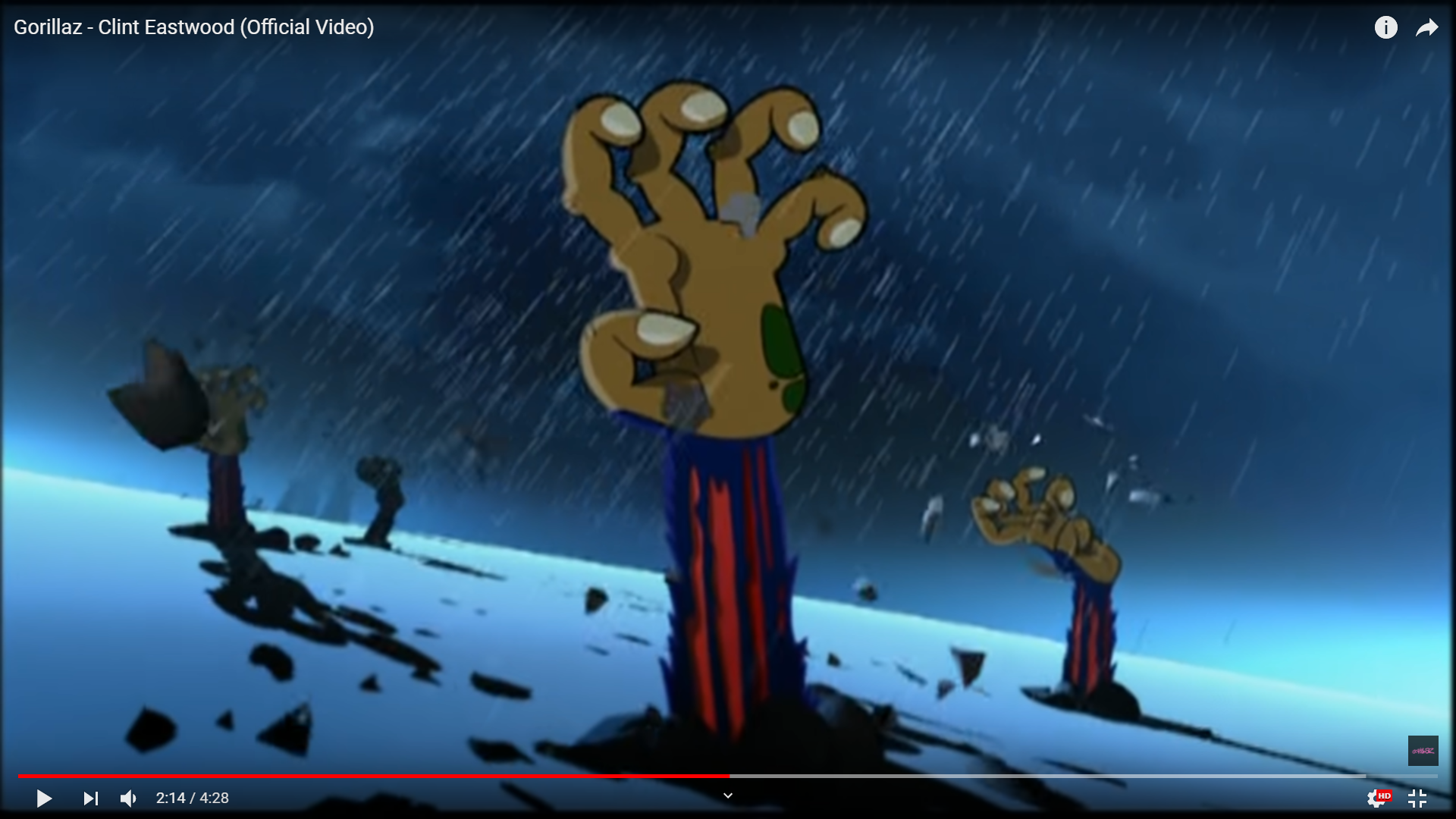
The first thing that jumps out at me that could be changed if you wanted to would be the paw and arm shape, this is one instance where a rigid straight up arm might help and the paw's fingers could be spread out as opposed to the curve. I only say this as it might help with the feeling of it popping up or you could just tilt the wrist with the palm facing upward. I hope that all makes sense the Gorillaz Clint Eastwood music video springs to mind, screen shot below.
-
Here’s the final (for now) @jbleau and @xin-li I totally agree with the a lot of your ideas, and I think going more night and more moon would have made this piece more halloweeny. However, I am ready to move on to the next piece and didn’t want to go through the major redraws needed to make that happen in a way I’d be happy (I’m slow when it comes to painting recently)
@Phil-Cullen I drew the paw probably 30 or 40 different ways during the sketch phase and to tell the truth I never found one I was completely happy with. My biggest challenge was having it not look like a cat. I may revisit this in the future but for now it’s time to move on.

Also just want to say, this forum is great! Thank you everyone, this is definitely my best illustration to date and it’s 100% due to the feedback I got here. Thanks again!
-
One thing looks really cool. 2 visually, use of color choice and angle of this is just perfect. Im speechless !
-
@Zachary-Drenski I feel your pain, I can't draw paws lol I need to do more animal studies. I was just nit picking, it looks great, love the texture and colours. Nice job!
-
love this piece

-
@Zachary-Drenski It looks great! Don’t ever look at feedback as direction...Especially from me! It’s just food for thought...It’s always easier to play with someone else’s piece, all the hard work is done. Thanks for posting and encouraging feedback!