Jan WIP - Let's draw a dragon on the snow (Critiques welcome :-)
-
@Laurel-Aylesworth Thank you for the critique. I see now that Will is not pointing the dragon :-).
@carlianne thank you for your suggestions. I was going for the "making the dragon", but I was afraid of not given enough info for the viewer if the dragon shape is not clear. I guess I have to work on the balance of that. I want to make the dragon look like "almost done, but not quite yet." I have not thought about adding regular footprints. It would add realism. But I will see how I can find a way to hint it without it being a distraction. -
@xin-li I think it is a fun concept, and I really like the perspective!
 ️
️ -
Brilliant concept, nice composition too. Looking forward to seeing where this goes.
-
@Jenna-Jenks @ChloeB-artistry thank you so much.
-
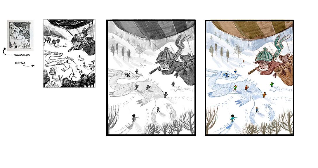
Progress so far. I am not very happy with the color yet. I need to fiddle a bit more before moving forward. Any thoughts? -
@xin-li looking really great, I like the colour palette so far.
I love the idea you added of the kid doing a snow angel for the dragon eye but I'm not sure it works as well visually. In your rough sketch the dragon is almost another character, with expression and personality. In the most recent image I think that is lost somewhat. Perhaps that is what you want though - he feels more like just a pattern in the snow than a character in the story ( if this was a book then he could 'come alive' on the next page when the kids are finished
 )
)Nicola Schofield
Twitter: twitter.com/NSchofieldArt
Instagram: instagram.com/NicolaSchofieldArt/ -
I love the composition so far

I agree with @neschof for the dragon eye, I'm not sure if it works visually with the child into. We lost a part of his personnality. Maybe you can let the track of a snow angel without having the child ?
For colours palette, I like the background with dragon, children etc, the bear plush. I think the palette of clother + balloon is okay, but yeah maybe you can find the best issue playing with them more. Maybe with balancing saturation in the foreground ? I'm sure you'll find
I love the idea, I'm hurry to see the result ! -
@neschof thank you so much for the feedback. Very interesting about the eye. I will try both approaches and see what I like the best.
-
I want to lead the viewers to focus on the dragon. But it is kind of hard to design the image that pattern on the snow would have the most contrast in value. So I try to put the most contract in value on the little people who are making the dragon. Any suggestions to make the dragon pop a bit more?
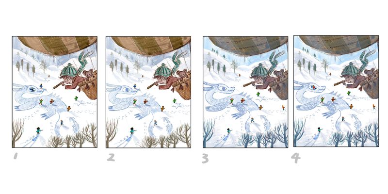
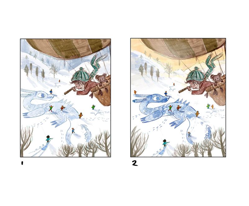
Here are 4 versions, which one do you think works best. (Keywords: adventurous, fun.)
-
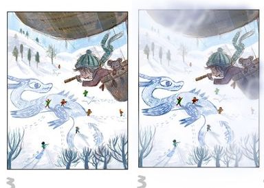
This is just an idea, doesn't mean I'm going in the right direction, and I hope you don't mind that I did a paint over..
I tried to drag attention to the dragon by upping the contrast a bit. Deep snow with harsh lighting can make the tracks pretty dark. Then I added some blue shadows to the balloon and characters in it. Then some clouds passing by, with a gap near the kids face, and where the dragon and center children are.
Great piece, I really love this.
All my links: https://APHOTICMOTH.carrd.co/
-
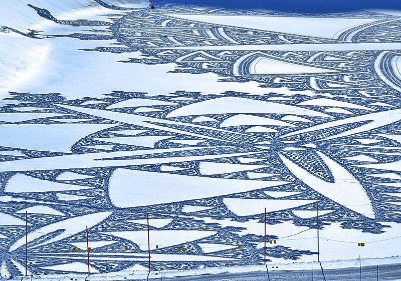
@xin-li What about playing around with the time of day so you can play around with color on the snow? Late afternoon light with purples and golds, the way Will Terry works in color to winter scenes. I think I agree about the eye, although the angel in the snow idea is clever.
-
@CLCanadyArts thank you so much for the reference and the draw-over. I like the direction and I will see how I can incorporate the idea into my piece.
-
@Laurel-Aylesworth I will check Will's lighting tutorial again. I remember there is one with the fox driving through the snowy forest.
I guess I need to take out the snow angle. It was a very fun idea, but it seems it does not work the way I did it.
-
@xin-li color-wise, 1. for composition, the last one. You may want to try a more discrete distribution of kids. Right now all four picture seems a little even-distributed.
-
@Lobalyss thank you for the feedback. I will try the snow angel without the kid in it :-).
-
@idid Good point with how the kids are distributed. I will try to find some rhythm to them
")
-
I keep adjusting the composition here and there, and color as well.
I am close to finish the study and start painting soon. Let me know if there is anything that sticks out.
-
I love the concept and composition!
I would be mindful not to up the contrast of the dragon too much, I think it dissipates the relationship between the fore- and background, causing it to look like the dragon is very close to the balloon. I definitely think the 1st one does not have this effect, so I would personally go with that one. Plus it gives the viewer a chance to investigate the image more, and see the dragon after the children. I hope this makes any sense
*Plus the shadows of the children in the first image show very well that they are standing on their creation and the dragon is a relatively flat surface they stand on. -
I agree with what @nadyart has said, but I do like the yellow sky in the second one and the sunshine hitting the ground! I think it suits the atmosphere of the piece better. I can't wait to see the finished illustration
-
@nadyart thank you so much for the feedback. I will fiddle a bit more with the value for the dragon :-).
@eriberart I went back and forth with the color of the sky. I will paint a bit more on other parts of the image, and get back to it tomorrow.