Nightfall WIP - feedback
-
Hey guys
") this is my first try in doing an illustration for the monthly contest. I usually don't do full illustrations so I'm really weak in composition and value structures. Do you have any advice how to improve that or any other feedback? I would love to hear what you think!
this is my first try in doing an illustration for the monthly contest. I usually don't do full illustrations so I'm really weak in composition and value structures. Do you have any advice how to improve that or any other feedback? I would love to hear what you think!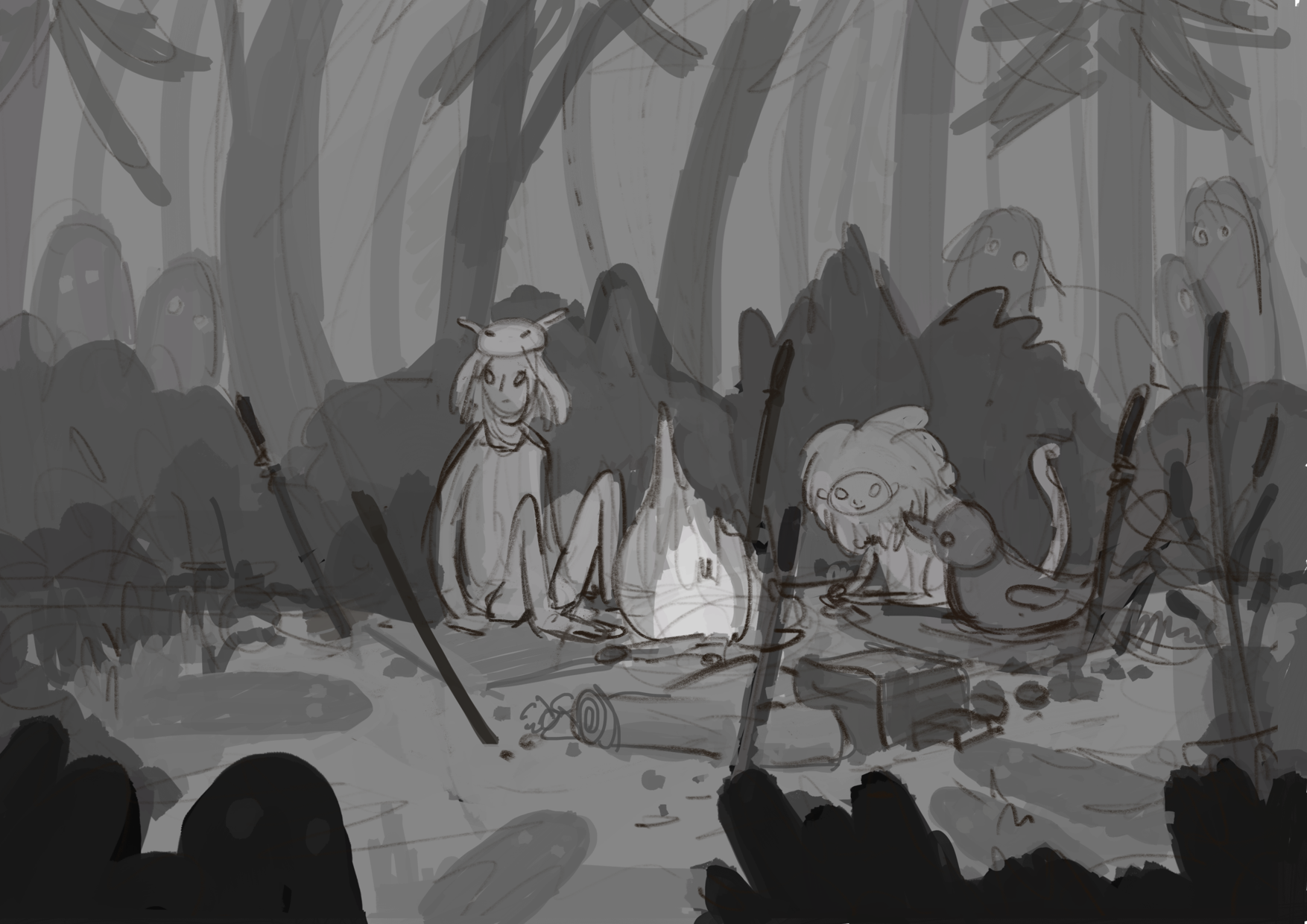
-
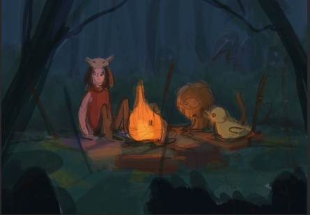
Hi @Juli, the storytelling in this drawing intrigues me! I like that the character with the hat is looking off to the left with a faint frown.
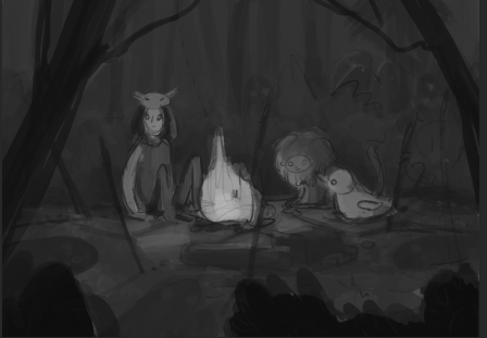
As for the values, are you planning to keep the wooded area in the background light in value? If you are planning to paint the background in dark blues and greens to show nighttime, the values in that area might have to be darker still. The ghosts in the background could remain at their current value, I feel.
Really lovely drawing. I'm excited to see where you take this.
-
I think it looks great so far. The only thing I can think of is to maybe make the dark bushes in the bottom corners a bit taller to fill in that empty space around the characters. Or just crop it a bit. But I like it how it is now, with the people slightly off center.
-
This is a very strong start. If this were my piece I would make a few tweaks to help with the value and composition. I hope you don’t mind I did a quick (very quick!) draw over of your illustration.
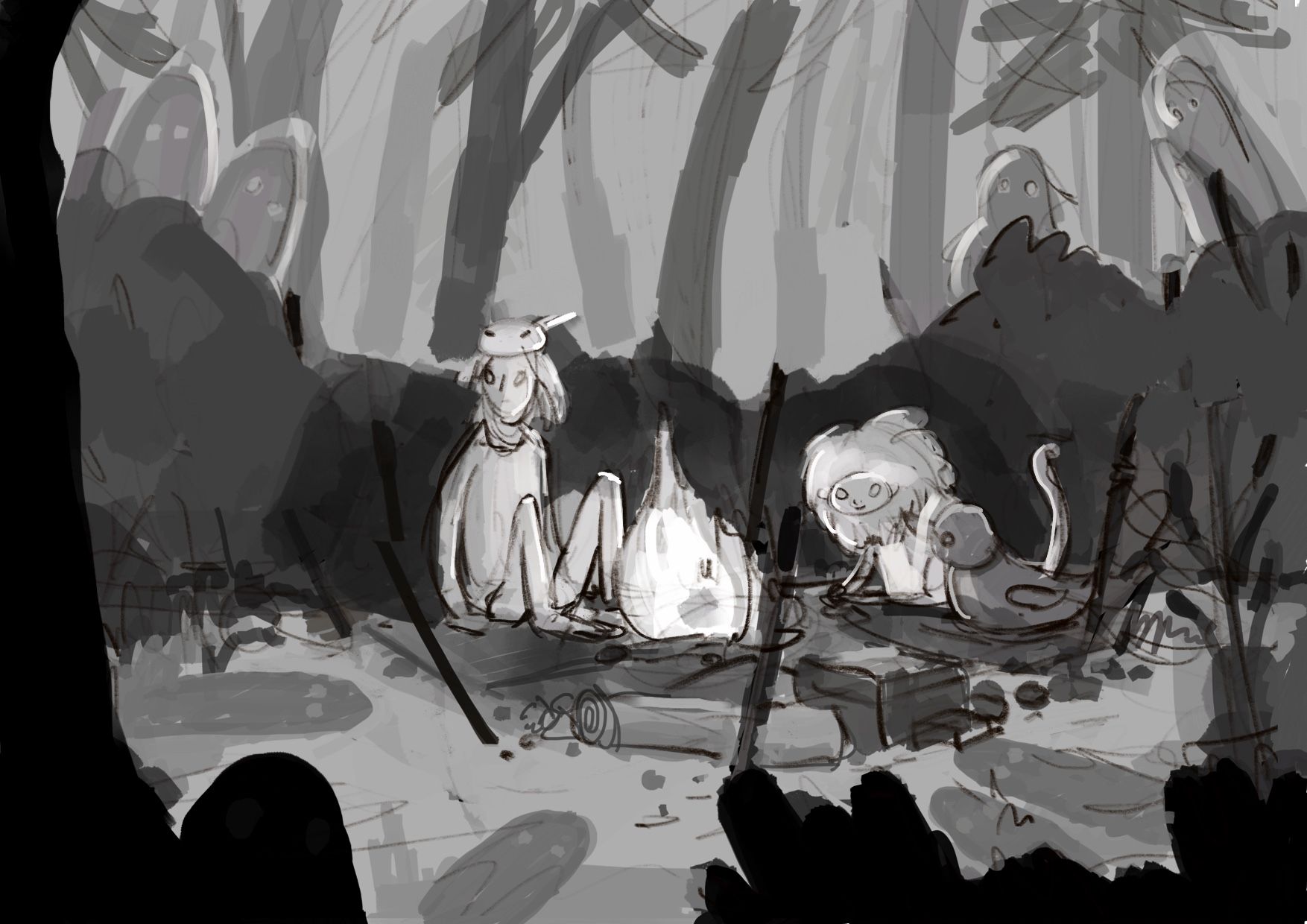
I sloped the bushes to add some variety and draw the eyes toward the main characters. Also added a tree in the foreground on the left side so I didn’t follow the masked character’s gaze off the page. Then pushed the contrast between the bushes and the characters. Also adjusted the overall contrast with curves.
I’m no expert but this is what I would do...I hope this helps. Good luck!
-
so first of all sorry for taking so long for my reply but it's the week of my finals for this semester and I'm pretty busy
@animatosoor yeah I think you're right. I tried to apply your feedback to the color compositions and made the background darker! thank you
@jenithornhill thank you! I think with the trees on the right and left it works way better than before, doesn't it?
@j-sienkowski I love when people draw over my stuff
and the tree is a pretty cool idea. I only made them a bit more diagonal to make the picture more dynamic. Maybe I will let the character look more in the direction where the ghosts are in the final illustration. Thank you! : D
I made these two color compositions. Do you have any feedback on these?
And which one do you like better?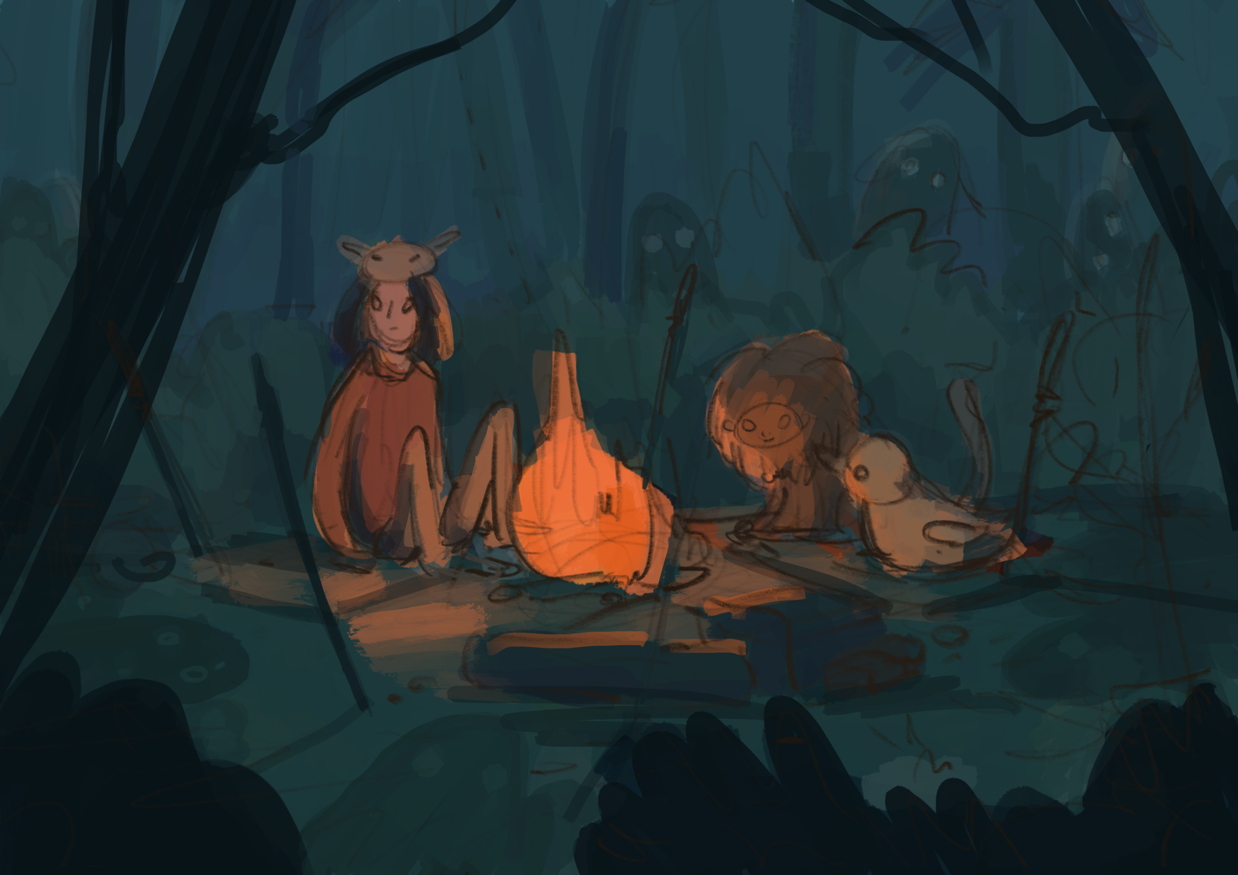
-
New update: I made a mixture between both color compositions by lowering the opacity on the first one. I think I like the mixture of both best
And I included the new value scheme because it changed so much! -
I just wanted to say that I love the colors in all of them!!
-
@LauraA thank you

-
@Juli I like the colours! But I think it's overall a bit too dark now. If you're using Photoshop, I would try doing a quick levels adjustment while you have the black and white filter one just to try and get a little more light in key areas.
Looking forward to seeing how this turns out!
-
The trees on the sides really frame the characters now. I think this is a much better composition.
-
@Juli are the ghosts in the background important? Because if they are they are getting lost in the darkness. I really like warm palette you chose. It is a good composition.
-
@Melanie-Ortins yeah, you might be right : D I will try some color corrections as soon as I think I'm finished
@chrisaakins I think I might try to make their eyes a little brighter as they are now. But my idea was to make them the second read : D I'm really not experienced in composition though.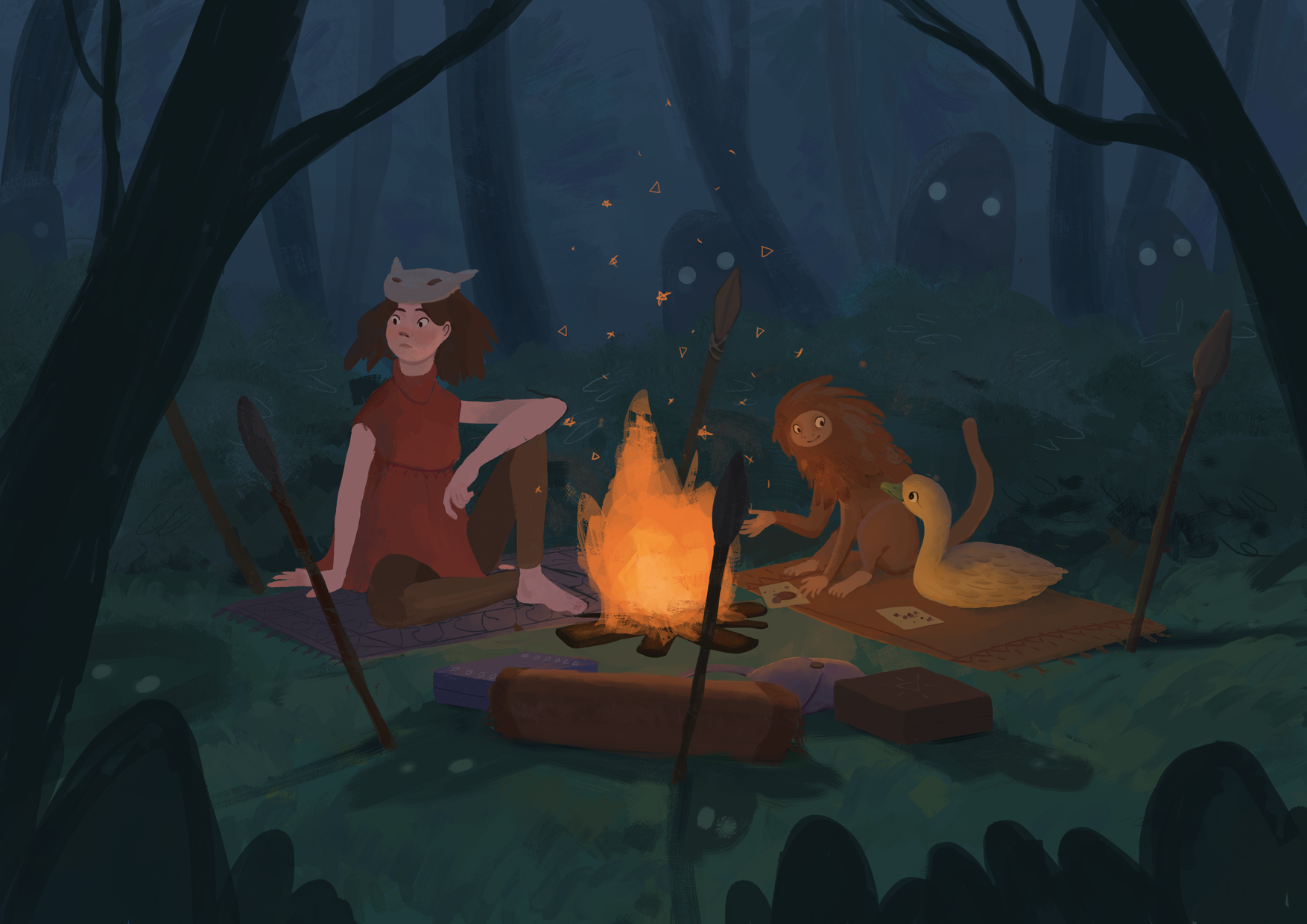
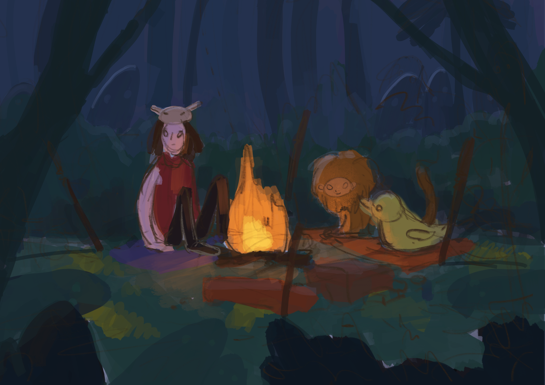
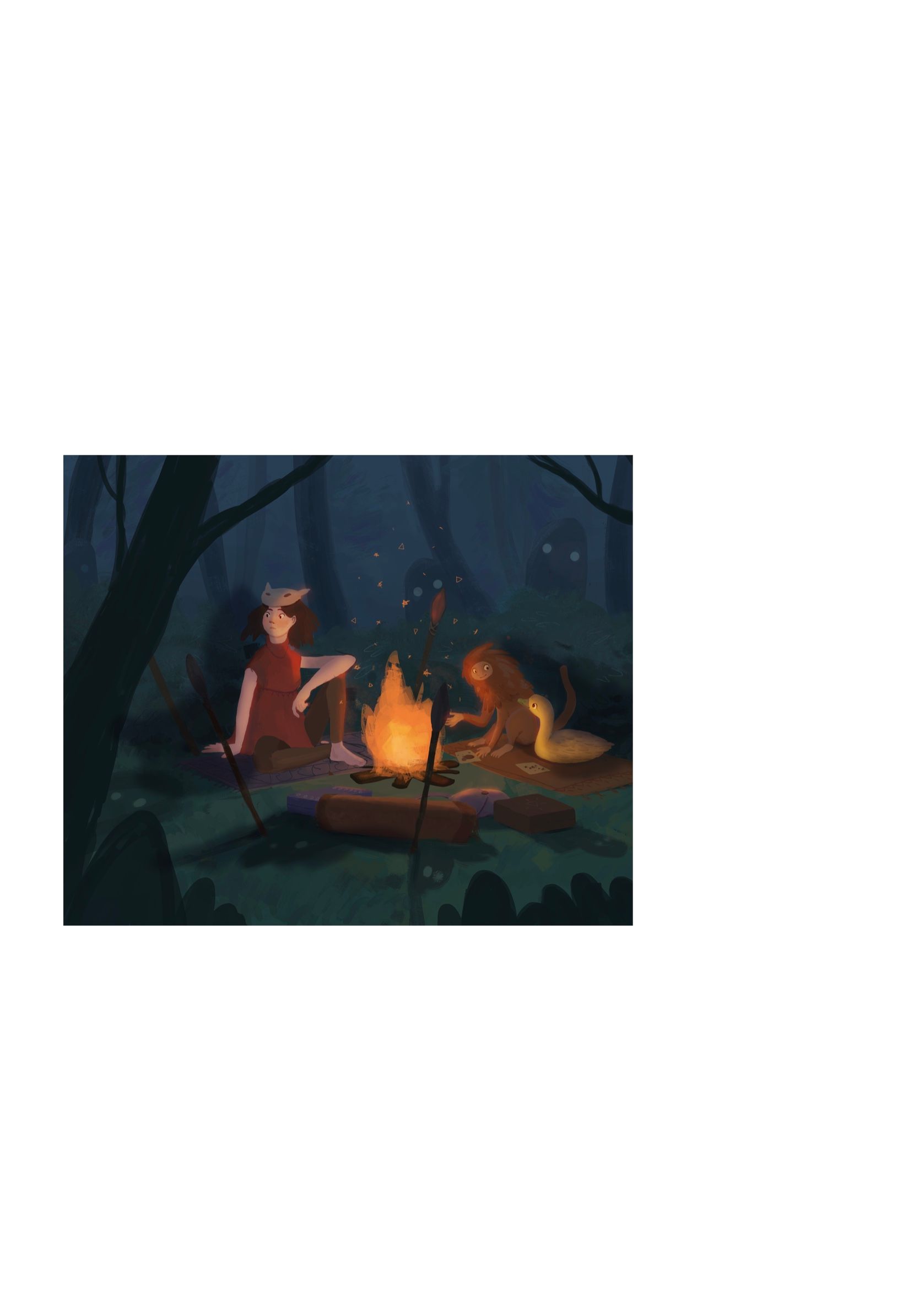
So this is how it looks now. Oh guys I struggled so much but also learned so much painting it : D It is not quite finished yet but I am at a point where I can see the end. Any feedback? Suggestions? Critiques?
-
Looking good. It's a bit dark all over. Where they are close to the fire could be lightened up. The only other thing that stands out to me is the girls left arm that's on the knee. I like her pose but the arm is very long. Nice color palette!
-
This is a really nice picture! One small thing: for me, having the fire in the dead center throws me off a bit...you might experiment with different crops and see if something feels right. For example, this is what it looks like if you crop a bit off the right
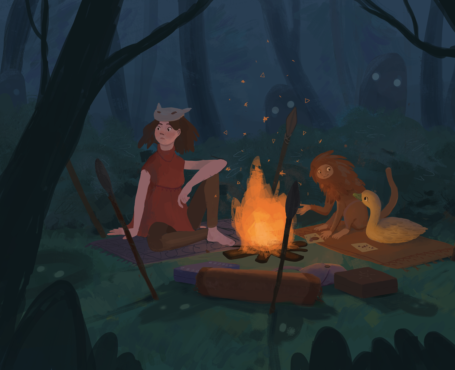
At least to me this makes the composition feel slightly less static? It's probably a matter of taste though...
-
It looks good so far. I agree with cropping it, so the focal point isn't center. Also might make it pop more with increased contrast. Something like this but done better, I think Will Terry has made similar adjustments to illustrations in the past. Just an idea, you might like it better the way you have it.
-
thank you all so much for your feedback
I think it improved the image a lot!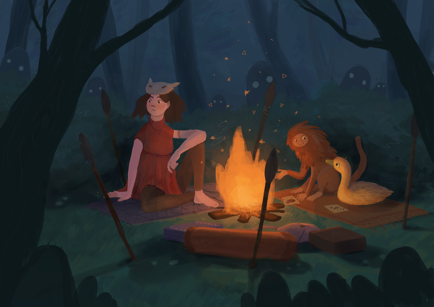
So I think I'm finished now. Maybe I will take a look at it later and change some tiny things but not much

except someone has something that definitely should be changed! : D so thanks again you all -
@Juli Hi! I think you made the suggested changes quite nicely and it definitely helped the piece come along. The only thing I would suggest at this point is to spend a little more time on the finishing touches of highlights on everything around the fire. Obviously you don't want to go overboard but a campfire in the dark can still light up things as close as the characters and the stakes are a little more than you have them. That might add a little more value diversity, too.