February contest WIP
-
@Aleksey
I am so slow on reading this amazing progress and apparently I just wait until you plop it on Instagram without knowing the back story. On that note and clearly after you have already decided I like number *1 and the egg is a cool link to the bird.
")
Instagram: www.instagram.com/heatherboyd.illustration/
Website: https://heatherboydillustration.ca
Shop: https://www.inprnt.com/search/products?q=HeatherBoydIllustration
Ko-Fi: https://ko-fi.com/heatherboydillustrationBe blessed,
-
@Heather-Boyd cool thanks
i am going to play with the poses for sure. I’ve been at work all day and my footsies are killing me. It’s gonna be nice to just sit and draw -
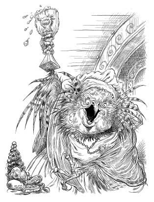
Ooooo! @Aleksey I REALLY like the bird guy! I was wrong earlier. Chris Riddell was the author of the Edge Chronicles but Paul Stewart was the artist. Your bird character really could fit into his world. Here is a pic of his work:
-
@chrisaakins haha this is great i love it. Not the style im going for but definitely like it.... gonna steal some ideas from them..
-
@jenithornhill you can do it differently ways, lines are only there to indicate edge. How you choose to indicate will work either way. The objects in the foreground are all using a solid line so making the bear fuzzy is a nice contrast. You can also mix it up where you use solid line but then make fuzz then back to a solid line. Lines are fun to play with. Try it out see how it looks. I’d be more concerned about the overall image because you will be using masses and colors so the lines wont stand out as much as you think. I use a lot of line but I mix it up all the time.
instagram and twitter: @artofaleksey
alekseyillustration.com -
@Aleksey Thanks. Sorry I posted this in the wrong place. I am still new to this.
-
@jenithornhill oh i dont mind. I hope my feedback was helpful
i figured you are new to forums probably, no harm done -
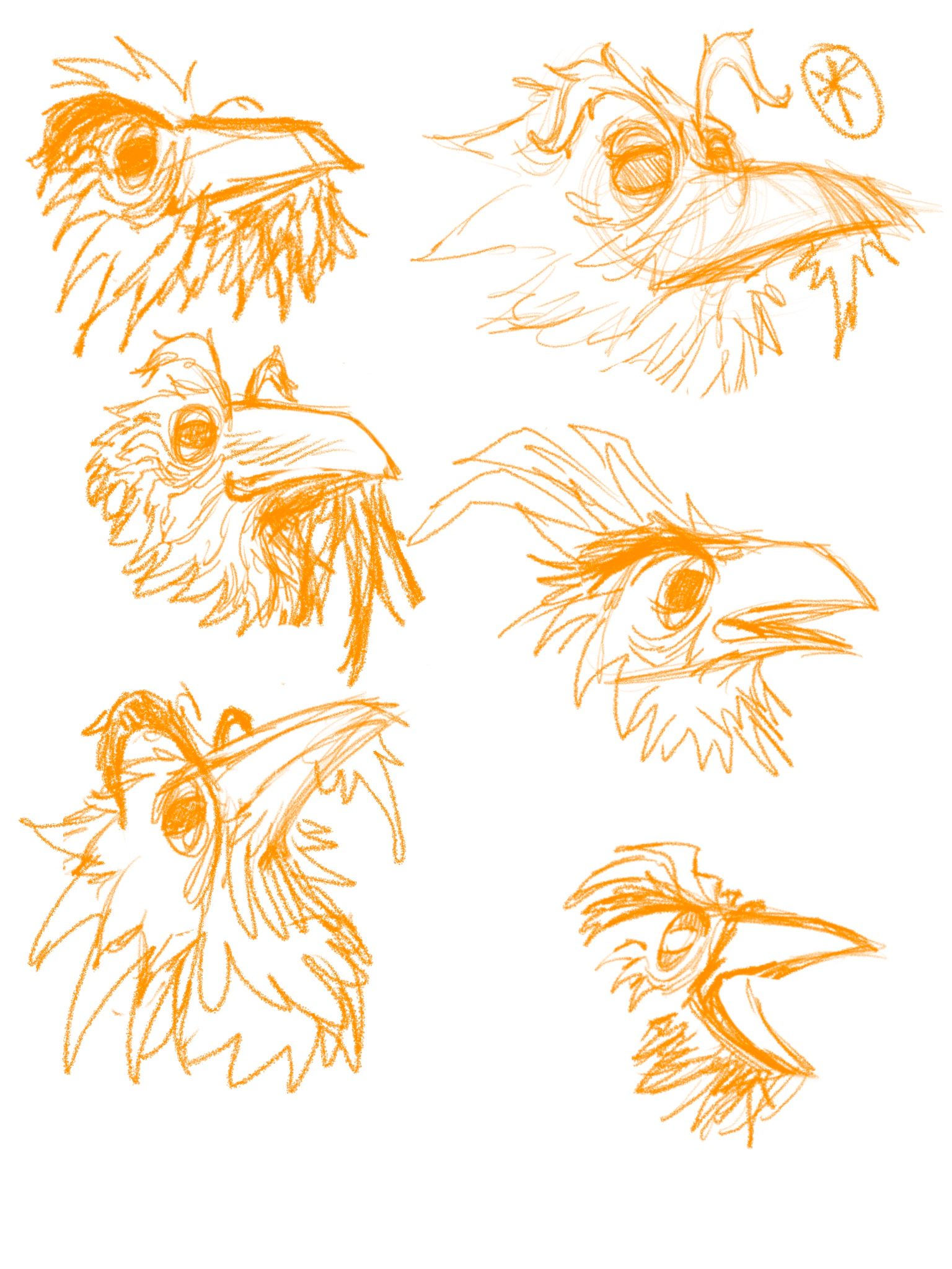
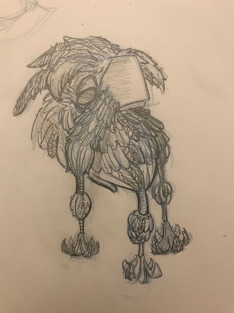
Some preliminary rough sketches. I wanted to do an old owl but lots of owls so i did a crow
-
I wanna give them a beard of bird feathers
instagram and twitter: @artofaleksey
alekseyillustration.com -
@Aleksey said in February contest WIP:
beard of bird feathers
Genius idea, this is gonna look great!
Nicola Schofield
Twitter: twitter.com/NSchofieldArt
Instagram: instagram.com/NicolaSchofieldArt/ -
@neschof haha thanks
Here are some other variations i did while on the bus i like the square shaped beak it looks old but confident
-
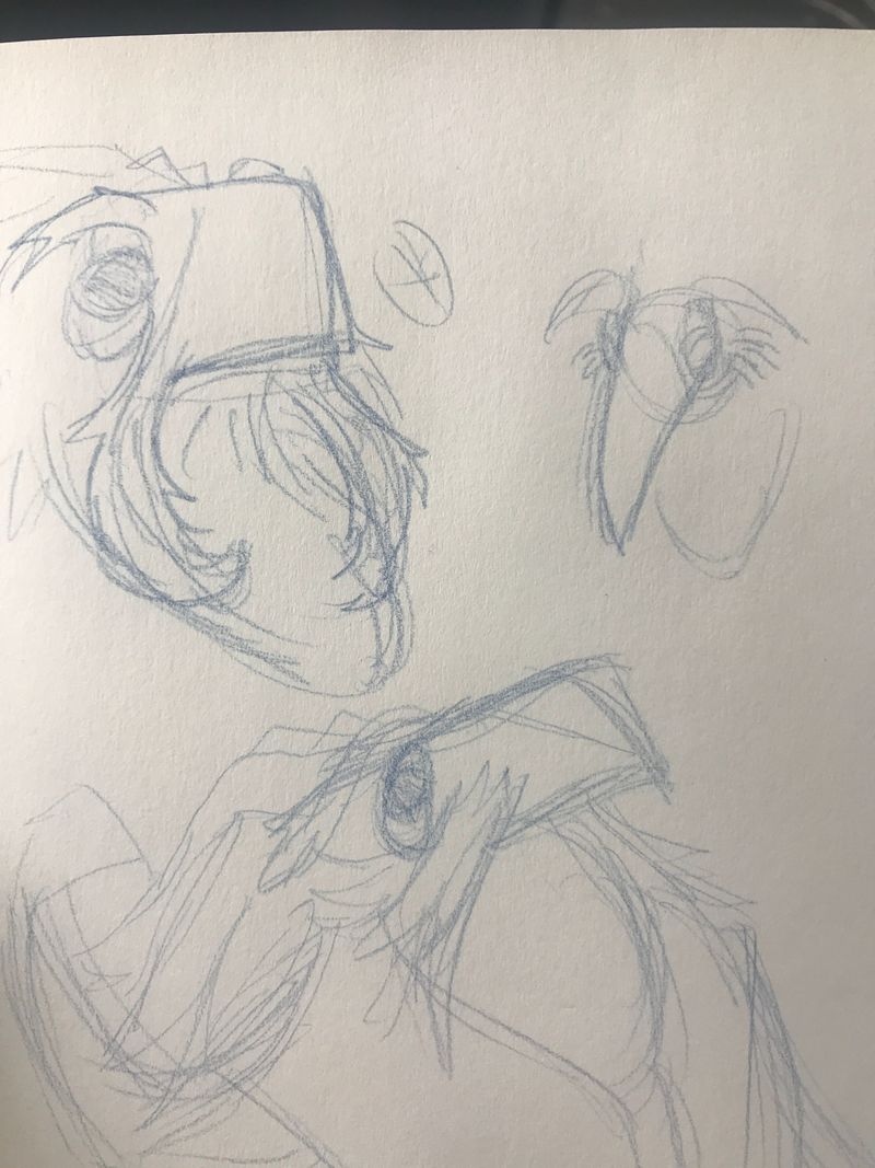
Ya know, sketching on paper makes it much easier for me to play with ideas
-
@Aleksey I was right the first time. Riddell was the illustrator. I should trust myself.
-
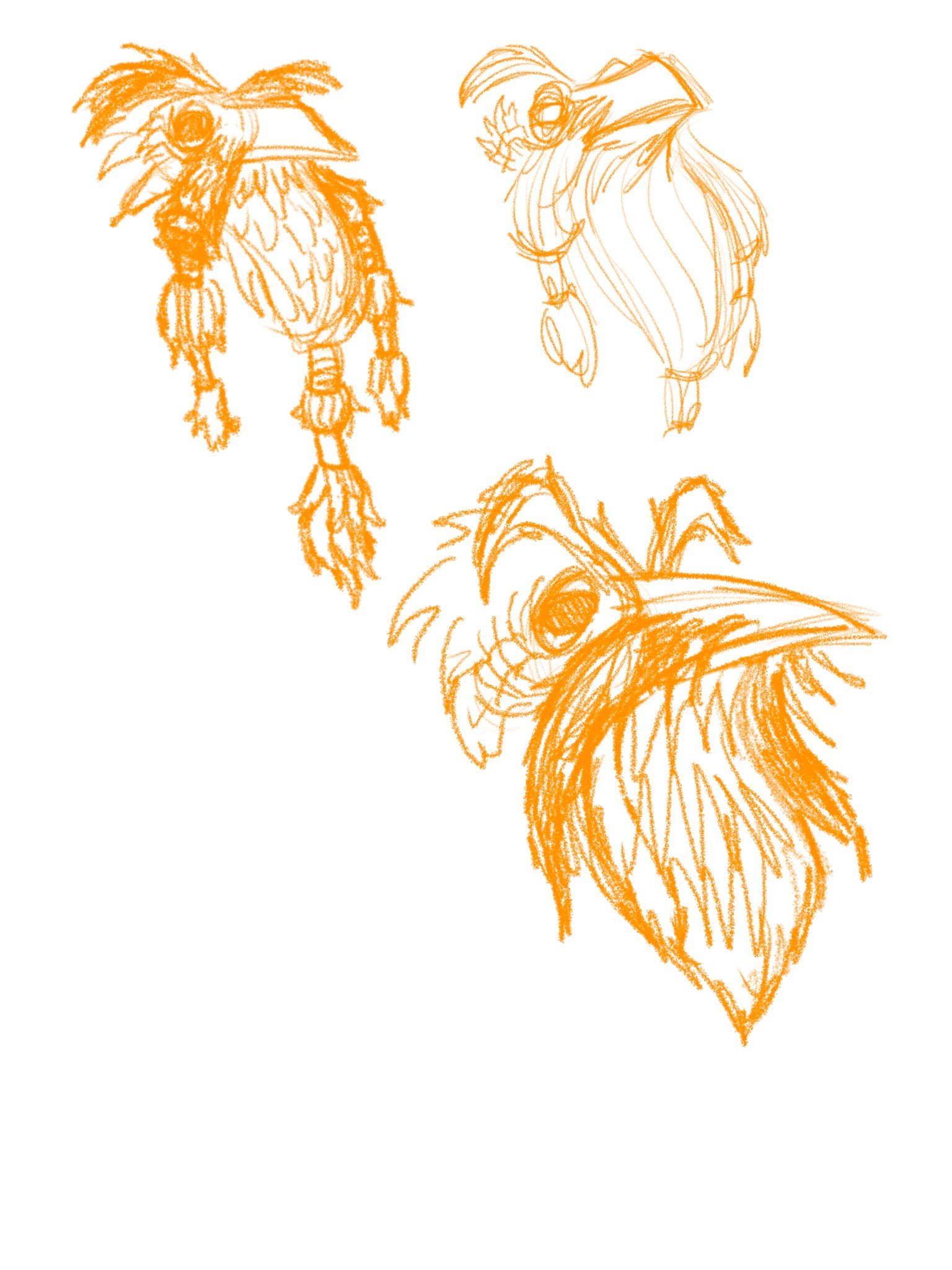
Ok i think i figured it out after several attempts
-
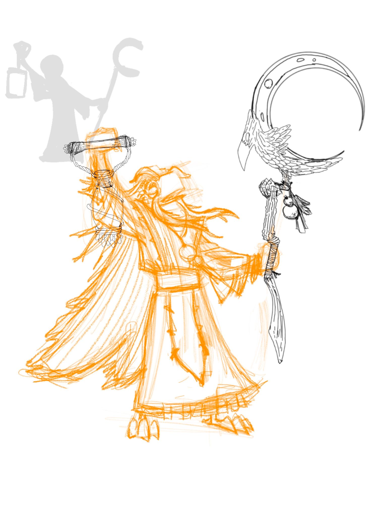
Making progress. Kinda turned out to just look like a bird wizard. You know im ok with this. Any feedback so far?
instagram and twitter: @artofaleksey
alekseyillustration.com -
@Aleksey Love seeing your process. It’s turning out great.
Laurie DeMott
instagram.com/demotlj -
@demotlj thanks! Any feedback? I think im gonna try and simplify it more.
-
Cool prop design and it‘s great to see all the thought that went into this illustration! One thing you may want to change here is separating the lantern more from the character - like you have in your original thumbnails. It‘s generally stronger to have the silhouette read clearly and the overlap between the arm and the lantern would „hide“ all the shape design you made for this prop.
I would also check the perspective of the lantern - from this angle you would see it from a lower viewpoint. At the moment it‘s seen from above (we can see the top ellipse), which makes it look like it‘s angling in a strange way.
Your character is slightly out-of-balance (falling backwards), but that‘s an easy thing to fix. -
@smceccarelli cool thanks! That’s very helpful i was thinking about the silhouette too. I think i need to reposition the arm to make it work better. Im gonna try to change the perspective entirely too i didnt do the smart thing and make a perspective grid before i started the sketch
-
@Aleksey I love the character. I think you should give him a bigger dynamic pose. He seems a formidable character but looks a bit stiff. Maybe widen his stance,
 try a gesture sketch to see what works.