Brutal honesty and love requested...
-
First I'd like to say, that with 74 entries, there were many other good pieces besides the 16 selected that were very, very good! I've only been doing this since November myself, I feel like if I improve each month, by my standards that's all I can ask of myself. The work done here gives me so much inspiration. Yes, the bar is set high, but that gives us newbees something to aim for. I may never make the top 16, but I am having so much fun and learning so much! This month I went through all the pieces and looked at them closely. I had my favorites picked, so it was interesting to see how it compared with what they picked. It's also a reality check for your own piece. I hope that helps!
-
Im always worried my criticism would come off mean in some way And that people on the forums already think im a weirdo but that might be my insecurity talking. But here are some things I’ve noticed in terms of your work and this piece. I hope you know you’re great and i love you dearly.
-
I notice you submit your piece sometimes in a very short time, I think you should take more time playing with compositions and placement of things before you start the final drawing and rendering. Like i know it’s February but you submitted it yesterday and its not even half the month yet. Take advantage of the time, play with the piece, the camera angles, the feeling you’re trying to go for (is the kid scared? Is he curious? Etc)
-
The composition, i know it’s a window and you want to show the monster falling in the window so some stuff you can play with is the point of view (do you need to show the the scene from the inside? Why not from the outside?). Does the kid need to be turning his head like that? Why can’t his body be facing the window a bit more and him holding the candle? Also consider giving your piece a bit more breathing room. It’s very cramped, The “ kid” also includes the bed and the pillow and everything hes interacting with So he takes up a lot of space while the monster is super tiny in comparison. You can even make the window larger and dont have to use a square cropping.
-
Sometimes it feels like you take shortcuts and it comes off as if you are trying to hide the fact you cant draw something. Not saying you cant but it comes off that way. Like for example look how the back arm looks like it’s being cut off and sunk down into the pillow. Also the way the torso and body is angled is a little weird to me. Try that pose on your bed using a camera or a mirror. I do that and it reallyy helps.
-
Color. Im not the best at color but ill try my best with this one. It’s clear you love to paint and you’re very good at painting. However you use extreme darks and extreme lights. Like the walls are almost black and so is the night sky outside it. You can use darks but maybe not that dark. The shirt is clearly white but the candle is the brightest light source and needs to be a lighter value than the shirt.
Dont feel like you need to do all or any of these but definitely suggest taking more time and playing with ideas and composition more.
-
-
@chrisaakins you do provide a lot of feedback and comments. I see your name on posts all the time. I appreciate it too! I'm new here, but I'm trying to do that too. My feedback may not be as helpful because I'm not as knowledgable yet, but I do my best to encourage people and let them know when I really like what they've done. We are all here to learn. Some of us are already working in this field, but you have all been so welcoming. I hope it stays that way. Perhaps if someone is thinking that they are giving more than they're getting it's time to move on.
-
@chrisaakins For some reason, some pieces or even some people's entire body is work is sometimes harder to critique than others. Usually I check out posts and if I can immediately identify an area that can be improved, something I'm able to articulate well and that I know would help the piece tremendously, then I immediately comment. And then other pieces, I look at them for a couple minutes and I can't come up with something specific, clear or helpful to say, so I just leave because taking the time to try and figure it out for myself, and then trying to explain it clearly, would be a 30+ minutes job and I have to get on with my day.
Your work falls solidly in that category almost all the time. It's not beginner enough that I know exactly where to point you at to improve dramatically, but it's not pro enough that the one little detail that doesn't work can easily be pointed out. It's a compilation of many different things which you're not doing terribly wrong, and not very well either. Right now you're falling a little bit into uncanny valley territory, where you have acquired a solid set of skills, but it's still not quite polished enough to pull it off. The fact you have a more realistic style doesn't help you, as this would pass more easily if it was more stylized. The boy's face is realistic but not done quite well enough; the mouth is in a slightly wrong position, the eyebrows look carved into the head, and his design is bland. All around the room there are little things which by themselves aren't deal breakers, but put together create an underwhelming whole. The hand is too big. There's no clear focus in the picture, The colors are kind of dull and the shadows grayish, despite the candle lighting which should be an opportunity for warm lighting. The curtains look rock solid instead of real cloth. There's the same amount of detailing everywhere no matter which level in the picture it is, front or back. The monster looks pasted on and remarkably stiff for a character in a falling/action pose. It might look like I'm piling on, but those are all small things when taken individually.
Apart from that, the illustration lacks a certain charm, a sparkle that makes it special. A warm glow from a candle lit scene could have given you this magic touch. Maybe the monster could have been just a silhouette, backlit by the moon. There just lacks a little something to make it special. I notice a lot of your work has that issue, and that's something hard to point out or explain, or teach. I think you're focused on making a good image, not a great image. You're doing the best you can, but at the idea/planning stage are you taking time to figure out what will make this illustration special? I have ideas for new illustrations everyday, but if I don't know what will be special about it, then it never goes past the idea stage.
I don't think you should interpret a lack of comments or critiques as "you suck". Rather, your work is at that stage where it's really hard to critique...
vanessastoilova.com
instagram.com/vanessa.stoilova/Check out my Youtube channel for tips on how to start your career in illustration! www.youtube.com/c/ArtBusinesswithNess
-
@chrisaakins said in Brutal honesty and love requested...:
I really do try to give good feedback to others as much as possible. I don't want to be a taker and not a giver. It seems that some posts get more than others, so I especially try to give feedback to newcomers and those with less feedback. I was really thinking that my pieces were in the "that's nice" category but not turning anyone's head. I wanted to know how to fix that.
I hope you don't think I was calling you out specifically @chrisaakins , (I haven't been thorough in reading through the forums lately, so I'm not as up-to-date on who the regulars currently are) and I'm not judging anyone who doesn't give much feedback to others. I just assume it does play a factor, so I threw it out as a possible reason.
Website: www.tessawrathall.com
Instagram: www.instagram.com/tessawrathall_art/
-
@Aleksey
Thank you for not holding back. I am in agreement with you on much of what you say. I do tend to work too fast and part of that stems from the fact I get possessed by an idea and want to go with it. I am also impatient with my skill level in illustration. I am much more comfortable with fine arts and inking. I really should take my time (although I confess that is hard sometimes with life and grad school). I do need to play around with composition more. I think sometimes what works in a fine arts piece does not work in illustration as well.(Believe it or not, I did use a photo reference for the pose, but I guess I did not draw it as well as I should have. I confess, I did not use a reference for the face. As far as his age, I was aiming for gangly middle schooler, not younger, but I guess he needs more work. )
@NessIllustration I always appreciate your time and thoughtful responses. I am an art teacher and I do know what you are talking about. I look at some kid's work and it's good, its just not great. And there are lots of minor things that could use tweaking. Hmmm. So death from a thousand cuts, huh? ouch. You have given me much to think about and work on. From what I can sum up I guess my biggest challenge is finding the right balance between realism and stylization. I either need to go full-on realism or a bit more stylized? Now that I think about it, my Penny piece was more stylized than this current piece and Lee really liked it. Thank you for taking the time to critique my work.
@deborah-Haagenson thank you for your words of encouragement. Thank you @Kaela-McCoy @Kali and @Coley for your positive input as well as your pointers.
I think I will pull this piece and either scrap it or rework it. I really want to convey a kid who heard the monster falling off the roof and wondering what the heck is going on, but maybe my focus should be on the monster and less the kid.
-
@TessaW Your comment is very fair in light of what you just said and I'm sure your right. I might have been a little snarky in my last post. I'm sorry about that!
-
I think @NessIllustration is really on to something here. I do find I have a harder time pinpointing what might be helpful to you. Sometimes I will see a few things that could be improved upon in your piece, but then I think that there are a bunch of small things that really don't address the bigger issues. . .which I can't quite pinpoint.
I also sometimes question how much critiques on individual pieces actually help with someone on your level. I think a lot of improvement will come from just making a lot of pieces and brushing up an skills behind the scenes. I think larger portfolio critiques are more helpful for artists at your stage. Just a thought. I could be wrong.
-
@TessaW I hoped you weren't.
") I thank you for taking the time to help me out with my art crisis.
I thank you for taking the time to help me out with my art crisis.@Laurel-Aylesworth Thanks for the words of affirmation. Painting digitally is new to me and I shouldn't expect an immediate transfer of my traditional skills into digital (not that I am a master there either, but am certainly better with them than digital) I feel like I am one of my students who looks at the master's work and then can't see the improvement in theirs.
-
@chrisaakins I relooked at your piece. I haven't read all the comments, so if this info is a repeat, I apologize. First, I think the guys eyes should have a more surprised look. Second, I think the guy should be moved from the center and turned a little bit, so he can see the monster - I'm not sure he would hear him falling through the air. I really like the candle and the bedding. I come from a traditional background too, so I get the struggle of transitioning to digital.
-
@deborah-Haagenson said in Brutal honesty and love requested...:
@TessaW Your comment is very fair in light of what you just said and I'm sure your right. I might have been a little snarky in my last post. I'm sorry about that!
Ok, whew. :smiling_face_with_open_mouth_cold_sweat: I saw your comment, and was wondering if you were addressing me or not. I wasn't sure! SVS and this forum have given me so much and continues to and I definitely don't feel as if I'm giving much of anything. I looked back at my comment, and can see how it seems accusatory. I am very socially awkward and can be insensitive without meaning to.
-
@chrisaakins Yes the "death of a thousand cuts" is particularly hard to critique. When there's just one or 2 things to point out, I write them down and I'm on my way in 5 minutes. On this pieces though (and others like it), I could pick 2 things to point out (for instance the hand too big and the mouth not quite in the right spot) and leave, but I wouldn't feel like I actually helped you any. You could fix those 2 things but you'd still have other issues in the picture. But if I point out every single thing, not only is it going to take me a very long time, but it's going to feel like I'm piling on you. I don't want to seem that harsh to you and possibly hurt your feelings. And as @TessaW has mentioned, a lot of time people at your level are served best by just continuing to practice, continuing to use reference and they will improve over time naturally. So when I encounter a piece that fits all those criterias, I stumble about for a couple minutes not knowing what to say and end up leaving... I'm very sorry if this made you feel like your art was awful, that's certainly not the case! I find that beginners or pros are easiest to critique, and in the middle it gets really hard to do!
vanessastoilova.com
instagram.com/vanessa.stoilova/Check out my Youtube channel for tips on how to start your career in illustration! www.youtube.com/c/ArtBusinesswithNess
-
@NessIllustration thanks! It really does help. I also need to figure out what I want. Do I want a painterly style or pen and ink style. I am still exploring and I was happy I was able to paint digitally. I need to keep at it, though. Pros like yourself are a big help, and we appreciate your input.
-
@chrisaakins , kudos to you for asking people to give honest feedback. I think many, many of us are just afraid to hurt feelings or (like me) feel totally unqualified to give any feedback. So, here's my totally unqualified thoughts
I really like how you handled the folds in the fabric, and the candle looks great. I feel that the angle of the boys head and body look "off", though. If he were laying in bed on his stomach, his neck wouldn't be so long, and he wouldn't be able to turn his head around so far. I can see the shape of his behind under the blanket, but not his back or shoulders, which makes it appear that he's coming up out of the mattress. I'd expect his left shoulder to be "up" and sort of blocking the view of his neck. Maybe his right arm showing, although maybe you intended it to be under the pillow.
Please take a look at this photo, and maybe it will help to explain a little better what I mean
https://www.gettyimages.in/detail/photo/young-woman-lying-on-grass-looking-over-shoulder-royalty-free-image/200146572-001I think the monster is adorable, though! He certainly looks as surprised to be falling as the boy looks to see him! And you've done a good job on the fabric of the curtains, too.
I hope that is at least slightly helpful
-
Hi Chris. Just want to throw in a word of encouragement.
I read through all the comments and feel like others have already shared what I would have said - I actually planned to post a comment in response to your original critique thread, but found it hard to pick out what to mention and found myself saying, “maybe later!” I think your work has been improving a lot over the months, and it’s been an honor to vicariously share in that journey with you. Please continue to share it here, if you feel so inspired to, because it’s very valuable to see your work.I’m also new to digital, and I’m finding it very difficult to find a style I like while using it. We’re in the same boat.
Just keep sailing.
-
I’m so sorry - I was one of those who viewed your post, but didn’t respond. In all honesty, I just feel completely unqualified to offer any helpful critiques, being so new to illustration myself (and new to the forums). But I know how terrible it feels to put your work out there and get little response. I’m definitely going to make more of an effort to stop lurking and start interacting.
-
You're so right. We need to be there for each other. I'm going to make more of an effort to respond to critique requests. Just not this one
 .
.
After reading everyones responses, everything that I thought for this piece has been said.
It's so easy to just hit the like button and move on because I think I don't have the time to put in the effort needed to give a good critique. But I have been in your position and every little comment helps. I'm glad you posted this. Be prepared, I will ream you...I mean give you constructive criticism next time.
Get well. -
I saw your finished piece in the finished challenge entry thread then right after I saw your WIP post...I would have commented but seeing as you had already submitted I chose not to. I would have said what most have said thus far in this post. Sorry you have the flu. I had it last week, no fun. Hope you feel well soon.
-
Chris, I understand. I left the critiques last night thinking, "These are all really good pieces, but I have no idea where mine fits into the mix and what I could have done better." Maybe it's the people in the middle, the ones who are the hardest to critique, who need it the most!
And yes, while participating in the forums I have been both on the "Something is off with x's submission, I don't know what it is exactly and the morning is escaping me, so I'll pass," side as well as the, "Hey, I want some feedback before moving on and I'm not getting any!" side. Being in Europe where most of you are asleep when I start working probably doesn't help. I do try to give feedback whenever something clear occurs to me. I have spent so much time writing on the forums lately largely because I badly need community and critique, but it's cutting into my work. I hope to participate in the next round of SVS portfolio reviews. It looks like that might help you as well.
I didn't even think of all the things some of the other people replied to you, but when I read their comments, I thought, "Hmm, that's true!" As a former oil portraitist, I think part of the problem is indeed that you are trying to pull off a realistic style and so that absorbs a lot of the energy that could be put into the more big picture, design aspects of illustration.
So, here goes:
First of all, you are in Atlanta? If you are committed to a realistic style, have you ever thought of going to a Portrait Society of Atlanta meeting or taking a class from one of their senior members? I learned a whole lot from them when I lived there years ago! I don't know if Marc Chatov still teaches (I would imagine so) but he taught me a ton about color. And there are plenty of other good teachers, too. It was a great community when I was there. (Don't laugh. I'm so old! It was back in the 90s!)
Here's what strikes me: Your boy has a bit of what Will calls "old man syndrome." That happens when the face isn't simplified enough or when the expression calls for some facial distortion, but in our attempts to emphasize it, it ages the character.
The pose makes him look uncomfortable in a stiff way. Of course he's scared, but he looks more rigid. I see why he might be turning back because he hears something, but the 180 degree angle makes it hard to pull off. Maybe he shouldn't have to do a complete about face? The body is still a bit too flat on the bed despite your attempts to give it volume. And yes, the hand is large. I think a solution for this particular problem would be photographing the pose or getting great reference while also studying figure drawing.
Technique-wise, oil is hard to pull off digitally. You might try some of the Kyle oil brushes with temp layers (any more than a few strokes tend to go to mush, so they require a lot of layers that you flatten later, and therefore I have been avoiding them lately). They are hard to handle skillfully, but if you think about each shape, you can achieve a less airbrushed look. The main thing, though, if you want to go this route, is to study traditional oil painting from life.
If you want to either redo this piece, or do another one for another occasion, in such a way as to concentrate more on concept, character design, composition, lighting and color, you might try simplifying your process (cut down on detail) at least temporarily. I share your interest in painting relatively realistically, but as you see, a lot of the chosen pieces are quite elegantly simple and focus on concept and design. (I'm making that note to myself as well.)
And no, the flu doesn't help! But you are not coming off as a whiner. It's a serious question and you are wanting serious answers. That's courageous.
-
@chrisaakins I feel the same way as @NessIllustration. I have seen your WIP for this piece. But I have a hard time giving critique.
I feel like it is hard for me to critique a more realistic style because I have a hard time painting realistically (I plan to do more studies on that). I always believe in what Lee says "do not let your weakness dictate your style". So I admire that you are so dedicated working on this quite realistic style.What I noticed now by re-visiting your WIP thread is the process you paint. It seems that you paint one object at time in the process. I find it much easier to tackle a painting when you paint the entire image at the same time. Here is an example (I took this example from Lee's painting class, I hope he would not mind me sharing it here) to show how to approach a painting.
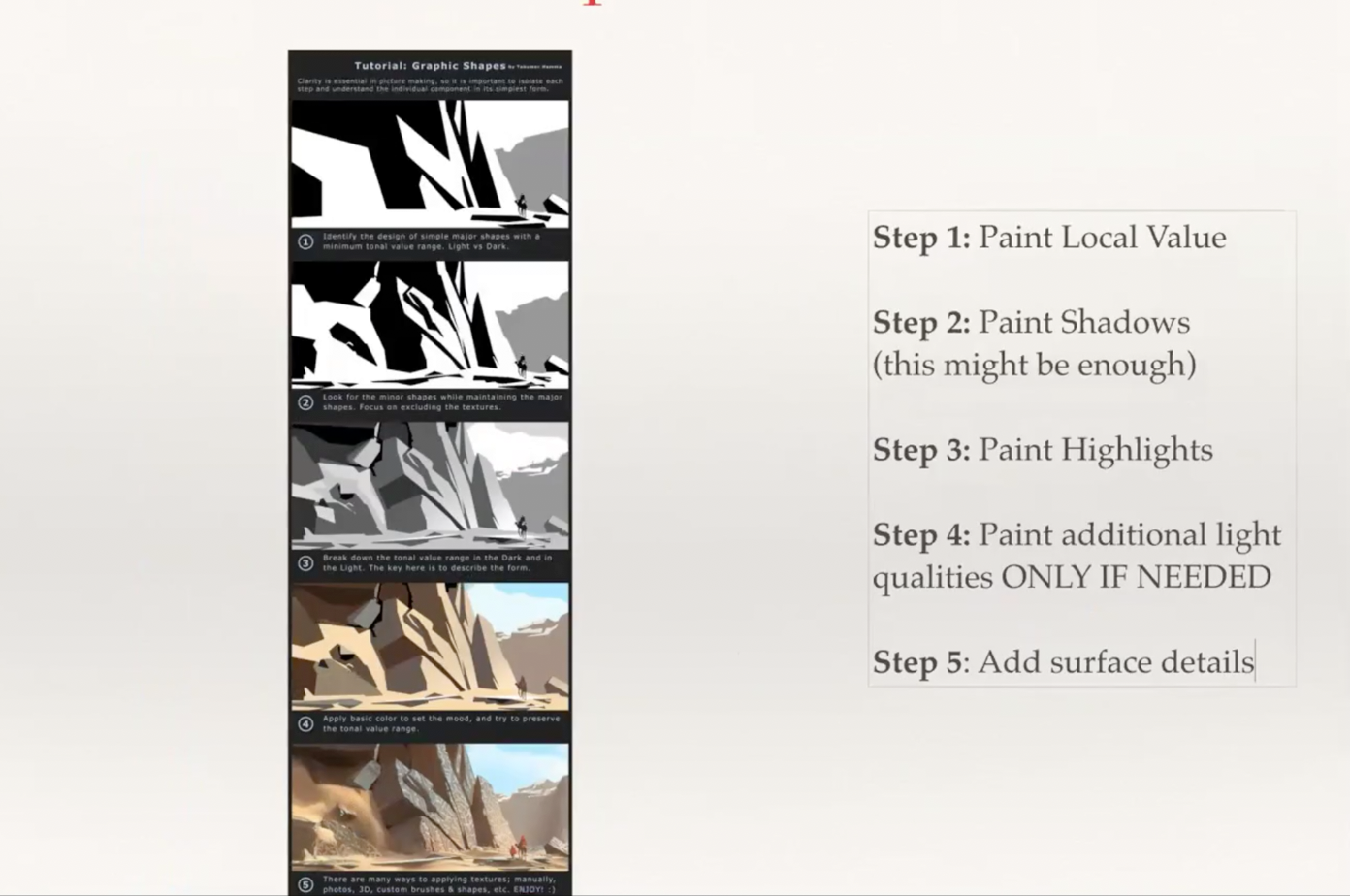
You might want to give this approach a try to see it helps you to keep the painting more coherent in terms of value and color.Hope this makes sense. As @Laurel-Aylesworth said, I will also try to make an effort to comment when others ask. We are all in this art journey together.