Thoughts/critique/ advice needed on typography for this illustration 🤔
-
Thank you guys so much for your help! I've updated it one last time after the latest feedback and will choose from the iterations I've done with your help. If anyone wants to weigh in still, I'm all ears. It's nice to feel like I'm getting close to a final design.
 You guys are the best.
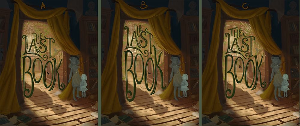
Website: www.tessawrathall.com
Instagram: www.instagram.com/tessawrathall_art/
-
@TessaW I definately love the C version!you ve come a long way from the first post. I d definately try and make something with the shadow of the letters to see if I earn something from it.
I tried something,hopefully it ll bring some value!!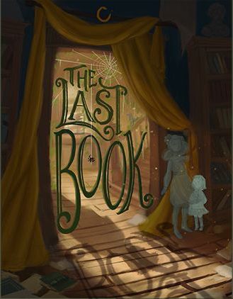
Waiting to see the finished piece!!
Instagram : https://www.instagram.com/g.chris.artwork/
Deviantart : https://www.deviantart.com/g-chris -
@Georgios-Christopoulos i think the text’s shadow is making the image a bit too busy. It also kinda obscures the boy’s shadow.
Portfolio: nyrrylcadiz.com
Instagram: https://www.instagram.com/nyrryl_cadiz/
YouTube: https://www.youtube.com/channel/UCbJCF1Im8ZO7hpGWTKOJMuA -
@TessaW i also like the third one. The word “The” fits snugly with “last”.
-
@Nyrryl-Cadiz yeah I think you re right. Who knows
")
-
Oh wow, I love all three of these thumbnails! If I had to pick, I think I'd also throw my hat into the ring with @Georgios-Christopoulos and @Nyrryl-Cadiz on thumbnail C. This piece really came together; I would be severely tempted to thumb through this book if I came across it in a bookstore, so: mission accomplished!

-
@TessaW I also vote C, the typography fits nicely together there. The eye is also drawn around the image with the spiderweb, character, and shadow on the floor. This is really good!