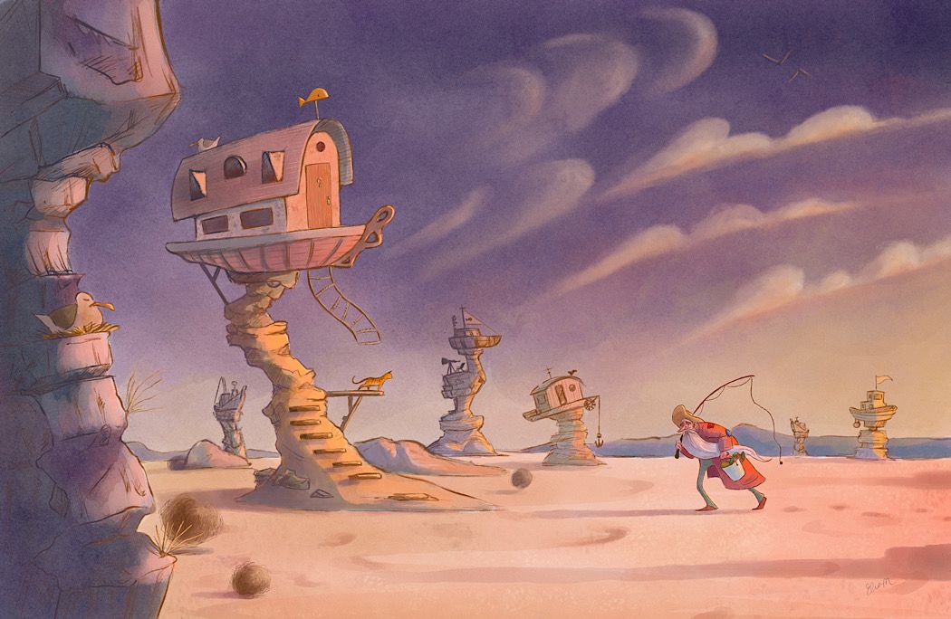
Society of Visual Storytelling

    SVSLearn Forums

    • Register
    • Login
    • Search
    • Recent
    • Tags
    • Popular
    • Users
    • Groups
    • Search

    May: Adrift at Sea

    Artwork
    11
    45
    2066
    Loading More Posts
    • Oldest to Newest
    • Newest to Oldest
    • Most Votes
    Reply
    • Reply as topic
    Log in to reply
    This topic has been deleted. Only users with topic management privileges can see it.
    • EliaMurrayArt
      EliaMurrayArt @DaveLeekArt last edited by

      @Bricz-Art thanks!!

      Instagram: https://www.instagram.com/eliamurrayart/
      Portfolio: www.eliamurray.com

      1 Reply Last reply Reply Quote 0
      • baileyvidler
        baileyvidler last edited by

        @EliaMurrayArt This is SO good! I feel like the sand adds so much to the story. Happy accidents! Can I ask how you got that wonderful texture in the sky?

        Bailey Vidler
        Portfolio: baileyvidler.com

        EliaMurrayArt 1 Reply Last reply Reply Quote 0
        • EliaMurrayArt
          EliaMurrayArt @baileyvidler last edited by

          @baileymvidler that is a watercolor brush in procreate. My favorite to use because it functions much like actual watercolor. It’s from the Max pack by Max Ulichney.

          But you can also use photo/scan of watercolor paper and set it to overlay or multiply for a similar effect.

          Instagram: https://www.instagram.com/eliamurrayart/
          Portfolio: www.eliamurray.com

          Jeremy Ross 1 Reply Last reply Reply Quote 1
          • EliaMurrayArt
            EliaMurrayArt last edited by EliaMurrayArt

            @Neha-Rawat once I moved the ladder it totally felt more alive!! It also made me want to add tumbleweeds. Thank you for unlocking a little brain block for me!

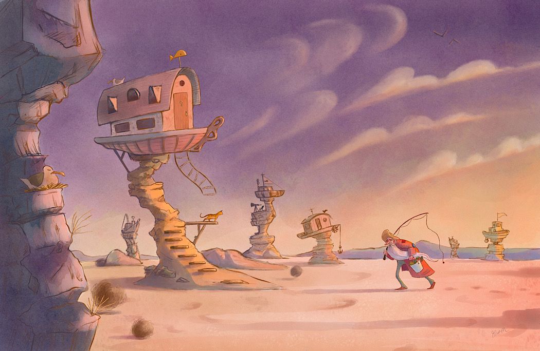
            Here’s a little more progress this morning.

            0D775E53-3CAC-43CC-981E-11343A30B3E0.jpeg

            Alternate sky? BDD080B0-47F5-4EE4-8632-7F24C93D4284.jpeg

            Instagram: https://www.instagram.com/eliamurrayart/
            Portfolio: www.eliamurray.com

            1 Reply Last reply Reply Quote 0
            • EliaMurrayArt
              EliaMurrayArt last edited by

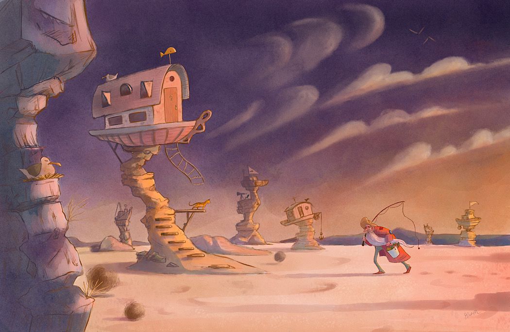
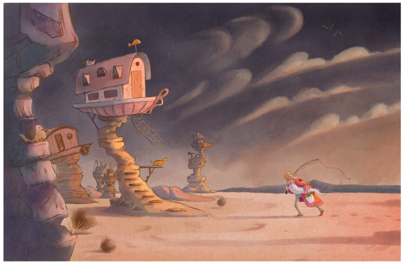
              I think my values need to be pushed.... here’s a darker sky. I’m not sure... I think it’s getting muddy...

              47E58775-4158-4E25-984C-DB6B40CD3DCB.jpeg

              Instagram: https://www.instagram.com/eliamurrayart/
              Portfolio: www.eliamurray.com

              sarahlash Kevin Longueil 2 Replies Last reply Reply Quote 1
              • Neha Rawat
                Neha Rawat last edited by

                Oh yeah! The flying ladder definitely brings it to life! Awesome! I think I'd make the fishing line flying taut as well since his beard conveys pretty strong winds (and maybe the anchor just a little at an angle in the background).

                I personally like the purple sky tint. Love the tumbleweed detail! 😃

                https://www.nrbstudio.in/
                https://www.instagram.com/nrbstudio.in

                EliaMurrayArt 1 Reply Last reply Reply Quote 1
                • EliaMurrayArt
                  EliaMurrayArt @Neha Rawat last edited by

                  @Neha-Rawat so far you haven’t steered me wrong! I forgot about the anchor haha I’ll adjust!

                  Instagram: https://www.instagram.com/eliamurrayart/
                  Portfolio: www.eliamurray.com

                  1 Reply Last reply Reply Quote 0
                  • sarahlash
                    sarahlash @EliaMurrayArt last edited by

                    @EliaMurrayArt I love the darker sky! It really makes your house pop. It’s so atmospheric and beautiful.

                    EliaMurrayArt 1 Reply Last reply Reply Quote 1
                    • EliaMurrayArt
                      EliaMurrayArt @sarahlash last edited by

                      @sarahlash thank you!! I'll see if I can drift it more purple as @Neha-Rawat suggests and make a happy balance.

                      Instagram: https://www.instagram.com/eliamurrayart/
                      Portfolio: www.eliamurray.com

                      1 Reply Last reply Reply Quote 0
                      • Jeremy Ross
                        Jeremy Ross @EliaMurrayArt last edited by

                        Hi @EliaMurrayArt, I used the same brushes for my May piece! I love your piece and agree with @Neha-Rawat comments on the wind. Maybe you can add some wind, flying sand, and few other things flying?

                        https://www.instagram.com/jeremyrayross
                        https://www.jeremyrayross.com/
                        https://twitter.com/jeremyrayross
                        https://jeremyrayross.substack.com/

                        EliaMurrayArt 1 Reply Last reply Reply Quote 0
                        • Coley
                          Coley last edited by

                          Oh. Gorgeous. I'm jealous once more LoL! Really hits the isolation feeling! I agree with the comments from Neha but it's looking super.

                          https://www.instagram.com/nicoleledrewmay/

                          1 Reply Last reply Reply Quote 0
                          • EliaMurrayArt
                            EliaMurrayArt @Jeremy Ross last edited by

                            @Jeremy-Ross thank you! yes it's my favorite brush set! I'll give the wind blowing sand a shot! (though I'll admit that sounds tough haha)

                            and thank you @Coley 😃

                            Instagram: https://www.instagram.com/eliamurrayart/
                            Portfolio: www.eliamurray.com

                            1 Reply Last reply Reply Quote 1
                            • Kevin Longueil
                              Kevin Longueil SVS OG @EliaMurrayArt last edited by

                              @EliaMurrayArt This is looking great! - for feedback i did a quick cut and paste of your image (i hope you don't mind) - the main thing i was thinking might be worth trying was isolating the fisherman on that side of the canvas in a sort of "steelyard composition" by removing the background elements in that area - the other thing that i was thinking was to possibly desaturate the sky a bit so the red of the coat becomes the clear winner in the warmth department - feel free to ignore! - it looks great as is 🙂

                              15.jpeg

                              Portfolio: kevinlongueil.com
                              https://www.instagram.com/kevinlongueil/

                              EliaMurrayArt 1 Reply Last reply Reply Quote 0
                              • EliaMurrayArt
                                EliaMurrayArt @Kevin Longueil last edited by

                                @Kevin-Longueil that's a really good suggestion - I'll play around with it! I do see how that could totally increase the feeling of "aloneness"

                                Instagram: https://www.instagram.com/eliamurrayart/
                                Portfolio: www.eliamurray.com

                                ? 1 Reply Last reply Reply Quote 0
                                • ?
                                  A Former User @EliaMurrayArt last edited by

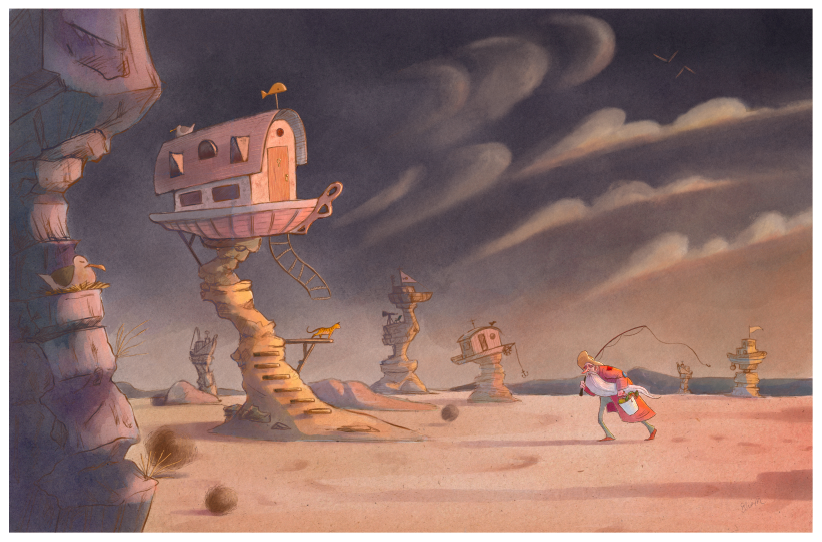
                                  @EliaMurrayArt The expanse of boats has a feeling of aloneness, too, as if the lake has abandoned them. It has a devastating feel to it that I think touches on climate change. With only three, it seems more accidental.

                                  1 Reply Last reply Reply Quote 1
                                  • EliaMurrayArt
                                    EliaMurrayArt last edited by

                                    I am so so very much appreciating these comments!

                                    Opinions? Votes? It's changed so much and it's been so exciting. I'm feeling a little illustration high right now. no rash decisions shall be made by me haha

                                    20a9c20d-2045-46e8-abb9-d4f98d135a0c-image.png

                                    084ee57b-d459-4cac-b2b9-981b00f8dc89-image.png

                                    Instagram: https://www.instagram.com/eliamurrayart/
                                    Portfolio: www.eliamurray.com

                                    Jeremy Ross 1 Reply Last reply Reply Quote 2
                                    • baileyvidler
                                      baileyvidler last edited by

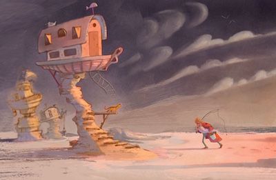
                                      I'm personally feeling the bottom one. The bottom one puts a lot more space between each of the houses, which feels more isolated to me. I am obsessed with this piece!

                                      Bailey Vidler
                                      Portfolio: baileyvidler.com

                                      EliaMurrayArt 1 Reply Last reply Reply Quote 1
                                      • Jeremy Ross
                                        Jeremy Ross @EliaMurrayArt last edited by

                                        Hi @EliaMurrayArt, love them both, but the top one pulls me in more. To explain, the weight of the character is so heavy, it balances everything perfectly on the left. The old man demands our attention!

                                        https://www.instagram.com/jeremyrayross
                                        https://www.jeremyrayross.com/
                                        https://twitter.com/jeremyrayross
                                        https://jeremyrayross.substack.com/

                                        EliaMurrayArt 1 Reply Last reply Reply Quote 1
                                        • EliaMurrayArt
                                          EliaMurrayArt @Jeremy Ross last edited by

                                          @Jeremy-Ross I think I'm going to have to agree - it makes the character stand out a lot more.... I looked at them both really tiny and I almost lose the character in the original composition.

                                          This has been VERY informative!

                                          Instagram: https://www.instagram.com/eliamurrayart/
                                          Portfolio: www.eliamurray.com

                                          1 Reply Last reply Reply Quote 0
                                          • EliaMurrayArt
                                            EliaMurrayArt @baileyvidler last edited by

                                            @baileymvidler Thank you so so much!

                                            I really like my original composition too, and I appreciate your point - after zooming out a bunch of times I find myself (a little reluctantly) pulled to the new composition because it does emphasize the character. Who I almost lose in my original composition.

                                            I like the tension that the new composition creates - it's almost like the man is battling against the town... It makes me feel disjointed - like he's been away for too long and is not quite welcome into the new environment. Which makes me feel lonelier.

                                            It's almost like the first composition is a couple steps later in the story - when he's come out of isolation, and is coming home... Where as the new composition is before that - and he's still alone.

                                            at least that's what my brain is creating.

                                            Instagram: https://www.instagram.com/eliamurrayart/
                                            Portfolio: www.eliamurray.com

                                            ? 1 Reply Last reply Reply Quote 0
                                            • First post
                                              Last post