MAY contest WIP (feedback welcome)
-
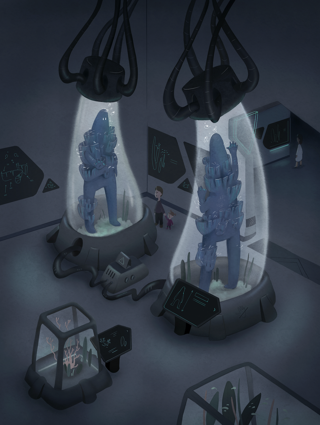
What a touching and heart-wrenching scene! Your image has a museum feel especially with the signs explaining each organism. Maybe you could add some more animals/information/diagrams related to the creature (or it’s habitat?) on the walls to further solidify the idea that this is a “zoo”.
Also, with the egg, I think it would help to bring more attention to it if one of the creatures was looking at the egg. Maybe the “female” could be kneeling and pressing her hands towards the egg while the “male” looks at the female with his hands towards her.
The paper-like material on each of the creatures confuses me because I’m not sure if it’s part of the creature’s anatomy or if it’s their version of clothes or if they’re restraints put on them by the zoo/lab.
That’s my two cents! This is a great concept and I can’t wait to see how it turns out! Great work!
 ️
️ -
@Elena-Marengoni I really like the idea and think you are conveying it well.
My first read is definitely the separation/isolation of the creatures from each other.
And the second read picks up all the details you describe. The egg, the humans, and other zoo/museum stuff.
I was a little confused like @aprilshin on the paper stuff. I thought initially the creatures were aliens and that was their work? It does not convey sea creatures? I wonder if you changed it to be more like coral or seaweed if it would do more what you are looking for.
I would be interested in seeing a value study as well.
Good luck!
-
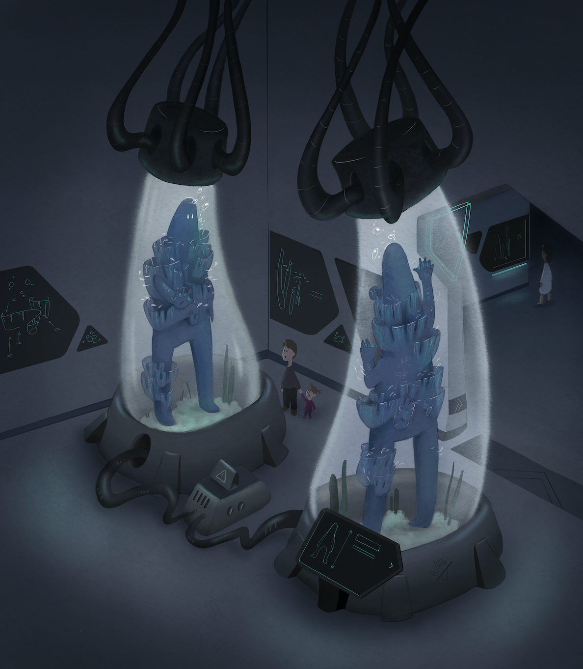
Woah this had me feeling some deep sadness for these seperated creatures.
but honestly, the egg distracted me from that. I interpreted the egg as just something random. I didn't relate it to the creatures at all. (probably because they're humanoid which means mammal)
So, I feel like the egg is a little besides the point and detracts from the main focal point.
Oh also I interpreated the wrappings arouund them as scrolls, and scrolls have stories. So these creatures have stories to tell eachother but can't. That's what I thought it was at first and I thought was a really cool way to show visually what's going on inside their minds.
Overall I really like this piece and it's emotional impact.
-
@Elena-Marengoni Hi there, this is a wonderful concept. I agree with the others about the egg and wonder if you even need it at all? There's already quite a bit going on visually and the idea of the couple separated in this way is already emotional. Love your style by the way!
rachel-horne.com
@rachel_horne_art -
Wow! Such great and inspiring feedback! Thank you!!
So here's what I am picking up from the comments:- The museum environment seems to be working. As @aprilshin is suggesting, I could maybe add some more diagrams and info. I kept those areas of the sketch very 'light' for now, just to show that there's something on the signs, but I will definitely add more details as I render.
@aprilshin @theprairiefox The wrappings on the creature could be confusing if not rendered in a way that makes them look organic (like seaweed). @LauraA the other drawing is indeed another piece on the same theme, where I was going for a more graphical effect, but I am definitely looking for something a little more realistic here. I think I'll play with the shape of the 'ribbons' (not all edged need to be perfect lines) and their transparency and maybe add some more 'veins'. The underwater environment in the tank and the little fish swimming in and out of the seaweeds of the creature could help as well. @Frost-Drive I like your idea of the scrolls! I wonder if it would overcomplicate the story, but I might give it a try in a separate piece because it sounds really cool and poetic
")
As for the egg...I am not sure yet! I think I want to keep the two creatures looking at each other to avoid creating too many focal points and it's true that two humanoids seem unlikely to produce eggs. One solution would be to remove the egg or use the third tank as a more generic stage-setting prop, but unrelated to the two main characters. Another approach could be to draw a 'baby creature', make the tank look more like the big ones, and have the little one look at the couple, but maybe it would overcomplicate the image? I'll test out a couple solutions and decide and hopefully I will have some value studies to post soon!
-
Unfortunately, I had to speed up the process a little bit and I didn't have time to share the intermediate steps of value and color studies for feedback. Still, I tested a couple of different solutions on my own and then got to work on the final piece. I completed it and then realized that it was probably too busy, so I decided to crop the image and simplify the composition...I have the feeling that the message gets across more easily in that way and that the focal points are working much better...I'd be curious to know if you perceive it in the same way!
Also, I looked at a screenshot from my crappy old phone and it seemed very dark, but it looked fine on my computer: do you see it dark as well?
That aside, I am planning to fix a few details (mostly clean up work) and redraw the left hand of the character on the left: I want to lift it so that the 'nostalgic' gesture is more explicit.
Instagram: https://www.instagram.com/elena.marengoni/
-
my heart. it hurts. I love these weird aliens so much.
Instagram: https://www.instagram.com/eliamurrayart/
Portfolio: www.eliamurray.com -
@EliaMurrayArt awwww! than you!!
-
@Elena-Marengoni the 'paper' stuff reads much better! Really liking the outcome.
I had a couple of thoughts:
-
I like the composition with the additional aquariums. They really reinforce that the main creatures are underwater and provide additional things to look at.
-
I think on the left creature the outstretched hand is lost in the color. I think if you lightened the color of his hand (like where it would touch the glass) it would give you a silhouette that would read much faster and better. The creature on the right you get the silhouette of his hand as it is dark on light.
Coming along nicely though.
-The Prairie Fox
https://www.instagram.com/theprairiefox
https://www.theprairiefox.com -
-
@theprairiefox thank you for these notes! I changed my mind around 100 times regarding the composition and eventually submitted the simpler version without the aquariums, but it's true that they were additional contextual clues... I really don't know, I just felt like the simpler composition was more suited for the 'isolation' prompt and conveyed the message in a better way. As for the readability of the hand, I added a little bit of white around it and drew the other hand pressed on the glass as well...I am still not 100% satisfied with it, but I think it reads slightly better now.