A good problem to have? (advice & critique request)
-
Hello SVS:
I hope this finds you well amidst the chaos. For the firs time I grit my teeth and dip my toe into posting artwork for feedback. Yikes!
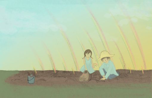
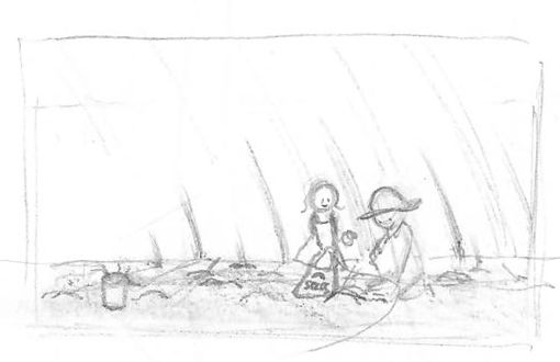
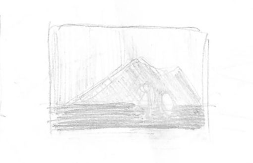
I committed to an art contest at work* and finished piece #1 (of 100?) in practicing My Craft. As a doodler that never completes works this is a rather big deal. The theme was Rainbows and brandishing the tried-and-true 'something unexpected in a normal setting' method I decided on a image inspired by Lee's "Flying Colors" and "The Book Garden". I broke all the rules doing only two thumbnails, a questionable value study and struggled with Photoshop brushes for far too many hours while trying digest the online class.
This, of course, can't end well. I now understand what a piece at 80% is. It had to be called 'finished and not perfect' because deadlines come up fast and 'Send' had to be clicked.
Tadaa ~ <cue crickets>

Somehow... it won 2nd place with a gift card. And they want to print and frame it.What?
I truly don't mean to sound egotistical, but I now wonder: Do I try to 'fix' it or move on? Suddenly, people will see it for a long time. If I do want to improve it, how?
They say you only learn by reflection. I already know some issues, but clearly there are things I don't see and could use advice on.
Pros:
− Actually like the composition(?)
− Like the sky
− Like the idea (need to work on execution)Cons:
− It is very plain (failed with textures).
− The area of focus/interest almost sinks into the background even if colors seem to pop.
− Strengthening line work seems to increase appeal but then doesn't fit in with the rest of the background.
− Accidentally left out the girl's legs
− Hat sits oddly on adult's head
− I realize I don't understand how to use a value study (as basic as it sounds)Thank you for working your way through such a long post and hearing out a floundering newbie. Your attention alone is already appreciated! Nuggets of advice would be delightful. For additional reference I've also included the thumbnail and questionable value study.


P.S: If anyone wishes to create their version of this composition feel free to do so. It would be interesting to see. (If you make a fabulously successful image please send me a print!)
Again, thank you for your time and attention!
*non-art industry so standards aren't astronomical
-
This might just be my personal opinion, so interesting to see what others say, but . . .
I wouldn't change it. This piece won the contest as is. There was something in it that they responded to and liked (even if you don't share that feeling) You might lose what they liked about this piece when you try to make it better.
And unless you ask if it's okay (or present both options?) it would feel kinda rude to me to turn in a different piece than the one that won.
Now, if you particularly love this piece yourself and want to work on it to put in your portfolio then go for it! But I wouldn't do it just to replace the piece that won. Let this piece have its moment and move on and keep creating new and better art. And instead of beating yourself up because you don't like it I find it helps for me to understand what they do like about it and why so that you can keep what is working when you do move on.
-
Congrats on taking 2nd place! I really like your concept. I like the overall style and your characters have a really sweet, pleasing design. I think that your composition is, for the most part, successful. My quick-take critiques:
-
I think you are spot on with your thoughts about the focal points sinking into the background. I think strengthening the color of the rainbows and adding linework to the figures would be a good fix for this problem. Without reading your description, I wasn't quite sure what was happening and couldn't quickly identify them as rainbows. If you are worried about cohesiveness with the background with the addition of linework to the figures, I think adding a few linework details here and there into the background would help. It wouldn't take much- you can add little groups of grass linework here and there- a bit more around where the grass and dirt meet, and a few in the main body of the grass. You could also emphasize the dirt holes that the rainbows are coming out of with linework.
-
I'd consider having the rainbows arch the other way- it would frame the figures nicely and I think the line direction would work better with the planters gesture and hand position. It would give it a nice flow.
-
Something that's a bit iffy to me is the time of day. Just because I'm not sure if I've ever seen a rainbow at that time of day and it sort of messes with the impact of the rainbow concept. I do really like the mood it conveys- I've worked on a farm before and it takes me right back to working long hours into the dusk. I'm torn on this one, but thought I'd point it out.
I think it's totally up to you if you want to change it, but I tend to agree with Carlianne's assessment. I wouldn't change it for the contest, but if you really love it overall and certain aspects of it are haunting you, make the changes for your personal satisfaction/portfolio.
-
-
@Kawa I think this is a really sweet image and from reading your post you already seem to identify the things that you would change about it to make improvements, I have to agree with @carlianne though - since you won the competition with this piece as is I think it's sensible to keep it that way and then make improvements for your portfolio piece.
-
Thank you all for your thoughtful and amazingly quick responses!
@carlianne
Thank you for sharing your reactions and opinions - It never occurred to me that it could be rude to make an edit and I appreciate the refreshing and humble perspective. Others have mirrored similar sentiments to not make changes. Messages from colleagues also mention it reminded them of a nostalgic moment so it seems to have struck a sentimental chord of some sort.@TessaW
I appreciate the time you've taken to not only read but extensively bullet suggestions and improvements. Thank you! Your comments reinforcing my own suspicions of problems and possible solutions feels really encouraging and gives me more confidence in my 'eye'. I didn't think of changing the direction of the arches - it opens up a new way to look at the composition for sure. As for the sky - while I do like it, I agree that time of day is vague. I never solved that problem and it shows. That said, I'm glad it can take you back to a (good?) memory. I'll endeavor pay more attention to establishing time of day more clearly going forward. Again, more food for thought and it is very helpful.@Rachel Horne
Thank you for your input and thoughts - it supports the reigning opinion that it should remain as is contest-wise. Your kind and supportive response is heartwarming and I'm glad I went ahead and took the scary step to post for feedback.Thank you all for a welcoming experience.
