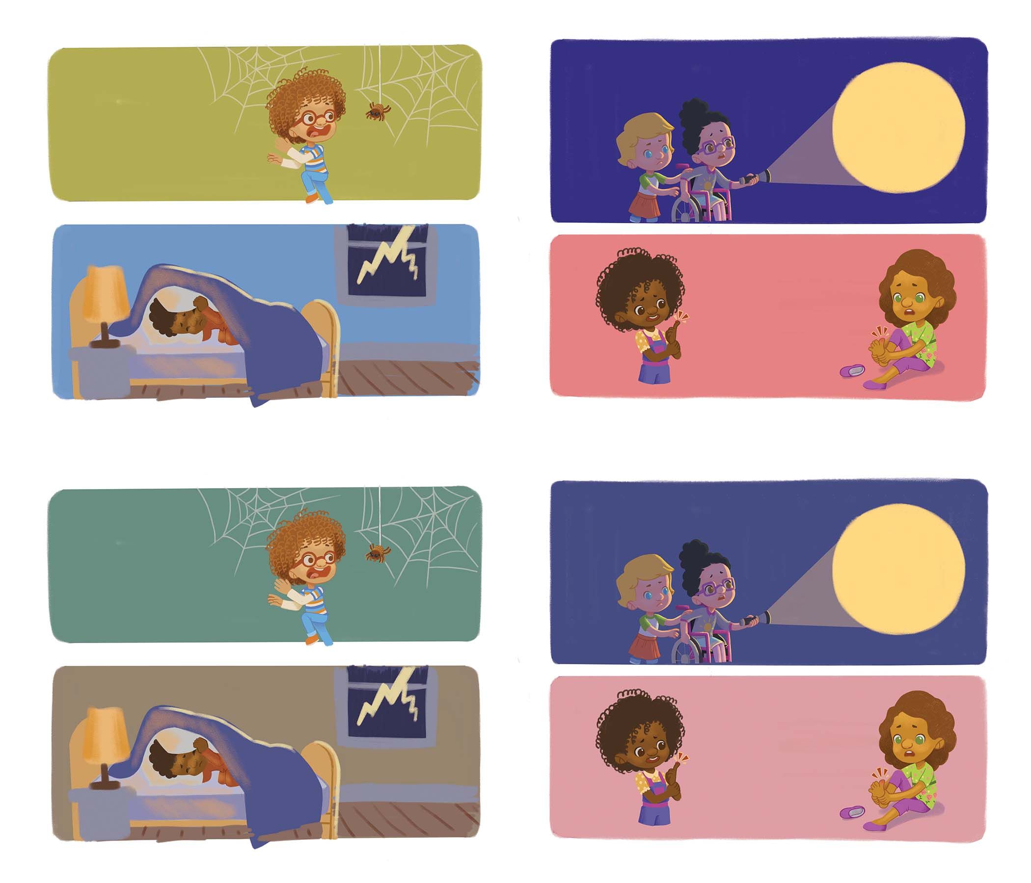
Critiques please- Which colors look right?
-
Hi, everyone! It's been a long time since I asked for a critique here in the forum. I'm currently working on a project and I'm stomped with the background colors. This spread was supposed to show the various fears of the children. I want it to convey fear, anxiety, panic. Which of the 2 spreads best convey that? Also, if you have better colors in mind please feel free to share them. I'm at a lost. Thank you so much for the help.
Portfolio: nyrrylcadiz.com
Instagram: https://www.instagram.com/nyrryl_cadiz/
YouTube: https://www.youtube.com/channel/UCbJCF1Im8ZO7hpGWTKOJMuA -
Hi Nyrryl,
illustrating children's fears sounds like a fun project! I love projects that deal with visualizing emotions, so cool!
Could you specify which image is meant to convey which emotion specifically? I think it could help to give more accurate feedback.As for the colors, I tend to prefer the second and less saturated set because it makes the characters more readable and makes them stand out a bit more. Are you planning to add more contextual references to the 2 scenes on the right as well or will they be placed on a more uniform type of background as in these compositions?
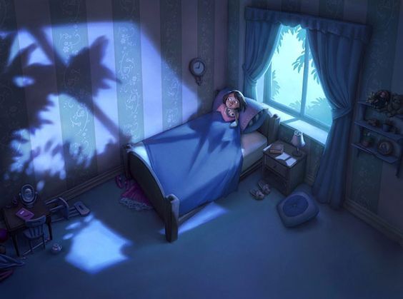
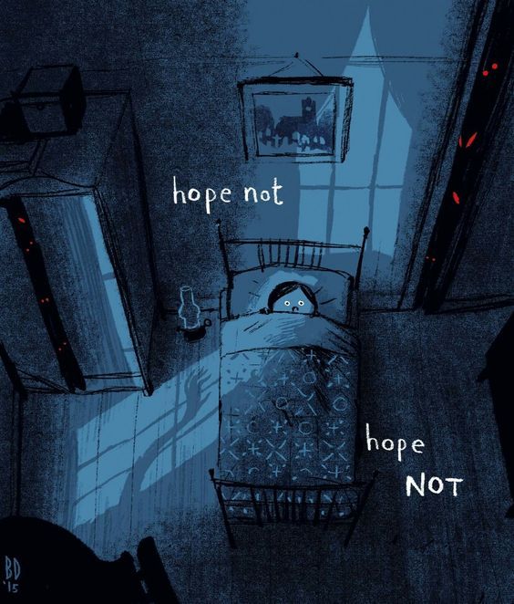
In the third image (the one in which the boy is asleep), I have the impression that the yellow strokes on the blanket are a little too strong. Maybe that's a test, but I would tone then down a tiny bit because it makes me think it's a reflective surface. Also, the room could perhaps be even darker (no lamp but only the light coming from outside or maybe a super feeble indoor light) and maybe more uniform in terms of tone. I am attaching 2 images to show you what I mean:
Can't wait to see your finished pieces!
-
@Nyrryl-Cadiz I like the less saturated ones too - very nice work!
-
I also like the bottom set
")
-
These are great! I like the bottom set of colors best.
-
@Nyrryl-Cadiz I like the top colours. But maybe turn down the saturation of the backgrounds. Great work.

-
@Nyrryl-Cadiz My favorites are the boy with the spider, and the two kids (one in wheelchair) in the dark.
As for color, most of the background palettes feel a bit too bright/happy. Suggest adding a transparent layer (multiply if in Photoshop) of black/blue to tone down the saturation. Will there be other details in this images? There's lots of potential to increase the mystery and suspense and fear. -
I like the bottom set without the pink background. Mainly, desaturated cool/neutral colors is what I would associate with those emotions.
-
I really love the spider one, both versions look great!
-
@Nyrryl-Cadiz I like the bottom images the best, the muted tones work much better. I think it's worth taking into account some of the advice that @Elena-Marengoni made above too