Question about color
-
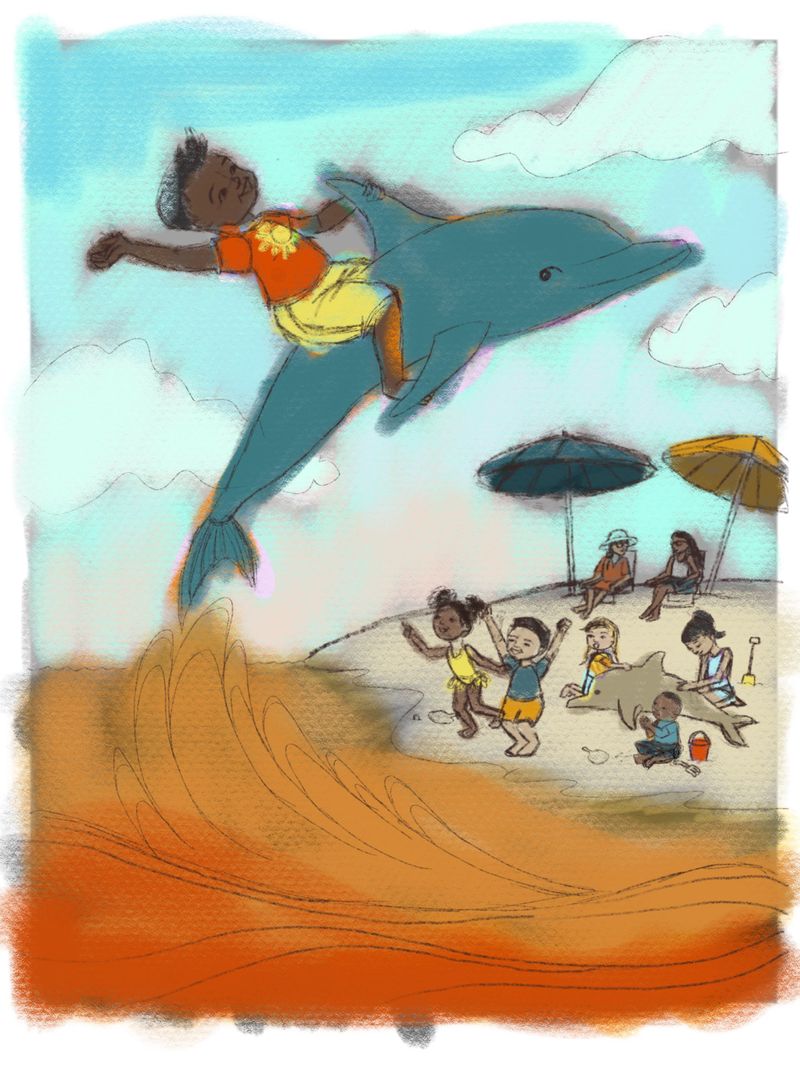
I was told I need more warm colors in my portfolio, so here is a quick color study. What do you think about an orange ocean, is that too weird?
-
@holleywilliamson It feels weird because the rest of the colors are realistic - and on the cold side! Why don't you set this scene at sunset? It would give you a great excuse to go warm.
-
@holleywilliamson Totally agree with @NessIllustration - if you warm up the sky (and in the final reflect that warmth in the lighting of the characters), the water's coloring won't feel weird at all.
-
remember warm doesn't just mean red yellow orange. You can have warm blues and warm green and warm purples.
You can also have cold reds oranges and yellows.
Color is relative. -
Wet dolphins should be shiny and the shine will allow you to ad rim light and warm highlight reflections on the skin of both the dolphin and the boy. Orange water? Looks like polluted runoff from a coal mine. I would make the water inviting swirls of blue and green and reflect warm highlights onto the waves.
-
@holleywilliamson an orange ocean is kinda weird. I would suggest turning the sky orange too. Make it an afternoon scene.
-
Hi @holleywilliamson !
I dont know if this is traditonal media or digital!
But what I see in the picture is that the colors are "dirty". Is dificult to create "warm" images if the colors are dirty.If you are doing traditonal media this is quite normal, becouse the colors have the tendency to darken and is dificult to make them warm and bright, this requires a very discipline way of painting to keep the color fresh, live and bright, not easy! is more easy with watercolour, but if you doing acrylics and oil is tricky.
If you are doing digital, try to do color sketches and try to find the base colors frist, you work finding this nice and warm colors (play with saturation) and also working on the values.
I did a fast sketch of your images, looking for warmness. For me the colors you pick work well but need to be more saturated and with a little more light.
 )
)Also I will say that for me, there is to much information in the images and makes it a little bit caotic, you have a good line of action with the waves and the delphin. but all the people behind for me they look to close, stick togheter. Looks there is more need to space to breath.
And be very careful with the black lines of the pencil, can kill color pretty fast!
Hope this help!
-
What about a pink or warm purple ocean! Fun illustration. Love it.
-
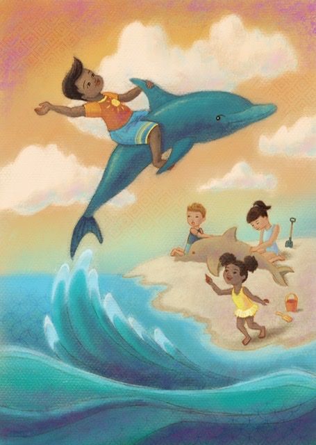
Thanks for everyone’s feedback! Here is how it turned out!
-
@holleywilliamson awesome illustration, captures really well the afternoon mood and also have something magic in to it. congrats!