Cinderella: Crowdfunding Project- Critiques welcome
-
It sounds like a fun project. (I totally understand the need to have multiple projects going on at once.) This looks great so far - I can't wait to see more!
-
@Kristin-Dudish thanks Kristin! I think I’ll complete an illustration this week
-
That dress is ridiculously pretty! The only thing that gave me pause was her right arm/hand (the one on the left for us), like Neha mentioned. It doesn't look quite natural. I think the hand needs some tweaking.
-
@TessaW Thanks!
-
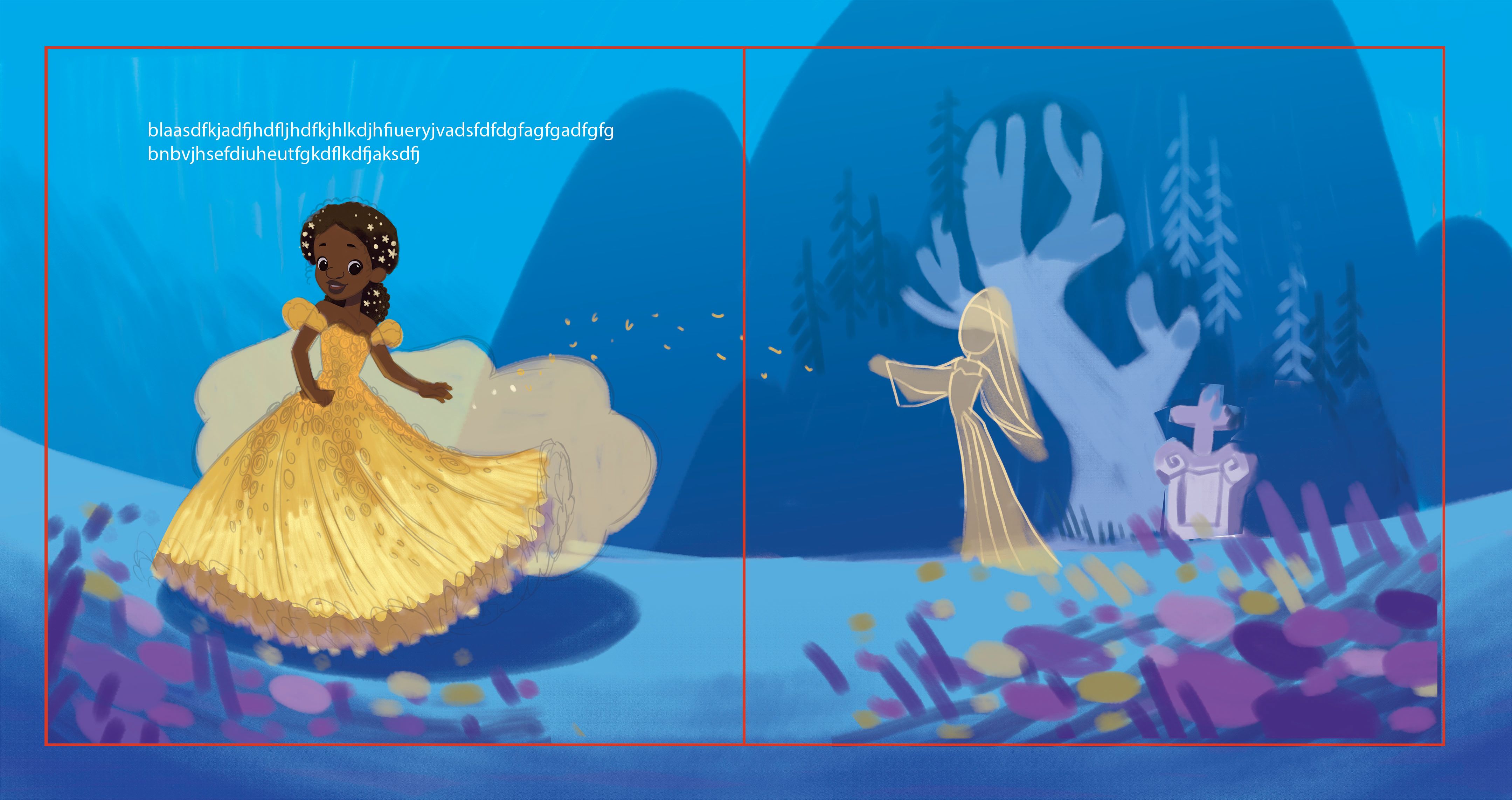
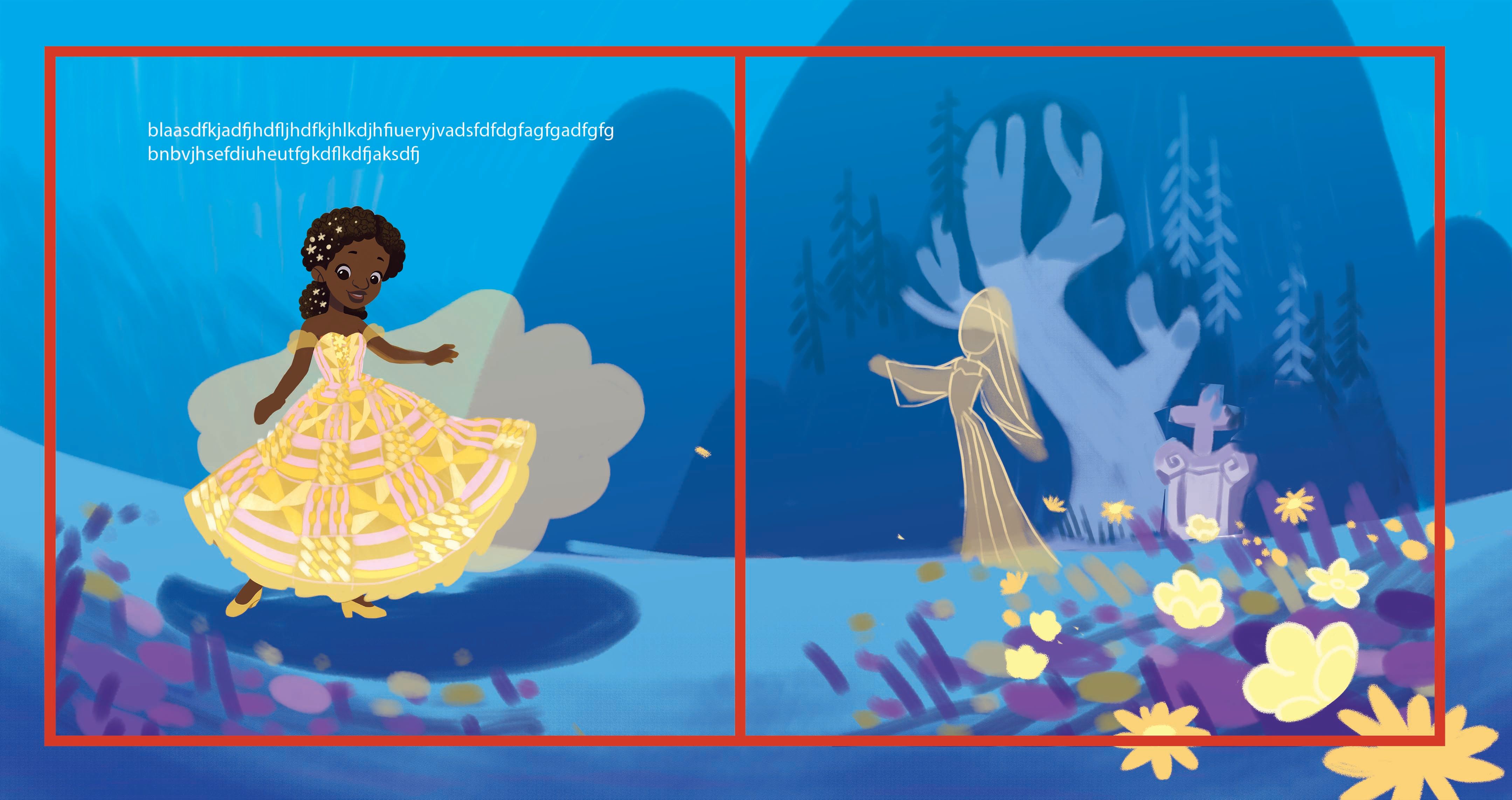
here's an update. thoughts?
-
It's shaping up nicely, but I think you messed up on the text. I don't understand what it says.

I love that you have the gravestone in there. I wanna see how the fairy godmother turns out!
-
@TessaW Oh dang!

 someone vandalized my illustration.

-
@Nyrryl-Cadiz ooh that gold against that blue! Knockout!
 ️
️ ️
️ ️
️ ️
️ ️
️ -
Beautiful colors!! So nice... love the stars in her hair. Something is making the pose look a bit stiff to me. Maybe the turn or position of her head? Looking forward to seeing more of your project.

-
@Nyrryl-Cadiz - this character is beautiful! As others have mentioned the colour choices are fantastic as they are so atmospheric and make the key character stand out. I really liked the way Cinderella was looking directly at the viewer in your sketches, it made you feel like you had a connection to her. I'm not sure whether your illustration is for the cover or inside spread but it might be nice to have her gaze out the page like your sketch in another of the images as I loved that. I showed it to my kids and my daughter said she'd "like to be her", which is high praise indeed as she's usually brutal about any sketches of mine
 Beautiful work!
 -
@Coley @KathrynAdebayo @Lorna-H Thanks everyone! I'll definitely work on the pose once I find more time.
@Lorna-H I actually wanted her eyes to be looking down on her dress. I guess that's another element to work on.
 I'm really happy your daughter likes it! When I was younger there were no books with main characters who looked like me. My main goal for this project is to provide characters that kids of color can identify with.
 -
@gavpartridge thank you so much for the input but i have to disagree with a lot of them.
Firstly, this is how I draw noses. It’s my signature potato nose and I love it a lot. I do agree it’s not the most appealing but I personally enjoy it.

Secondly, she’s a black girl. Black people mostly have bigger noses. I don’t want to white wash her by giving her a dainty button nose.
Thirdly, no variation in line width. I mostly don’t do line work on my illustrations. Therefore, I don’t really give much thought about lines.
Lastly, you said it’s too distracting. No, the line work is too faint that it needs even more definition if you ask me.
I do agree on her pose though. I’d have to work on that some time. I’d really like to apologize for sounding mad in this pose. I just had to say what’s in my mind. I’d like you to know that I do value your opinion and I do enjoy reading them. They help me to grow as a better artist. Do keep them coming. Thanks!
-
@Nyrryl-Cadiz - I totally agree that it’s so important that kids can see characters who actually reflect themselves in the books they read, so it’s fantastic you are doing this project. I can also totally understand why she might want to gaze at her dress having just transformed into her ball gown, it fits the narrative perfectly, so just forget my suggestion!

-
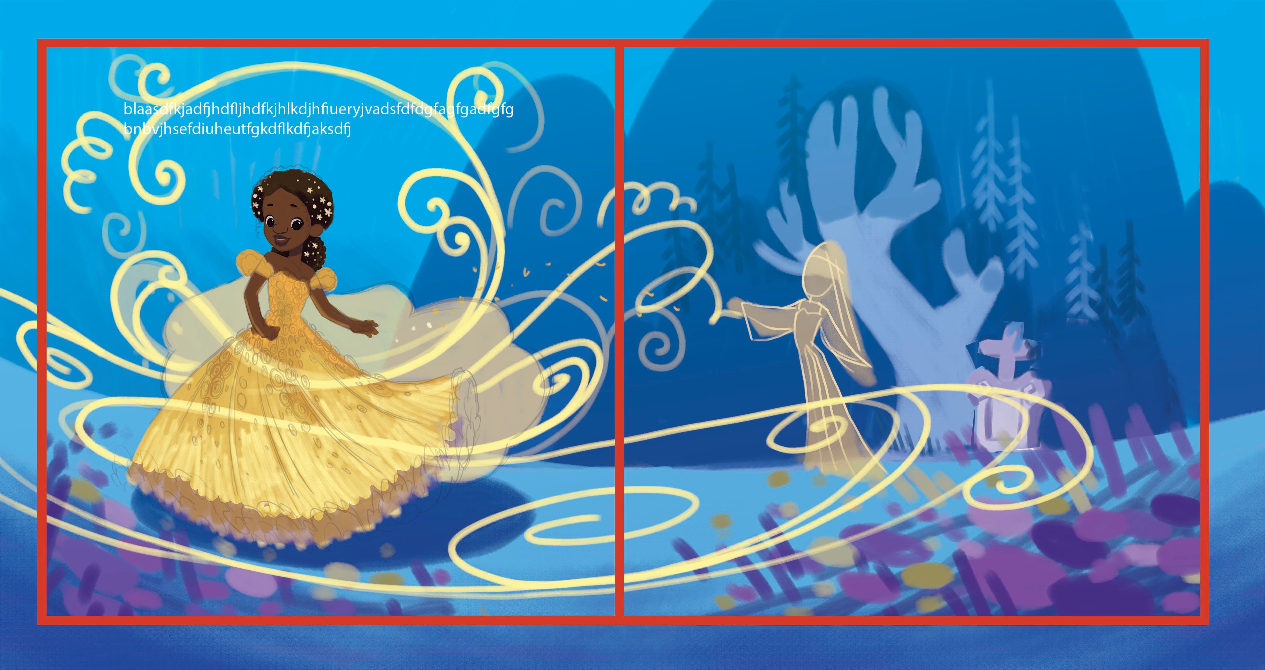
Hi, everyone! Sorry for the long update. I've been really busy with work lately. I wasn't able to work on this piece as much as I want to. I wasn't able to implement your critiques. I'll get to it soon, I promise!

Currently all I managed to do is add some "magic" lines. I hope you like it. Stay tuned for more... in a couple of months...

-
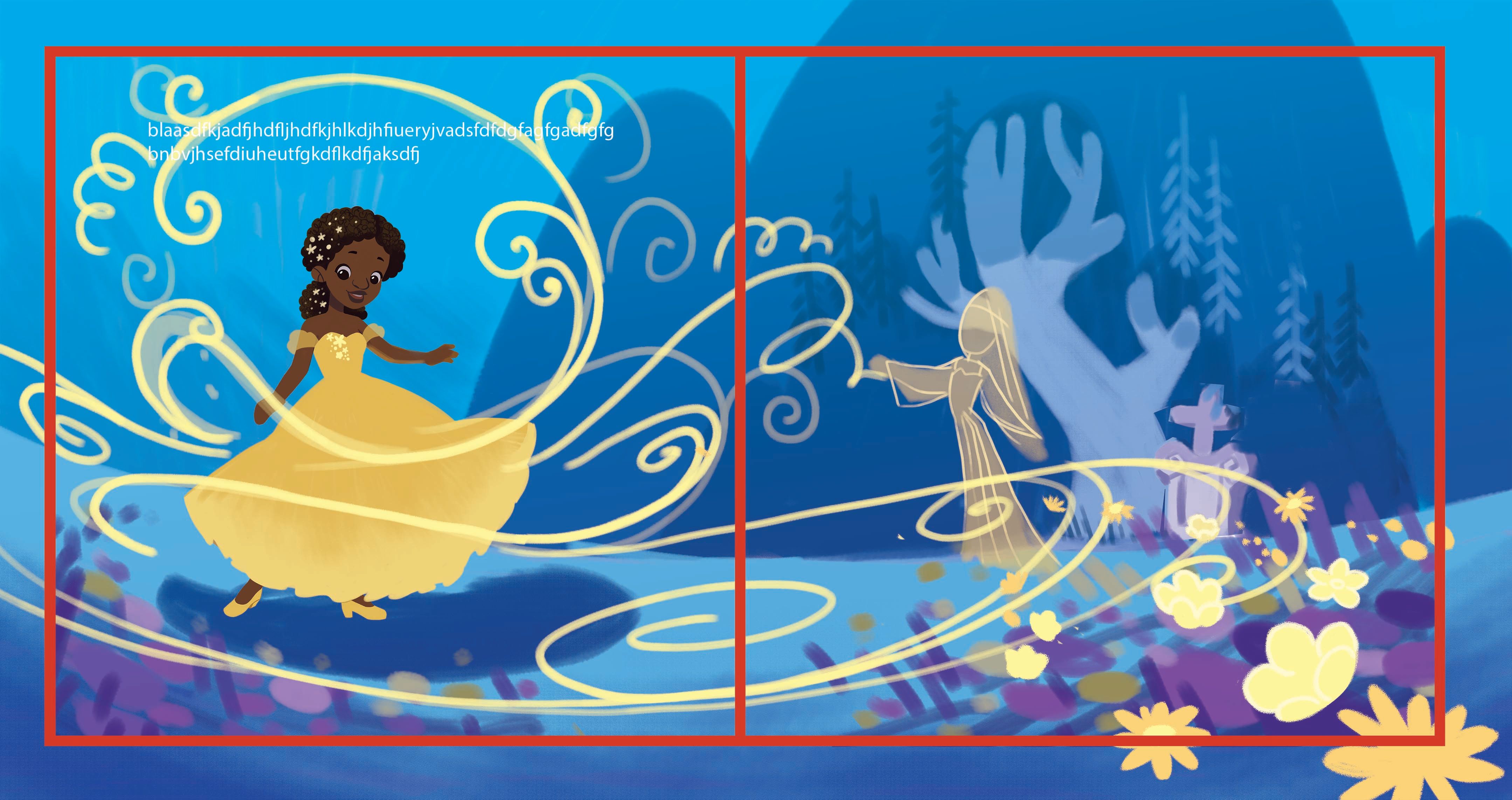
more updates. I've finally started to work on Cinderella
-
Very cool idea.


I love your color choice and your design of the princess and environment. I am wondering about one thing - I am not sure if it is a good idea, but thoguht I will just put it out here :-). I started to think about the question of "universal" and "difference" among different culture. It depends what you are interested in exploring - I thought it might be interesting to incorperate a bit of "what a black princess will dress up differently compared to a traditonal fairytale princess. Would it be interesting to incorperate things like beads on hairs, and dresses, a bit of fabric with some afro pattern.
-
@xin-li definitely! I've been thinking of that too but i'm a bit apprehensive that I might misuse their culture and be accused of appropriation. If I were to do it, I need to make a lot of research. It's definitely something I'm considering.
-
It's looking great. I love the sparkles in her hair and the pose looks very natural.
-
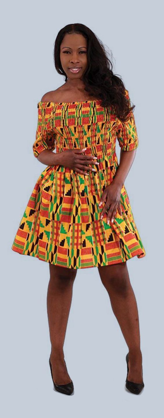
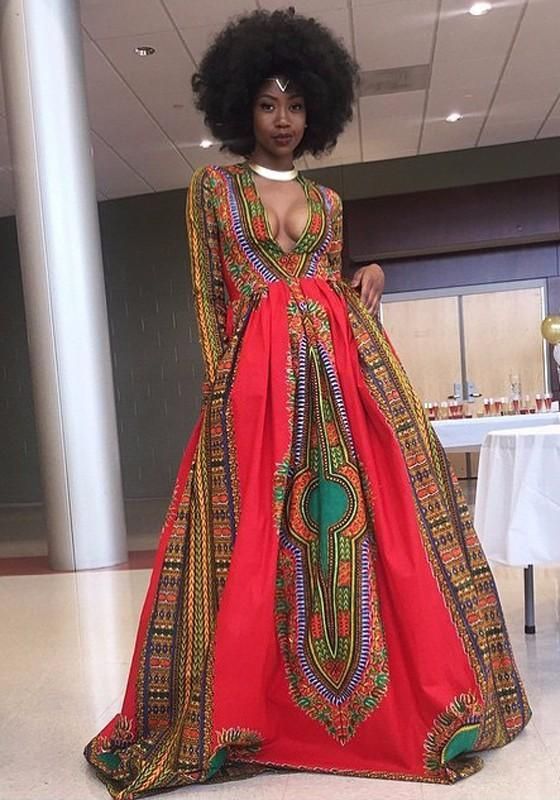
Hi everyone! I've been exploring trying to convey African culture (which is very diverse already) into this piece. So far this is what I've made. I found dresses with really patterns online and decided to implement them.
I also think I'm going to play with her hair next maybe put them in braids and beads? we'll see.
I first tried these colors but I found it not matching with my current color scheme.
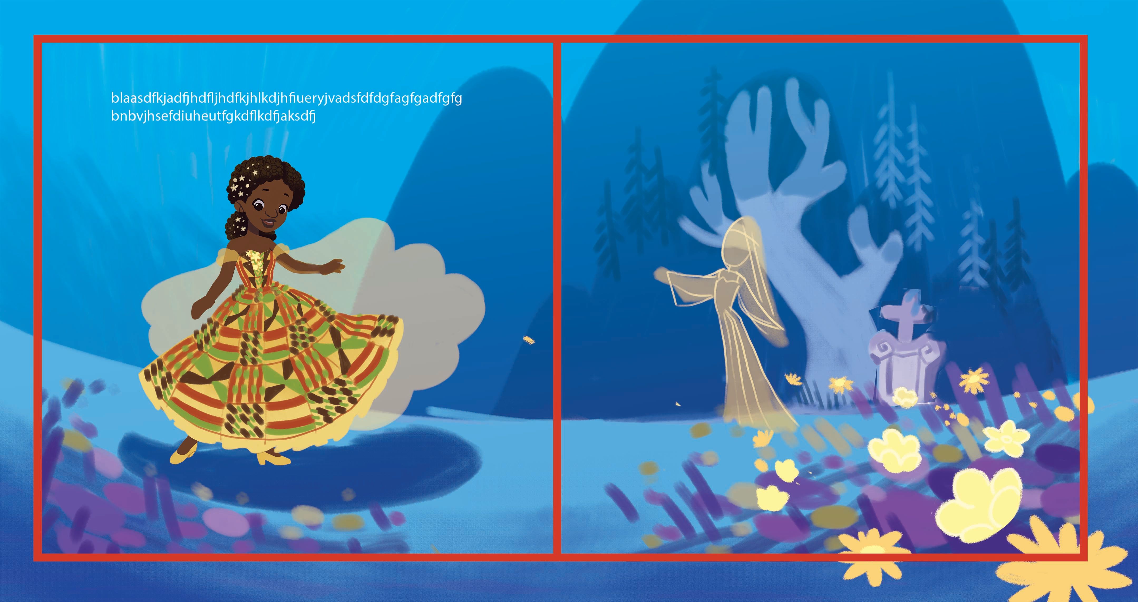
I tweaked it a bit and arrived to this version. I love the colors on this one.
-
It looks really pretty!
But as you already mentioned, I'd definitely do some more thorough research. The patterns and colors have symbolic colors and by changing them up or using the wrong ones you might add unintended meaning (same with braids). The more delicate colors might also just feel wrong or perhaps washed out and old relative to the vibrant colors you normally see. I might also be way overthinking this.
 Best bet is to ask a few people that know.