WIP July Book Cover - Help me choose!
-
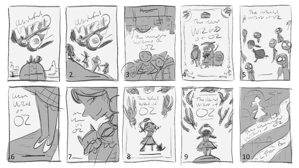
I am grateful I got into the habit of thumbnailing - thanks @Lee-White ! I'm still a bit slow on idea generation but I get more creative if I keep pressing on! Here are the thumbs I came up with.
And here are the 3 strongest options in my opinion. I'm having trouble deciding which to go forward on, can you help?
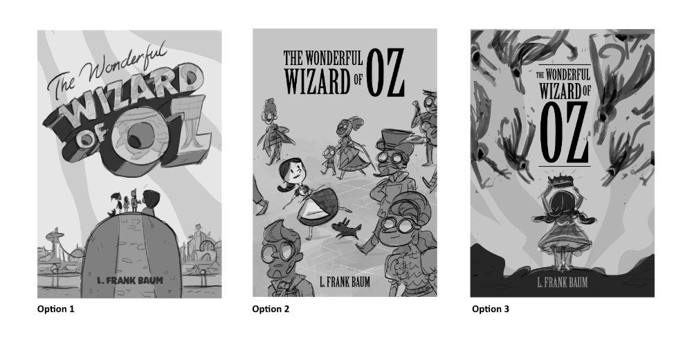
Option 1:
Keywords: Adventure, Travel, Wonder
The four main characters stand atop a hill with a yellow brick road, overlooking the Emerald City in the background. I wanted this to feel like an old travel postcard. There are faint story elements (witch heads, silver shoes, poppies) inside the letters.Option 2
Keywords: Whimsical, Not Like the Others
Dorothy and Toto walk among the eccentric residents of Emerald City, who all wear green spectacles. I imagine this cover is shades of green while Dorothy is full color, indicating she's a different soul in this world. If there was a back cover, the scarecrow, tin man, and lion would be back there.Option 3
Keywords: Mystery, Tension, Powerful
Dorothy putting on the golden cap that controls the flying monkeys. They dive toward her in an intense way. In the book, the Wicked Witch uses this cap, and Dorothy claims it after she defeats her, using the monkeys on her adventures in Oz. I like this one - it feels fresh because it focuses on a less common part of the story and makes you wonder who the REAL wizard is in Oz.Carrie Copa
https://carriecopadraws.com/ -
@carriecopadraws looking great!
-
No I can't help, because they all look great! #1 is such a fun treatment of the title, which I haven't seen before in a book cover. #2 is great because it's not a stereotype of the movie or book that we see often and the comp is cool. #3 is such a cool pairing of composition and text! It also hints at part of the story that's not commonly shown, but you still have the icons of Dorothy and the monkeys There's something a little stiff about title as is, though I like the placement and general idea of it.
-
I really love #3! It's still got enough things to read as "Wizard of Oz" to someone who hasn't read the book and has only seen the movie, but it's a great scene to illustrate for someone who has!!
#2 doesn't quite read for me, it took me a couple reads to know that Dorothy is walking through the Emerald City (and I probably would not have gotten it if I was someone coming to the book for the first time after only seeing the movie)
-
I like option 3. I just feels more dynamic and uses the space really well.
I feel like in the first one the charcaters are hard to notice, might be a little small and the second one juat didn't click with me.
Good work tho

-
@TessaW @korilynneillo @Luca-Salvatore
Thanks for your feedback! I'm leaning towards #3 because it's different (and Oz can get quite dangerous, it's not all rainbows and yellow roads).
I really like #1 but it maybe feels too safe? It uses a lot of elements commonly seen on other Oz covers, but it's also easily recognizable because of that. Is it different enough from the pack?
Sounds like #2 might make a better interior illustration than a cover, I appreciate the thoughts on that.
Carrie Copa
https://carriecopadraws.com/ -
@carriecopadraws
I really like opt. #1 and #3 - maybe #3 would be my favourite.
One note from a publishing background (I had a job in pub. company working with licensed artwork such as Disney etc for some time) - I kinda would like to see Dorothy's face. From the marketing point of view, if there's an eye contact possible between the viewer and the main character on the cover, the potential buyer is more inclined to keep looking at the cover and thinking about buying that item - faces can catch our attention.
But maybe it would not work for this kind of a concept - so take it just as an idea to think about.")
-
@carriecopadraws These are all so fun! Great job!
-
Those three are all really great. I love the one with Dorothy mixed I n the with the villagers, very different and she feels planted right in the scene. But number 3 is so awesome too, an iconic moment and the composition with the monkeys flying down pulling all the attention to her is awesome.
-
3 is definitely my favorite. Feels very exciting. The 2nd one doesn’t quite speak "wizard of oz" to me, I think it would need more identifying pieces to the story. The first one is good too but I get most excited thinking about the completed cover for the 3rd. Can’t wait to see where this goes!
-
@mag I appreciate the insight and totally agree a face on the cover can attract the viewer! But I think I might risk making #3 anyway, there are some successful designs without using eye contact from the cover character (usually an adventure book where the character is facing another danger). Maybe I can make mine work too.
-
For whatever reason, I love 10 most. and if you can combine #3 and #10, that would look fantastic! In option #2 of your more detailed mock up cover, Dorothy looks great, but other people seems like a bit random and strange to her, so using pathway in #10 as visual guideline can help.
My second favorite is #4, as it has a sense of simplicity/being minimal. This could be a personal preference though
-
If I look at your influences--then I think Option#3 will be most satisfying. But, great work! My personal fav is Option #2..but that is because it would be fun to do the character design of all those figures. Looking great!!
-
@carriecopadraws you are killing it! I love the text treatment from #1, but I think #3 is more exciting and "feels" more like the tone of the book. I would love to see the other characters incorporated into #3...I'm not sure how.? Maybe silhouetted in the foreground or in the distance looking back towards Dorothy? I love the use of non-movie elements too!
-
@j-sienkowski Thanks! I was thinking the cover would wrap around and the other characters would be looking toward her from the back cover. I might mock that up too.
-
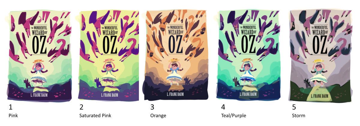
UPDATE: COLOR STUDIES!
@mag though I did make a thumbnail with Dorothy facing the viewer and didn't care for it (#8 in the top post) because she looked oblivious to the danger, I tried it again in the color studies, and you were right - the cover is better with her facing the audience. Thank you for your feedback on that!
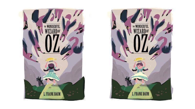
So here are my color studies, does anyone have a clear favorite? I'm still working on the monkey placement and Totos' pose, but this is mostly to check colors.
Carrie Copa
https://carriecopadraws.com/ -
@carriecopadraws My favorite is number 4
-
@carriecopadraws Number 3
-
@carriecopadraws Wow! These are awesome! This is great moment from the book too. Number 4 stands out to me but number 1 is a close second. Very nice!
-
Wow I'm super impressed with all of the thumbnails and color schemes! Number 2 catches my eye. I like all the color in it! I like 4's colors as well.