Society of Visual Storytelling

    SVSLearn Forums

    • Register
    • Login
    • Search
    • Recent
    • Tags
    • Popular
    • Users
    • Groups
    • Search

    Wizard of Oz: THUMBNAILS - Your Feedback is greatly appreciated!

    Artwork
    12
    14
    525
    Loading More Posts
    • Oldest to Newest
    • Newest to Oldest
    • Most Votes
    Reply
    • Reply as topic
    Log in to reply
    This topic has been deleted. Only users with topic management privileges can see it.
    • Pamela Fraley
      Pamela Fraley SVS OG @cszoltan last edited by

      @cszoltan wow! These are so good!! I’m loving 2 and 4. I like all the character designs too.

      instagram.com/fraleycreates

      1 Reply Last reply Reply Quote 1
      • Pamela Fraley
        Pamela Fraley SVS OG @cszoltan last edited by

        @cszoltan my husband says 4. I always like to ask him because he’s not an illustrator so he sees it all differently.

        instagram.com/fraleycreates

        1 Reply Last reply Reply Quote 1
        • Nyrryl  Cadiz
          Nyrryl Cadiz SVS OG @cszoltan last edited by

          @cszoltan 4 is very appealing to me

          Portfolio: nyrrylcadiz.com
          Instagram: https://www.instagram.com/nyrryl_cadiz/
          YouTube: https://www.youtube.com/channel/UCbJCF1Im8ZO7hpGWTKOJMuA

          1 Reply Last reply Reply Quote 1
          • Kevin Longueil
            Kevin Longueil SVS OG @cszoltan last edited by

            @cszoltan Love your drawings! 3 for me - the book is dark and quite violent ...not a fun romp at all in my opinion - 3 has a sense of tension to it that seems appropriate. They are all excellent though!

            Portfolio: kevinlongueil.com
            https://www.instagram.com/kevinlongueil/

            1 Reply Last reply Reply Quote 2
            • Heather Boyd
              Heather Boyd @cszoltan last edited by

              @cszoltan
              Hi! Your characters are super hugy adorable - another not real word but (shrug) it works. Because your characters are fab I like 4 but I like how 3 is a more unexpected perspective. My only possible addition for number 3 is maybe have a character -scarecrow popping out of a bush in the back grass or have a green glow silhouette/shadow coming from the bottom towards her. Some element that says Oz more. πŸ™‚

              Instagram: www.instagram.com/heatherboyd.illustration/
              Website: https://heatherboydillustration.ca
              Shop: https://www.inprnt.com/search/products?q=HeatherBoydIllustration
              Ko-Fi: https://ko-fi.com/heatherboydillustration

              Be blessed,

              1 Reply Last reply Reply Quote 1
              • JudeKillory
                JudeKillory last edited by

                great character designs, love your cowardly lion. Maybe more full figure thumbnails? i do like 4 but it feels crowded.

                https://www.instagram.com/jude_killory/

                1 Reply Last reply Reply Quote 1
                • holleywilliamson
                  holleywilliamson SVS OG last edited by

                  I like 2 with Dorothy in a fun gesture and the other characters visible but not prominent. I think having a central composition for a cover works.

                  https://www.instagram.com/holleywilliamsonart/
                  http://holleywilliamson.com

                  1 Reply Last reply Reply Quote 1
                  • Neha Rawat
                    Neha Rawat last edited by

                    I like a mix of 1 and 2. I like Dorothy's movement in 2 and the single line title in 1 (else everything looks too columned).
                    Your character designs are super! I hope it comes across in this composition πŸ™‚

                    https://www.nrbstudio.in/
                    https://www.instagram.com/nrbstudio.in

                    1 Reply Last reply Reply Quote 1
                    • Jonathon B Baker 0
                      Jonathon B Baker 0 last edited by

                      I'm really liking 3 and 4. 3 because the composition draws me in and makes me want to know more but I don't think It's immediately obvious that it's Wizard of Oz. Not that that's a bad thing. Just an observation. 4 I like because you know the story immediately and it;s a good intro to the characters. The composition works well too.

                      Jonathon Bee

                      1 Reply Last reply Reply Quote 1
                      • cszoltan
                        cszoltan last edited by

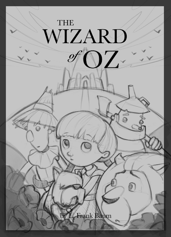
                        Wow so many great comments, Thank you everyone!!!
                        I started to clean up nr. 4, it was definitely the most effective of them all.
                        I will leave it as it is for a couple of hours and start working on something else, and later, with a fresh perspective I will start to paint.
                        Cant wait to share the process with all of you, Thank you!

                        Annotation 2020-07-17 101648.png

                        C.S.Zoltan
                        Portfolio: www.behance.net/cszoltan
                        Instagram: www.instagram.com/c.s.zoltan

                        1 Reply Last reply Reply Quote 2
                        • First post
                          Last post