Contest judging for July - "representative of the story"
-
Thank you for sharing all of this information. I think in many peoples minds the Wizard of OZ is the 1939 movie rather then the original book, but yes when you do a cover for the Book then I think it should represent more the book.
@baileymvidler thanks for the original illustrations, I dont know why but 100 year ago cartoons and illustrations that were made for children were so creepy lol.C.S.Zoltan
Portfolio: www.behance.net/cszoltan
Instagram: www.instagram.com/c.s.zoltan -
@cszoltan If it was stated in the prompt to stick with the novel, then I guess it's vital but it doesn't. Remember they said we have creative freedom to do the cover as we please. So I guess it's not really a great deal.
Portfolio: nyrrylcadiz.com
Instagram: https://www.instagram.com/nyrryl_cadiz/
YouTube: https://www.youtube.com/channel/UCbJCF1Im8ZO7hpGWTKOJMuA -
@Nyrryl-Cadiz Yup, I think you can go all the way with this one, it is an incredibly rich universe and there is a lot of fun to be had! I m just trying to see it from a client`s point of view, and also as a portfolio peace, if a potential art director sees my cover illustration, I dont want them to immediately think, that I have illustrated the Movie
 not the book.
C.S.Zoltan
Portfolio: www.behance.net/cszoltan
Instagram: www.instagram.com/c.s.zoltan -
@cszoltan Is it really that bad if you illustrated the movie tho? Art Directors are not that nit-picky. At least I think they're not.
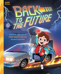
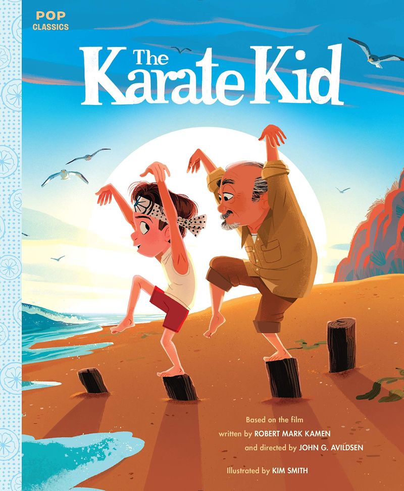
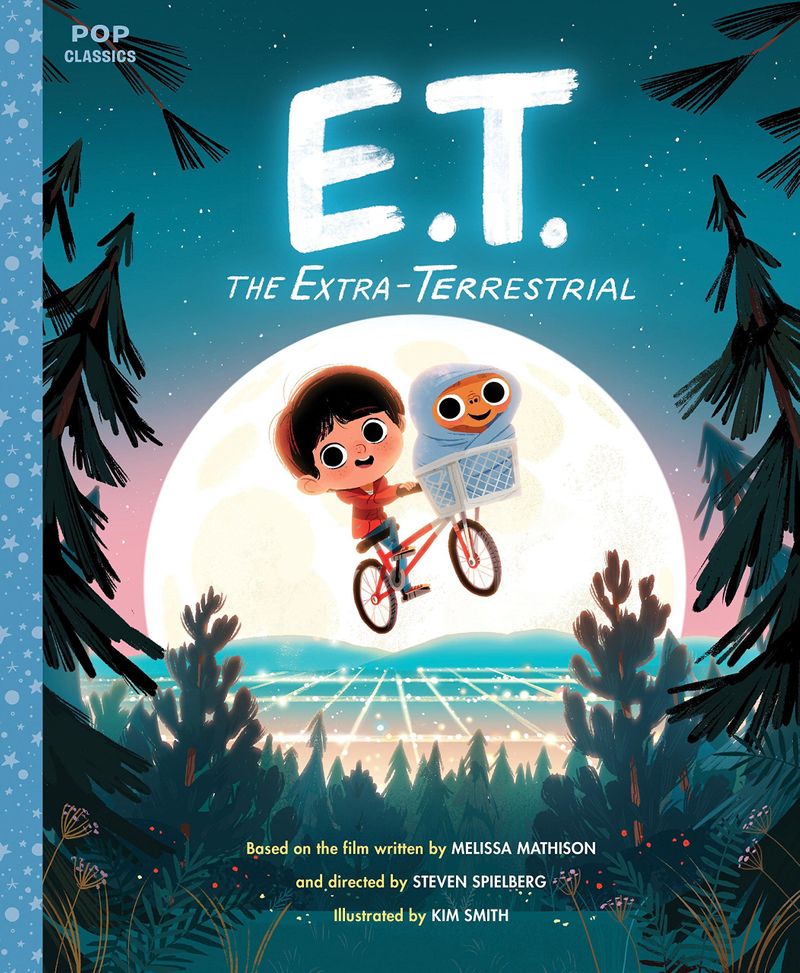
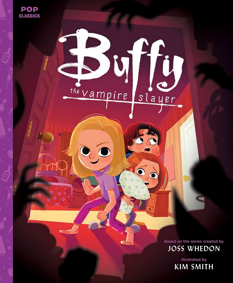
Unless you deliberately state it, they'll never know this project was supposed to be based on the book and not the movie (which Jake did not specifically made clear btw). Art directors probably won't even ask you if you followed this illustration's prompt to a tee or if there was any specific prompt involved.Anyway, lot of movies are getting illustrated as children's books nowadays. Kim Smith did this and her books are best sellers. Art Directors might actually like it more to see you referencing the movie. Besides who among the young generation these days have read the book? They'll probably connect with the movie more.
I guess my main point is that it's okay to reference the movie just as much as it's alright to reference the novel. As long as you have a new piece in your portfolio to show to your potential clients that's all that matters.
Portfolio: nyrrylcadiz.com
Instagram: https://www.instagram.com/nyrryl_cadiz/
YouTube: https://www.youtube.com/channel/UCbJCF1Im8ZO7hpGWTKOJMuA -
I think the judges for this contest will be selecting the most pleasing compositions for the critique, but I predict a discussion will come up about using iconic movie elements on the book cover. Will be curious to hear the their thoughts.
-
@Nyrryl-Cadiz thanks for sharing Kim Smith's work -I especially like the karate kid.
As for the topic in question, I support illustrating the book from it's text and being clear what version it is (there's more than one?) in good conscious. Because it's a book cover I would not draw from the movie, if the text says one eye but the cover shows two -for the witch I would have that nagging visual in my head for whole book. I would feel I would not do it justice (to the original author) if I chose to edit their original work. I remember this concern came up for me when we did the last book cover and someone chose to put characters on the cover that were not in the first book but in the second. I had reread the book and was puzzled I couldn't find the characters, but they were in the movie adaption.
Anyways I am not taking part in this contest and read the write up for it -so there's some flexibility but since it's still a book cover, I'd keep to the book. If the text was the movie then by all means have the cover with the move additions. Yeah, good topic to get us thinking @Kevin-Longueil
Instagram: www.instagram.com/heatherboyd.illustration/
Website: https://heatherboydillustration.ca
Shop: https://www.inprnt.com/search/products?q=HeatherBoydIllustration
Ko-Fi: https://ko-fi.com/heatherboydillustrationBe blessed,
-
@Heather-Boyd yeah, giving it much thought now, I think it should really just fall on the individual illustrators and what they want the prompt to be for themselves.
-
@Nyrryl-Cadiz Wow these are some frickin` awesome covers! I totally agree on the fact the "kids now a days" do connect more with the movies, it is easier to consume. I need to look in to who made these illustrations, thank you for sharing!
C.S.Zoltan
Portfolio: www.behance.net/cszoltan
Instagram: www.instagram.com/c.s.zoltan -
@cszoltan Her name is Kim Smith. She's a Canadian illustrator. Here's her portfolio https://kimillustration.com/
Portfolio: nyrrylcadiz.com
Instagram: https://www.instagram.com/nyrryl_cadiz/
YouTube: https://www.youtube.com/channel/UCbJCF1Im8ZO7hpGWTKOJMuA -
Jake did specify the book by putting Frank Baum on the template. He also said an edition, rather than version so I think he means the same story but with say a new foreword or something.
My understanding is that he was trying to give us a prompt that was similar to what a real commission would be like, so sticking to the book means you've actually read it and are able to follow a brief. If I was commissioned to create a book cover, the first thing I'd do is read at least the first few chapters.
He's also chosen Wizard of Oz because the original story is out of copyright. The film isn't. It shows an art director that you can follow a brief but still be creative within those confines.
Having said that, if the aim is to create a great portfolio piece and it doesn't align with your aims, there's no reason you can't change the prompt slightly to create something that appeals to your market.
-
@Kevin-Longueil It could be the cover for a yet to be released edition of the book. I bet transforming Wizard of Oz into a boss robot world would get Jake to put it into top 16.

-
@Nyrryl-Cadiz Already did some digging, also found her books, thank you for sharing Nyrryl

C.S.Zoltan
Portfolio: www.behance.net/cszoltan
Instagram: www.instagram.com/c.s.zoltan -
@cszoltan awesome! I’m glad you like her.

-
@Kevin-Longueil does Dorothy have a blue dress in the book? Asking for a friend
 . I was thinking of using a different color than blue but wasn't sure.... I suppose artistic licence could prevail but I haven't read the book either
-
@Coley Here's a description of Dorothy's outfit from Chapter 3 of the book (she changes into these clothes once she gets to Oz):
Dorothy had only one other dress, but that happened to be clean and was hanging on a peg beside her bed. It was gingham, with checks of white and blue; and although the blue was somewhat faded with many washings, it was still a pretty frock. The girl washed herself carefully, dressed herself in the clean gingham, and tied her pink sunbonnet on her head. She took a little basket and filled it with bread from the cupboard, laying a white cloth over the top. Then she looked down at her feet and noticed how old and worn her shoes were.
“They surely will never do for a long journey, Toto,” she said. And Toto looked up into her face with his little black eyes and wagged his tail to show he knew what she meant.
At that moment Dorothy saw lying on the table the silver shoes that had belonged to the Witch of the East.
“I wonder if they will fit me,” she said to Toto. “They would be just the thing to take a long walk in, for they could not wear out.”
She took off her old leather shoes and tried on the silver ones, which fitted her as well as if they had been made for her.
Finally she picked up her basket.
“Come along, Toto,” she said. “We will go to the Emerald City and ask the Great Oz how to get back to Kansas again.”
-
@Coley Dorothy has a gingham dress, blue and white checked. The munchkins were very impressed because white meant she was a sorceress and they thought blue was very kind of her to wear because it was the favorite color of munchkinland. So it worked out well for her starting out her journey.
-
Thanks so much @carriecopadraws and @carolinebautista

-
@Coley Blue and white gingham is it - Looks like @carriecopadraws has it covered! the only thing i might add it that she lived in a one room house - this might be important to folks that were showing Dorothy's house in the illustration.
-
@Coley she does change into a green dress in Emerald City which turns out to be white when she leaves. But most of it she's wearing the blue and white gingham farmer girl dress
-
Thanks @carrieannebrown and @Kevin-Longueil