Society of Visual Storytelling

    SVSLearn Forums

    • Register
    • Login
    • Search
    • Recent
    • Tags
    • Popular
    • Users
    • Groups
    • Search

    Wizard of Oz Cover WIP- Need Feedback & Suggestions!

    Artwork
    10
    13
    527
    Loading More Posts
    • Oldest to Newest
    • Newest to Oldest
    • Most Votes
    Reply
    • Reply as topic
    Log in to reply
    This topic has been deleted. Only users with topic management privileges can see it.
    • cszoltan
      cszoltan last edited by

      Hello everyone, I'm exited to share with you my progress of painting this Cover art. Thanks for the feedback that you gave me on the thumbnail.
      I have done the "line art" that will be used in the final images, and I also did a B&W test on how my lights will work in the scene. I have already done the Flat-ing for the Characters and different planes, so they will be easier to selection during painting process... and I`m about to start paint!
      Your feedback is greatly appreciated,
      Thanks and have Fun Painting on your own OZ!

      Annotation 2020-07-22 154145.png

      C.S.Zoltan
      Portfolio: www.behance.net/cszoltan
      Instagram: www.instagram.com/c.s.zoltan

      1 Reply Last reply Reply Quote 11
      • Coley
        Coley last edited by

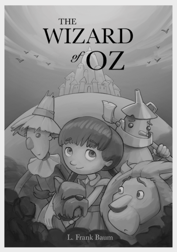
        These characters are very appealing! It looks beautiful!

        https://www.instagram.com/nicoleledrewmay/

        1 Reply Last reply Reply Quote 2
        • JoshuaDages
          JoshuaDages last edited by

          Love these character designs. The only critique I could see would be that it feels a little heavier on the right-hand side because of the Lion and "OZ," but that's if I had to be picky. Really like it!

          Joshua Dages
          https://www.instagram.com/joshuadagesart/
          https://joshuadages.com/
          https://www.etsy.com/shop/JoshuaDagesArt

          1 Reply Last reply Reply Quote 1
          • cszoltan
            cszoltan last edited by

            Thank you @Coley & @JoshuaDages , I think I will balance it our with some flowers on the left side, so it wont feel heavier on the Right side.

            Here is a quick update. which one would work best, the classical blue sky background or #2 or #3.
            Nr. 2-3 are more interesting with the red title.
            thank you foryou feedback!
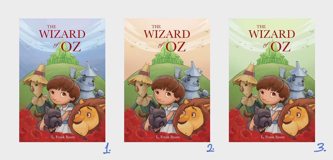
            Untitled-1.jpg

            C.S.Zoltan
            Portfolio: www.behance.net/cszoltan
            Instagram: www.instagram.com/c.s.zoltan

            Freya Chakour Nyrryl  Cadiz carriecopadraws miranda-hoover 4 Replies Last reply Reply Quote 2
            • Freya Chakour
              Freya Chakour @cszoltan last edited by

              @cszoltan hmmmmm difficult to decide but I think for me the second one is the most appealing. the warm tone makes it friendly. I always try to imagine wich book I would took up if these lay before me, and this would definitely be it, even though I like the green one too, but I think the orange sky balances the image better

              https://www.instagram.com/fyra.c/
              Portfolio: https://www.artstation.com/fyrac

              cszoltan 1 Reply Last reply Reply Quote 1
              • deborah Haagenson
                deborah Haagenson last edited by

                It's 2 for me also. I agree with the prior post that it balances the image. I think the green sort of seperates the colors into the top and bottom half.

                1 Reply Last reply Reply Quote 1
                • Nyrryl  Cadiz
                  Nyrryl Cadiz SVS OG @cszoltan last edited by

                  @cszoltan i love 2. that orange sky looks amazing against the emerald city.

                  Portfolio: nyrrylcadiz.com
                  Instagram: https://www.instagram.com/nyrryl_cadiz/
                  YouTube: https://www.youtube.com/channel/UCbJCF1Im8ZO7hpGWTKOJMuA

                  1 Reply Last reply Reply Quote 1
                  • Coley
                    Coley last edited by

                    Orange 😊

                    The blue is a bit dark. I dont know what it would be like lighter

                    https://www.instagram.com/nicoleledrewmay/

                    1 Reply Last reply Reply Quote 1
                    • Eric Droke
                      Eric Droke last edited by

                      I think it's #2 for me, as well. Great job!

                      1 Reply Last reply Reply Quote 1
                      • carriecopadraws
                        carriecopadraws SVS OG @cszoltan last edited by

                        @cszoltan I like #3 - the green city and sky make a nice backdrop, drawing attention to the two red things - the title and poppies in the foreground. The characters stand out well on this too. The orange sky in #2 makes the green hill and Emerald City stand out instead, which does not seem intended to be the focal point?

                        Carrie Copa
                        https://carriecopadraws.com/

                        1 Reply Last reply Reply Quote 1
                        • miranda-hoover
                          miranda-hoover @cszoltan last edited by

                          @cszoltan Looks great! Personally, I like the green sky the most: it draws your attention to the foreground, seems less busy, and reads better at a smaller size. Orange would probably be my second choice.

                          https://www.instagram.com/mirananemone

                          1 Reply Last reply Reply Quote 1
                          • K.Flagg
                            K.Flagg last edited by

                            I like the warmth in the sky also on #2....very nice coloring!

                            K.Flagg

                            1 Reply Last reply Reply Quote 1
                            • cszoltan
                              cszoltan @Freya Chakour last edited by

                              @deborah-Haagenson @Freya-Chakour @Nyrryl-Cadiz @Eric-Droke @K-Flagg Yes, I think it balances out the flowers and the title more, and also holds contrast to the Emerald City.
                              @miranda-hoover @carriecopadraws If the sky is a light green then the grass and the City becomes One background, and gives a stronger contrast to the foreground characters and the red title on top.

                              Thank you for all your help, have a great Weekend!

                              C.S.Zoltan
                              Portfolio: www.behance.net/cszoltan
                              Instagram: www.instagram.com/c.s.zoltan

                              1 Reply Last reply Reply Quote 1
                              • First post
                                Last post