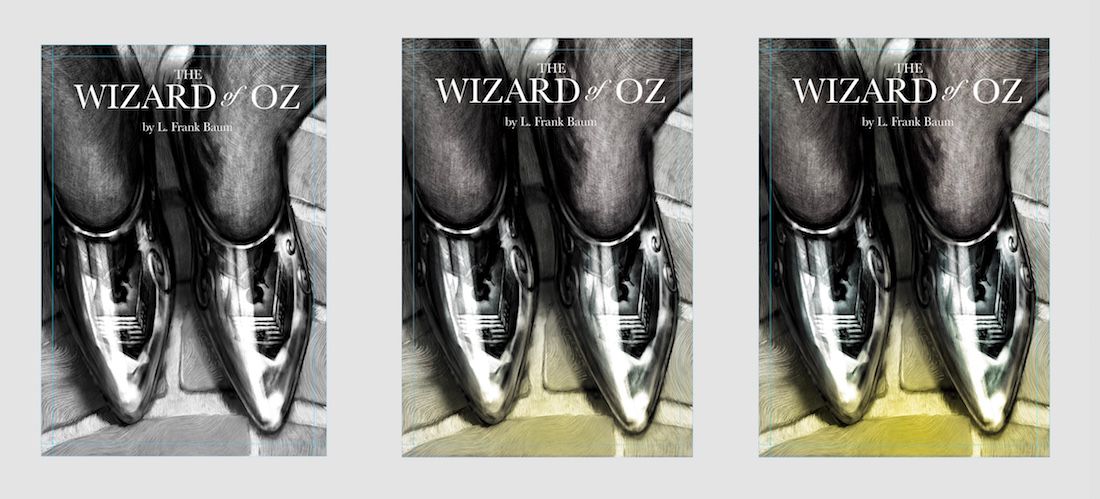
July Prompt - Silver shoes -Tiny bit of color..any thoughts?
-
Not sure about adding color to this...i really like black and white and for me it grabs my attention in a way and more often than color usually does...but was wondering what anyone thought about a tiny yellow tinting of the bricks...still work to do...but was wondering if i should abandon my color struggle - any feedback always very appreciated!
-
@Kevin-Longueil This is super cool. I love that you can see her reflected in the shoe. I am kinda drawn more to the one on the right with all the yellow. I'm not sure if its making a natural focal point, but my eyes keep drifting to that one.
-
I personally like the yellow!
-
@Kevin-Longueil I do think the black and white one does work better. I certainly understand the desire to make the bricks yellow though.
What if you made all of the bricks yellow? I took a screen cap and did some rough Photoshopping.
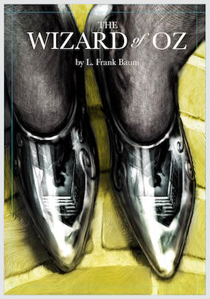
(Not necessarily saying that's the answer, but just trying things out. It may be too much yellow???)
-
I think I like the black and white more. I'm not sure if it's because I saw this last week and loved it like it was. Hmmm.
But I also feel like the yellow pulls the eye to it and really, my eye wants to explore those amazing reflections!
I don't know if a slightly more neutral yellow might work. But the original version really is amazing, that's just my personal view and might not be the judge's view!
-
@Kevin-Longueil I would have normally agreed with you about the black and white but when I saw the yellow it really helps pull together "the wizard of oz" for me. And I don't want to be this picky but a yellow between the two yellow exampes, the left one is too muted (it's like an after thought -not trying to be cruel, you know that) and the other is too saturated which for me turns my focus more on the ground than the shoes.
")
-
@Coley said in July Prompt - Silver shoes -Tiny bit of color..any thoughts?:
But I also feel like the yellow pulls the eye to it and really, my eye wants to explore those amazing reflections!
I agree to this which is why I like the yellow all around option that @drawnbyshawn did but maybe not so much or not so saturated. The yellow is warm so it draws you in but here it surrounds the most important part, instead of bringing your eye towards the bottom and partly missing all that amazing detail because the warm yellow is so darn hard to look away from lols. And the stone pathway doesn't have so much detail as to distract you away from the centre with the addition of the yellow (if you keep the yellow not too much or saturated as I said above) -possibly
. -
@Kevin-Longueil smart
-
Love the yellow. I like how @drawnbyshawn colored all the bricks in, which you may have been planning on anyway. It looks like a book cover meant for a display shelf at a book store.
-
What if the road was more gold? Came back to this again because I enjoyed it so much earlier this evening.
-
Thank you all for the kind words and quick feedback! - you are awesome!!
@Pamela-Fraley Thank you for the feedback Pamela! Super helpful to hear your take on it.
@TessaW Thank you Tessa! another vote for yellow
@drawnbyshawn Thank you Shawn! Hmmm..you do like the black and white better but folks are liking your fully yellow bricks - i have a full yellow version that i mostly discarded due to my black and white leanings... but seeing someone else do it has forced me to have an open mind about the yellow i will go back to it and give it more of a chance - Thank you for taking the time to do the draw over!
@Coley Thank you for your feedback Coley! it is very helpful! If i do go with the yellow I'm leaning toward a less saturated one for sure.
@Heather-Boyd Thank you for the feedback Heather! Very helpful to me - of course i know you are not being cruel LOL! I agree too - if i go with the yellow it would be a bit less saturated
@Nyrryl-Cadiz Thank you Nyrryl
@KathrynAdebayo Thank you so much for the feedback and kind word Kathryn! Very helpful to me - gold sounds very cool. maybe lean a bit more toward ochre'y? I tried so many yellows and kept landing on this one..i think it is a bit too saturated though...Thank you again! -
@Kevin-Longueil I like your touch of strong yellow, third version, very much! It almost gives the impression that when her feet hit the road, it has a magical effect (which also happens in the movie, but back then they couldn't do gradual effects so they just went straight to full color). At any rate, it's perfectly consistent with the story, aesthetically pleasing, and to me the gradual aspect integrates the two parts of the image well and adds to the magical feeling.
-
@Kevin-Longueil The hint of yellow in # is really interesting!
Another thought is if your cover is primarily black and white, consider contrasting that with a color title. Here's an example:

Carrie Copa
https://carriecopadraws.com/ -
The yellow gives it more depth of field. The bricks are gold but the mortar would not be gold. See how that change affects it.
-
@LauraA Thank you for your feedback Laura! - I had that same idea of the magical effect when i put the splash of color there!
@carriecopadraws Thank you Carrie! I had not considered colored text..i am wondering which one you found interesting though..2 or 3... your feedback has a bit of a cliffhanger in it
@Kim-Hunter Thank you for the feedback Kim! I will use some yellow for sure. For some reason white mortar really bothers me on this ..too much contrast and it leads my eye all over the place... i could be wrong though - thank you again for the feedback! -
@Kevin-Longueil I was talking about #3, but you might feel differently if you use a color title. Curious to see what you go with.
-
Mortar - white would be too much contrast but a lesser tint of yellow over gray might work.
-
I think l’m close...maybe a bit darker behind illustrator’s name..way more saturated than I thought I would end with but it really enhances the reflection somehow...oddly ..it’s fun to put an image on book mock up
Any final feedback before I send it in?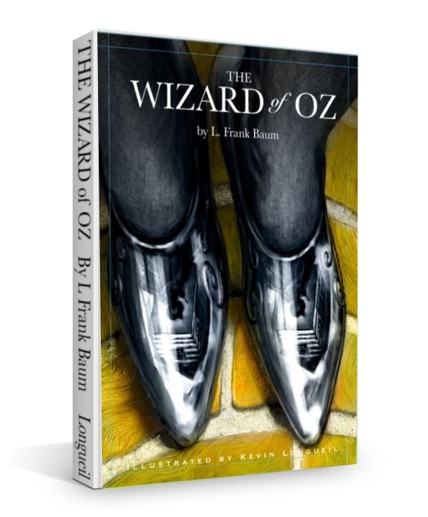
-
@Kevin-Longueil I totally love it!
Btw, if you’ll be sending the mock-up version, get rid of the bleed marks on your design (well, rather “cut” the design along the bleed marks and with that cropped image create the mock-up, but you probably know that.)
-
@mag Thank you! I won’t send the mock up in....I just posted it this way because i thought it was kinda fun to see it looking like a real book - thank you for the feedback!