Society of Visual Storytelling

    SVSLearn Forums

    • Register
    • Login
    • Search
    • Recent
    • Tags
    • Popular
    • Users
    • Groups
    • Search

    Dragonfly WIP looking for feedback

    Artwork
    contest critique
    17
    38
    3452
    Loading More Posts
    • Oldest to Newest
    • Newest to Oldest
    • Most Votes
    Reply
    • Reply as topic
    Log in to reply
    This topic has been deleted. Only users with topic management privileges can see it.
    • Anna Lindsay
      Anna Lindsay last edited by

      Hi all!
      I'm trying to challenge myself this month and come up with an illustration that isn't too 'easy'. I feel like I need a fresh pair of eyes on this composition because I'm not sure if it's working.

      • Is the overall composition working? Is the dragonfly and rider enough of a focal point?
      • Would it benefit from some added details to improve the storytelling? e.g. considering adding one or two pixies/fairies in the flowers watching the dragonfly rider go by. Or is it already too busy?
      • Does the perspective make sense?
        dragonflywip.jpg
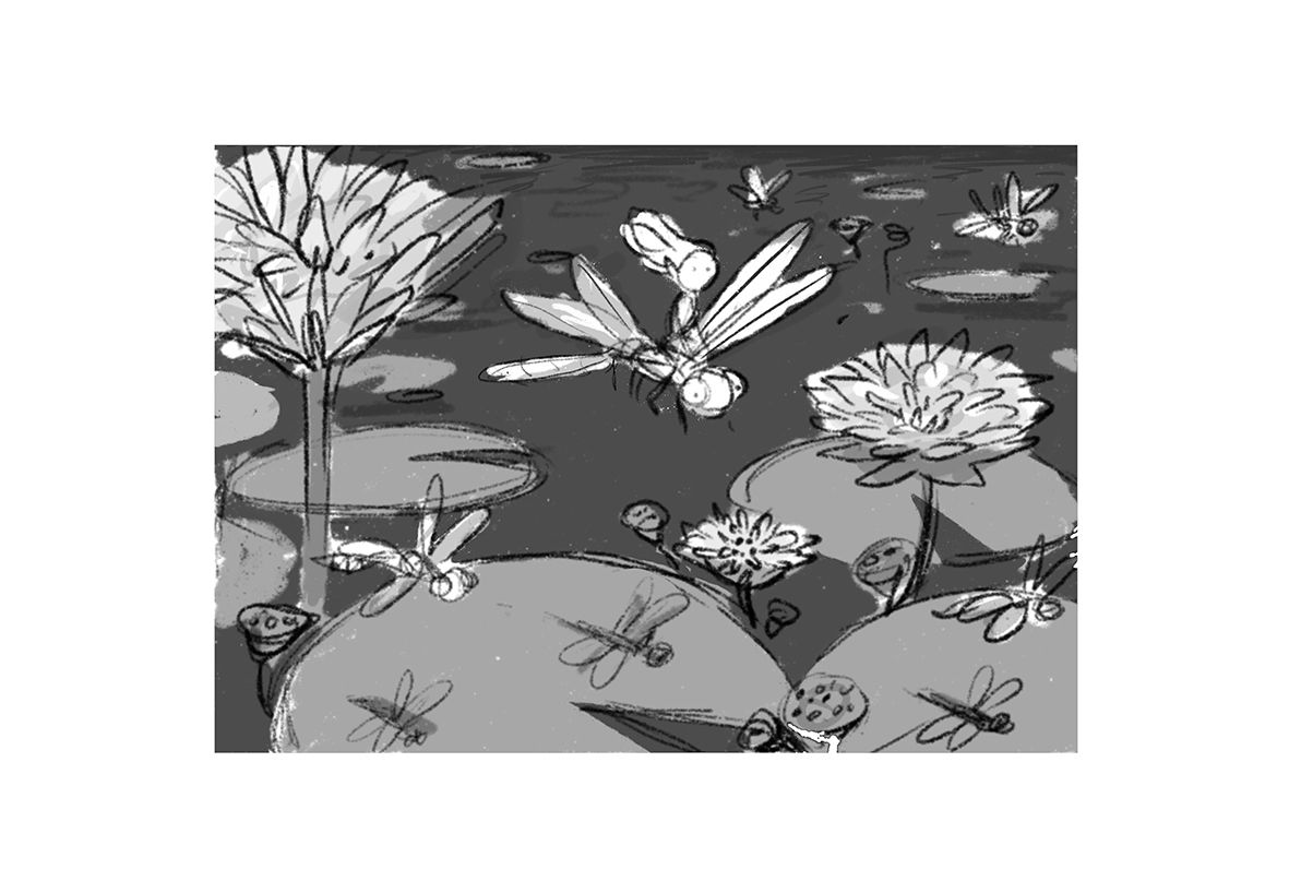
        (not sure if it's clear from the thumbnail but the dragonflies are casting shadows on the lily pads below.)
        Any feedback would be greatly appreciated! Don't hold back, I'm willing to start over if it's not working.
      Julia Chris Perry 0 Heather Boyd 3 Replies Last reply Reply Quote 4
      • Neha Rawat
        Neha Rawat last edited by

        @Annabishop This is so cute! I love it! To answer your questions:

        • Yes, the focal point works pretty well based on the contrast and space around the characters. My only suggestion would be to shift them off-center.
        • I think pixies in the flowers is a wonderful idea! It would definitely enhance the storytelling because it's adding character interaction and putting more focus on the main characters.
        • Perspective looks good!

        I didn't catch that the dragonflies were casting shadows at first, but I suppose it could work. Before I read that, I'd actually imagined a more diffused soothing lighting to up the whimsical vibe of it. Are you planning on a strong light source?

        Either way, I love it! πŸ˜ƒ

        https://www.nrbstudio.in/
        https://www.instagram.com/nrbstudio.in

        Anna Lindsay 1 Reply Last reply Reply Quote 1
        • Anna Lindsay
          Anna Lindsay @Neha Rawat last edited by

          @Neha-Rawat Hi Neha, thank you so much for taking the time to reply!

          • I totally see what you mean about the characters being a bit too central, I'll try to shift them.
          • With the light source I was imagining the midday sun hitting them from above. I thought the shadows could look interesting and I was worried about the lily pads being kind of an 'empty' space without them. However, you're right -harsh midday light isn't very atmospheric!
            Maybe hazy early morning light would work better. Then the flowers and stems would cast stretched shadows that could look nice, I'll try it out.

          I'm glad you like it! I love your work btw

          1 Reply Last reply Reply Quote 0
          • Julia
            Julia @Anna Lindsay last edited by Julia

            @Annabishop I like it!! The real challenge will be the contrast / light / shadows / reflects in the water. I am looking foward to seeing to next phase!

            https://www.instagram.com/julia.nsw/

            Anna Lindsay 1 Reply Last reply Reply Quote 1
            • Anna Lindsay
              Anna Lindsay @Julia last edited by

              @Julia Thank you! You're right, it's gonna be tricky πŸ˜…

              Julia 1 Reply Last reply Reply Quote 0
              • Julia
                Julia @Anna Lindsay last edited by

                @Annabishop ah ah!! No challenge, no reward! You re heading in the right direction. You ll be learning stuff along the way, so it is already a win!! And with a strong concept, it can't be a total fail anyway. Good luck! I am sure you ll master the execution πŸ˜ƒ

                https://www.instagram.com/julia.nsw/

                Anna Lindsay 1 Reply Last reply Reply Quote 1
                • Anna Lindsay
                  Anna Lindsay @Julia last edited by

                  @Julia Thank you for the kind words of encouragement! I think this is the best way to trick myself into learning new things haha. 'Studying fundamentals' oof sounds a bit dry, 'draw some whimsical dragonfly pixies' oh yeah sign me up!

                  1 Reply Last reply Reply Quote 1
                  • Anna Lindsay
                    Anna Lindsay last edited by

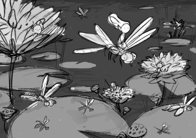
                    Tried shifting the main characters off-centre and I'm not sure if I've made it better or worse?

                    Untitled_Artwork 45.jpg

                    MyArt Multiverse Jeremy Ross miranda-hoover Laurel Aylesworth 4 Replies Last reply Reply Quote 2
                    • MyArt Multiverse
                      MyArt Multiverse @Anna Lindsay last edited by

                      @Annabishop I really like the whimsy of this idea! ❀ my only thought is maaaybe make them a teensy bit bigger than the rest of the objects just to give it that extra oomph of focal point...just an idea😊

                      Stephanie
                      https://www.instagram.com/my_art_multi_verse/?hl=en

                      1 Reply Last reply Reply Quote 1
                      • Jeremy Ross
                        Jeremy Ross @Anna Lindsay last edited by

                        Great idea @Annabishop, and grayscale contrasts look great! Can’t wait to see the finished piece!

                        https://www.instagram.com/jeremyrayross
                        https://www.jeremyrayross.com/
                        https://twitter.com/jeremyrayross
                        https://jeremyrayross.substack.com/

                        1 Reply Last reply Reply Quote 1
                        • miranda-hoover
                          miranda-hoover @Anna Lindsay last edited by

                          @Annabishop Very cute idea! I think making her larger in your second version really improved the image.

                          My only comment would be that she's flying out of the image instead of into the image. Maybe try flipping the background and her position, but leave her and the other dragonflies pointing the same direction (so she's still between the flowers and flying left to right, but she's on the left side of the image instead of the right).

                          Great values and love the other pixies hanging out if the flowers.

                          https://www.instagram.com/mirananemone

                          1 Reply Last reply Reply Quote 1
                          • Laurel Aylesworth
                            Laurel Aylesworth @Anna Lindsay last edited by

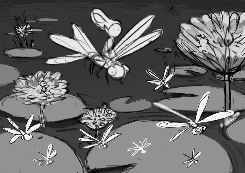
                            @Annabishop This is great, and I'm so glad you shifted the dragonfly to the right a bit. You might want to think about reducing the size of the pixie's head (the one on the left in the flower) because it's competing with the dragonfly pixie in order of importance (right now they seem equal). Values look good too. Can't wait to see the next version!

                            www.laurelaylesworth.com
                            instagram.com/laurelaylesworth

                            1 Reply Last reply Reply Quote 1
                            • Chris Perry 0
                              Chris Perry 0 @Anna Lindsay last edited by

                              @Annabishop Play with more thumbnails. This idea seems to close to the prompt image. Add something to the story. The use of tones is good showing focal point and my eye goes directly to the middle figure with the circular framing of the pond beneath it.

                              Anna Lindsay 1 Reply Last reply Reply Quote 0
                              • Anna Lindsay
                                Anna Lindsay last edited by

                                Thank you everyone for the helpful feedback! I had some time today to make a (hopefully) improved version. I took @miranda-hoover's great suggestion of flipping the background so the main character is flying in to the image rather than flying out. Does this look better?
                                dragonflywipv3.jpg

                                Jacy13 miranda-hoover Nyrryl  Cadiz 3 Replies Last reply Reply Quote 3
                                • Jacy13
                                  Jacy13 @Anna Lindsay last edited by

                                  @Annabishop I think this is looking great! I can't wait to see your progress on this drawing πŸ™‚

                                  Deviantart: https://www.deviantart.com/jacy13
                                  Instagram: https://www.instagram.com/jacy13draws/?hl=en
                                  Portfolio: https://jacy13.artstation.com/

                                  1 Reply Last reply Reply Quote 1
                                  • Anna Lindsay
                                    Anna Lindsay @Chris Perry 0 last edited by

                                    @Chris-Perry-0 When Jake posted the fairy and dragonfly image the day after I uploaded this WIP I did have a "Ahh crap" moment haha. πŸ˜… It may well mean I don't get votes in the contest since it looks unoriginal but winning the contest isn't really a priority. I'm more interested in using the contest as motivation to make a cool portfolio piece.

                                    Chris Perry 0 1 Reply Last reply Reply Quote 1
                                    • Heather Boyd
                                      Heather Boyd @Anna Lindsay last edited by Heather Boyd

                                      @Annabishop hey,

                                      *these comments are feedback from your original post.

                                      Your values look good. I agree with those who have noted your character to centered. If you moved her over slightly to the right and maybe down a bit, I feel it is a bit uneasy near the top edge. And if you possibly overlapped the character and her ride overtop another Lilly pad (add to our perception of depth).

                                      I recognized the shadows of the dragonflies a bit more but maybe make them more blurry because they are in motion and the actual critters more in focus but less focus than the main characters.

                                      My last note is maybe adjust the two sizes of the pixie and the dragonfly she is riding, she feels to me she might be more weight on top of him/her. So I'd either make your pixie smaller or your dragonfly larger.

                                      Water lilles are really among my very favorite flowers. ❀

                                      Instagram: www.instagram.com/heatherboyd.illustration/
                                      Website: https://heatherboydillustration.ca
                                      Shop: https://www.inprnt.com/search/products?q=HeatherBoydIllustration
                                      Ko-Fi: https://ko-fi.com/heatherboydillustration

                                      Be blessed,

                                      1 Reply Last reply Reply Quote 1
                                      • miranda-hoover
                                        miranda-hoover @Anna Lindsay last edited by

                                        @Annabishop Looks great! I'm excited to see what colors you pick!

                                        https://www.instagram.com/mirananemone

                                        1 Reply Last reply Reply Quote 1
                                        • Nyrryl  Cadiz
                                          Nyrryl Cadiz SVS OG @Anna Lindsay last edited by

                                          @Annabishop looking good! Your composition is lovely. I can't wait for your finished piece

                                          Portfolio: nyrrylcadiz.com
                                          Instagram: https://www.instagram.com/nyrryl_cadiz/
                                          YouTube: https://www.youtube.com/channel/UCbJCF1Im8ZO7hpGWTKOJMuA

                                          1 Reply Last reply Reply Quote 1
                                          • JoshuaDages
                                            JoshuaDages last edited by

                                            I love the perspective on this. I think your latest version is spot on. Can't wait to see it!

                                            Joshua Dages
                                            https://www.instagram.com/joshuadagesart/
                                            https://joshuadages.com/
                                            https://www.etsy.com/shop/JoshuaDagesArt

                                            1 Reply Last reply Reply Quote 1
                                            • First post
                                              Last post