Society of Visual Storytelling

    SVSLearn Forums

    • Register
    • Login
    • Search
    • Recent
    • Tags
    • Popular
    • Users
    • Groups
    • Search

    July Prompt - Silver shoes -Tiny bit of color..any thoughts?

    Artwork
    15
    36
    1828
    Loading More Posts
    • Oldest to Newest
    • Newest to Oldest
    • Most Votes
    Reply
    • Reply as topic
    Log in to reply
    This topic has been deleted. Only users with topic management privileges can see it.
    • carriecopadraws
      carriecopadraws SVS OG @Kevin Longueil last edited by

      @Kevin-Longueil I was talking about #3, but you might feel differently if you use a color title. Curious to see what you go with.

      Carrie Copa
      https://carriecopadraws.com/

      1 Reply Last reply Reply Quote 1
      • Kim Hunter
        Kim Hunter last edited by

        Mortar - white would be too much contrast but a lesser tint of yellow over gray might work.

        1 Reply Last reply Reply Quote 1
        • Kevin Longueil
          Kevin Longueil SVS OG @carriecopadraws last edited by Kevin Longueil

          I think l’m close...maybe a bit darker behind illustrator’s name..way more saturated than I thought I would end with but it really enhances the reflection somehow...oddly ..it’s fun to put an image on book mock up 🙂 Any final feedback before I send it in?

          A2248AAD-7680-4F73-85C8-130AFBC70B9F.jpeg

          Portfolio: kevinlongueil.com
          https://www.instagram.com/kevinlongueil/

          mag Jeremy Ross Nyrryl  Cadiz 4 Replies Last reply Reply Quote 10
          • mag
            mag Pro SVS OG @Kevin Longueil last edited by

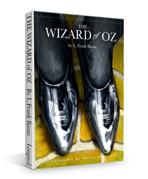
            @Kevin-Longueil I totally love it!
            Btw, if you’ll be sending the mock-up version, get rid of the bleed marks on your design (well, rather “cut” the design along the bleed marks and with that cropped image create the mock-up, but you probably know that.) 😉

            Mag
            https://www.instagram.com/mag_takac/
            http://mag.takac.name

            Kevin Longueil 1 Reply Last reply Reply Quote 2
            • Kevin Longueil
              Kevin Longueil SVS OG @mag last edited by

              @mag Thank you! I won’t send the mock up in....I just posted it this way because i thought it was kinda fun to see it looking like a real book - thank you for the feedback!

              Portfolio: kevinlongueil.com
              https://www.instagram.com/kevinlongueil/

              1 Reply Last reply Reply Quote 0
              • Jeremy Ross
                Jeremy Ross @Kevin Longueil last edited by

                Makes me want to do a mock up for my cover @Kevin-Longueil!

                https://www.instagram.com/jeremyrayross
                https://www.jeremyrayross.com/
                https://twitter.com/jeremyrayross
                https://jeremyrayross.substack.com/

                Kevin Longueil 1 Reply Last reply Reply Quote 1
                • TessaW
                  TessaW last edited by

                  It looks really cool!

                  @Jeremy-Ross You should!

                  Website: www.tessawrathall.com

                  Instagram: www.instagram.com/tessawrathall_art/

                  1 Reply Last reply Reply Quote 1
                  • Coley
                    Coley last edited by

                    Super awesome. Just gorgeous. Totally pro. You figured the yellow out!

                    https://www.instagram.com/nicoleledrewmay/

                    1 Reply Last reply Reply Quote 1
                    • Nyrryl  Cadiz
                      Nyrryl Cadiz SVS OG @Kevin Longueil last edited by

                      @Kevin-Longueil beautiful!!!

                      Portfolio: nyrrylcadiz.com
                      Instagram: https://www.instagram.com/nyrryl_cadiz/
                      YouTube: https://www.youtube.com/channel/UCbJCF1Im8ZO7hpGWTKOJMuA

                      1 Reply Last reply Reply Quote 1
                      • Eric Droke
                        Eric Droke last edited by

                        You CRUSHED it! Love the limited use of color. But my favorite part is the reflection in the shoes! Genius! Way to go!

                        1 Reply Last reply Reply Quote 1
                        • Nyrryl  Cadiz
                          Nyrryl Cadiz SVS OG @Kevin Longueil last edited by

                          @Kevin-Longueil My last suggestion is maybe lose the grid lines?

                          Portfolio: nyrrylcadiz.com
                          Instagram: https://www.instagram.com/nyrryl_cadiz/
                          YouTube: https://www.youtube.com/channel/UCbJCF1Im8ZO7hpGWTKOJMuA

                          Kevin Longueil 1 Reply Last reply Reply Quote 1
                          • Kevin Longueil
                            Kevin Longueil SVS OG @Jeremy Ross last edited by

                            @Jeremy-Ross Here is the image i used Jeremy....fairly low res. but still fun

                            4c3e94f0e3e41640a191f7f88c36499c.jpg

                            @TessaW Thank you Tessa!
                            @Coley Wow! thank you Coley!
                            @Nyrryl-Cadiz Thank you so much Nyrryl! I will remove the grid lines when i post it on the contest thread for sure - thank you again
                            @Eric-Droke Thank you Eric!

                            Portfolio: kevinlongueil.com
                            https://www.instagram.com/kevinlongueil/

                            Jeremy Ross 2 Replies Last reply Reply Quote 2
                            • Jeremy Ross
                              Jeremy Ross @Kevin Longueil last edited by

                              Thanks @Kevin-Longueil

                              https://www.instagram.com/jeremyrayross
                              https://www.jeremyrayross.com/
                              https://twitter.com/jeremyrayross
                              https://jeremyrayross.substack.com/

                              1 Reply Last reply Reply Quote 0
                              • Griffin McPherson
                                Griffin McPherson last edited by

                                I would go with the yellow for sure. Particularly considering that it’s meant to be a book cover I think there should be some color to grab the eye. Love the reflection in the shoes by the way!

                                Kevin Longueil 1 Reply Last reply Reply Quote 1
                                • Jeremy Ross
                                  Jeremy Ross @Kevin Longueil last edited by

                                  Tried my hand with the mockup @Kevin-Longueil, Definitely had fun trying this; Here it is!
                                  https://forum.svslearn.com/topic/9866/wizard-of-oz-book-cover-mockup

                                  https://www.instagram.com/jeremyrayross
                                  https://www.jeremyrayross.com/
                                  https://twitter.com/jeremyrayross
                                  https://jeremyrayross.substack.com/

                                  1 Reply Last reply Reply Quote 1
                                  • Kevin Longueil
                                    Kevin Longueil SVS OG @Griffin McPherson last edited by

                                    @Griff Thank you for the feedback Griff!

                                    Portfolio: kevinlongueil.com
                                    https://www.instagram.com/kevinlongueil/

                                    1 Reply Last reply Reply Quote 0
                                    • Kevin Longueil
                                      Kevin Longueil SVS OG @Nyrryl Cadiz last edited by

                                      @Nyrryl-Cadiz now I’m wondering if I should leave the grid lines in when I post it to show what is and is not in the bleed zone...?

                                      Portfolio: kevinlongueil.com
                                      https://www.instagram.com/kevinlongueil/

                                      mag 1 Reply Last reply Reply Quote 0
                                      • mag
                                        mag Pro SVS OG @Kevin Longueil last edited by

                                        @Kevin-Longueil I was wondering the same, even thinking about posting two images side by side one with bleed, one without... but decided to just go with the grid lines, so it’s clear I’m counting with the bleed and they can be sure where everything is placed within the “actual” clean format of the cover... but I don’t like having them there either. 🤔

                                        Mag
                                        https://www.instagram.com/mag_takac/
                                        http://mag.takac.name

                                        Kevin Longueil 1 Reply Last reply Reply Quote 1
                                        • Kevin Longueil
                                          Kevin Longueil SVS OG @mag last edited by

                                          @mag Thank you for your thoughts Mag.. i'm thinking i'll post with the grid lines too then 🙂

                                          Portfolio: kevinlongueil.com
                                          https://www.instagram.com/kevinlongueil/

                                          1 Reply Last reply Reply Quote 0
                                          • Kim Hunter
                                            Kim Hunter last edited by

                                            Very cool!

                                            Kevin Longueil 1 Reply Last reply Reply Quote 1
                                            • First post
                                              Last post