Society of Visual Storytelling

    SVSLearn Forums

    • Register
    • Login
    • Search
    • Recent
    • Tags
    • Popular
    • Users
    • Groups
    • Search

    WIP magazine cover, critiques requested ;) - final updated July 29

    Artwork
    10
    26
    1456
    Loading More Posts
    • Oldest to Newest
    • Newest to Oldest
    • Most Votes
    Reply
    • Reply as topic
    Log in to reply
    This topic has been deleted. Only users with topic management privileges can see it.
    • idid
      idid @j.sienkowski last edited by idid

      @carolinebautista Ah, so helpful! Let me try if soften the straight line helps, and also add more warm colors ! Maybe I am making the colors too cool unintentionally --- It has been really warm recently ...

      stay cool !

      1 Reply Last reply Reply Quote 0
      • idid
        idid @Nyrryl Cadiz last edited by

        @Nyrryl-Cadiz It is for a literature digest magazine by POPLAR Publishing Co. They are mainly in Asia market, mostly Japan / China / Taiwan , etc. 🤗

        1 Reply Last reply Reply Quote 1
        • cszoltan
          cszoltan last edited by

          Hi Idid, I think that A is much stronger, the composition is perfect for all the text and "labels" that have to go on a magazine cover. The idea that you can see outside is interesting, but wouldn't it be much better to have a simple cave background as well, just so that the text can read more easily.
          Cant wait to see your progress!

          C.S.Zoltan
          Portfolio: www.behance.net/cszoltan
          Instagram: www.instagram.com/c.s.zoltan

          idid 1 Reply Last reply Reply Quote 0
          • chrisaakins
            chrisaakins last edited by

            @idid I really like A. I think the colors are very good. I don't think you need to warm them up any. They definitely feel warm in comparison to the outside and the kid's outfits and colors contrast very nicely. I think if you warmed it up they might get lost. The cooler scenes are nice in their colors but it is not reading "yeti" to me. It just looks like a large circular critter. But A definitely reads protection and care. I love it. I really like the character design and the watercolor effect of your medium.

            Chris Akins
            www.chrisakinsart.com
            www.instagram.com/chrisakinsart/

            1 Reply Last reply Reply Quote 0
            • idid
              idid @cszoltan last edited by

              @cszoltan and @chrisaakins Thank you! I like A better, too! I made a few changes after your suggestions and sent it to editors, they eventually chose B2. They liked all of them and B2 has a bright color that kids will love. So I am ready to illustrate on paper now! Can't wait 🙂

              I'll share a finished piece once it is approved.

              Many thanks to all of you! 😘

              cszoltan 1 Reply Last reply Reply Quote 2
              • cszoltan
                cszoltan @idid last edited by

                @idid Cant wait to see the final cover Idid!

                C.S.Zoltan
                Portfolio: www.behance.net/cszoltan
                Instagram: www.instagram.com/c.s.zoltan

                1 Reply Last reply Reply Quote 0
                • idid
                  idid last edited by

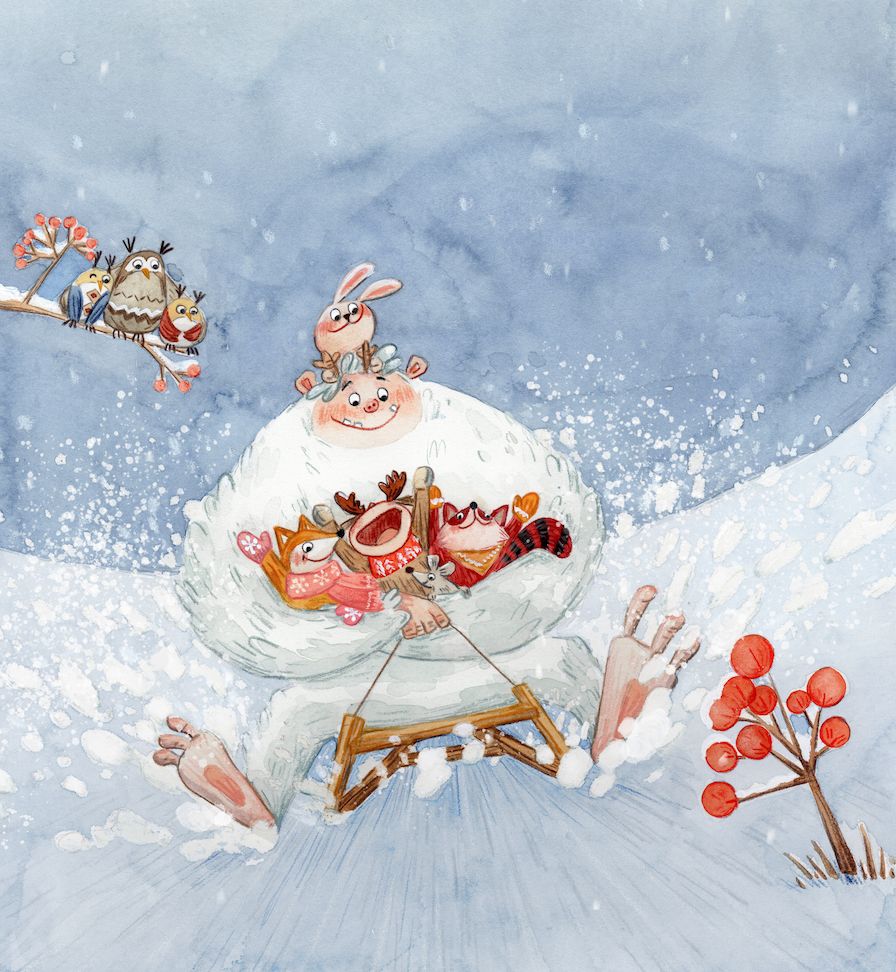
                  Hi again everyone, I really appreciate all your critiques/suggestions! I have finalized the cover illustration and attached it here (it is a bit tilted and logo/texts on the cover will compensate for that). The editor also prefers a really whiter background so I changed the level of background digitally.

                  I learned a lot from this experience, and .... also realized there's so much to improve in my illustration as color palette, way of rendering, etc. .... so more critiques are definitely needed in the future 🤗

                  Thank you again!

                  tmp.jpg

                  holleywilliamson Nyrryl  Cadiz 2 Replies Last reply Reply Quote 10
                  • holleywilliamson
                    holleywilliamson SVS OG @idid last edited by

                    @idid looks great! All your characters are so cute. Is that traditionally done to start with?

                    https://www.instagram.com/holleywilliamsonart/
                    http://holleywilliamson.com

                    idid 1 Reply Last reply Reply Quote 0
                    • idid
                      idid @holleywilliamson last edited by

                      @holleywilliamson Thank you! they are traditionally done 🙂 background level has been changed digitally

                      1 Reply Last reply Reply Quote 0
                      • TessaW
                        TessaW last edited by

                        It turned out beautifully!

                        Website: www.tessawrathall.com

                        Instagram: www.instagram.com/tessawrathall_art/

                        idid 1 Reply Last reply Reply Quote 0
                        • Blitz55
                          Blitz55 last edited by

                          Completely late to this party but this is a fantastic thread. I loved seeing the process toward completion. The final is absolutely charming in it's style and I think reads really well.

                          Draw, Draw, Draw, Draw and Draw Some More!
                          Instagram: https://www.instagram.com/levisimpson55/

                          idid 1 Reply Last reply Reply Quote 0
                          • idid
                            idid @Blitz55 last edited by

                            @Blitz55 Thank you so much! I think I'll never be able to make that far without suggestions from people on this forum.

                            1 Reply Last reply Reply Quote 1
                            • idid
                              idid @TessaW last edited by

                              @TessaW Thank you! your suggestions are so helpful!

                              1 Reply Last reply Reply Quote 0
                              • Nyrryl  Cadiz
                                Nyrryl Cadiz SVS OG @idid last edited by

                                @idid Beautiful! Did you do paint this piece traditionally.

                                Portfolio: nyrrylcadiz.com
                                Instagram: https://www.instagram.com/nyrryl_cadiz/
                                YouTube: https://www.youtube.com/channel/UCbJCF1Im8ZO7hpGWTKOJMuA

                                idid 1 Reply Last reply Reply Quote 0
                                • idid
                                  idid @Nyrryl Cadiz last edited by

                                  @Nyrryl-Cadiz Thank you! Yes, I paint it traditionally with watercolor and colored pencil. Digitally changed the background level a little bit.

                                  Nyrryl  Cadiz 1 Reply Last reply Reply Quote 1
                                  • Nyrryl  Cadiz
                                    Nyrryl Cadiz SVS OG @idid last edited by

                                    @idid i love how organic it looks. The texture and colors are amazing!

                                    Portfolio: nyrrylcadiz.com
                                    Instagram: https://www.instagram.com/nyrryl_cadiz/
                                    YouTube: https://www.youtube.com/channel/UCbJCF1Im8ZO7hpGWTKOJMuA

                                    1 Reply Last reply Reply Quote 1
                                    • First post
                                      Last post