Our SVS Virtual Studio OCTOBER 2🎃2🎃
-
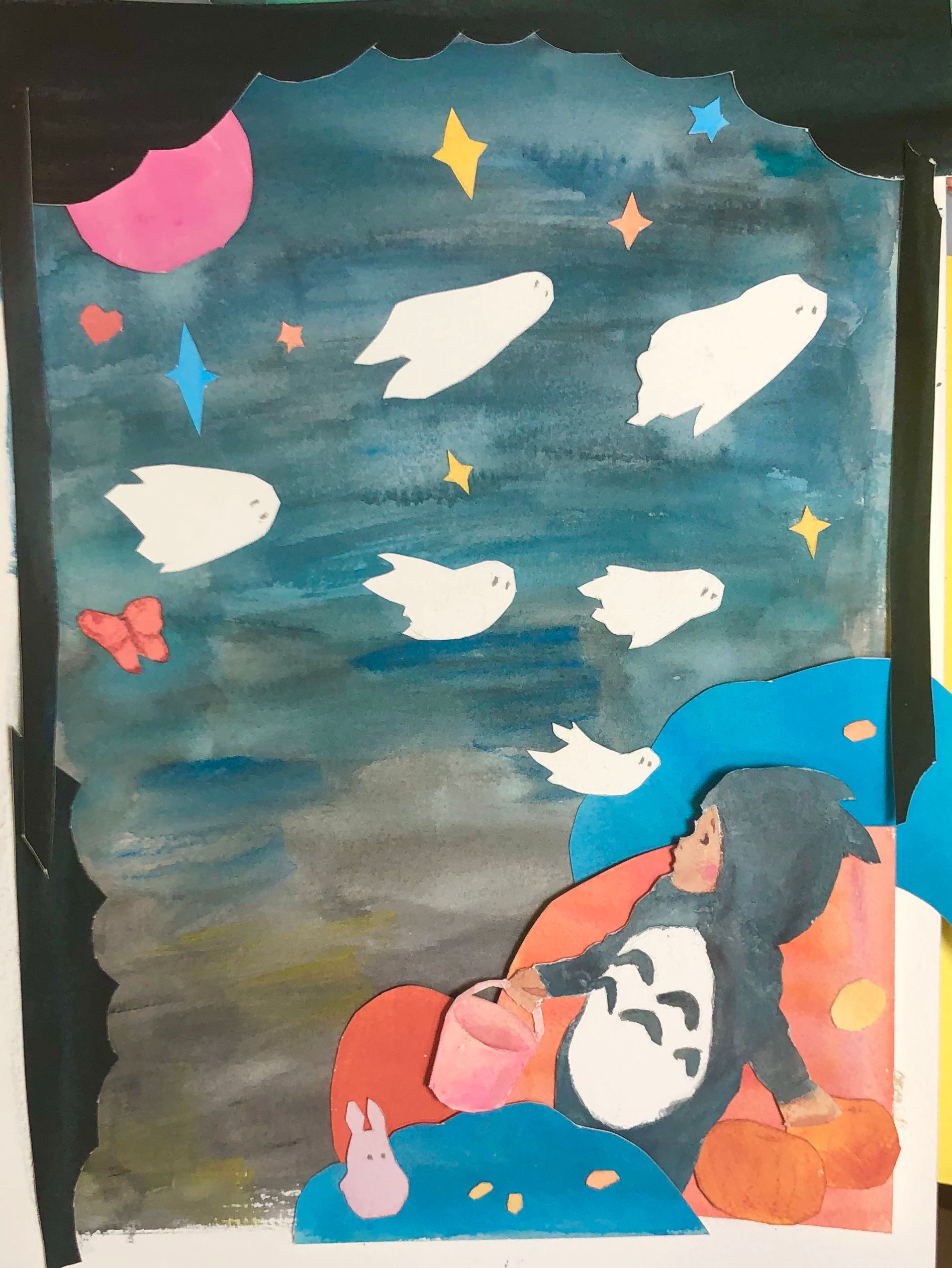
Here’s what I’m playing around with this week. I was doing some master copies of Ezra Jack Keats and was having so much fun with the cut paper I decided to have another go at this months prompt (I don’t want to talk about the last attempt
 ).
).I’ve also been working on putting together a dream portfolio and I noticed that there were reoccurring graphic shapes, a sort of randomness, and some neon colors, so I’m trying to mix those in here too. I’ll probably mess with it digitally when it’s all done to get rid of the shadows and such and smooth out the lines... Also, I don’t feel like wasting an entire piece of watercolor paper to make a perfect black border
 so I’ll probably finish that digitally as well.
Not sure where I’m going with the bottom left corner but I don’t want to make it draw your eye - maybe some rolling black/gray/blue hills rolling down towards the kid with a tilted table of candy in front getting thrown into the air? I may add another kid running towards us....or a couple...
-
@Jade-Vaughan That is looking absolutely incredible! Wish I could draw a background like that

-
@Jacy13 Thank you! Honestly it just takes time and effort. Took around 2 days of working to get it right. The hardest thing for me is keeping sizes relative to one another and adjusting line weight. I'm much more character driven x)
-
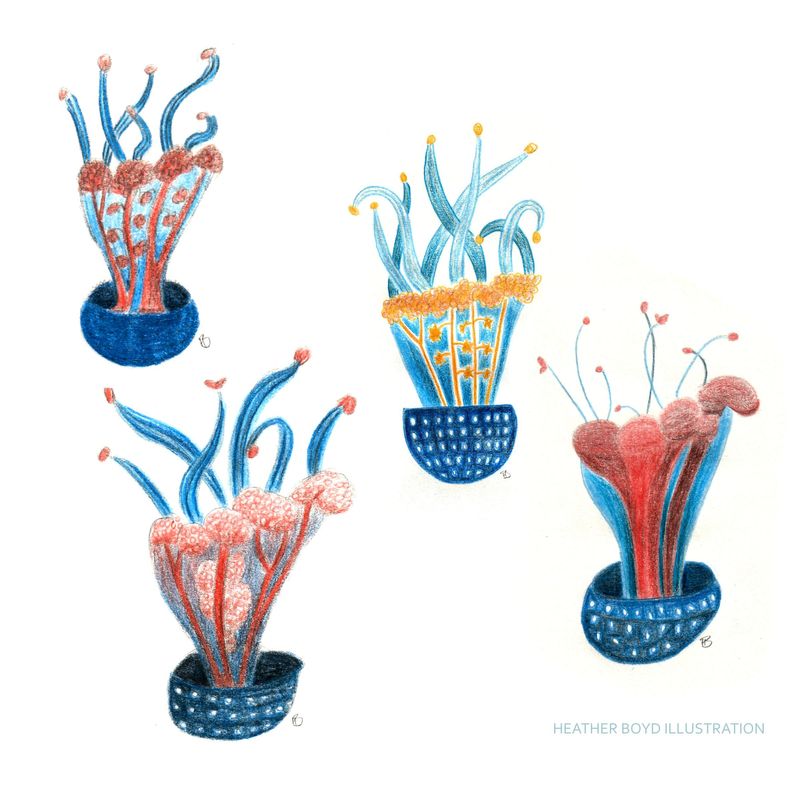
This isn't Halloween or fall related that's what the svs contest is for combining the two (and I am almost finished the drawing) but I did this some time back. 1 jellyfish done 4 ways.
-
@Heather-Boyd This are really charming
-
-
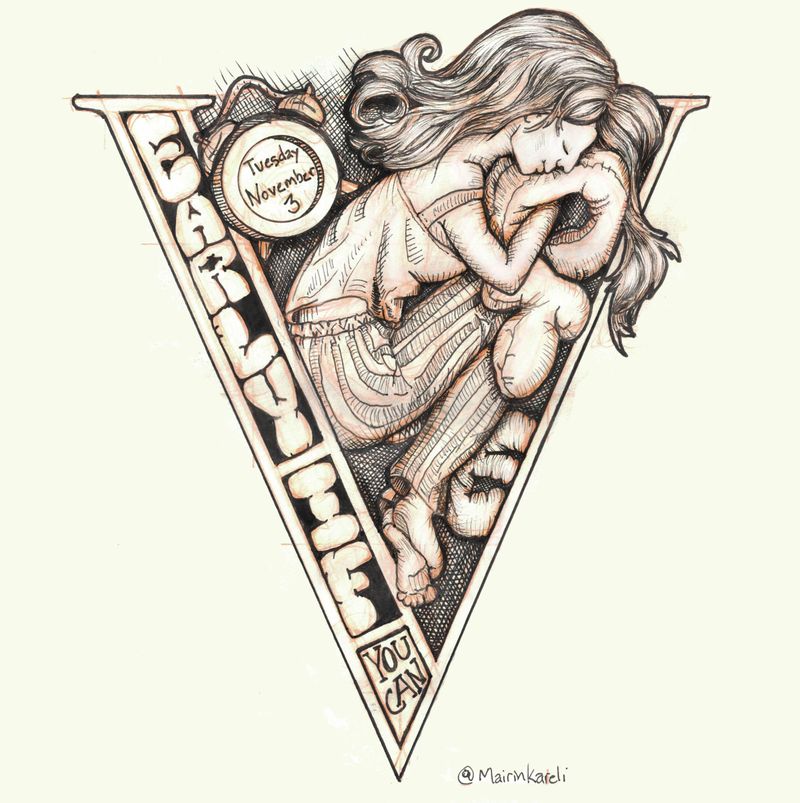
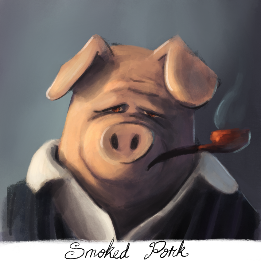
Had to get this one out of my system.
-
@Mairin-Kareli Thank you.
 I try to create charming/ delightful work.
 -
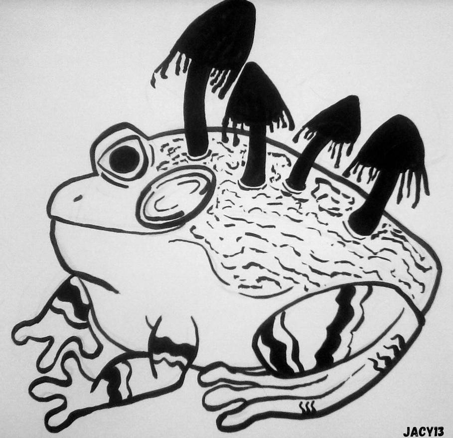
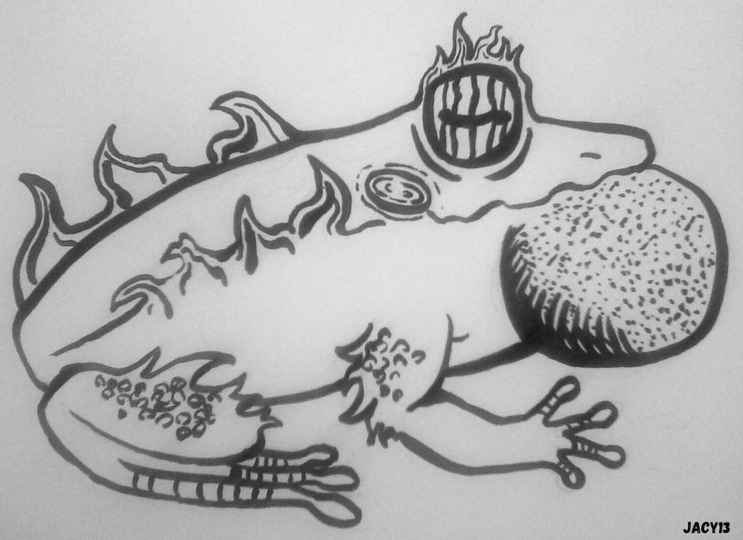
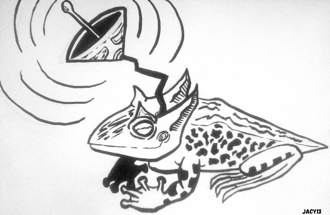
Here are a few of my inktober pieces I've finished up this month! It's part of a series I'm working on called "Funky Frogs", haha
 Some of these are just loosely based on the prompts.
Bulky frog:
Wisp frog:
Radio frog:
-
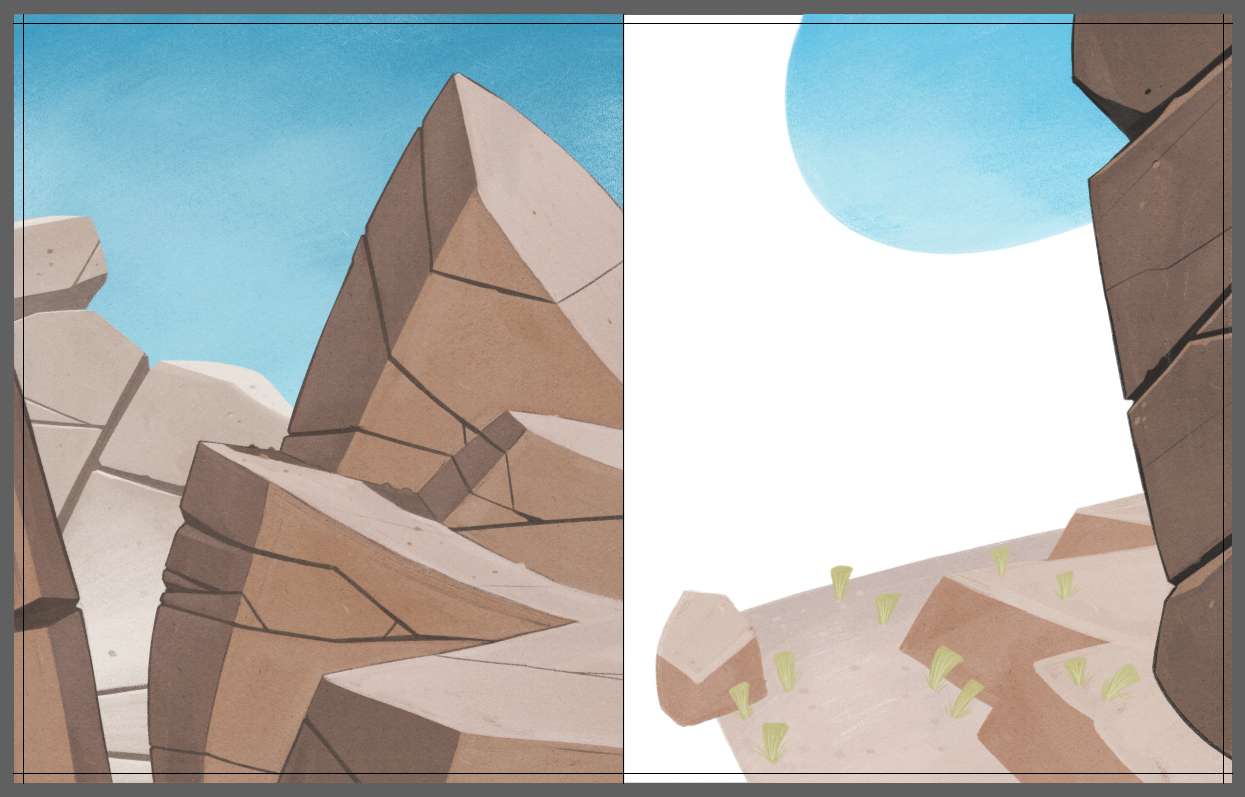
Workin' on the environments of some book interiors. My process is now paint the background and environment, THEN doodle the characters

-
@Braden-Hallett Interesting - you completely polish the background before you add anyone else to the scene? Is that more so that you can more accurately use the light and shadow of the environment on the characters??
-
@jdubz yup! It's because I have the bad habit of doing exactly the opposite (finishing and polishing the characters first) which means I need to fix the environment to match the characters instead of just rendering the characters to match the surroundings.
-
@Braden-Hallett Very cool! I'm currently trying to break the habit of over finishing characters too early so I can attest to that pain

-
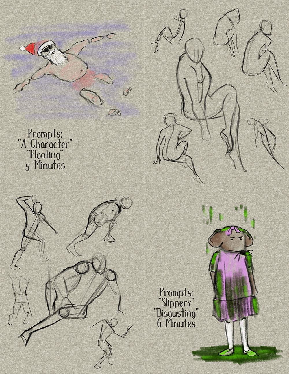
The local San Diego chapter of SCBWI hosts a once-a-month "Illustrator Shmooze" where we all draw together and socialize and get to know each other. Lately everything has been happening on Zoom, of course, so we've had fun watching life drawing videos from YouTube together and trying our hand at some prompts. We used the Inktober prompt list to play with a couple. After an hour of life drawing (argh, that was painful!!) we did: "A Character and Floating" as one 5-minute prompt, and then "Slippery and Disgusting" as the second 5-minute prompt which became 6-minutes because it was hard to finish... Haha!! We shared and laughed and it was a good time.
-
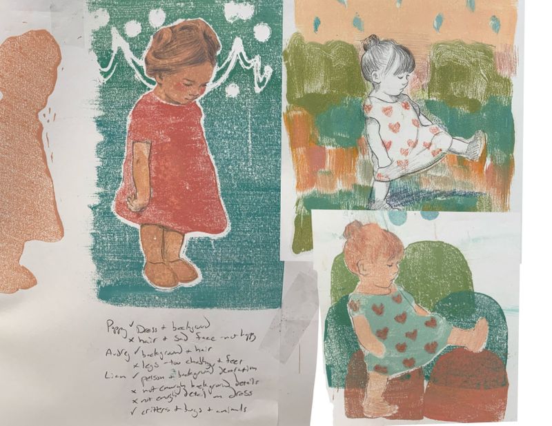
I just wanted to share another one because I’m super excited about this! I’ve been working on discovering a process I love that consistency produces results I like. I’ve been deep diving into this for all of 2020 and usually I’m just slugging through making a bunch of trash
 BUT I every so often, I’ve been getting little breakthroughs that inform me, and today I feel like I got one of those! I made the image on the top right a week ago sort of by accident. I printed the background first and just wiped an area clean to draw the girl in and misjudged her height by quite a lot!! But I crammed her into that space anyway, and just really liked the result.. But I didn’t love how she had no color.. So next I tried the version under that one. I actually did about 5 prints before I got to this one which I liked somewhat, but the dress wasn’t doing it for me still. Today, I tried modifying a sketch I made yesterday to print. The sketch I did had pretty accurate proportions, but I wanted to try to replicate the short smashed proportions I had done last week by accident so I shortened her arm and dress by a fourth, and smashed her legs from above knee height to partial calf and enlarged her head. I tried giving color to her as well...And I feel like I nailed it! I’m just really happy with it. I ended up asking my three kids their thoughts also ( I do sometimes, but never with this much intention) after listening to an SVS ( I think it was? ) talk mentioning how in children’s illustration, adults might be the gatekeepers, but KIDS are your actual audience, and wrote their likes and dislikes under the image. They all had an opinion and made really good points! I’m excited to see if I can continue making consistent results in this way!
 -
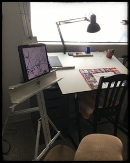
@Braden-Hallett i realized today that I don’t have to wait until Christmas for an easel to relieve my neck pain when drawing. I’ve had an easel in my art room for 30 years!!


-
@burvantill said in Our SVS Virtual Studio OCTOBER 2
 2
2 :
:@Braden-Hallett i realized today that I don’t have to wait until Christmas for an easel to relieve my neck pain when drawing. I’ve had an easel in my art room for 30 years!!


Nice! Can't hurt, might help! Though your arm may get tired of the new drawing position for the first little while

-
@Braden-Hallett said in Our SVS Virtual Studio OCTOBER 2
 2
2 :
:Though your arm may get tired of the new drawing position for the first little while
Nope. All good. I use the big easel from time to time for large format loose sketching, which is why it’s so ridiculous that it didn’t occur to me to put the iPad on it. FACE PALM!
-
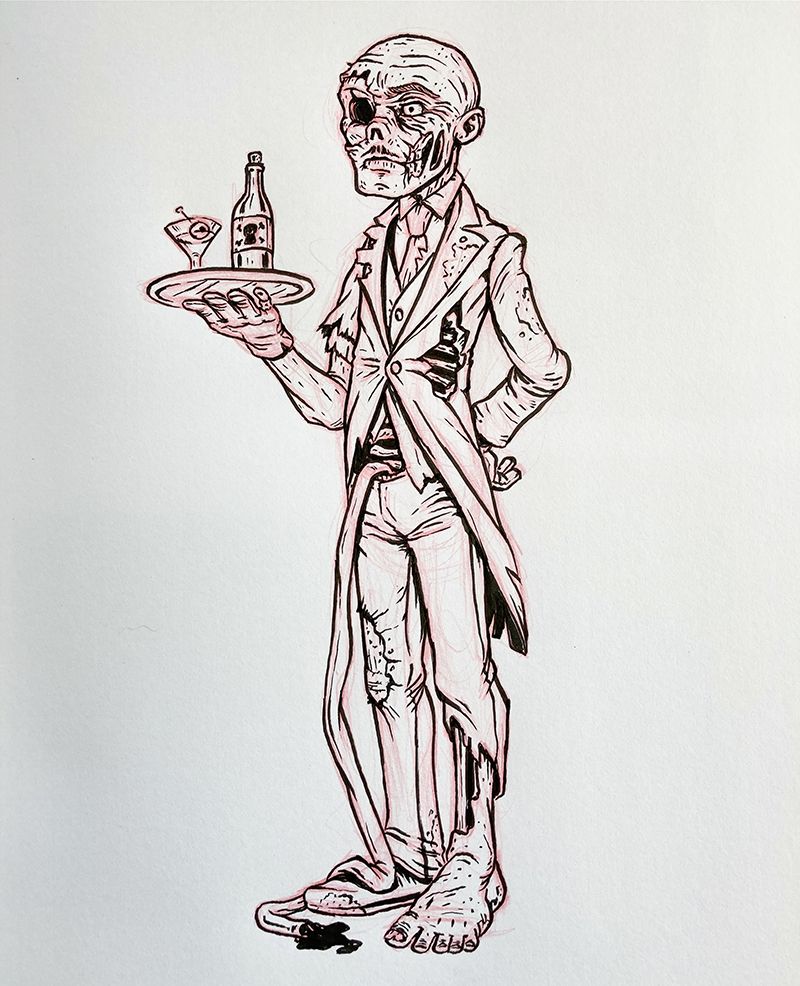
Had to take a break from Inktober to sketch a zombie.
-
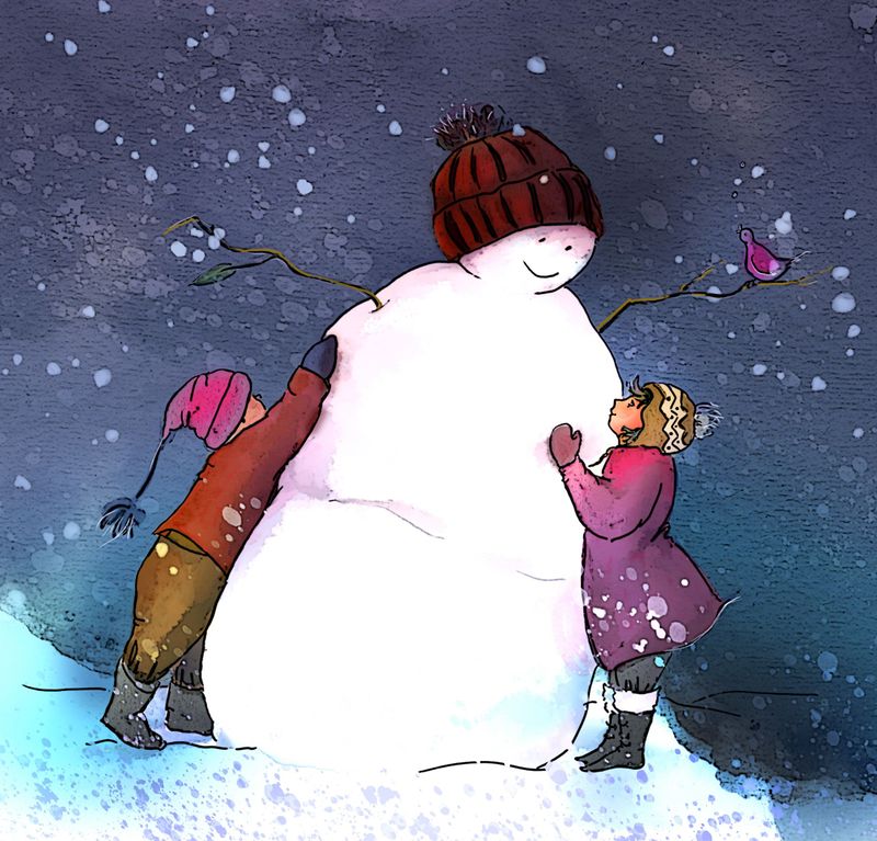
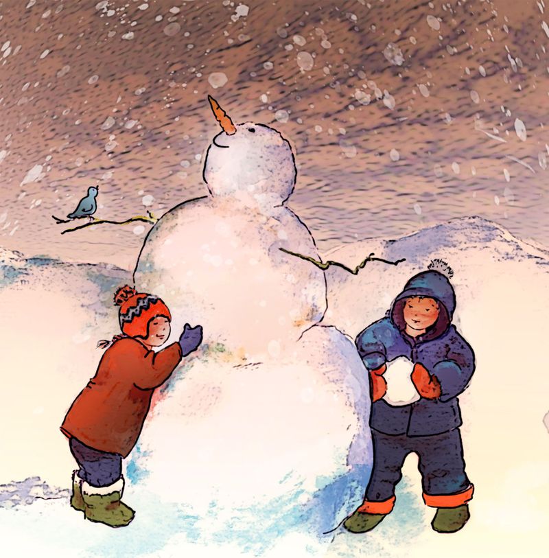
I've been doing little snowmen scenes! Two different skies on the first. I had used a portion of a watercolor painting layered underneath of the darker toned one but it's not working I don't think. So changed it out ..I'm still using a layer of traditional medium for the sky portion, but I think it's more 'opened up' and I kind of prefer it.
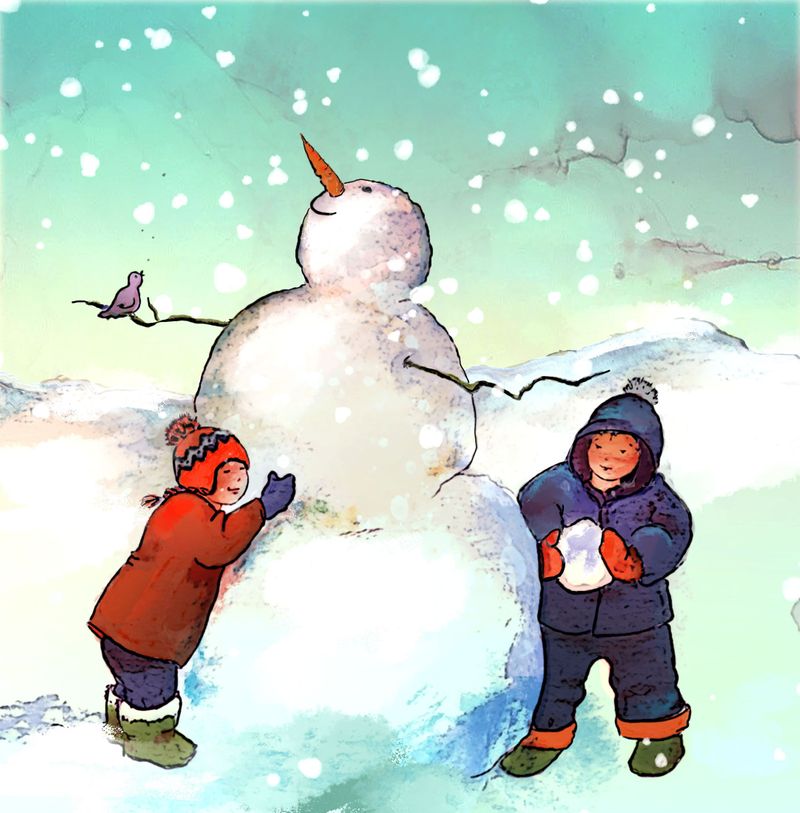
and this one:
