Feedback Welcomed - Sequential Work for my Website!
-
Ooh ooh @NessIllustration look at this!
Finis Coronat Opus
Instagram: www.instagram.com/madgcartoons/
Behance: www.behance.net/madgcartoons
Website: https://michaelangelodgo.wixsite.com/madgcartoons -
Finis Coronat Opus
Instagram: www.instagram.com/madgcartoons/
Behance: www.behance.net/madgcartoons
Website: https://michaelangelodgo.wixsite.com/madgcartoons -
Finis Coronat Opus
Instagram: www.instagram.com/madgcartoons/
Behance: www.behance.net/madgcartoons
Website: https://michaelangelodgo.wixsite.com/madgcartoons -
@Michael-Angelo-Go How pretty!
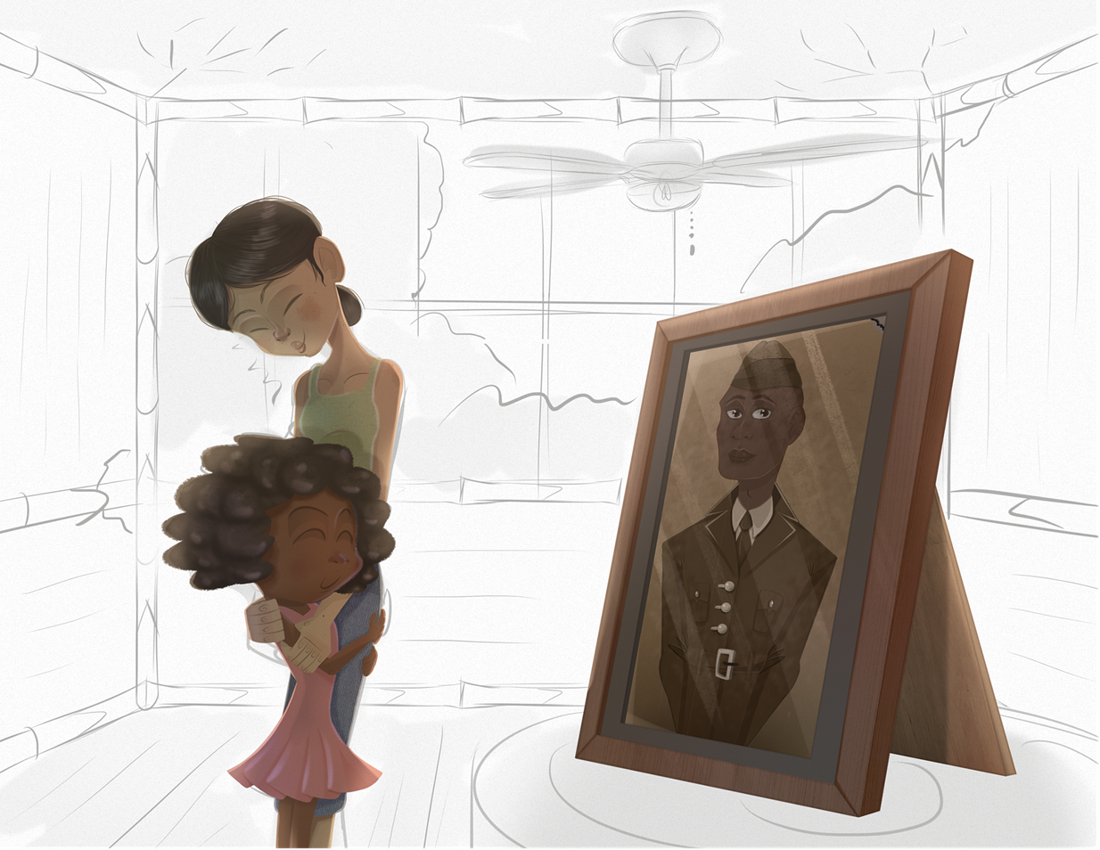
 This is a step above your other work, Michael! Try to add a bit more contrast to improve readability! For instance,the little girl's hair darker to distinguish it more from her hair. You could also move around the foliage in the window a little bit so the mom's head clearly pops out against the sky
 ")
vanessastoilova.com
instagram.com/vanessa.stoilova/Check out my Youtube channel for tips on how to start your career in illustration! www.youtube.com/c/ArtBusinesswithNess
-
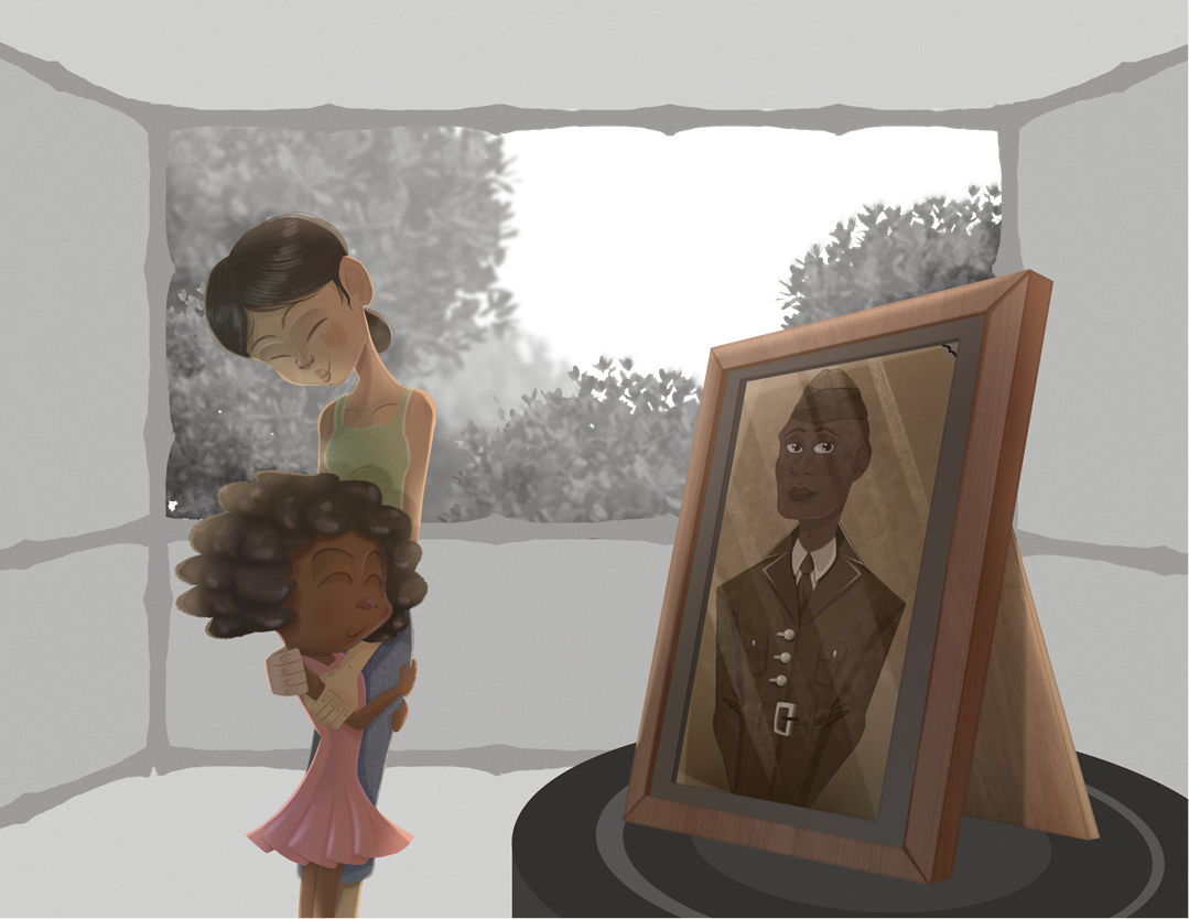
@NessIllustration Oh I forgot to mention I'm not done. I'll add an update later today! I didn't add the fan as you can see.
-
@Nyrryl-Cadiz @NessIllustration
I just finished rendering the scene. I added some motion blur, but I'm worried it might be overkill. Should I add some blur, no blur, or only a little bit of in-between? Let me know what you all think!


Finis Coronat Opus
Instagram: www.instagram.com/madgcartoons/
Behance: www.behance.net/madgcartoons
Website: https://michaelangelodgo.wixsite.com/madgcartoons -
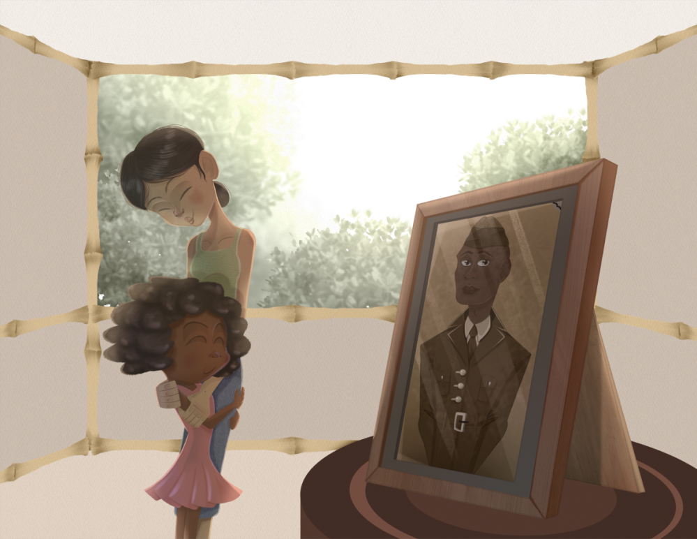
@Michael-Angelo-Go I prefer without, it just looks nice and crisp
This is probably my favorite piece of yours ever! I love the limited color palette and the emotions. I do think you could push your blacks a bit more black to make the contrast sharper though!vanessastoilova.com
instagram.com/vanessa.stoilova/Check out my Youtube channel for tips on how to start your career in illustration! www.youtube.com/c/ArtBusinesswithNess
-
@Michael-Angelo-Go Like so?
vanessastoilova.com
instagram.com/vanessa.stoilova/Check out my Youtube channel for tips on how to start your career in illustration! www.youtube.com/c/ArtBusinesswithNess
-
@NessIllustration no blur and perhaps increase the value contrast.
Portfolio: nyrrylcadiz.com
Instagram: https://www.instagram.com/nyrryl_cadiz/
YouTube: https://www.youtube.com/channel/UCbJCF1Im8ZO7hpGWTKOJMuA -
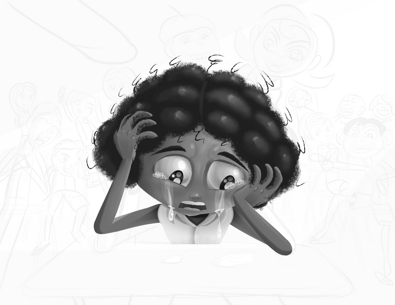
My next drawing.
-

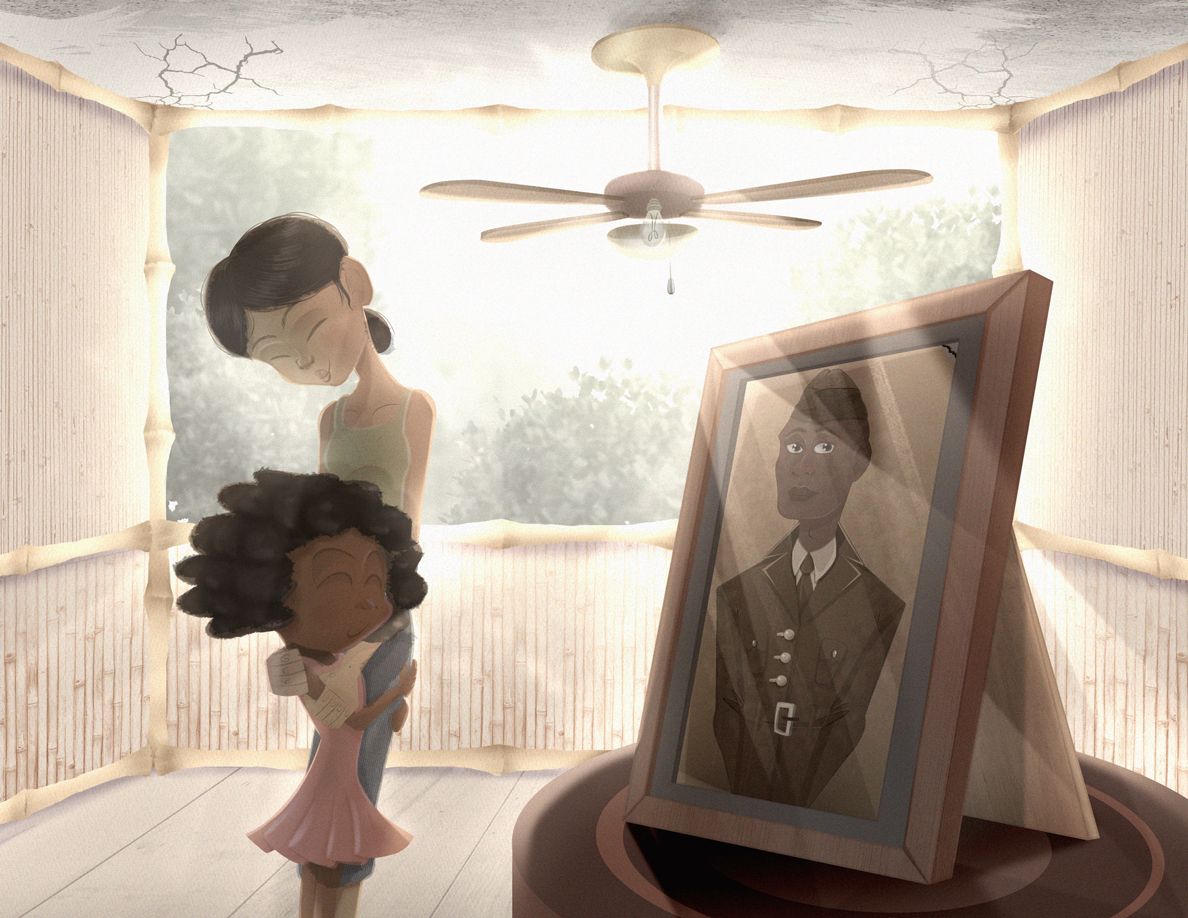
I darkened the values, but now I'm thinking maybe the mother's shirt sticks out too much because it's a little saturated.
Finis Coronat Opus
Instagram: www.instagram.com/madgcartoons/
Behance: www.behance.net/madgcartoons
Website: https://michaelangelodgo.wixsite.com/madgcartoons -
-
Progress you guys!
Finis Coronat Opus
Instagram: www.instagram.com/madgcartoons/
Behance: www.behance.net/madgcartoons
Website: https://michaelangelodgo.wixsite.com/madgcartoons -
Finis Coronat Opus
Instagram: www.instagram.com/madgcartoons/
Behance: www.behance.net/madgcartoons
Website: https://michaelangelodgo.wixsite.com/madgcartoons -
Finis Coronat Opus
Instagram: www.instagram.com/madgcartoons/
Behance: www.behance.net/madgcartoons
Website: https://michaelangelodgo.wixsite.com/madgcartoons -
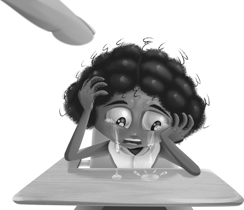
This one's taking a little while to render.
-
Finis Coronat Opus
Instagram: www.instagram.com/madgcartoons/
Behance: www.behance.net/madgcartoons
Website: https://michaelangelodgo.wixsite.com/madgcartoons -
That's all for tonight folks. Goodnight. I know the lighting's really ....eh but I'll fix it's still a wip.
-
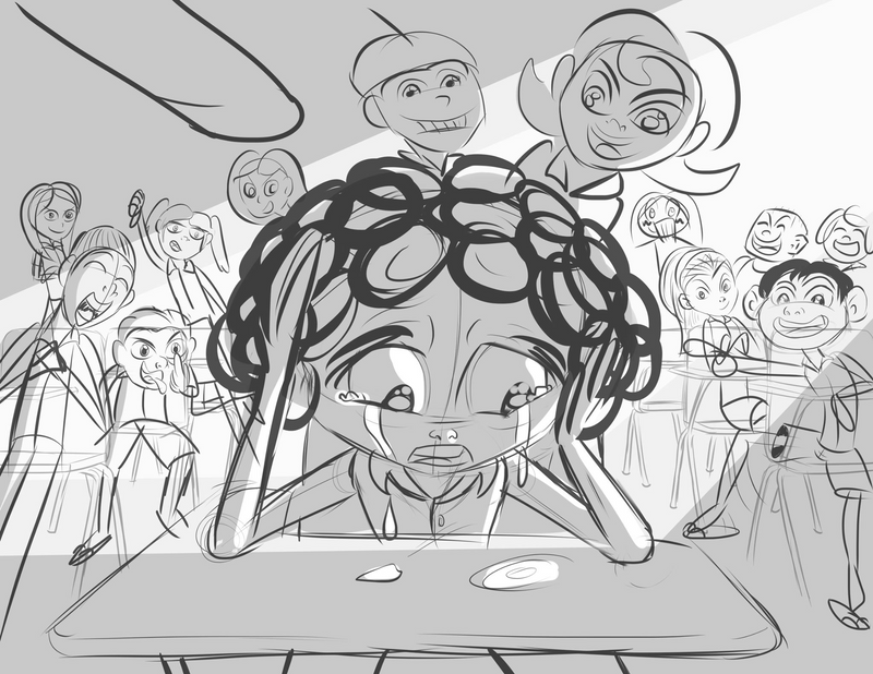
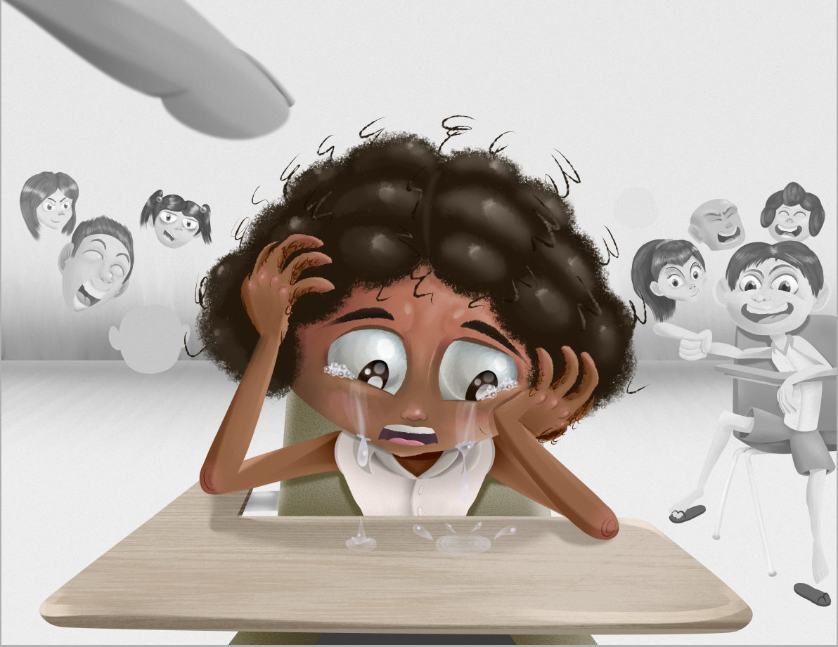
Okay, I'm finished with this second piece. I'll be honest, I hated drawing this because there were so many characters on this page and the lighting was pretty complex! I'm also worried that the composition isn't great. It's not as strong as the first thing I drew.

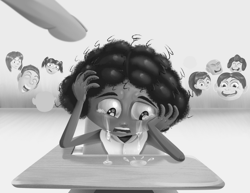
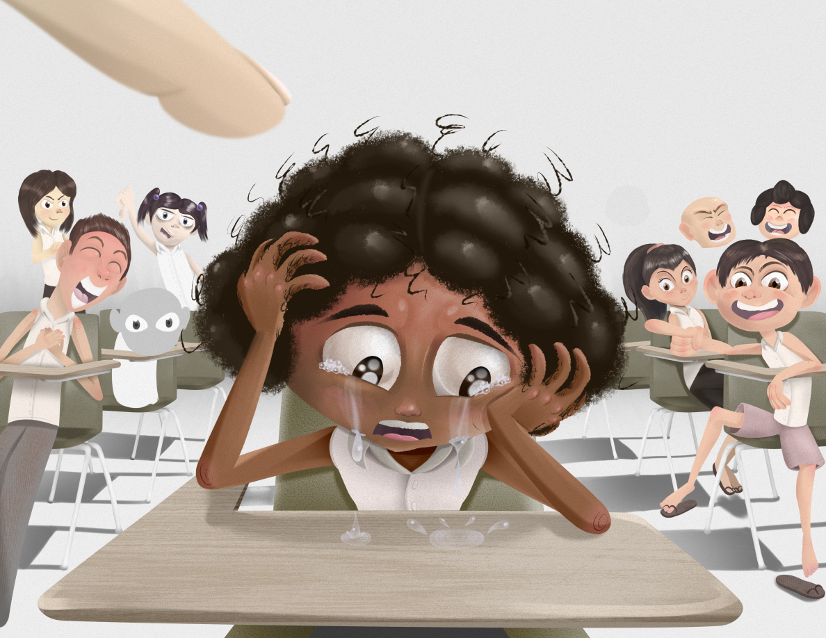
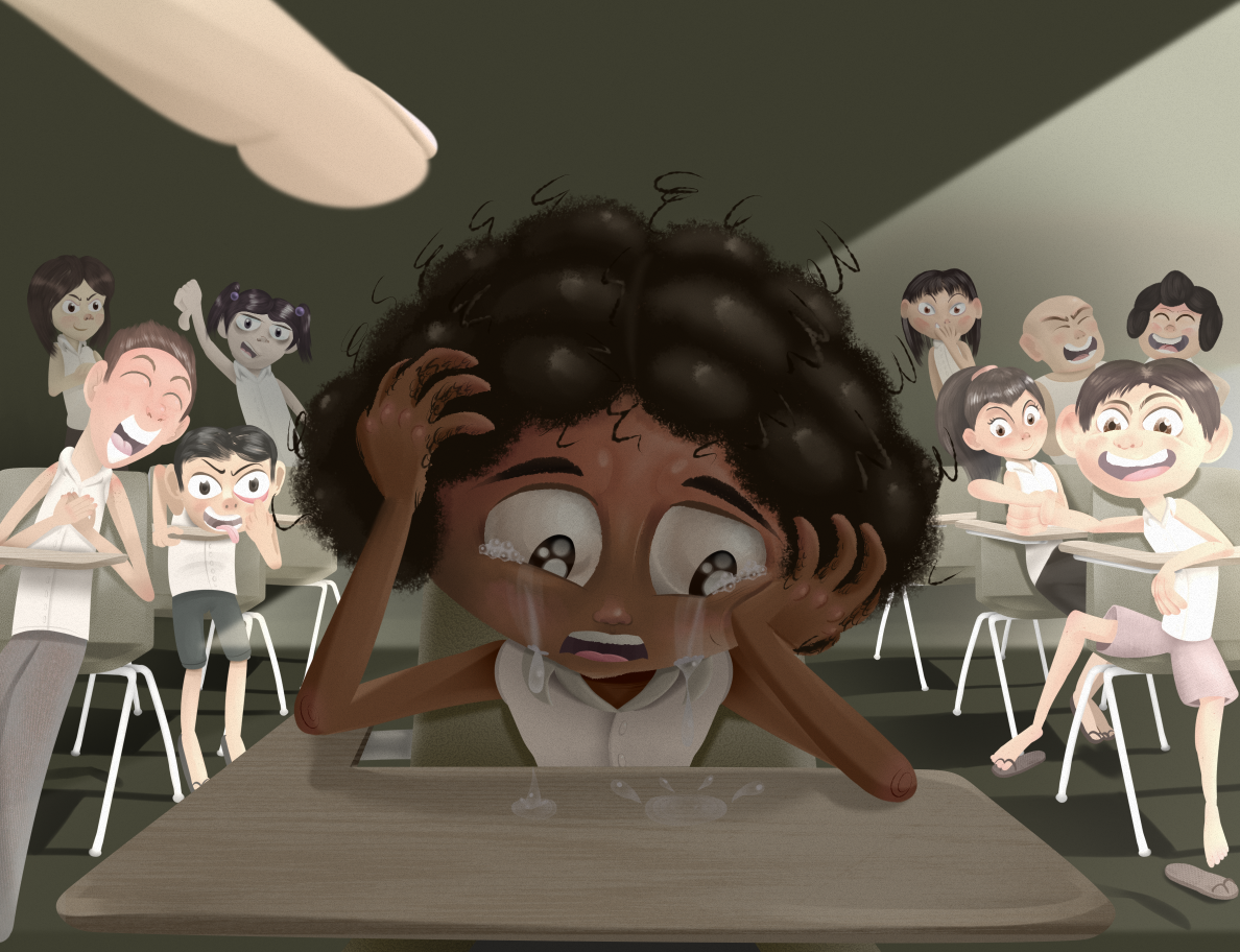
I made two drawings, one with blur.

And one without. To be honest, I think I'm okay without blur on this one.
@Nyrryl-Cadiz @NessIllustration do you see any areas for improvement? It's kind of busy.
Finis Coronat Opus
Instagram: www.instagram.com/madgcartoons/
Behance: www.behance.net/madgcartoons
Website: https://michaelangelodgo.wixsite.com/madgcartoons -
@Michael-Angelo-Go It's well rendered! I much prefer the one without blur though. I think her head is too big compared to her other body proportions (and compared to her classmates). Her eyes are also much too big for her head compared to the other kids, and it makes it look wrong as if you're stepping out of the rules established by your own style. In general though the piece looks great on a technical standpoint, but makes me feel uneasy on the subject matter.
While bullying and getting laughed at are common themes for children's books, your portrayal of it is incredibly intense and would maybe even be traumatic for kids (especially ones that have experienced bullying in their own lives). I'm hesitating to say that you shouldn't show this - I don't think any subject should be off limits - and that's why I didn't say anything when I first saw the sketch, but it made me uneasy then and it makes me uneasy now. Now that I've had a bit more time to think about why that is, I think this wouldn't gain you any points with an art director that might feel this is way too intense for kids. In children's books, difficult topics have to be approached delicately, empathically, and in an age appropriate way. For instance, books about bullying often focus of the depiction of the feelings of isolation and hopelessness. I feel like outright showing a nightmare trauma scene is just a bit much for kids, and this piece may show art directors that you're kind of heavy-handed and lack subtlety with difficult topics. Does that make sense?
vanessastoilova.com
instagram.com/vanessa.stoilova/Check out my Youtube channel for tips on how to start your career in illustration! www.youtube.com/c/ArtBusinesswithNess
