March WIP - Fairytale Flower - final touches
-
I really like your colours, I think I like 3 and 4 the most

-
@carlianne I like 1 and 2 the best (leaning more towards 2). 4 is cute, but reminds me a lot of Tinkerbell so it doesn't seem as unique as the others. I also like 3, but it doesn't feel as adventure-y to me.
-
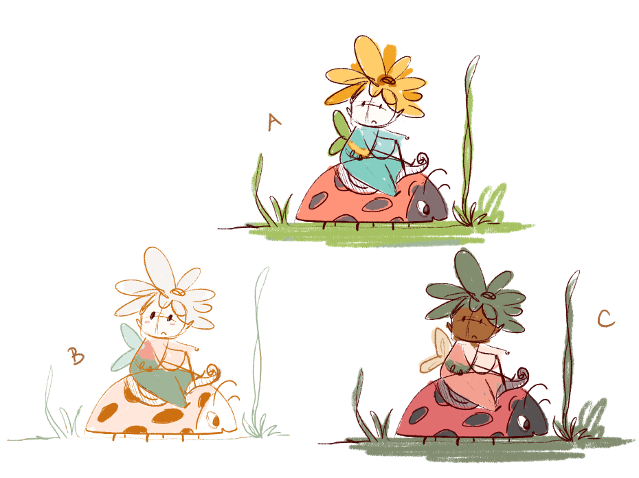
Thanks everyone for your feedback!! I decided to do some more color studies as I was exploring and I think that I want her to have a ladybug steed, and I was worried option 2 won't work well there. And also I wanted to explore the style for 3 a little more to see if I could make it work as a spot illustration.

obviously still rough, but let me know any thoughts here!
-
I love the ladybug steed! Very cute. I like all of them, but I like the complimentary colors of C. The values of the plant on her head and her face are close, so if you vary those, then I think that might work better. Great job!
-
@carlianne 2 and C. I think she’s empowering and full of adventure
-
I love your color palettes. I like the bright happy airy felling of A but can see C working into the story that she is well camouflaged from above (a bird snack?)
-
@carlianne i love C haha.
-
@carlianne Haha! You know I liked 4 the first time around, but now I like C. It's all about the contrast. I might intensify one color, though. Perhaps the green.
-

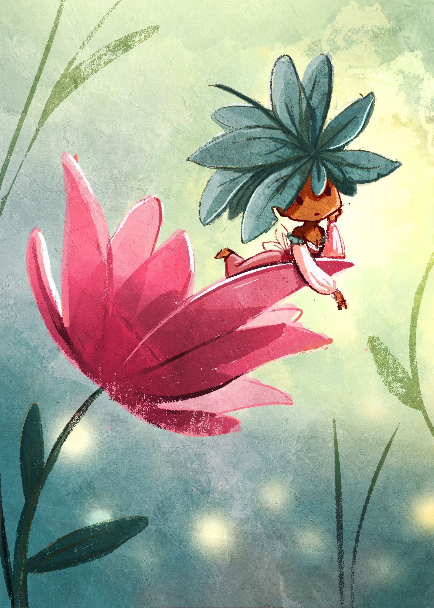
Not really for the contest but I wanted to practice drawing her and also wanted to practice doing some lighting
-
@carlianne Oh this is beautiful!

-
@carlianne C is fantastic!
 Love the ladybug.
 -
@carlianne This is so cute! I have a suggestion (I've not tried it before because I literally just thought of it)
I can see you've used an overlay texture on the whole image and it's looking great! Maybe just to make it look a teeny bit better, try creating a mask of the texture for each element (background, leaves, flower, fairy) in a different orientation so that it's not obvious to the view that you've just applied a short cut overall texture.
-
@carlianne said in March WIP - Fairytale Flower - color study stage:
Not really for
Beautiful, Beautiful, Beautiful!
-
@Neha-Rawat oh yeah that is what Lee says in his texture video! I should just stop being lazy

-
I love it!! I think this iteration shifted it into another gear altogether.
-
love the color Pallet! very cute!
-
@carlianne I love her and the color palette!! The texture and light are wonderful! Can't wait to see you final submission :).
-
Love the painterly style and how the lighting is working. Great textures.
-
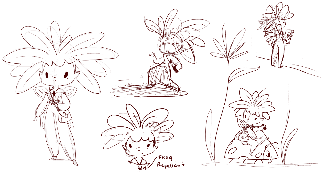
Okay working on the poses
To flush out my story idea, my idea is that she lives in a village that is under siege by frogs, and she's been sent to find repellants (lemons from the lemon tree) but she has to travel through frog territory to get there (the pond).

-
@carlianne Beautiful illo.Also the layout sketch is nice. An idea if you want it
 Maybe add a close up of her looking at a lemon tree picture ,so she can recognize it once she looks at it at real life (indicating that it is her first time stepping out of her village and she had not seen a lemon tree yet in her life)
Just my 2 cents!!!
Keep it up, the character is beautiful!