Society of Visual Storytelling

    SVSLearn Forums

    • Register
    • Login
    • Search
    • Recent
    • Tags
    • Popular
    • Users
    • Groups
    • Search

    Critique requested

    General Discussion
    critique characterdesign illustration fairytale march
    3
    4
    610
    Loading More Posts
    • Oldest to Newest
    • Newest to Oldest
    • Most Votes
    Reply
    • Reply as topic
    Log in to reply
    This topic has been deleted. Only users with topic management privileges can see it.
    • emergingeden
      emergingeden last edited by

      Hi guys,

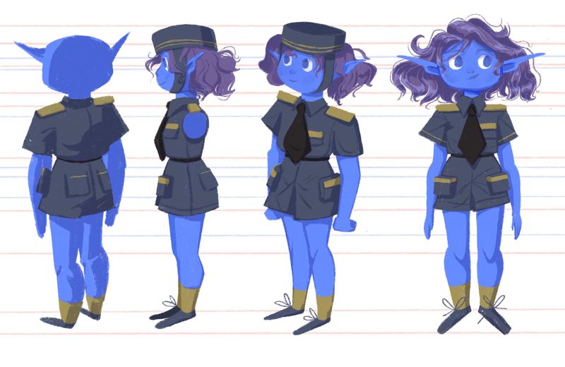
      I’ve made a (very late) drawing for the March contest. I wonder if anyone has some tips and critique for my turnaround? I feel like the hat is off in some places...

      Btw I didn’t draw the hair or arm to show off the body better.

      E360D943-EA9E-430C-8A46-19D467BB4A97.jpeg

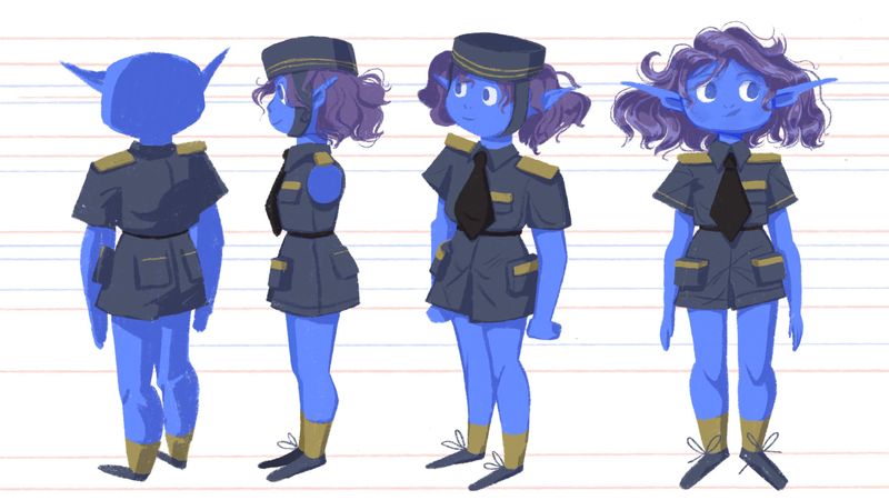
      My idea was to have a traveler that works for the railway. I tried to go for a timeless vaguely vintage uniform. The character is preteen btw!

      2827E370-F768-499E-BC23-834BCDC129E1.jpeg C2B47FA5-9DE1-456B-B623-5BA314B99231.jpeg

      find my art on instagram!

      1 Reply Last reply Reply Quote 2
      • emergingeden
        emergingeden last edited by

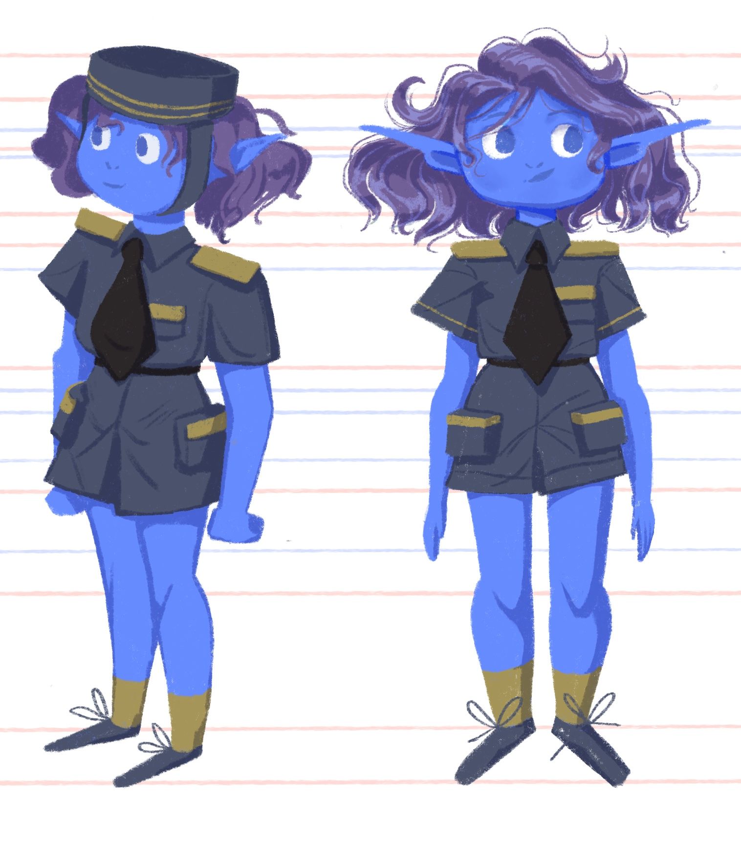
        Adjusted the hat in the third pose

        04DD52F9-2D08-4737-A70A-E8385EBFBD5D.jpeg

        find my art on instagram!

        1 Reply Last reply Reply Quote 2
        • KevinTreaccar
          KevinTreaccar last edited by

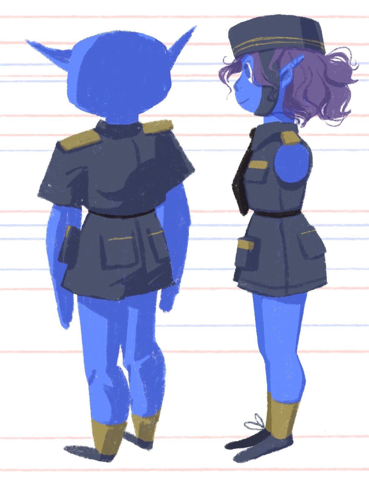
          These are great. She looks fun. One subtle thing – be careful with the shoulders. Your 3/4 shots look like their shot from a higher angle. While the back shoulder should be smaller, they should still be on the same plane like the front and side shots.

          kevintreaccar.com
          instagram.com/kevintreaccar

          1 Reply Last reply Reply Quote 0
          • Freya Chakour
            Freya Chakour last edited by

            she look so cute!! and just a little thing, but the ears in the first pose are a bit to high, also the left pocket on her backside is a bit to much to the right side. also I really love how you rendered her her at the last post! looks so fluffy and beautiful!

            https://www.instagram.com/fyra.c/
            Portfolio: https://www.artstation.com/fyrac

            1 Reply Last reply Reply Quote 1
            • First post
              Last post