A or B? Bunnies or no bunnies?
-
@Braden-Hallett That's such a hard choice!
I like that the extra bunnies in the background feel like they give some context to the book cover story, but also I love the clarity of the 2nd image without them... -
@Braden-Hallett love these characters! You always create dynamic poses and expressive expressions.
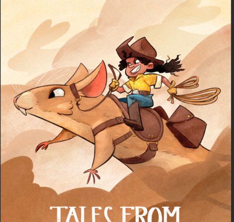
The background bunnies add context for me, otherwise it's unclear why the girl is riding a hamster/mouse(?). But I can also see why some find them distracting because they are so close in value to the main subjects. Could you use value to push them back farther so they don't compete? Or darken the values with the main subjects so they stand out even more from the background and dust clouds?
The dust clouds, if that's what they are, are a great design element but also add quite a bit of ambiguity. Why are they so dark? Are the characters running in the clouds? There is no visible ground and no hill, so there is a disconnect with the title and it makes the setting unclear. If that's what you're going for, then good job! But for me, it doesn't help tell me what this book is about.
Adding more setting might also help with scale. Are the bunnies the same size as the main subjects? Is the girl small and the bunnies & rodents normal size? This is so intriguing, I want to read the story, but there are so many questions, too!
illustrator - author - smiley person
mbaileyart.com
instagram.com/mbaileyart/ -
I love the bunnies but I think if they were just a hare (haha, couldn't resist a pun) lighter, might be a cleaner read. Really awesome design either way!!!!
-
Also noticed the front bunny and hamster noses are lined up so maybe if they were scaled slightly smaller as well to offset that angle ;).
-
Your hand lettering (assuming you drew that and it is not a font!) looks really good.
")
-
@Melissa-Bailey-0 @Braden-Hallett
I agree. Maybe the value of the color specifically could be changed between the foreground and the background slightly? Experiment with adding a very light-handed shift to blue in the background compared to the foreground? Otherwise if not a color change, maybe the foreground characters could be slightly even more dark than the background.It's kind of funny saying this, because contrast is an area I am still learning in!
Just some ideas. Your work is always so good! -
I vote A because the background looks more lived in.
-
@Braden-Hallett as an artwork I love A.as a cover, my instinct goes for B with less busy background. Really love A.Maybe consider adding it on the back cover,as a continuous artwork?
-
I like the bunnies in this image, they add some good storytelling!
-
To me, they read more as spirit bunnies than actual giant bunnies. The bunny version feels better compositionally to me. And the pinkness of the bunny ears ties in well with the vermilion hamster ears. Intriguing!
-
I vote for bunnies!
-
@Braden-Hallett I voted for bunnies, but maybe not the "A" with bunnies here. I definitely think she should be alone on the page without the other character in the back. And I do think bunnies improves it, but maybe just not that pronounced, but still somewhat there so I'm like "What's all that dust from? Oh yeah, giant bunnies. Neat!"
Maybe like super low definition but just the shapes?
-
@Braden-Hallett Before the picts loaded with my slooooow internet I was thinking, YES giant bunnies! ALWAYS! But, after seeing the images, I think not this time. I love the giant bunny concept, its so great, but for the book cover I think the single bunny and rider looks more heroic. You could imply the giant rabbits in the dust clouds, maybe, subtle. You could pull that off. =)x
EDIT: just saw the last image. LOL! Well done.

EDIT2: @jdubz Just realized that last image was not Braden's LMAO! -
Thanks for the votes everyone! I think with some TLC I COULD make the bunnies work, but I've gotta send this off today, so no bunnies for now!
@jdubz said in A or B? Bunnies or no bunnies?:
@Braden-Hallett I voted for bunnies, but maybe not the "A" with bunnies here. I definitely think she should be alone on the page without the other character in the back. And I do think bunnies improves it, but maybe just not that pronounced, but still somewhat there so I'm like "What's all that dust from? Oh yeah, giant bunnies. Neat!"
Maybe like super low definition but just the shapes?
I think in my head this is closer to what I wanted it to look like! I'll try this out. I MUST add the bunnies!
-
@burvantill Lol that's funny