Comic Feedback - handwritten text
-
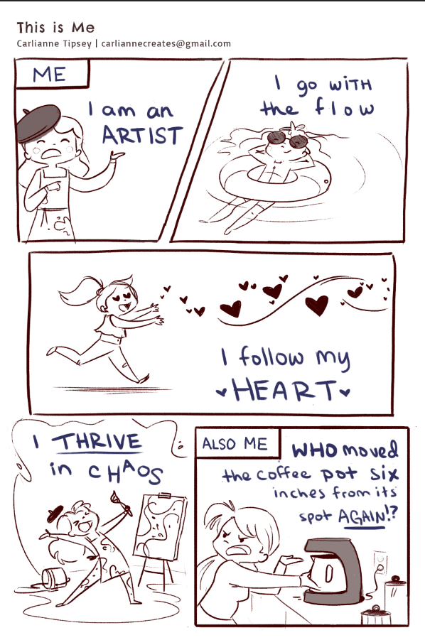
Hello! I'm working on this comic for a local SCBWI event and this is my first time handwriting the text in a comic. I would love any feedback or suggestions on the typography.
Thank yoooou
Check out my art and tutorials :)
Instagram: www.instagram.com/carliannecreates/
Youtube:
https://youtube.com/c/CarlianneCreatesShop: www.carliannecreates.com
-
@carlianne Hi there,
") I am not sure about style as much as size. I feel like the size is competing with your pictures (reasonably the same weight so to speak). Typography wise (or literally your question) unsure. Sorry
I am not sure about style as much as size. I feel like the size is competing with your pictures (reasonably the same weight so to speak). Typography wise (or literally your question) unsure. Sorry 
-
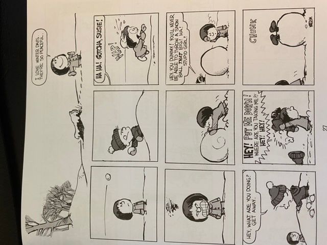
Hi @carlianne, love the punch on this one! It made me laugh. Regarding the text, I agree with @Heather-Boyd , it feels too large. Also, maybe try experimenting with some typed font and add special hand lettering on the parts you want more emphasis on.
Here’s an example from Calvin and Hobbs.
-
@Jeremy-Ross @Heather-Boyd Great feedback thank you!!
-
Comics normally have upper case letters and rarely have much of a slant to them and if they do it is often used for emphasis (along with bolding the text).
For your comic there is nothing tying the lettering to the image, thats where word balloons come in. Lettering/balloons are part of the overall design process and can add to the panel or detract.
Are these comics inked/lettered by hand? If so, there is a great old-school tool called an ames lettering guide. (Ames Letttering Guide on Amazon ), they are 5 or 6 dollars.
For how to use it Here
Will Eisner has some great books on comics and sequential art that are the "Bible". They are worth the price.
-
@carlianne this reminds me of this artist on Instagram link text
Hope I linked that right. Her artist comics are very relatable too. And I like how she does the text.
 -
I agree that the lettering is taking away from the art. I think you need a closer balance. Think graphic design when laying out text and images. You are in charge of directing the eye where you want it to go. What do you want the reader to see first?
I follow an artist that creates his text with a font for layout, size and leading, then hand letters over the top so that it's nice and neat but he can still add a bit of flair when he wants.
Dave KellettMay I ask, what is the SCBWI region? I would like to check out the comic event.
Lisa Burvant
www.lisaburvant.com
Instagram & Twitter & SVS: @burvantill -
@burvantill thanks! I’ll check it out.
It’s the San Francisco region illustrators day event. The deadline for submissions was yesterday night but the event is in two weeks. There will be a critique and special seminars for graphic novels
-
Readability is by far the most important thing about comics. I would highly suggest using a font specially meant for comics, to increase legibility.
I don't think the letters there were too big. In fact, it's better to be too big than too small. I see a lot of comics made with tiny letters and that is just really rude to people with low vision. Also nobody in the world likes to squint to read so go TOO small and there goes your audience as well.