Comic page style test
-
@Braden-Hallett it has been a while since I have been on the forums. I started a Masters in Writing for Children and Young Adults and it has been consuming a lot of time. Coming back, it is good to see your stuff again.
I would echo what @blamillo said and a couple things.
- The extra spikes from the word bubbles in panels 3 & 4 aren't working for me. They make me think multiple people are saying something. I think that you are trying to create emphasis but are telling the reader something else.
- The layering of word bubbles in panel 3 is nice as it communicates one person is talking over the other but the background coming through between the bubbles is distracting and my eyes keep looking just at the strange effect it creates. I would just put the one bubble over the other without the purple border.
- On the final panel I think you might have pushed the waving arms too far into the background maybe too desaturated. I think making them stronger would have a bigger pay off.
-The Prairie Fox
https://www.instagram.com/theprairiefox
https://www.theprairiefox.com -
Yes to the first question, it works very well. Both characters and background hold there own without competing.
And yes to the second, I enjoy when things come out from one image and lead into another.
The one thing I am not super fond of is the colour of the character in blue and orange. I think it's too intense, somehow. Though I take it he's a major character.
Anyways, cool cool. Nice raven popping out the R!
Instagram: www.instagram.com/heatherboyd.illustration/
Website: https://heatherboydillustration.ca
Shop: https://www.inprnt.com/search/products?q=HeatherBoydIllustration
Ko-Fi: https://ko-fi.com/heatherboydillustrationBe blessed,
-
@theprairiefox Oooh! A masters in writing! That sounds like fun

All good points on the word bubbles and waving arms. I'll make some tweaks
") Thanks!
Thanks! -
@Heather-Boyd said in Comic page style test:
I think it's too intense, somehow
I'll tone one of the colours down
Thanks! -
Thanks everyone for the feedback! I've made some changes suggested here and elsewhere and I think it's much stronger!

-
@Braden-Hallett the word bubbles and arm are looking so much better!
One thing you can do with the word bubbles (after relooking at the original you might have been trying to do this) is make the bottom look like ice. It almost looked like you were trying this in panel 3 originally. I think they are fine the way they are but if you want another option.

-The Prairie Fox
https://www.instagram.com/theprairiefox
https://www.theprairiefox.com -
@theprairiefox are you thinking about particular word bubbles? The bubbles in general? Like, is someone saying things in an icy way?
-
@Braden-Hallett I was wondering if that is what you were originally trying to imply in panel 3 with the bubble of the girl swearing. With the spikes hanging down? If you did want it to feel icy then this would be the kind of bubble to use and not the dangling spikes.
I am honestly not 100% sure what you are trying to accomplish with the oddly shaped bubbles in panels 3, 4, and 5.
In panel 3 it could have been her being icy. In panel 4 & 5 it almost seems like you want them to feel like they are further away?
-The Prairie Fox
https://www.instagram.com/theprairiefox
https://www.theprairiefox.com -
@Braden-Hallett in my writing program I ran across a couple of books by Ivan Brunetti. I like them both but love the one for kids, in particular, it has nice examples of everything. Very helpful for adults as well!
It has a nice page on balloons and lettering. You can see the page here.
Using this as an example, I wonder if using a dotted outline would communicate better that what is being said is in the background?
The book is like $9, I suggest purchasing it.
https://www.amazon.com/Comics-Easy-ABC-Ivan-Brunetti/dp/1943145393
His other book is good too.
https://www.amazon.com/Cartooning-Philosophy-Practice-Ivan-Brunetti/dp/0300170998/
-
@theprairiefox said in Comic page style test:
I am honestly not 100% sure what you are trying to accomplish with the oddly shaped bubbles in panels 3, 4, and 5.
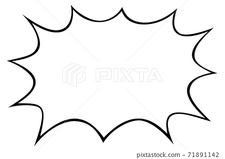
I was going for a less extreme version of a shouting bubble. Something like this but not as spiky:
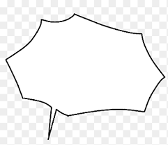
or this
@theprairiefox said in Comic page style test:
Using this as an example, I wonder if using a dotted outline would communicate better that what is being said is in the background?
A dotted line is usually used to show a whisper. Mattea is certainly not whispering in panel three

@theprairiefox said in Comic page style test:
The book is like $9, I suggest purchasing it.
I have a couple of resources coming from the blambot creator, but thank you
-
@Braden-Hallett I wonder if just larger text that is bolded would accomplish what you are wanting. It does a good job of creating emphasis without confusing the reader. That is what Brunetti suggests on his page as well.
The smaller 'UH-OH' text in panel 4 makes those seem much quieter.
-The Prairie Fox
https://www.instagram.com/theprairiefox
https://www.theprairiefox.com -
@theprairiefox I'll fiddle with some bold text, for sure! Thanks for all the feedback. Once I've read through the blambot lettering book I'll keep my eyes peeled for the one you have
-
Another couple of typography tricks that may be worth trying out:
- For angry speech or shouting, you can try a coloured inner stroke to the word balloon. This works well if you combine it with interesting balloon shapes to suggest fiery, icy, or acidic qualities to the speech.
- Applying some random jitter to individual letters’ size, baseline offset, and rotation can introduce a bit of chaos, if that’s desirable.
- Play around with warp and distortion effects. Joyful or musical speech - and especially sound effects - can benefit from wave, flag, arc, and bulge treatments.
- Sometimes you can even have the type expanding outside the confines of word balloons. To do it with the style you’re using, you’d scale the type up so it’s pushing against or breaking the boundary of the balloon, and then apply a white stroke to the outside of the text, so it’s like the balloon is wrapping around the letters. This is usually only done with single words - I could see it working with the little brother’s “Martin!”
-
I love the way this reads. The characters come in so clear as the first read, but the movement and context the scene gives are a great second read. You know what's going on with the characters and have a great sense of space. A lot comics don't do this well, and it actually makes them quite hard to get a clear read at first sometimes. All of the speech bubbles look fine, except perhaps the "Martin!" one where the brother has his first bit of dialogue. The shape of the bubble is a little confusing, as the pointed bits coming out of a speech bubble in this way normally indicate that multiple people are saying what's in the bubble. Overall, really great looking! I hope to see more!
Instagram:
@jmoglesby
@santa_fiesta -
@jmoglesby Sorry, I just realized that the dialogue box thing had already been mentioned.
-
@blamillo said in Comic page style test:
Applying some random jitter to individual letters’ size, baseline offset, and rotation can introduce a bit of chaos, if that’s desirable.
I'm gonna have to look in that for sure! I think it's pretty easy with the blambot fonts.
@blamillo said in Comic page style test:
Sometimes you can even have the type expanding outside the confines of word balloons.
Also a good idea! Thank you
-
@jmoglesby said in Comic page style test:
All of the speech bubbles look fine, except perhaps the "Martin!" one where the brother has his first bit of dialogue.
My shouty bubbles do not read as shouty bubbles. Ah well
Thanks for the feedback! It's adding a little bit more polish every time!
-
The art and style look really great (love it), the balloon shapes are better placed on the second version though I like the shapes they had on the first one the most (the spikes did felt like more than one character was speaking though).
You can check some tips from Nate Piekos at his website Blambot (he is a pro letterer and also has different comic book fonts available as well).
You can read the tips here:
https://blambot.com/pages/comic-book-grammar-tradition
https://blambot.com/pages/lettering-tipsHe also just released a book about lettering that could be worth a read too:
https://blambot.com/pages/the-essential-guide-to-comic-book-lettering -
@glenfx Awesome! Thanks for the feedback and resources
-
@glenfx THese resources were great! I read these instead of doing what I should have been doing. Haha!