Society of Visual Storytelling

    SVSLearn Forums

    • Register
    • Login
    • Search
    • Recent
    • Tags
    • Popular
    • Users
    • Groups
    • Search

    SVS Virtual Studio MAY 2022

    Artwork
    27
    83
    4775
    Loading More Posts
    • Oldest to Newest
    • Newest to Oldest
    • Most Votes
    Reply
    • Reply as topic
    Log in to reply
    This topic has been deleted. Only users with topic management privileges can see it.
    • chrisaakins
      chrisaakins last edited by

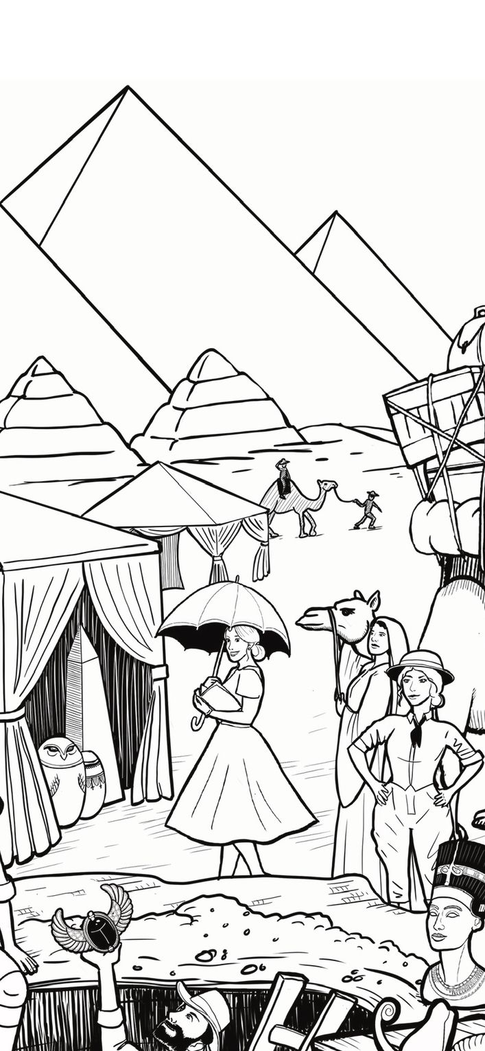
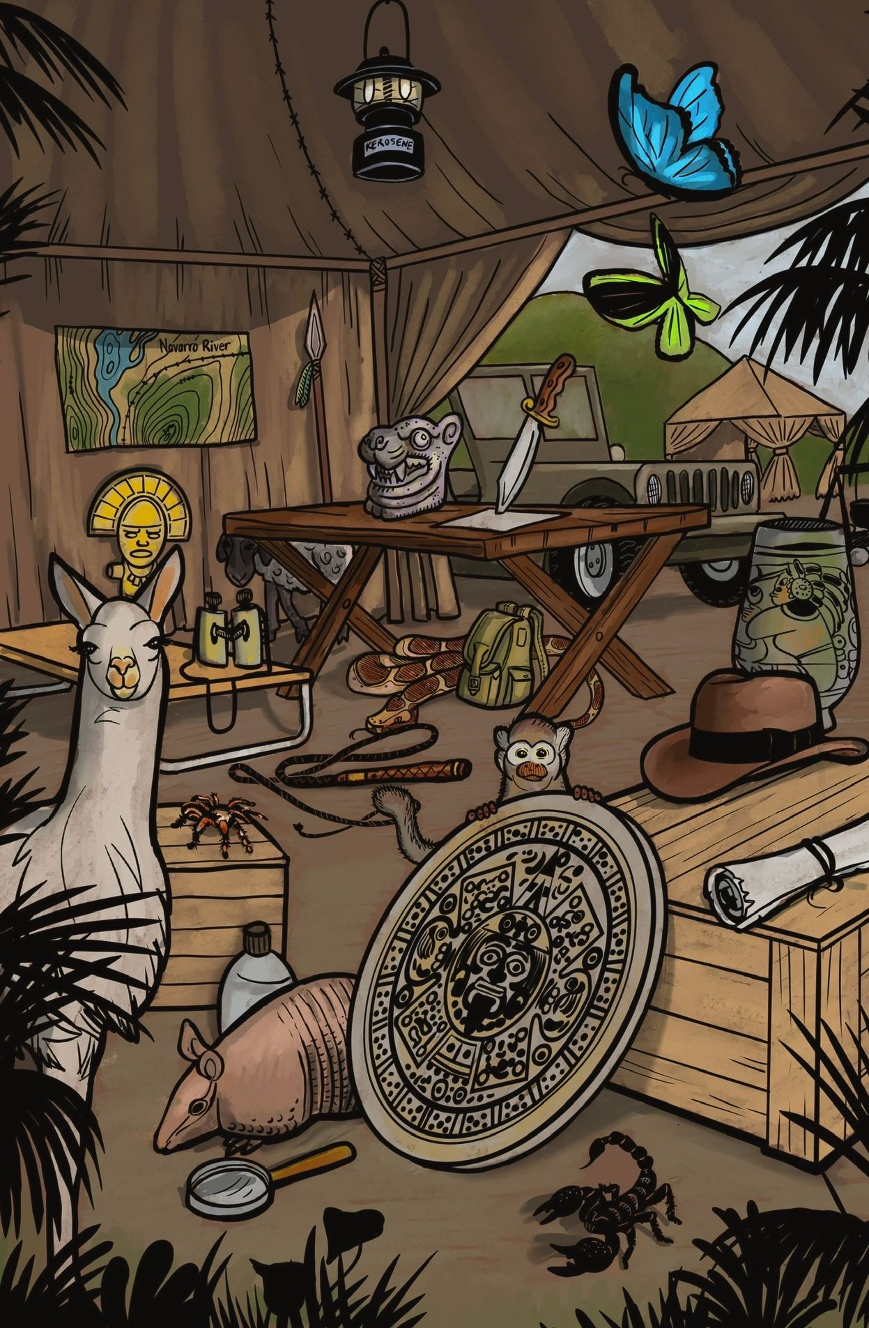
      Working on a couple of things for a children’s activity book.
      4E4466A9-9BC0-4BDB-BED6-41E4642B929B.jpeg 6939568C-41B6-4289-A45D-23C1E493E69D.jpeg

      Chris Akins
      www.chrisakinsart.com
      www.instagram.com/chrisakinsart/

      1 Reply Last reply Reply Quote 6
      • kylebeaudette
        kylebeaudette last edited by

        IMG_20220528_221726_505.jpg IMG_20220528_221726_655.jpg IMG_20220528_221726_617.jpg eixxbg.jpg

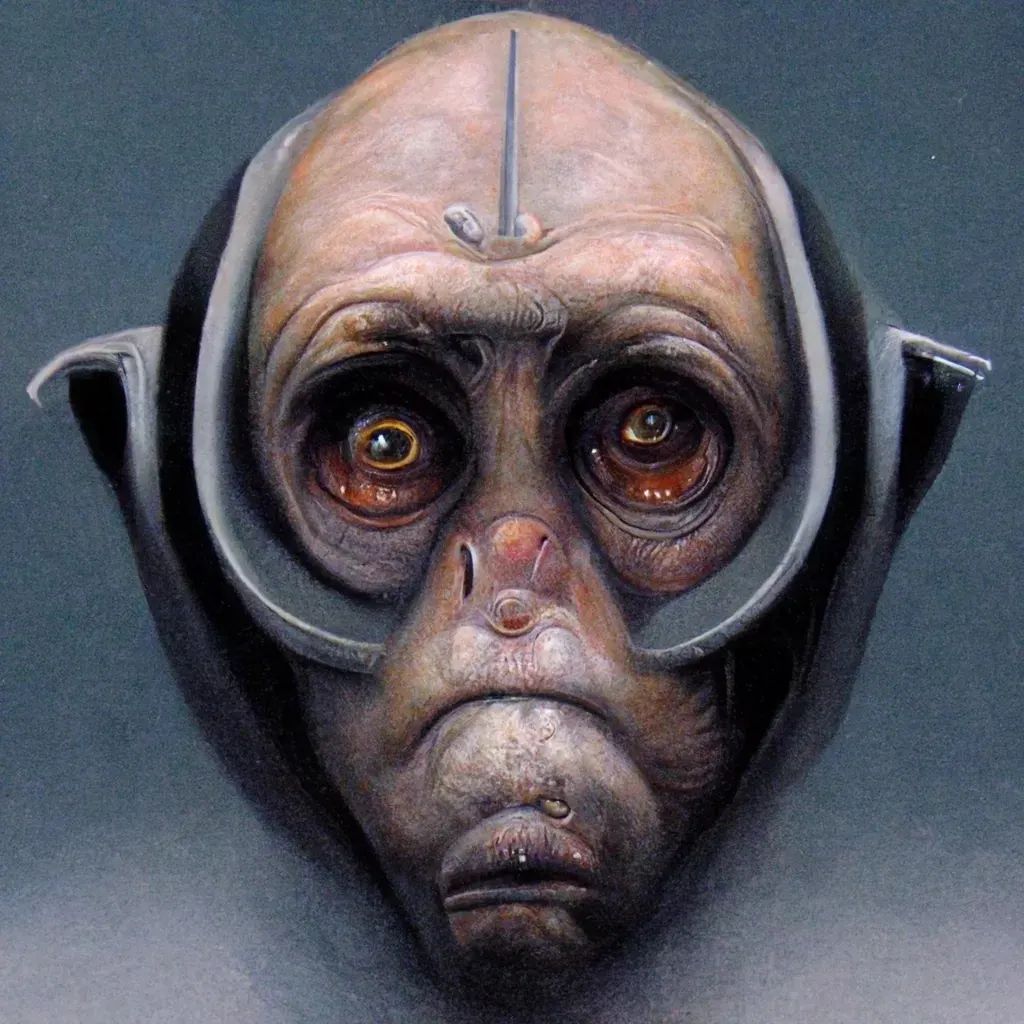
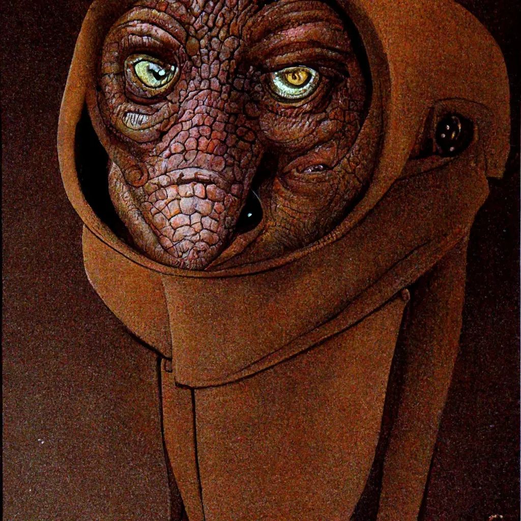
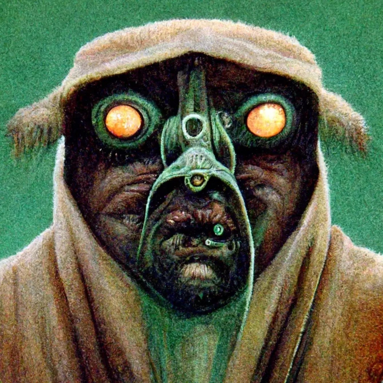
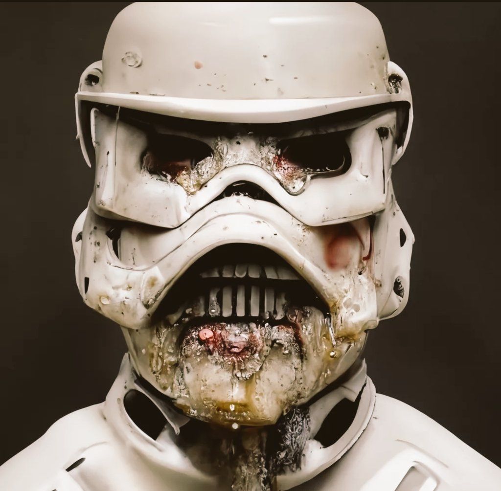
        Playing with the ai tech called midjourney. Very cool!

        Instagram- www.instagram.com/kyle_beaudette/
        Www.twitter.com/kylebeautweet
        Www.etsy.com/shop/Artofkylebeaudette
        https://youtube.com/@kylebeaudette?si=ComtMDsVyK1HPn55

        burvantill 1 Reply Last reply Reply Quote 4
        • burvantill
          burvantill Moderator @kylebeaudette last edited by

          @kylebeaudette That last one of the trooper reminds me of Scott Wetterschneider's stuff he's ben posting on IG recently. Very fantastically creepy. 👍

          Lisa Burvant
          www.lisaburvant.com
          Instagram & Twitter & SVS: @burvantill

          kylebeaudette 1 Reply Last reply Reply Quote 0
          • AngelinaKizz
            AngelinaKizz last edited by

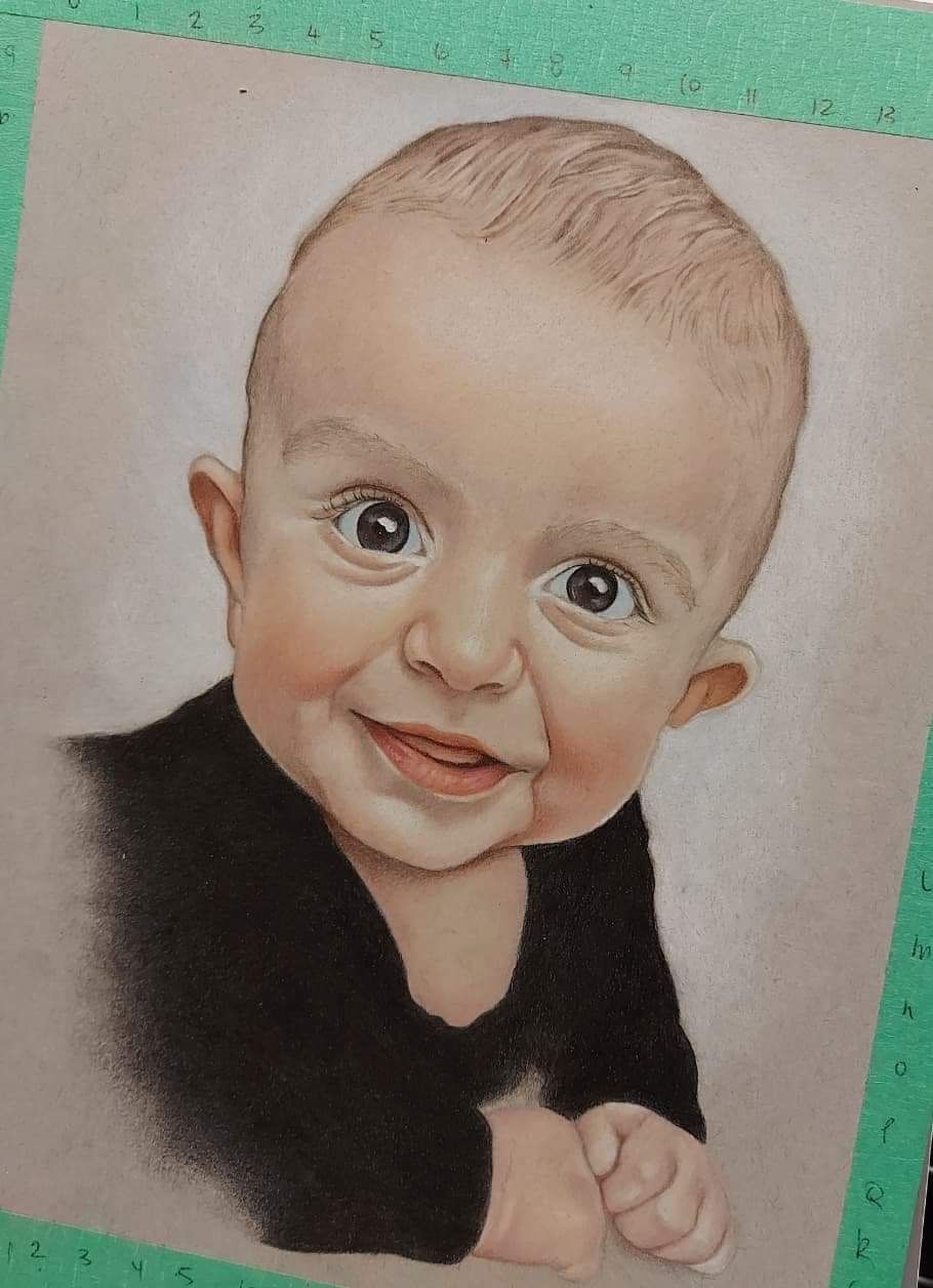
            May was a stupidly busy month for me. I wrote and submitted 3 stories to the Canadian version of SCBWI, I’ve been working in the salon long hours to compensate for taking the whole month of April off (due to being hella sick with covid), a started my second term of university, and I’ve been getting myself back into colored pencil portraits. So here’s a piece I finished on the weekend. It’s done in luminance colored pencils, on strathmore 400 series toned grey. 882A0902-C757-405C-A943-CA28E556C491.jpeg

            www.evarartistry.com
            www.Instagram.com/evarartistry/

            Melissa_Bailey PenAndrew Asyas_illos Jeremiahbrown 4 Replies Last reply Reply Quote 6
            • Melissa_Bailey
              Melissa_Bailey @AngelinaKizz last edited by

              @AngelinaKizz lovely portrait!

              Whew! I'm tired just reading all that you've crammed into one month!

              Got a question for you: are the Luminance pencils more opaque? I also just did a colored pencil test on the Strathmore 400 toned gray and found that many of my colored pencils struggled to show up against the gray. The Lyra polycolor and Polychromos especially did not have the opacity needed for the paper. The Derwent Lightfasts mostly were okay but the yellows did struggle a bit.

              Recently I've been considering treating myself to a set of Luminance -- I have 3 pencils: white, black, and crimson aubergine, and I really like them. Slowly, I've been replacing my Polychromos as they're used up (they're good pencils but just not right for me as they lack opacity and I hate the gold lettering on the barrel!). Luminance seem to be more opaque, which is what I'm looking for -- the only white colored pencil that I've found to be more opaque is the Holbein soft white.

              Anywho ... long ramble to just get your thoughts on the Luminance. You've got a lot of experience using them!

              illustrator - author - smiley person
              mbaileyart.com
              instagram.com/mbaileyart/

              AngelinaKizz 1 Reply Last reply Reply Quote 0
              • burvantill
                burvantill Moderator @Solomon Designs last edited by

                @Solomon-Designs LOVE the color scheme!

                Lisa Burvant
                www.lisaburvant.com
                Instagram & Twitter & SVS: @burvantill

                1 Reply Last reply Reply Quote 0
                • PenAndrew
                  PenAndrew @AngelinaKizz last edited by

                  @AngelinaKizz So beautiful.

                  1 Reply Last reply Reply Quote 1
                  • AngelinaKizz
                    AngelinaKizz @Melissa_Bailey last edited by

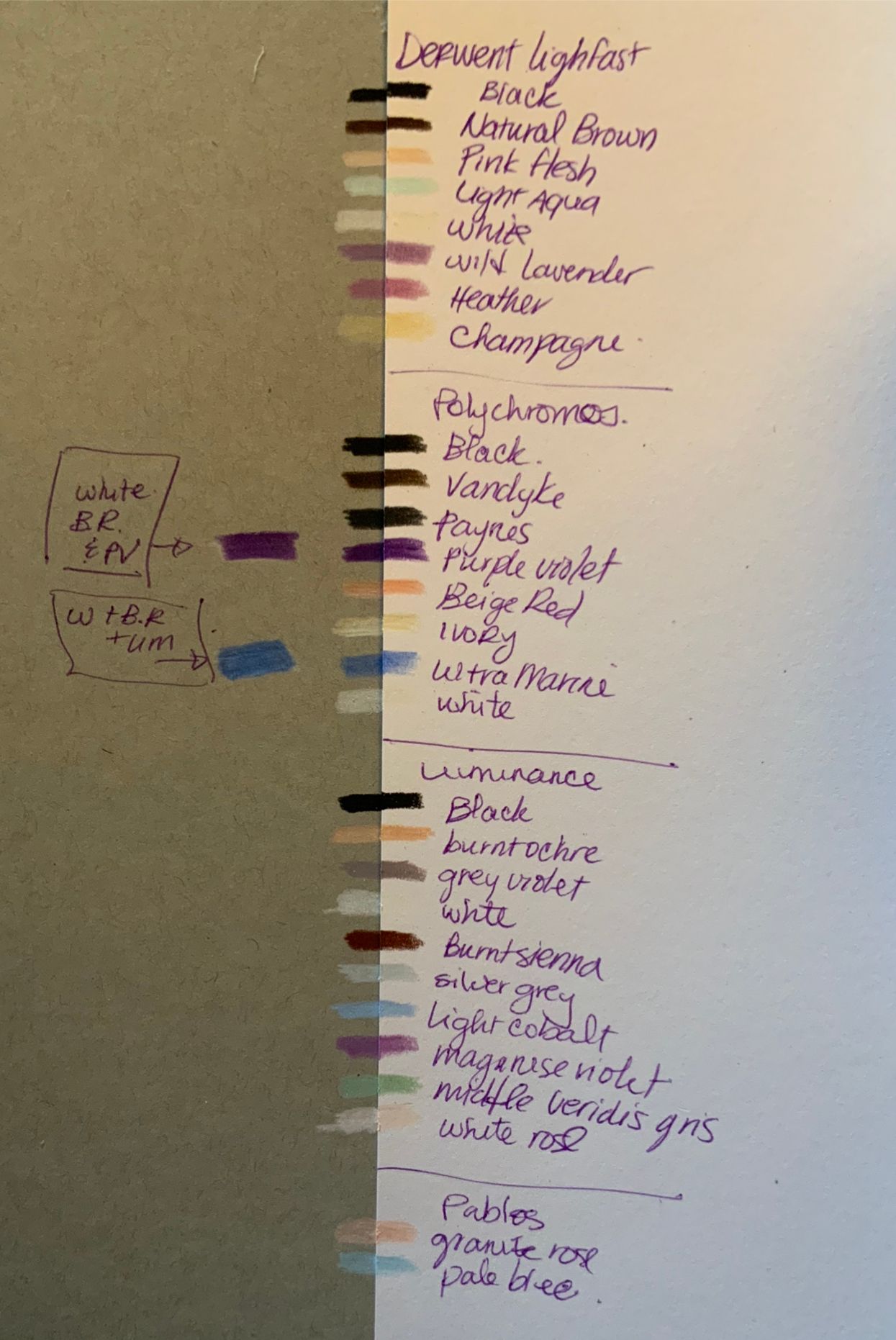
                    @Melissa_Bailey I don’t find that they differ enough that I notice one is better over the other. I did up a small color swatch to test out if one had better coverage than the other. I used a full burnishing pressure, to compare their opacity. And I tried to pick similar colours from each of my brand collections. While some of the more vibrant tones muddied a bit, I never use one color on its own, I layer and layer and layer for smooth transitions. I put a little example of how I would brighten the Poly ultramarine and purple violet, by laying a thin layer of white and beige red and then either color directly over top. When working on toned grey, you do have to pick your colors slightly brighter and warmer than you’d like to ensure that the grey doesn’t affect the end result.

                    B712BE9B-6FE7-491F-BDE7-439DD53A0379.jpeg

                    www.evarartistry.com
                    www.Instagram.com/evarartistry/

                    Melissa_Bailey 1 Reply Last reply Reply Quote 2
                    • kylebeaudette
                      kylebeaudette @burvantill last edited by

                      @burvantill i love what he's been up to, he's so good at ai art (is that possible?)
                      I hope to work with him to sculpt one of his weird creatures in clay.

                      Instagram- www.instagram.com/kyle_beaudette/
                      Www.twitter.com/kylebeautweet
                      Www.etsy.com/shop/Artofkylebeaudette
                      https://youtube.com/@kylebeaudette?si=ComtMDsVyK1HPn55

                      burvantill 1 Reply Last reply Reply Quote 2
                      • AlliFaith
                        AlliFaith @Griffin McPherson last edited by

                        @Griffin I used to do a lot of pet portraits for my dad's clients (he was a veterinarian) and it was a lot of fun and a good way to make some extra cash! This one looks great, so you should definitely explore that ideas.

                        1 Reply Last reply Reply Quote 1
                        • Asyas_illos
                          Asyas_illos @AngelinaKizz last edited by

                          @AngelinaKizz holy cow! And so good!

                          Asyasewardillos@gmail.com
                          www.Instagram.com/asyas_illos/
                          https://asyasewardillos.wixsite.com/mysite

                          AngelinaKizz 1 Reply Last reply Reply Quote 1
                          • AngelinaKizz
                            AngelinaKizz @Asyas_illos last edited by

                            @Asyas_illos thanks!!!!

                            www.evarartistry.com
                            www.Instagram.com/evarartistry/

                            1 Reply Last reply Reply Quote 0
                            • burvantill
                              burvantill Moderator @kylebeaudette last edited by

                              @kylebeaudette THAT would be cool to see. And fun to do. Like a master copy but not. 😃

                              Lisa Burvant
                              www.lisaburvant.com
                              Instagram & Twitter & SVS: @burvantill

                              1 Reply Last reply Reply Quote 1
                              • Melissa_Bailey
                                Melissa_Bailey @AngelinaKizz last edited by

                                @AngelinaKizz thanks for doing that, and for the detailed reply!

                                It seems we work very similarly -- light layers, and a lot of them. Sometimes I burnish, sometimes I like the texture and keep it. 😊 And sometimes after burnishing, it looks too perfect so I go back and add lines/texture (that's what I did with my storm illustrations--they needed some spontaneity).

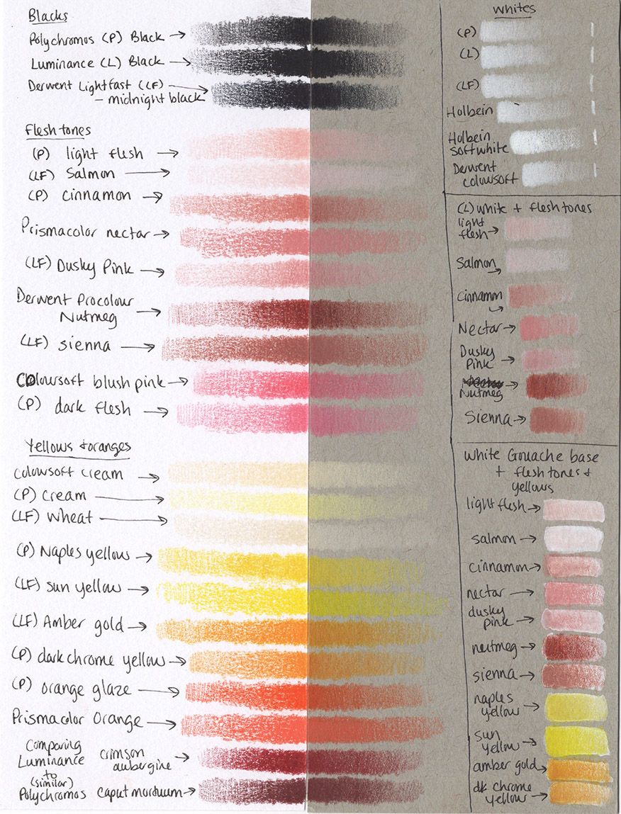
                                Your color tests got me curious so I did a few and thought I'd share them here. In my storm illustration, the grey wanted to show through and overpowered my flesh tones and some of the yellows. I think it might have been that some pigments are more transparent than others, across brands. That certainly is the case with watercolors and acrylics -- the same pigments are used, just different binders, so it stands to reason that the same could happen with colored pencils.

                                I tried your suggestion of laying down a light base of white CP first for the skin tones. It works, but not as vibrantly as I was hoping, with the pencils I have. There's also the issue of not having as many layers to work with on the smooth toned paper. So I experimented with laying down a white gouache layer first, and for me, I think that's the result I'm looking for. Although, the wax pencils seemed to work better over the gouache--the oil-based Polychromos struggled, as well as one of the Lightfasts, and it shows up on the scan.

                                Anyway, thought I'd share ... maybe our findings will be helpful to more than just us!

                                fbf931ad-41a8-4765-b88a-9b4c18635e37-CP test low res.jpg

                                illustrator - author - smiley person
                                mbaileyart.com
                                instagram.com/mbaileyart/

                                AngelinaKizz 1 Reply Last reply Reply Quote 1
                                • AngelinaKizz
                                  AngelinaKizz @Melissa_Bailey last edited by

                                  @Melissa_Bailey I'll have to try gauche at some point! I can definitely see how you're getting the toned Grey through the pencil crayon. Maybe doing base of pan pastel would be helpful to try? I don't often use the toned Grey, I often prefer to do a background on my images, but I do like the Grey when I have to work in white hairs.

                                  www.evarartistry.com
                                  www.Instagram.com/evarartistry/

                                  Melissa_Bailey 1 Reply Last reply Reply Quote 1
                                  • Jeremiahbrown
                                    Jeremiahbrown @AngelinaKizz last edited by

                                    @AngelinaKizz Woot! This is just beautiful. So cool to see you overcome your hand setback in such a defiant, frog choking the Pelican (I think everyone's seen that image right?) kind of way!

                                    Jeremiah Brown
                                    www.jeremiahbrownillustration.com
                                    https://www.instagram.com/jeremiah.brownillustration/

                                    AngelinaKizz 1 Reply Last reply Reply Quote 2
                                    • AngelinaKizz
                                      AngelinaKizz @Jeremiahbrown last edited by

                                      @Jeremiahbrown thanks Jeremiah! Took 2 years, but honestly it was SVS that helped me. Illustrations are much freer than portraits, and doing them digitally comes with that helpful undo button. I can't even count how many times I'd retry the same line over and over again. Without svs, I don't know that I'd be where I am now with my hand.

                                      www.evarartistry.com
                                      www.Instagram.com/evarartistry/

                                      1 Reply Last reply Reply Quote 1
                                      • Melissa_Bailey
                                        Melissa_Bailey @AngelinaKizz last edited by

                                        @AngelinaKizz interesting suggestion about the pan pastel. Have you used that before as a base layer? Do you have to spray it with a workable fixative before adding colored pencil layers?

                                        I used gouache because I already own a tube of white and I didn't want to purchase anything new for an experiment.

                                        Doing experimental illustrations on toned gray because I have a story idea where most of the book will be black and white, and I think the toned gray will be really impactful on the illustrations. But then the end of the book introduces color, and I would want to keep continuity in the artwork and use the same paper throughout. Which is why I'm testing how to use color on toned gray. Whew! Complicated explanation, but that's why I'm doing what I'm doing. 😊

                                        illustrator - author - smiley person
                                        mbaileyart.com
                                        instagram.com/mbaileyart/

                                        1 Reply Last reply Reply Quote 0
                                        • Suhayla Omer
                                          Suhayla Omer @Mike Marttila last edited by

                                          @Mike-Marttila

                                          The colouring is amazing love the shadows

                                          1 Reply Last reply Reply Quote 0
                                          • First post
                                            Last post