Society of Visual Storytelling

    SVSLearn Forums

    • Register
    • Login
    • Search
    • Recent
    • Tags
    • Popular
    • Users
    • Groups
    • Search

    Help me kill my darling

    Artwork
    critique feedback
    9
    26
    2551
    Loading More Posts
    • Oldest to Newest
    • Newest to Oldest
    • Most Votes
    Reply
    • Reply as topic
    Log in to reply
    This topic has been deleted. Only users with topic management privileges can see it.
    • Mia Clarke
      Mia Clarke @Nyrryl Cadiz last edited by

      @Nyrryl-Cadiz The lillies are central to the resolution, but they could probably go. These suggestions are exactly what I need, thank you so much!

      www.miaclarkeart.com
      https://www.instagram.com/miaclarkeart/

      1 Reply Last reply Reply Quote -1
      • Asyas_illos
        Asyas_illos last edited by

        Wow I need to read that! I agree with Nyrryl you need to pick out what’s most important and let the rest go. Also checking your values in greyscale as Angelina said will help too. I will attempt a draw over later but I need to know a bit more about the story first.

        Asyasewardillos@gmail.com
        www.Instagram.com/asyas_illos/
        https://asyasewardillos.wixsite.com/mysite

        1 Reply Last reply Reply Quote 1
        • Mia Clarke
          Mia Clarke @Nyrryl Cadiz last edited by

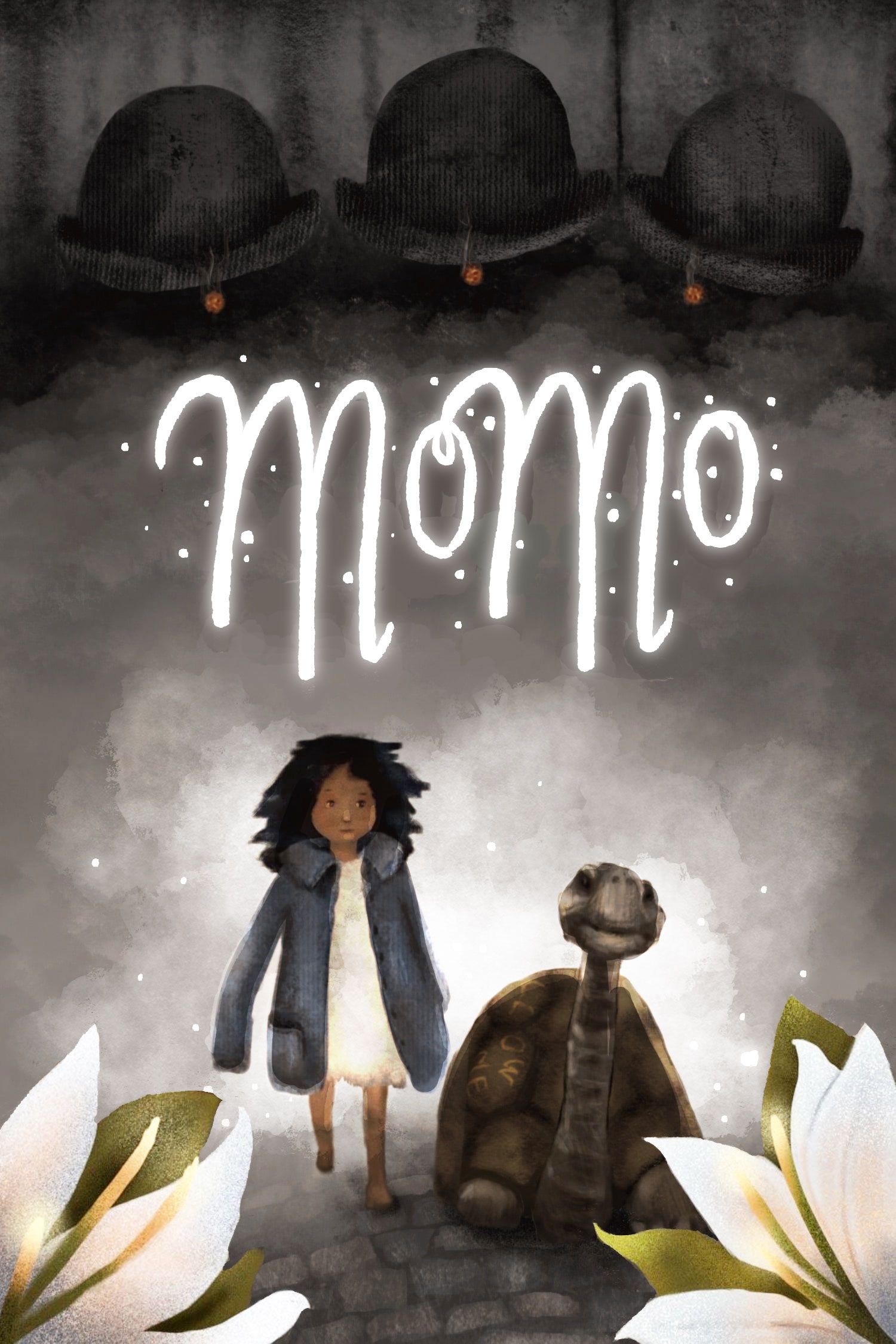
          @Nyrryl-Cadiz Ok, now I've removed everything. It's not at all polished. Is this a better direction?

          7F51AC20-9CBD-45CC-8DB4-6035D0E92BBE-min.jpeg

          www.miaclarkeart.com
          https://www.instagram.com/miaclarkeart/

          AngelinaKizz NessIllustration Nyrryl  Cadiz 3 Replies Last reply Reply Quote 1
          • AngelinaKizz
            AngelinaKizz @Mia Clarke last edited by

            @Mia-Clarke I think now too much has been taken away. I also think you really need a light source, because your values are still muddy.

            www.evarartistry.com
            www.Instagram.com/evarartistry/

            Mia Clarke 1 Reply Last reply Reply Quote 0
            • NessIllustration
              NessIllustration Pro @Mia Clarke last edited by

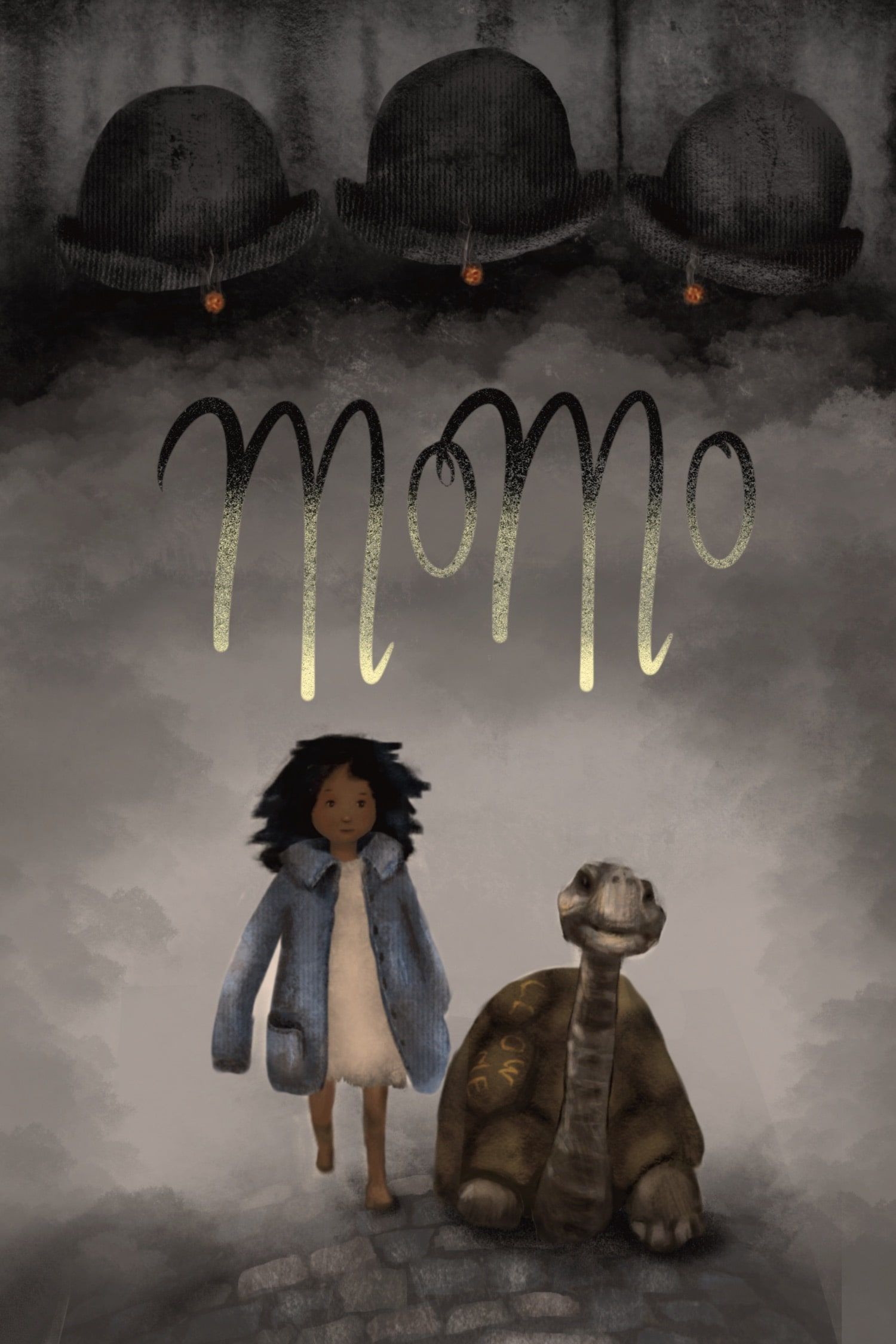
              @Mia-Clarke I agree it's now slightly too empty. I've added back the lilies, added a backlight, some white fog and white glowy title with little fairy light to add a bit more magic. Bit more contrast on characters with light reflections on the outlines, and on the girl's face. Title is slightly nudged upward now too. What do you think?
              Untitled-7.jpg

              vanessastoilova.com
              instagram.com/vanessa.stoilova/

              Check out my Youtube channel for tips on how to start your career in illustration! www.youtube.com/c/ArtBusinesswithNess

              Mia Clarke 1 Reply Last reply Reply Quote 1
              • Mia Clarke
                Mia Clarke @NessIllustration last edited by

                @NessIllustration I like this a lot! Thanks! The lillies in the foreground are the opposite to the men in grey, and so it seems apt to have them there. I still would like to incorporate timepieces somewhere... Maybe I could hang a pocketwatch on the title?

                www.miaclarkeart.com
                https://www.instagram.com/miaclarkeart/

                NessIllustration 1 Reply Last reply Reply Quote 0
                • Mia Clarke
                  Mia Clarke @AngelinaKizz last edited by

                  @AngelinaKizz Yes, I agree. I just figured it might be easier to dial it all the way back and work from there... Thank you so much for your help!

                  www.miaclarkeart.com
                  https://www.instagram.com/miaclarkeart/

                  1 Reply Last reply Reply Quote 1
                  • NessIllustration
                    NessIllustration Pro @Mia Clarke last edited by

                    @Mia-Clarke That sounds like a really cute idea!

                    vanessastoilova.com
                    instagram.com/vanessa.stoilova/

                    Check out my Youtube channel for tips on how to start your career in illustration! www.youtube.com/c/ArtBusinesswithNess

                    1 Reply Last reply Reply Quote 0
                    • Griffin McPherson
                      Griffin McPherson last edited by

                      Killing your darlings is not an easy thing to do. I find that as long as I’m working on the original image and trying to change it I will never get it to a place it’s needs to be.
                      To remedy this I recommend starting from scratch with the feedback you got from the portfolio review in mind. I know that sounds like it will be a ton more more than just fixing what you have but I have always found starting from scratch in cases like this ti be way faster than fixing an image that I’m attached to.

                      Mia Clarke ArtistErin 2 Replies Last reply Reply Quote 1
                      • Mia Clarke
                        Mia Clarke @Griffin McPherson last edited by

                        @Griffin-McPherson Yeah, I think you’re on to something… I should probably take the ideas from this thread and start over on a new piece.

                        www.miaclarkeart.com
                        https://www.instagram.com/miaclarkeart/

                        Miriam 1 Reply Last reply Reply Quote 0
                        • Miriam
                          Miriam @Mia Clarke last edited by Miriam

                          @Mia-Clarke It's good to remember that you don't need to (and most of the time it's best NOT to) tell the whole story on the cover. You just want to pique their interest, so they'll pick it up & read it.

                          I like your character design for the girl & the magical effect on the title.

                          It sounds like the tortoise is part of a deus ex machina (but at least there's the foreshadowing of the girl having similar traits), so that's something I might not want to give away on the cover.

                          But then again — it might be nice for reptile lovers in a sea of dog books.

                          Maybe you could hide the tortoise among the lilies? It would be great to have it barely noticeable in the illustration, so it doesn't draw attention until they know the significance after reading that part of the story.

                          It sounds like you're getting a good start on breaking away. Good luck!

                          Mia Clarke 1 Reply Last reply Reply Quote 1
                          • Nyrryl  Cadiz
                            Nyrryl Cadiz SVS OG @Mia Clarke last edited by

                            @Mia-Clarke hi again! Tho I love the simplicity of it all. I think you may have stripped it down too much. I think it would be great to show a clock in the bg. Also, show variation in size with the gray men. Maybe have a silhouette of the amphitheatre in the bg as well.

                            I’ll try to make a draw over if I have the time soon.

                            Portfolio: nyrrylcadiz.com
                            Instagram: https://www.instagram.com/nyrryl_cadiz/
                            YouTube: https://www.youtube.com/channel/UCbJCF1Im8ZO7hpGWTKOJMuA

                            Mia Clarke 1 Reply Last reply Reply Quote 1
                            • Mia Clarke
                              Mia Clarke @Miriam last edited by

                              @Miriam I definitely think you’re hitting the nail on the head here, I’m probably guilty of what Will Terry keeps calling “over-illustrating” on this one. I think I just fell so much in love with the story that I wanted to just paint as much of it as possible.

                              The tortoise is a main character, so having her on the cover makes sense, I think… Plus, any chance I get to draw a tortoise, I’ll grab. I just love their little faces!

                              www.miaclarkeart.com
                              https://www.instagram.com/miaclarkeart/

                              1 Reply Last reply Reply Quote 0
                              • Mia Clarke
                                Mia Clarke @Nyrryl Cadiz last edited by

                                @Nyrryl-Cadiz I think you’re right. If you do have tine to do a draw-over, I’d love that!

                                www.miaclarkeart.com
                                https://www.instagram.com/miaclarkeart/

                                1 Reply Last reply Reply Quote 0
                                • tomparsonsart
                                  tomparsonsart last edited by tomparsonsart

                                  I love the feel of this, and your style of rendering. But I was puzzled by the bowler hats before you described the story, wasn't quite sure what they were. And even after, I think they are a bit odd, with the cigar just hanging there underneath, with no face or anything else.

                                  Take this with a grain of salt, because I'm no expert, but I'm thinking of movies or posters I've seen, where there is a villain in the dark and you can only see a silhouette with some rim light, and a glowing cigarette, and maybe the whites of their eyes. Maybe if you just had one of them and did something similar. The shapes of the jacket could be the background, interacting with other elements. I like the smoke in the background, maybe you could have it also come forward and obscure the edges of some foreground elements.

                                  The main point is I think the elements need to vary in size more, as has been said. Otherwise It is a nice image and I love the way you draw and your texturing. I love the hand lettering also.

                                  www.tomparsonsart.com
                                  https://www.instagram.com/tomparsonsart/

                                  Mia Clarke 1 Reply Last reply Reply Quote 2
                                  • Mia Clarke
                                    Mia Clarke @tomparsonsart last edited by

                                    @tomparsonsart Thank you so much for this feedback, it helps a lot! I’m currently redrawing this image from scratch based on all the inpus, and your comment on the silhouette of the men in grey is really valuable to me, as I just did them in roughly the same fashion again in the new image, without much thinking… I’ll take your advise on board, and I’ll post my results here when I have them.

                                    www.miaclarkeart.com
                                    https://www.instagram.com/miaclarkeart/

                                    tomparsonsart 1 Reply Last reply Reply Quote 0
                                    • tomparsonsart
                                      tomparsonsart @Mia Clarke last edited by

                                      @Mia-Clarke Didn't mean to derail your progress! If you're going to keep those in, I think just even a small addition to the man or men might help clarify, like the eyes or something. Good luck!

                                      www.tomparsonsart.com
                                      https://www.instagram.com/tomparsonsart/

                                      Mia Clarke 1 Reply Last reply Reply Quote 0
                                      • Mia Clarke
                                        Mia Clarke @tomparsonsart last edited by

                                        @tomparsonsart Not derailing at all! I’ve added the silhouettes now, and it made it better. 😊

                                        www.miaclarkeart.com
                                        https://www.instagram.com/miaclarkeart/

                                        1 Reply Last reply Reply Quote 1
                                        • ArtistErin
                                          ArtistErin @Griffin McPherson last edited by

                                          @Griffin-McPherson Yep I agree with you here Griffin, it is easier to begin from scratch and thumbnail, establish values, create your focus and develop elements from there. I know, I'm in that boat too, trying to learn to not do what always gets me into trouble when a composition just isn't working. It sucks sometimes 😞 But that said, you do have beautiful rendering techniques and I love your textures, colors, and mood...

                                          Erin Richardson
                                          instagram.com/erinrichardsondesigns21
                                          www.erinrichardsondesigns.com

                                          1 Reply Last reply Reply Quote 0
                                          • First post
                                            Last post