Help with picking a thumbnail
-
Thanks everybody for your input on my thumbnails. I finally got a chance to sketch it out I would love your insight before I take it to paint. Thanks!
-
My thought is to keep it to two colors gray blue and salmon, the boat will be salmon like the krill, the idea being the whale thinks his boat is a large krill
-
@lmrush what a fun composition. I just don't like that middle whale going straight up and down. A little angle would be nice I think. Also I what do you think about that middle whale being the one to hold up the boat. It feels a little weird that we can't see the rest of the whale that has the boat.
-
@Rich-Green I don't see the Lee/David course. What is the title? I just redrew all my book pages and need to redo them again, I think....AAAgghhh!!! As my son says, they look a little flat and the eyes need more expression than just being circles......He has a pretty good eye and I always ask for his opinions on my work because I know he will be honest and he seems to get children's books. If I could wow him, I'd feel so accomplished
")
Marsha Ottum Owen
-
I like the top right one. I think the wave is balanced just right with the position of the whale, etc.
-
@holleywilliamson Thank you so much, I can totally see that now. I will play around a bit with it
-
@Marsha-Kay-Ottum-Owen It is Illustration 1 turbocharging your creativity
It was fantastic! -
@lmrush Oh, thank you for letting me know.
-
@Marsha-Kay-Ottum-Owen - Hi Marsha, Sorry I was not on here for a day or two and just seeing your question now. The course I had been referring was Illustration 1 - Turbocharge your Creativity. Here is link to the course page on the SVSLearn site: https://svslearn.com/classDetail/-KeUrrNoH9yvS19fsXA6
-
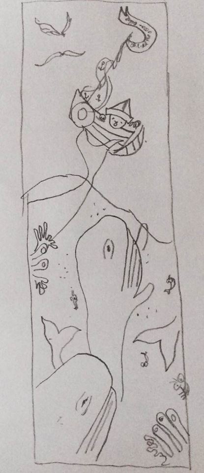
Whale value study. Thank you for everyone's input, I took the tail away I think it reads better now, I would love other suggestions for improvement before I take it to color-Thanks everyone!
-
I just realized I didn't tilt the whale

-
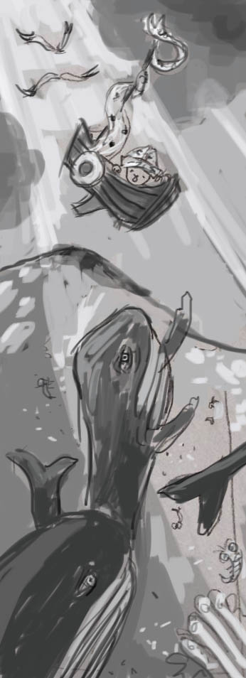
Quick color study I learned how in turbocharging your creativity. Another class starting soon. Sign up !
-
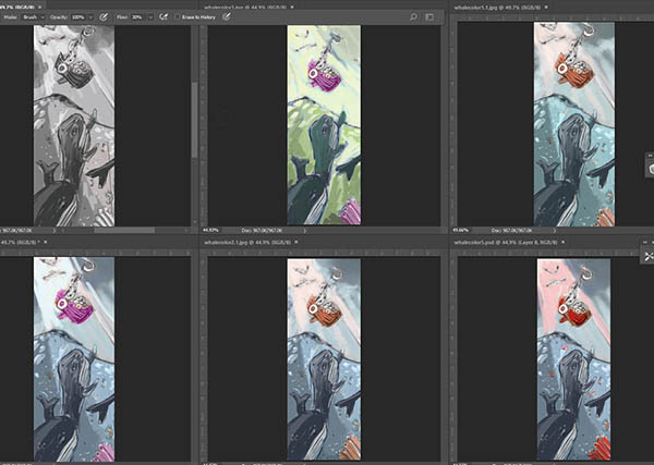
Forgot to ask for your thoughts on color. Thanks!
-
@lmrush I like the bottom middle. The complementary colors are working really well together.
portfolio: moniquecucchi.com
instagram.com/crookedandbeautiful
shop: crookedandbeautiful.com -
@mcucchi thank you. That one was my original idea for color
-
I like the bottom middle too. The oranges and blues have great contrast. Great lighting!
-
@bharris thank you. I appreciate your help
-
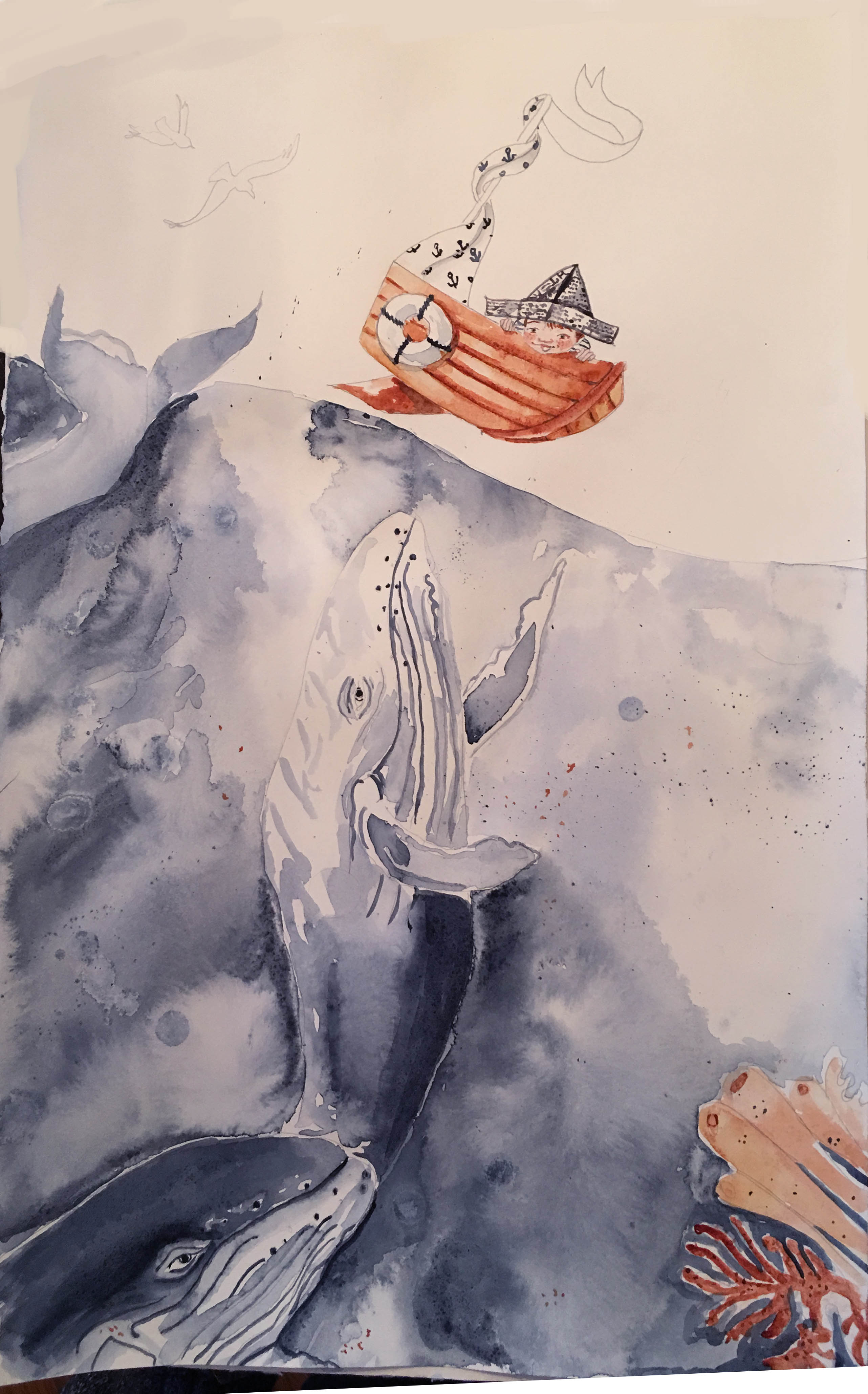
With the amazing Turbocharging your creativity class ending, I now have some time to play around, still have some work to go, not happy with the face, I may paint a new one and layer it in photoshop. I was anxious to start painting and rushed the process of drawing the boy, and I knew I would regret it, also trying a limited palette
-
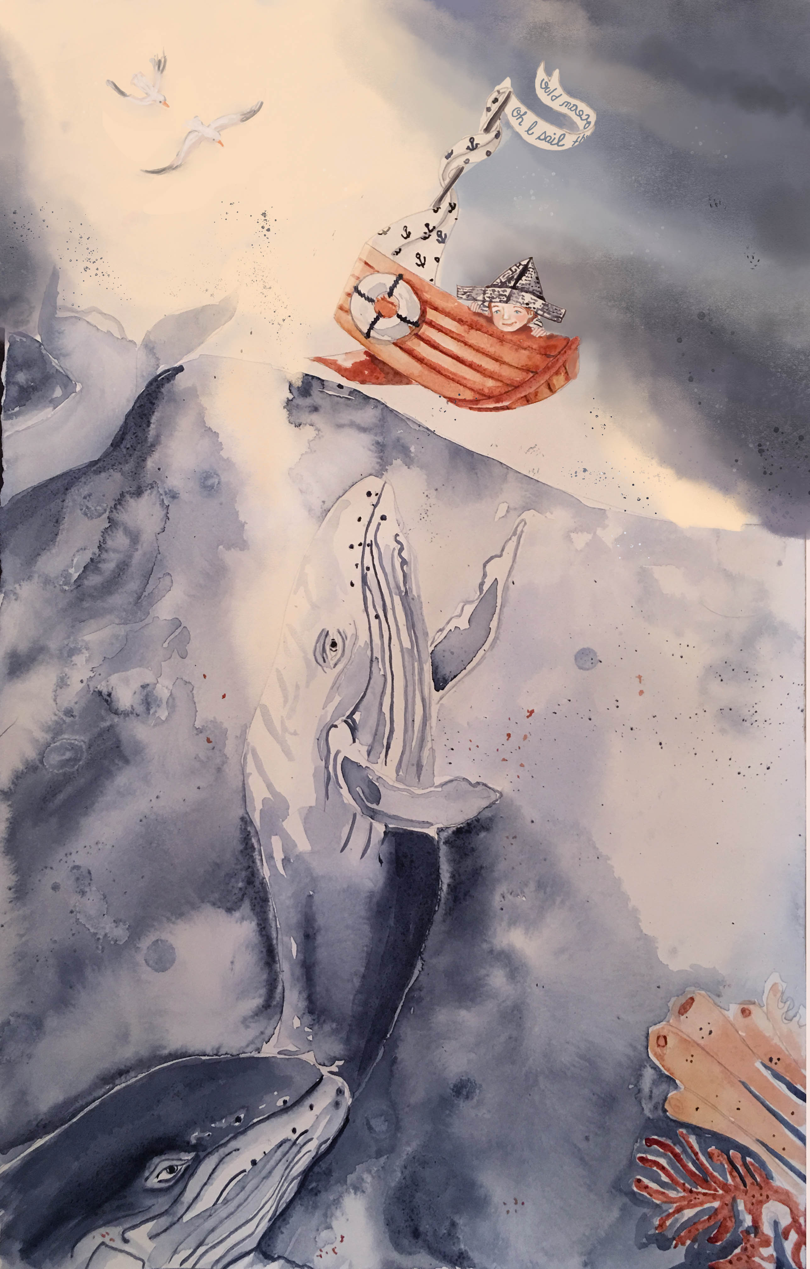
Hi everybody, this is a mix of watercolor and digital-Does the digital stick out like a sore thumb? I think I am too close to it-the water whales and boat are watercolor the boy, sky and birds are digital- Really wondering if I should repaint the whole thing watercolor only?? All thoughts welcome-thanks!
-
@lmrush Pretty colors!
As far as repainting it goes, the digital sky does have a very different texture than the watercolour ocean, but maybe that works since the sky should be fluffier and the ocean should be wetter anyway.  I really like how you've done the seagulls.
One thing I might darken a bit is the very light patch of sky to the lower right of the boat. The contrast between it and the dark part of the sky pulls the eye there, away from the boat. Also, I think the way you had the light around the upper part of the boat and little sailor in your thumbnail was more effective at highlighting the boat than the dark sky.
Thank you for sharing your process images here--it's really fun to see an illustration come together!