Thumbnails for a personal project. PLEASE VOTE! :)
-
Hello all. This is my first post and hopefully my image comes up.
") Anyway, I usually do a sketch and paint and have never done thumbnails before. This is my first go-round with making thumbnails for a painting. I'd love to get feedback from any of my fellow SVS mates and would like a little vote as to which thumbnail I should take to the next level. I numbered them so it would be easy to tell me what you guys like. Whichever one gets the most votes is the one I'll take the next step with. This is a personal project. It is about a little robot (currently named "2"), and he is on a bit of a journey. And with anything I ever post, please feel free to critique the crap out of me haha. I love and appreciate thoughts other than my own..
Anyway, I usually do a sketch and paint and have never done thumbnails before. This is my first go-round with making thumbnails for a painting. I'd love to get feedback from any of my fellow SVS mates and would like a little vote as to which thumbnail I should take to the next level. I numbered them so it would be easy to tell me what you guys like. Whichever one gets the most votes is the one I'll take the next step with. This is a personal project. It is about a little robot (currently named "2"), and he is on a bit of a journey. And with anything I ever post, please feel free to critique the crap out of me haha. I love and appreciate thoughts other than my own.. 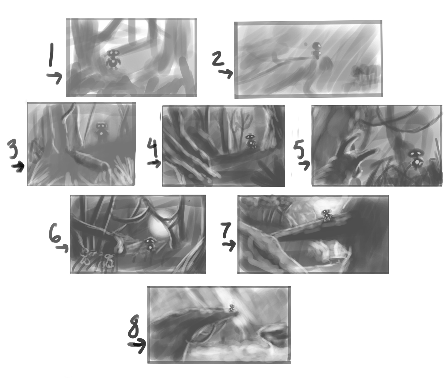
-
Good job! I like nr4. They are all a bit dark, but this one reads really well for me. Good luck with your pp!
Leontine
"A picture is worth a thousand words."https://leontineillustrator.com
https://www.instagram.com/leontine.illustrator/
http://www.facebook.com/leontineillustration -
@Leontine-Gaasenbeek Thanks for taking a peek :). Yes, the darkness. I'm hoping for a silhouette type of shot in this image where my character will be mostly backlit. And of course since they are thumbnails I didn't spend a lot of time with the lighting, was just looking to put down the idea, perhaps I should make sure the backlight I'm wanting is nailed down a bit more. Thanks for taking the time to look
-
Thanks for the feedback Dado
I agree with you about flipping number 5. Yes I took the Creative Composition class and about 5 other courses :). I understand what you are saying about simplifying my value. The way I did mine feels a bit more fluid to me, I basically laid down a bit of background value then added more then erased some, going back and forth... so kinda like sculpting the image instead of drawing it (I guess that is a good way to describe it). Like I said, I've never done thumbnails before so I tried to let it flow a bit, as you can see numbers 1 and 2 were lighter until I got further down the line and I think the other begin to get that fluid look to them. I absolutely understand what you are saying about making an easily read pic in order to pitch it to a client :} . I'm sure that would have to be placed in my next step of a thumbnail after a basic rough like the ones you share... "rough" then "clarification" perhaps I know I have seen artists trying to get a base of 3 different values to provide that understanding as you were saying (I'm a tutorial junky as I'm sure many people are here. so I attempt to find whatever info I can) But anywhooo... yes, clarification if introducing to eyes other than my own. Thank you very much for letting me borrow your eyes and thoughts! - Kris
-
@Dado-Almeida
ps... was just checking out your site... very cool stuff !! Once again... thank you for the feedback!!
-
I am curious about the character and the next illustration too, simplifying the values is is very good idea.
-
I totally agree with Dado about the value simplification. I tend to break the scene down first into two values (light vs. dark) then go to a 5 value set up (white, 25%, 50%, 75% and black).
It's easy and allows me to control both the lights, mids, and dark value relationships. It ends up looking like these below. This is student work from a digital painting class I taught last fall. Students had to do 6 value studies from a 3d animation. Fantastic exercise and many students made big leaps in their skill set by doing this exercise. : )
-
thanks for the reply Lee. May I ask a question. When you do your first thumbnail, do you do it more like a sketch where you are mainly attempting to get a basic placement of objects and forms, then do a second version with your value simplification or are you doing a lot of the sketch and values inside the same image because the ones you show (above) seem to have been more than just sketched out. I hope that makes sense. My thinking may be totally wrong so I want to make sure I get it right :). Are thumbnails a basic compositional sketch to get an idea down and then work the value out on the next step or should a thumbnail have all the lighting and arrangement of objects done inside each thumbnail before deciding on which one to take to the next level? I ask because when I did these thumbnails I was more thinking of compositional arrangement within the sketch and a tad of lighting. Each took about 2 to 5 minutes to do I think.
PS... thank you Lee for giving me your thoughts... and once again, thank you to everyone taking a look. I've never done a forum before so this is awesome to get to talk to people about this. Thanks!!!
-
I suggest taking the children's book class. There is a lot of info there but it goes over thumbnails. I found them very helpful..
-
Specifically talking the second video called the book dummy. Truthfully I have not take the entire class...so that is all I can add as a suggestion. Perhaps someone more seasoned can add further advice..
-
Thanks Reid. Yes I took that class. Very good stuff. In that class Jake's thumbnail layouts are very basic and give him an ideal of placement and most of the characters are almost "stick figure like" and with no indication of lighting or direction of light or value. Perhaps its just a personal thing for basic thumbnail sketches? I guess? lol.
-
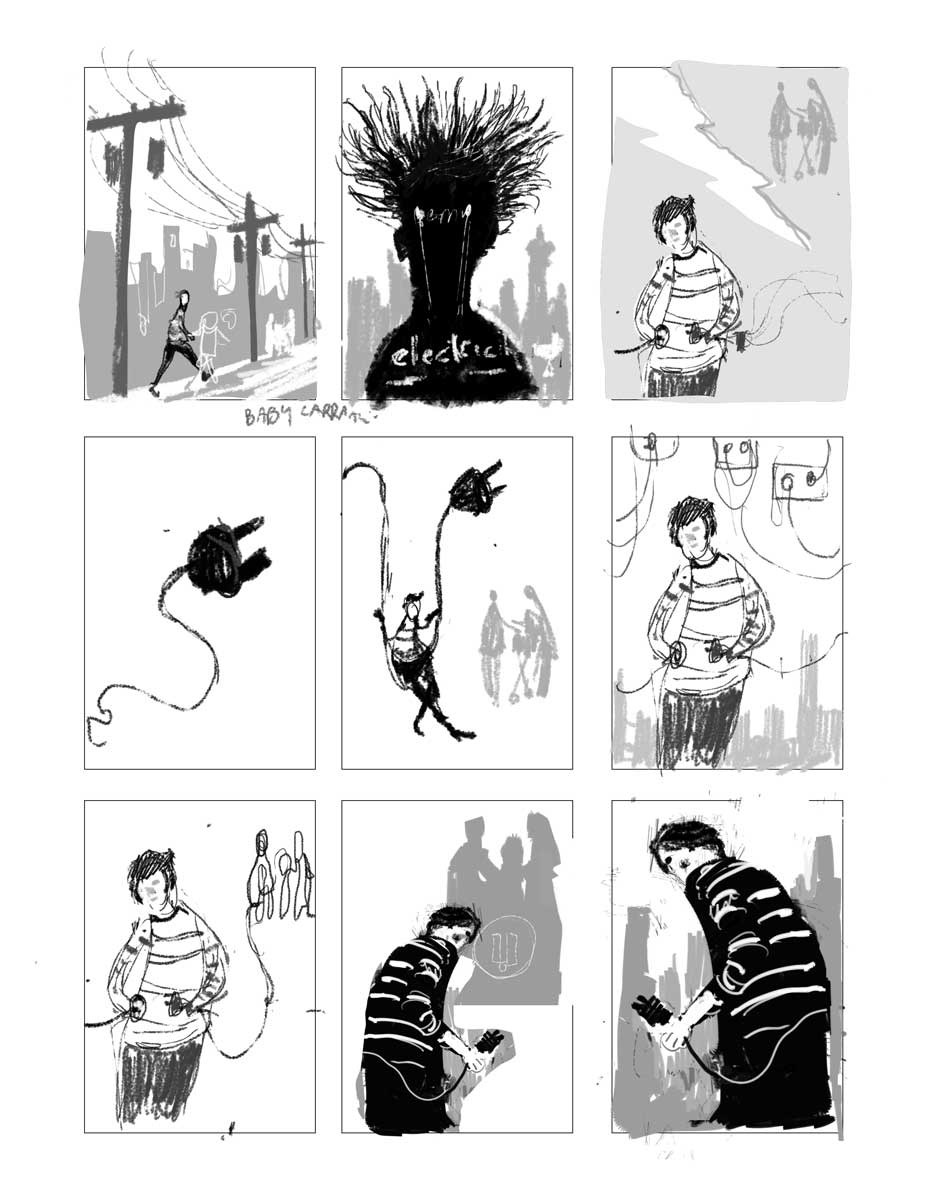
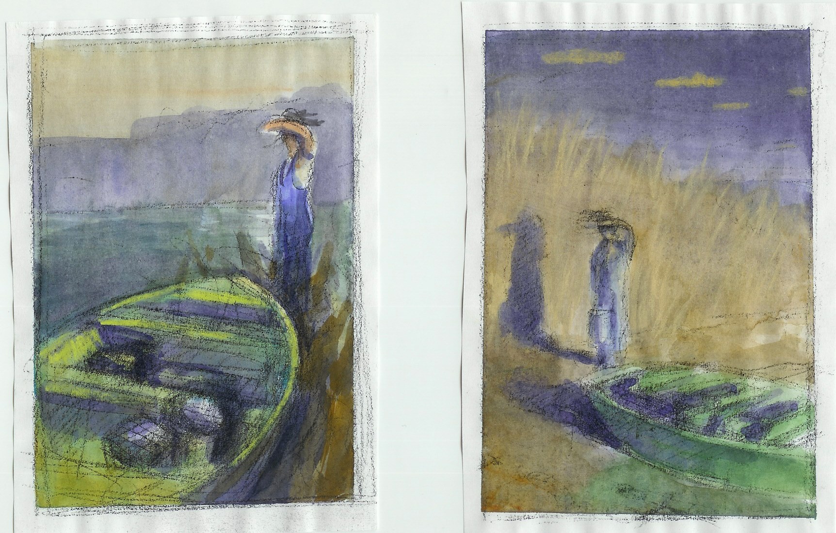
Kris, I typically start with a VERY rough sketch and get the composition worked out. I like to do a lot of them so I don't focus too much on quality at the first stage at all. I do like to use the 5 value system though. It helps keep them more orderly than if I just sketch in pencil. I just focus on camera angle and placement of objects.
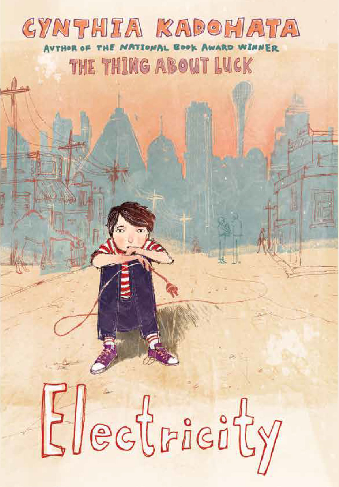
Here's how that first stage might look. These were for a book cover I did last year titled "Electricity". (I've included more info below this image so keep scrolling for more):
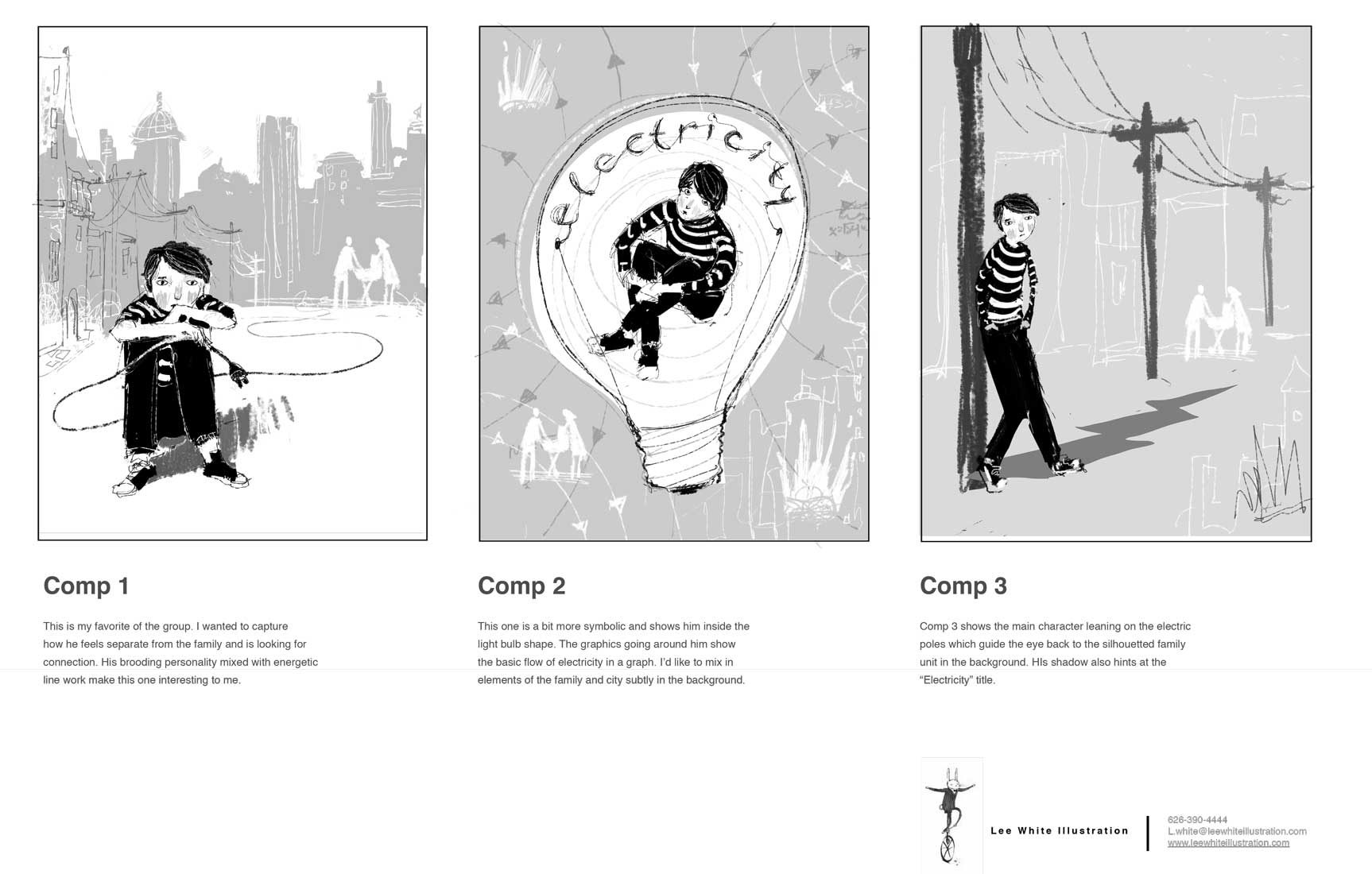
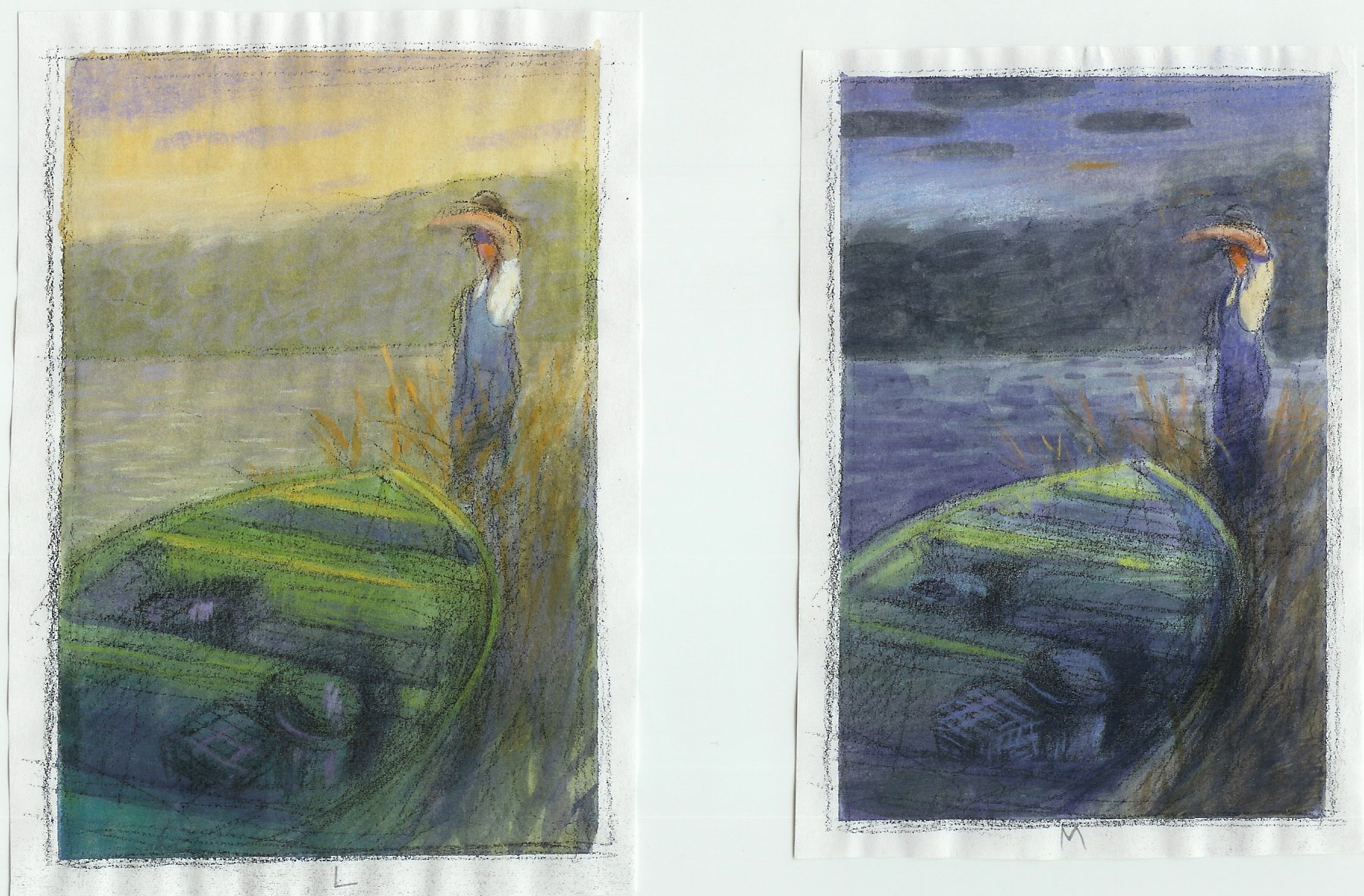
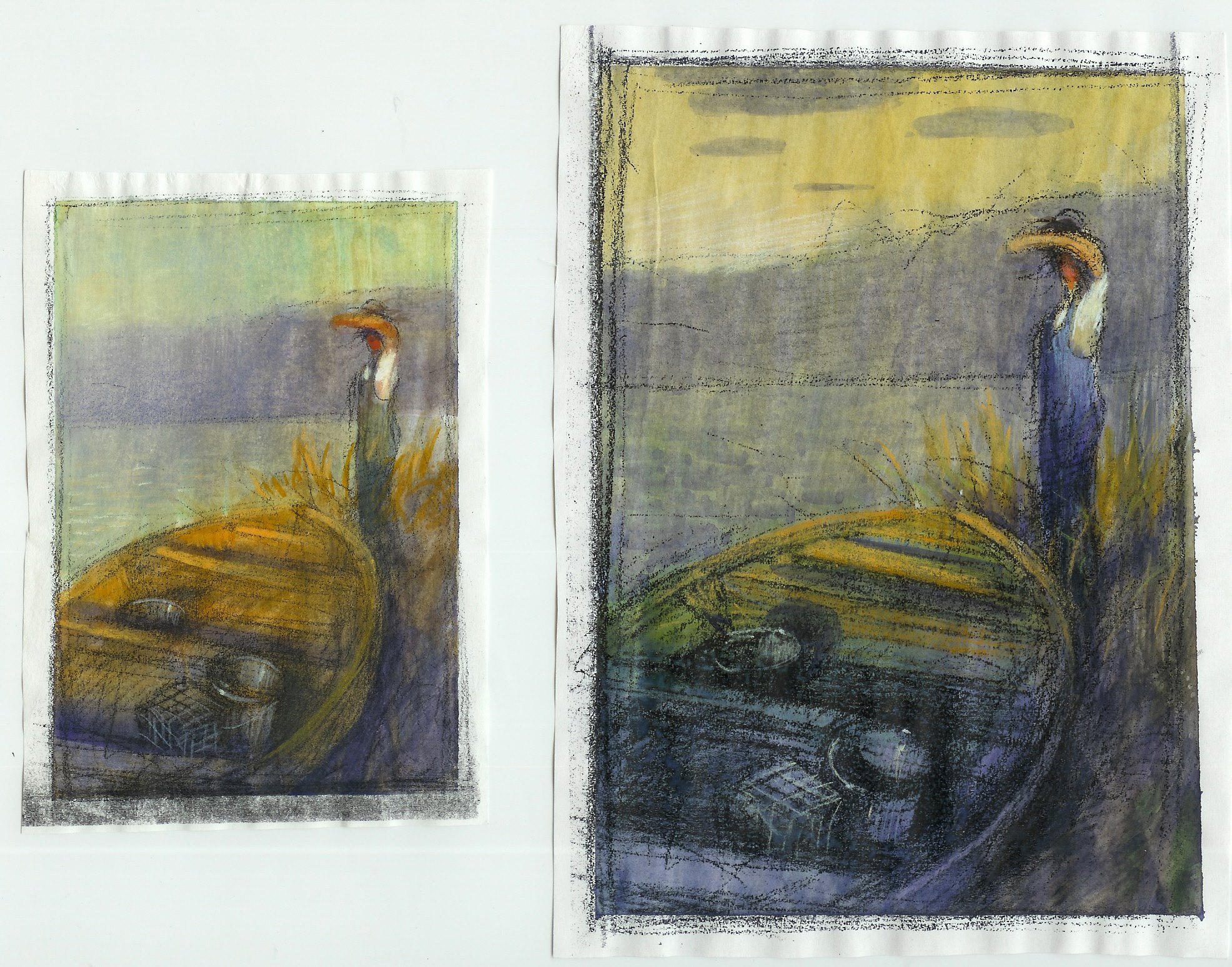
Then, once I figure out which ones I actually like I clean them up to present to the client. I ALWAYS do a little write up to let the client know what I am thinking. Here's that stage (more below that):
Then once I talk to the client a bit, I submit a final painting and they add type. Here's the finished cover:
-
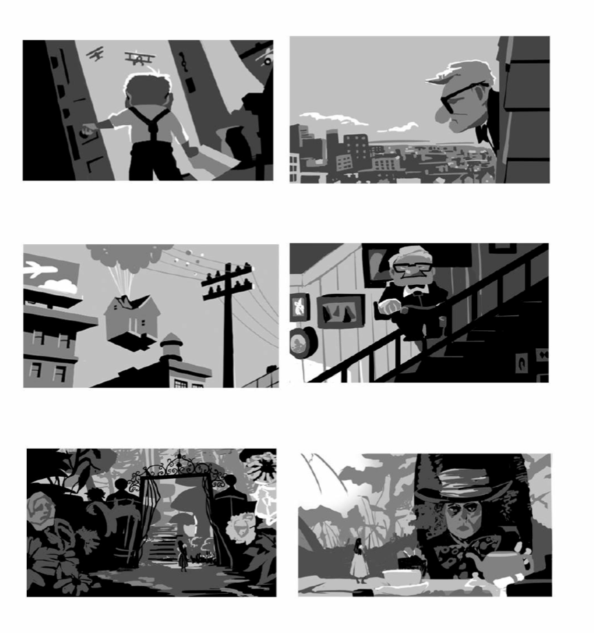
Here's another sample by the awesome Chris Sheban (who is going to do a video with us!!!!!! YAY!!!). It shows how he works from the rough all the way to the finish. So he does the value and color in one step. Of course, he is a total pro and knows what he is doing. I would suggest the greyscale route first, and then go to color. Note: I do these color studies AFTER I do the greycale studies. So it's just figuring out what works best for you.
-
Excellent. I really appreciate you taking the time to do that. The thumbnails I posted were simply my first step for creating the "idea" of an image. So then I see from your stuff my next step would be solidify the value, then a color study, then rendering. Very nice and very appreciated. Thanks Lee :).
... and thank you to everyone who took the time to write -
I love number 5 and 8! Great Job!!!
-
Without regard to storytelling, just based on visual appeal as a composition, I like #5.
-
@Olivia-Hope-Shelley
Thanks Olivia -
@Patty-Burke
Thanks Patty.
I think I remember you in one of the classes. I can't remember which one (Might have been Composition), but I think it was a sledding/winter scene with the cute little dogs Anyway. thanks for letting me borrow your eyes :). thanks -
@Kris-Knight I was immediately drawn to 5 and 8, although on a second look, I'm really liking #7. This looks like a really fun project. I can't wait to see your next steps.
Maile
-
I vote 5 and 8, leaning more towards 8 for adventure appeal and being curious where he is going. Lee's thumbnails are fantastic, loved seeing the progression and the other artist's samples.