Alice in Wonderland - illustration series
-
really good work here. I think you are leveling up on this one. Looks like your work just keeps getting better and better. : )
-
@kevin-longueil Thank you Kevin! I always hope to get your feedback because you always make such good points. The paws were disturbing me as well. So much so that I wiped them out and re-did them completely yesterday ;-).
As for the focal point, you are right. Alice is the point of highest contrast, but the saturation is getting in the way, so I am going to play with reducing the saturation of the outer sections and maybe also blurring the edges slightly, and reducing the contrast at the end of the tail (which is spot on the thirds line, so it´s a natural focal point as well). Thank you for pointing that out! -
@lee-white Thank you Lee - your words mean a lot to me here, because I am seeing my style change and it´s scary! I am so attracted by highly graphical work (Charlie Harper and co) and I had to see if there was a way to bring some of that sensibility into my own work - it´s a constant fight against the pull to render

I hope these could be both an exploration and a showcase - and if they bring me into Bologna, that´s just added bonus... -
I think you are finding a great balance between doing your more rendered style and including more graphical elements. Bravo! I always love seeing your work. I have to say, I love the shadow below the cheshire cat, its an odd thing to notice but it really helps with the believability of the image.
-
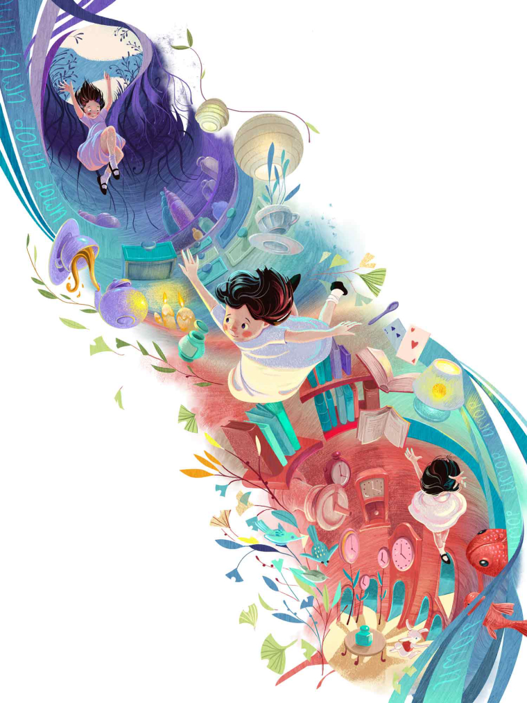
@smceccarelli These floor me. Especially the Down the Rabbit Hole. WOW.
-
I'm so glad you have a deadline because I want to see MORE!!!!

-
Second one down - missing final adjustments and of course hungry for feedback on anything that could be improved..

-
This is extraordinary @smceccarelli! I think this is perhaps my favourite of anything I've seen of yours. Well done! I could seriously look at that last one for days.
The only thing I'd say for a critique is that Alice is dressed pretty plain in my opinion. I'm wondering though if you did that on purpose - so that her surroundings really stand out and so then she looks even more out of place in this world? If that's the case, even just adding a simple ribbon around her waist would help I think. The middle one in particular looks a bit hospital gown-ish at the moment with how it's billowing.
I seriously think a publisher should hire you to illustrate a new take on Alice
-
Absolutely love the color choices and Chesire Cat!
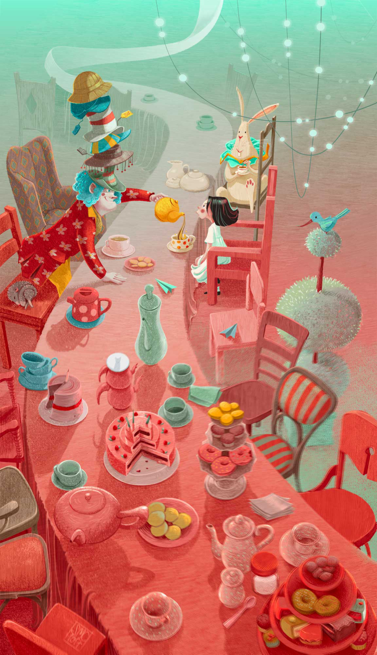
My only comment is that the facial expressions of the characters in the Mad Hatter scene seem very similar to one another. Alice's expressions, in particular, appears to be the same as the illustration with the Chesire Cat.
Beautiful work!
-
@smceccarelli Wonderful work!
-
@smceccarelli Beautiful!!!
-
@smceccarelli I am in love with this. I really like how the ginko leaves, and blue green color tie everything together.
-
Its really beautiful work
 storytelling, composition and colours. Perfect in my opinion.
 -
Well thank you all @Tom-Shannon @Kevin-Longueil @DanetteDraws @Guest @HilariousBosch @Christine-Garner for the great feedback! I keep seeing things that bug me, but that is my curse....I am overall really happy with this new direction and I hope I can keep pushing the graphic approach - it just feels right at this stage. Danette, you have a good point . Alice´s plainness is intentional, as you have guessed, but I will try to see how a ribbon plays out.
-
Amazing work! I love the colors on the down the rabbit hole one! And seeing the progress from sketch to color is simply a treat! Love it
 thanks for sharing looking forward to more!
 -
Again, great colour palette!
-
You are doing some next level stuff here. I can really tell how much hard work you put in. The illustrations are beautiful.
-
Next one down. What do you think of the green fog between the chairs? Too much?

-
Beautiful! I personally think the green fog works well.
-
@smceccarelli Love it! its so illustrative! chapeau!