Society of Visual Storytelling

    SVSLearn Forums

    • Register
    • Login
    • Search
    • Recent
    • Tags
    • Popular
    • Users
    • Groups
    • Search

    Alice in Wonderland - illustration series

    Artwork
    27
    63
    14604
    Loading More Posts
    • Oldest to Newest
    • Newest to Oldest
    • Most Votes
    Reply
    • Reply as topic
    Log in to reply
    This topic has been deleted. Only users with topic management privileges can see it.
    • Laurel Aylesworth
      Laurel Aylesworth @smceccarelli last edited by

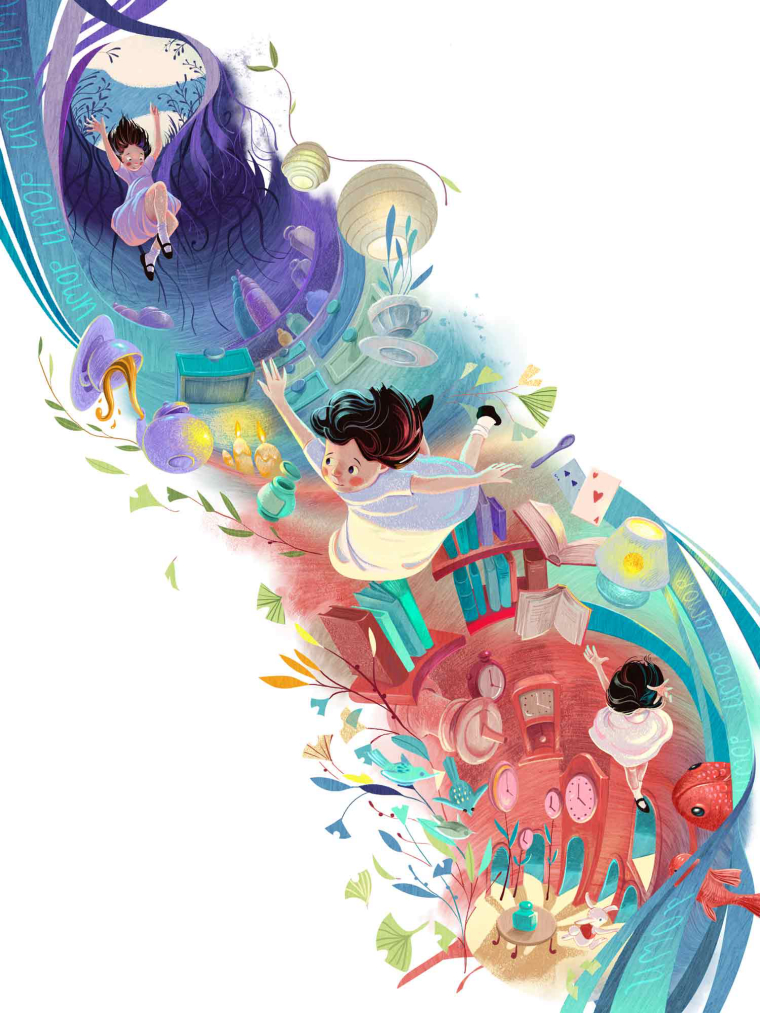
      @smceccarelli These floor me. Especially the Down the Rabbit Hole. WOW.

      www.laurelaylesworth.com
      instagram.com/laurelaylesworth

      1 Reply Last reply Reply Quote 0
      • Pam Boutilier
        Pam Boutilier last edited by

        I'm so glad you have a deadline because I want to see MORE!!!!
        πŸ˜ƒ

        ~ Pam
        www.PamBoutilier.com

        1 Reply Last reply Reply Quote 1
        • smceccarelli
          smceccarelli Pro SVS OG last edited by smceccarelli

          Second one down - missing final adjustments and of course hungry for feedback on anything that could be improved..

          0_1509636822933_1WIP.jpg

          DanetteDraws ? Kevin Longueil HilariousBosch 4 Replies Last reply Reply Quote 10
          • DanetteDraws
            DanetteDraws @smceccarelli last edited by

            This is extraordinary @smceccarelli! I think this is perhaps my favourite of anything I've seen of yours. Well done! I could seriously look at that last one for days.
            The only thing I'd say for a critique is that Alice is dressed pretty plain in my opinion. I'm wondering though if you did that on purpose - so that her surroundings really stand out and so then she looks even more out of place in this world? If that's the case, even just adding a simple ribbon around her waist would help I think. The middle one in particular looks a bit hospital gown-ish at the moment with how it's billowing.
            I seriously think a publisher should hire you to illustrate a new take on Alice πŸ™‚

            https://danettebyatt.com
            Twitter @DanetteDraws
            Instagram @DanetteDraws

            1 Reply Last reply Reply Quote 0
            • ?
              A Former User last edited by

              Absolutely love the color choices and Chesire Cat!

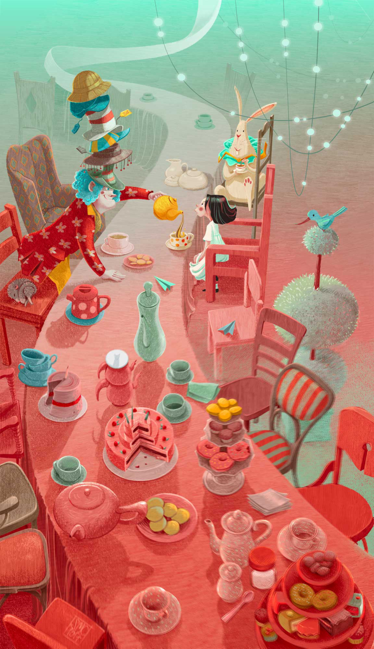
              My only comment is that the facial expressions of the characters in the Mad Hatter scene seem very similar to one another. Alice's expressions, in particular, appears to be the same as the illustration with the Chesire Cat.

              Beautiful work!

              1 Reply Last reply Reply Quote 0
              • ?
                A Former User @smceccarelli last edited by

                @smceccarelli Wonderful work!

                1 Reply Last reply Reply Quote 0
                • Kevin Longueil
                  Kevin Longueil SVS OG @smceccarelli last edited by

                  @smceccarelli Beautiful!!!

                  Portfolio: kevinlongueil.com
                  https://www.instagram.com/kevinlongueil/

                  1 Reply Last reply Reply Quote 0
                  • HilariousBosch
                    HilariousBosch @smceccarelli last edited by

                    @smceccarelli I am in love with this. I really like how the ginko leaves, and blue green color tie everything together.

                    because art imitates life and life is beautiful

                    1 Reply Last reply Reply Quote 0
                    • Christine Garner
                      Christine Garner last edited by

                      Its really beautiful work πŸ™‚ storytelling, composition and colours. Perfect in my opinion.

                      website: https://thimblefolio.com

                      1 Reply Last reply Reply Quote 0
                      • smceccarelli
                        smceccarelli Pro SVS OG last edited by

                        Well thank you all @Tom-Shannon @Kevin-Longueil @DanetteDraws @Guest @HilariousBosch @Christine-Garner for the great feedback! I keep seeing things that bug me, but that is my curse....I am overall really happy with this new direction and I hope I can keep pushing the graphic approach - it just feels right at this stage. Danette, you have a good point . AliceΒ΄s plainness is intentional, as you have guessed, but I will try to see how a ribbon plays out.

                        1 Reply Last reply Reply Quote 1
                        • ambiirae
                          ambiirae last edited by

                          Amazing work! I love the colors on the down the rabbit hole one! And seeing the progress from sketch to color is simply a treat! Love it πŸ™‚ thanks for sharing looking forward to more!

                          1 Reply Last reply Reply Quote 0
                          • MF James
                            MF James last edited by

                            Again, great colour palette!

                            http://wakeupmonster.co.uk/
                            instagram - @mfjamesillustrations

                            1 Reply Last reply Reply Quote 0
                            • evilrobot
                              evilrobot SVS OG last edited by

                              You are doing some next level stuff here. I can really tell how much hard work you put in. The illustrations are beautiful.

                              http://www.palacioillustration.com/

                              https://www.scbwi.org/illustrator-gallery/illustrator-detail/?illustrator_id=84142

                              https://www.pinterest.com/evilrobot2/pins/

                              https://twitter.com/MyEvilRobot

                              1 Reply Last reply Reply Quote 0
                              • smceccarelli
                                smceccarelli Pro SVS OG last edited by

                                Next one down. What do you think of the green fog between the chairs? Too much?

                                0_1510155093912_ALICE_3_INSTA_3.jpg

                                Leontine MOO 2 Replies Last reply Reply Quote 9
                                • TessaW
                                  TessaW last edited by

                                  Beautiful! I personally think the green fog works well.

                                  Website: www.tessawrathall.com

                                  Instagram: www.instagram.com/tessawrathall_art/

                                  1 Reply Last reply Reply Quote 1
                                  • Leontine
                                    Leontine @smceccarelli last edited by

                                    @smceccarelli Love it! its so illustrative! chapeau!

                                    Leontine
                                    "A picture is worth a thousand words."

                                    https://leontineillustrator.com
                                    https://www.instagram.com/leontine.illustrator/
                                    http://www.facebook.com/leontineillustration

                                    1 Reply Last reply Reply Quote 1
                                    • smceccarelli
                                      smceccarelli Pro SVS OG last edited by

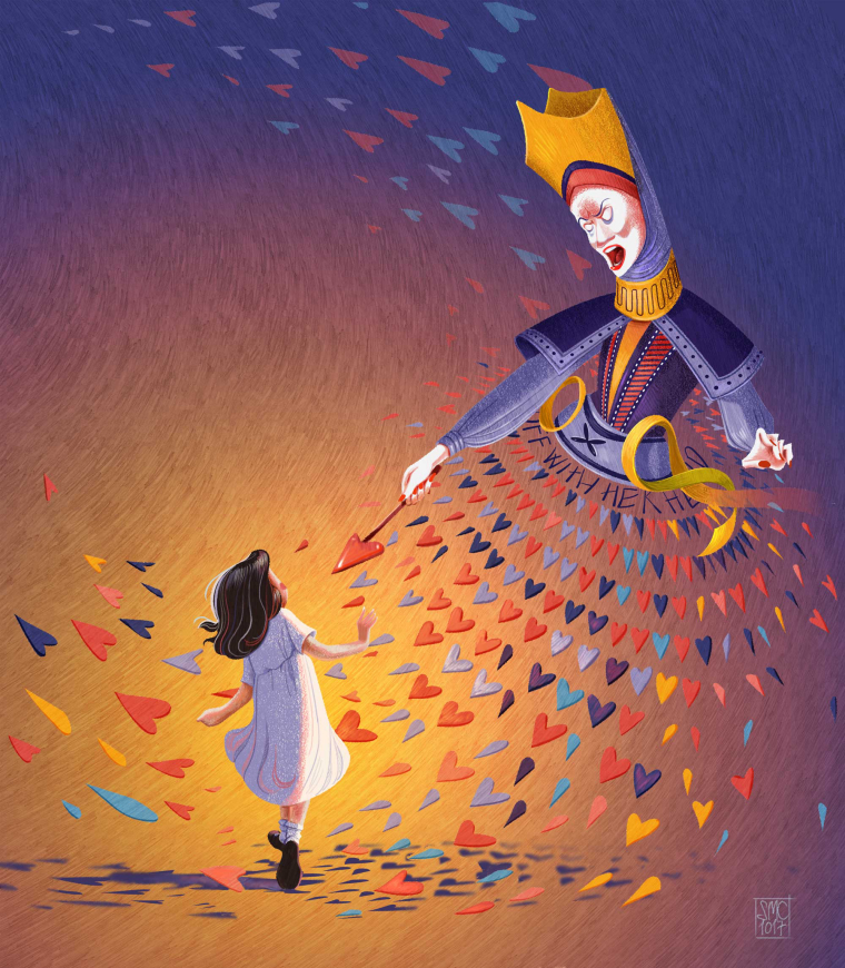
                                      I am not sure about this one...what do you think?

                                      0_1510227376362_4_WIP.jpg

                                      Laurel Aylesworth Kevin Longueil 2 Replies Last reply Reply Quote 6
                                      • Laurel Aylesworth
                                        Laurel Aylesworth @smceccarelli last edited by

                                        @smceccarelli I think the queen's dress needs more dimension to round it out (the way you did with the cheshire cat), but I do love how the points of the hearts are coming at Alice. And...psst...you should have won the SCBWI narrative art award. Totally solid work.

                                        www.laurelaylesworth.com
                                        instagram.com/laurelaylesworth

                                        1 Reply Last reply Reply Quote 1
                                        • Kevin Longueil
                                          Kevin Longueil SVS OG @smceccarelli last edited by

                                          @smceccarelli This looks great - i love the texture of the background! for feedback i would agree with Laurel - i think in the drawing that the density of hearts around the waist of the Queen seemed to imply her form more strongly than in the painted version - for the background it is possible that the color, saturation, and texture of the background are pulling my attention from Alice - even when i look directly at Alice she seems to fade from view as the background comes into focus - i messed with levels a bit hoping to find something that might get Alice to pop - did not really get great results but i felt that the green really works to bring Alice forward but maybe not as well with the queen - anyways - feel free to ignore πŸ™‚ this series is really very impressive!!

                                          0_1510261089660_Untitled_Artwork-22.jpg

                                          Portfolio: kevinlongueil.com
                                          https://www.instagram.com/kevinlongueil/

                                          1 Reply Last reply Reply Quote 1
                                          • smceccarelli
                                            smceccarelli Pro SVS OG last edited by

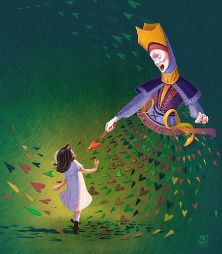
                                            Thank you @Kevin-Longueil @Laurel-Aylesworth! I think you are definitely right, I need to mess a little with the queen's dress. I do not want to put something "inside" the dress, but it needs to get more volume. I also agree that I probably need to push back the background more. My major source of in-person feedback (a great designer colleague) suggested darkening it more. Or maybe it is the saturation. I'll play around. Green looks good - unfortunately the whole series only uses a five-color palette and it does not include green. Maybe I could try with teal and purple instead of yellow and purple...
                                            Ok, more playing in any case.
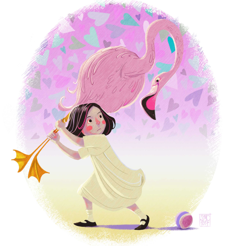
                                            Here is a little fun "extra" I did today for color collective. Not as polished, but I only had two hours...

                                            0_1510262250287_CROQUET_FINAL.jpg

                                            1 Reply Last reply Reply Quote 6
                                            • First post
                                              Last post