Society of Visual Storytelling

    SVSLearn Forums

    • Register
    • Login
    • Search
    • Recent
    • Tags
    • Popular
    • Users
    • Groups
    • Search

    Alice in Wonderland - illustration series

    Artwork
    27
    63
    14604
    Loading More Posts
    • Oldest to Newest
    • Newest to Oldest
    • Most Votes
    Reply
    • Reply as topic
    Log in to reply
    This topic has been deleted. Only users with topic management privileges can see it.
    • ?
      A Former User @smceccarelli last edited by

      @smceccarelli Wonderful work!

      1 Reply Last reply Reply Quote 0
      • Kevin Longueil
        Kevin Longueil SVS OG @smceccarelli last edited by

        @smceccarelli Beautiful!!!

        Portfolio: kevinlongueil.com
        https://www.instagram.com/kevinlongueil/

        1 Reply Last reply Reply Quote 0
        • HilariousBosch
          HilariousBosch @smceccarelli last edited by

          @smceccarelli I am in love with this. I really like how the ginko leaves, and blue green color tie everything together.

          because art imitates life and life is beautiful

          1 Reply Last reply Reply Quote 0
          • Christine Garner
            Christine Garner last edited by

            Its really beautiful work 🙂 storytelling, composition and colours. Perfect in my opinion.

            website: https://thimblefolio.com

            1 Reply Last reply Reply Quote 0
            • smceccarelli
              smceccarelli Pro SVS OG last edited by

              Well thank you all @Tom-Shannon @Kevin-Longueil @DanetteDraws @Guest @HilariousBosch @Christine-Garner for the great feedback! I keep seeing things that bug me, but that is my curse....I am overall really happy with this new direction and I hope I can keep pushing the graphic approach - it just feels right at this stage. Danette, you have a good point . Alice´s plainness is intentional, as you have guessed, but I will try to see how a ribbon plays out.

              1 Reply Last reply Reply Quote 1
              • ambiirae
                ambiirae last edited by

                Amazing work! I love the colors on the down the rabbit hole one! And seeing the progress from sketch to color is simply a treat! Love it 🙂 thanks for sharing looking forward to more!

                1 Reply Last reply Reply Quote 0
                • MF James
                  MF James last edited by

                  Again, great colour palette!

                  http://wakeupmonster.co.uk/
                  instagram - @mfjamesillustrations

                  1 Reply Last reply Reply Quote 0
                  • evilrobot
                    evilrobot SVS OG last edited by

                    You are doing some next level stuff here. I can really tell how much hard work you put in. The illustrations are beautiful.

                    http://www.palacioillustration.com/

                    https://www.scbwi.org/illustrator-gallery/illustrator-detail/?illustrator_id=84142

                    https://www.pinterest.com/evilrobot2/pins/

                    https://twitter.com/MyEvilRobot

                    1 Reply Last reply Reply Quote 0
                    • smceccarelli
                      smceccarelli Pro SVS OG last edited by

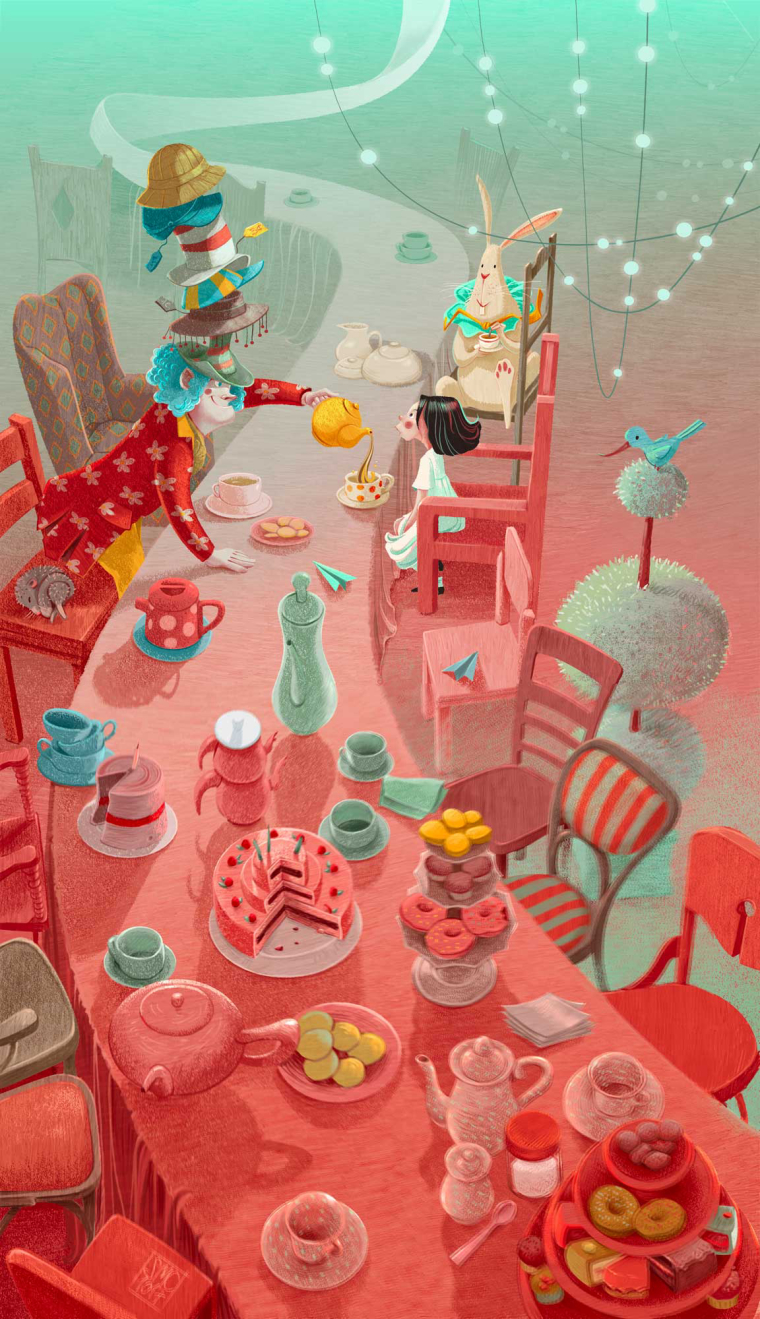
                      Next one down. What do you think of the green fog between the chairs? Too much?

                      0_1510155093912_ALICE_3_INSTA_3.jpg

                      Leontine MOO 2 Replies Last reply Reply Quote 9
                      • TessaW
                        TessaW last edited by

                        Beautiful! I personally think the green fog works well.

                        Website: www.tessawrathall.com

                        Instagram: www.instagram.com/tessawrathall_art/

                        1 Reply Last reply Reply Quote 1
                        • Leontine
                          Leontine @smceccarelli last edited by

                          @smceccarelli Love it! its so illustrative! chapeau!

                          Leontine
                          "A picture is worth a thousand words."

                          https://leontineillustrator.com
                          https://www.instagram.com/leontine.illustrator/
                          http://www.facebook.com/leontineillustration

                          1 Reply Last reply Reply Quote 1
                          • smceccarelli
                            smceccarelli Pro SVS OG last edited by

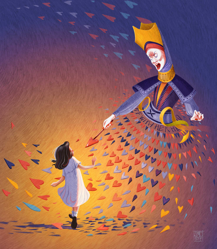
                            I am not sure about this one...what do you think?

                            0_1510227376362_4_WIP.jpg

                            Laurel Aylesworth Kevin Longueil 2 Replies Last reply Reply Quote 6
                            • Laurel Aylesworth
                              Laurel Aylesworth @smceccarelli last edited by

                              @smceccarelli I think the queen's dress needs more dimension to round it out (the way you did with the cheshire cat), but I do love how the points of the hearts are coming at Alice. And...psst...you should have won the SCBWI narrative art award. Totally solid work.

                              www.laurelaylesworth.com
                              instagram.com/laurelaylesworth

                              1 Reply Last reply Reply Quote 1
                              • Kevin Longueil
                                Kevin Longueil SVS OG @smceccarelli last edited by

                                @smceccarelli This looks great - i love the texture of the background! for feedback i would agree with Laurel - i think in the drawing that the density of hearts around the waist of the Queen seemed to imply her form more strongly than in the painted version - for the background it is possible that the color, saturation, and texture of the background are pulling my attention from Alice - even when i look directly at Alice she seems to fade from view as the background comes into focus - i messed with levels a bit hoping to find something that might get Alice to pop - did not really get great results but i felt that the green really works to bring Alice forward but maybe not as well with the queen - anyways - feel free to ignore 🙂 this series is really very impressive!!

                                0_1510261089660_Untitled_Artwork-22.jpg

                                Portfolio: kevinlongueil.com
                                https://www.instagram.com/kevinlongueil/

                                1 Reply Last reply Reply Quote 1
                                • smceccarelli
                                  smceccarelli Pro SVS OG last edited by

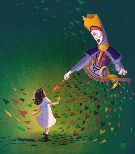
                                  Thank you @Kevin-Longueil @Laurel-Aylesworth! I think you are definitely right, I need to mess a little with the queen's dress. I do not want to put something "inside" the dress, but it needs to get more volume. I also agree that I probably need to push back the background more. My major source of in-person feedback (a great designer colleague) suggested darkening it more. Or maybe it is the saturation. I'll play around. Green looks good - unfortunately the whole series only uses a five-color palette and it does not include green. Maybe I could try with teal and purple instead of yellow and purple...
                                  Ok, more playing in any case.
                                  Here is a little fun "extra" I did today for color collective. Not as polished, but I only had two hours...

                                  0_1510262250287_CROQUET_FINAL.jpg

                                  1 Reply Last reply Reply Quote 6
                                  • MF James
                                    MF James last edited by MF James

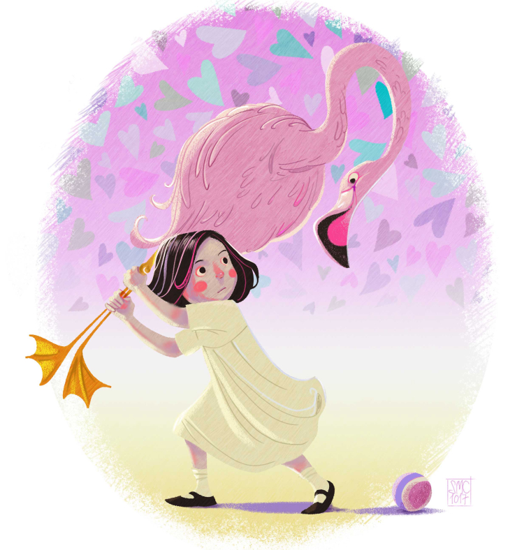
                                    They are all great. I would love to have that book.

                                    http://wakeupmonster.co.uk/
                                    instagram - @mfjamesillustrations

                                    1 Reply Last reply Reply Quote 1
                                    • smceccarelli
                                      smceccarelli Pro SVS OG last edited by smceccarelli

                                      And the last.
                                      I like the first three much more than the last two...but I guess I am tired and it's time to pause before I go in and make the final adjustments. I still have about five days, so there's time to look away before going back for corrections and edits.. .

                                      0_1510436229772_5_WIP.jpg

                                      Kevin Longueil 1 Reply Last reply Reply Quote 5
                                      • Kevin Longueil
                                        Kevin Longueil SVS OG @smceccarelli last edited by

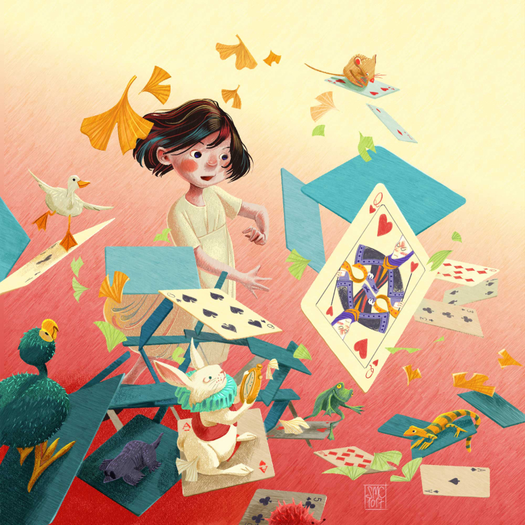
                                        @smceccarelli Very nice!!

                                        Portfolio: kevinlongueil.com
                                        https://www.instagram.com/kevinlongueil/

                                        1 Reply Last reply Reply Quote 0
                                        • Eli
                                          Eli last edited by

                                          @smceccarelli , amazing work!! I LOVE the color palette--it's so unexpected and it works so well! For the record, I really like the last two. It is hard to pick a favorite--I love Cheshire Cat and also the Tea Party--but they are ALL stunning.

                                          1 Reply Last reply Reply Quote 0
                                          • MOO
                                            MOO SVS OG @smceccarelli last edited by

                                            @smceccarelli Love it! Your lighting is so good. Everything.....

                                            Marsha Ottum Owen

                                            1 Reply Last reply Reply Quote 0
                                            • First post
                                              Last post