What should I focus on next time? (critique)
-
@art-of-b I think its looking great. @stringfellowart makes great points. My critique would be on the light source, to me it looks like you have multiple sources. When I do a piece that is based outside I tend to look for reference photos of something similar so i can get a feel on how the light will play with the elements around it.
-
Overall this is very nice and it has colors except maybe for the water it feels out of place with the blue and the edges of the reflections seem a bit blocky
-
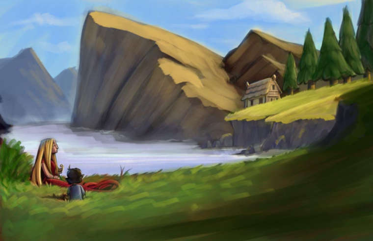
Have you thought about painting outside with a few paints and a sketchbook? Makes your landscapes more realistic I find.
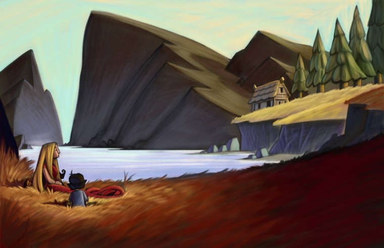
Here is a quick paint over I did to make your characters the interest hope it helps.
-
I agree with @Zombie-Rhythm . When I first saw your painting I said WOW. Your painting has a great drama that the critique paint overs lack. I do like the idea of moving the water line up to give the subject a little more room but other than that I love it.
-
This is lovely Jason! nice job.
I have a couple of suggestions. The first is your brushes. The paint strokes look blurry. You need a hard edge and less opacity variation in your strokes. Especially towards your focal points and center of interest.
The characters and little house are cool (focal points), but your value, contrast, and saturation on that big brown rock structure there keeps my eyes going to that. Maybe break it up with some small little trees or rocks or something on the face of it?
Very nice overall. Keep it up! : )
SVS Faculty Instructor
www.leewhiteillustration.com -
@lee-white thanks but I cant take credit I just did a paint over on the original.
")
-
I can't add any advice others haven't already given but great art. I look forward to seeing more of your work!
-
Thank you for the paint over! I see what you mean about giving the characters more headroom. It really helps to isolate the characters.
@Zombie-Rhythm
Thanks for the kind words! I think if I redid the sky I would use more fluid strokes, absolutely. Interesting thoughts regarding rules vs. style. I can see where you're coming from. I think I'm still at the level where if I'm breaking a rule it's because I'm unaware of the rule, however XD. I'd love to say 'yup, that's my style' but really it's closer to 'oh so THAT'S how you're supposed to do it...'
Ah, those damn light sources
I used to take pictures while out hiking to use a reference. I may have to start doing that again (google is becoming less and less useful for images).
Thanks for the feedback.
-
Interesting! I wonder if the water would be better if it were closer in hue to the sky?
Thanks for the paint over! I'm glad @Lee-White liked it XD
Doing sketching (or painting, I suppose) is something I've been trying to make room for. I can never nail down those desaturated blues of distant hills without colour-picking.
It's interesting, though, that the green grass in your paint over registers much better as 'grass' (since grass is green) and helps to draw the eye to the red dress much better the brown-red grass in my version. But my version is actually closer to the view outside my window (everything here is TINDER dry).
Thanks again for the paint-over. I get a much better sense of distance with your version.
Thanks for chiming in! I'd love to take the advice but need some clarification. Are you referring to Jason's paint over, or my original post?
-
I don't know how much I have to add at this point, but I think what stands out to me is how intense the the shadows of the foreground are with those reds and oranges, but you lose all of that once you get to the house. I know you are trying to go for atmospheric perspective coloring with more lighting in that area, but I feel we'd get a little more warmth in the shadows of the grass back there and it would help unify the piece a bit. Maybe even extend some warm to the rocks in that area as well. Getting in some sharper grass blades around the focal point, kind of like what Lee was saying, would also add a lot. I guess I'll throw in a paint over as well, cause, why not? I didn't mean to wash out the foreground so much, but hopefully you see what I mean about bringing the warmth in the house area.
Good job in general though. I think it's very appealing!
-
@art-of-b I know what you mean, the colour picker is a little bit of a bad device on photoshop painting because it can be relied upon. Try doing lots of little colour comps of layers of rocks without using the picker then you will get use to colouring them.
In oil painting I usually blob some sky colour in with the colour of the rocks and you automatically get that distant rock effect. Try thinking like that when you paint them. Might help you out.
-
@jason-bowen oops, that's what i get for not paying close enough attention! Although same crits go for @Art-of-B
I can't wait to se this when it is finished. : )
-
@art-of-b "I think I'm still at the level where if I'm breaking a rule it's because I'm unaware of the rule"
Then, make your own rules. Like "in my world, heads are going to be square or my mountains have three peaks or my skies are turquoise or everything has this texture..." Not randomly, of course, you look at your work and choose the things you really like. Once you do the same thing over and over people stop telling you that that is incorrect and start telling you "you have style". They can like it or not, that is a different subject. And in the process, you improve. If the thing you choose doesn't really work, you understand that and change the necessary to make it work. No idea is good in the first place.Some things they advised you I don't agree, some overpainting I feel like yours was better, like if they try to resolve a problem rationally but this is art and the most important thing is that the image makes you feel something (giving more room to breathe to your subjects when they already have a nice separation with the background, and if that were not the case, there are a lot of tools for that purpose. You don't have always to surround your subject with negative space. You can blur the background, desaturate it, if you have horizontal lines in your subject, for example, you can put vertical lines in the background, color contrast, color temperature, size of texture... there are millions of ways. Making a radical change like adding negative space around your subject changes the complete overlay, the complete composition. Perhaps you really want to transmit that your subjects are in an uncomfortable or claustrophobic moment, perhaps you are really interested in cutting the line of the mountain because was to long and it was dragging a lot of attention before, perhaps you think that giving room is a good idea but in your layout is going to make your subjects smaller and that's not acceptable for you, and you decide that is not so important problem and prefer to finish your work and go to the next instead of investing hours in changing everything... Millions of things...). I don't say that neither of these things are the case here (I'm only making examples), but are the things that I consider before saying, "that subjects can be benefit for more room". I'm not saying is a bad idea, I'm saying is a different thing that you can do in your drawing, but is not going to fix a problem in my opinion, because there were never one, and is going to change the feeling of the work.
Don't get me wrong, If your drawing were bad, I'm the first to tell you "you need to learn this or that..." but for this piece and style I think you are in a good place. Don't stop creating!